
A reader observes:
You were wrong because you did not consider the statistics more holistically. That’s the learning point for your students. Cross check your indicators if you have dials which are telling you different things. If jobs are increasingly rapidly, then GDP should also be up. If jobs are increasing rapidly, then mobility and gasoline consumption should also be up, because so many people need to drive to work in this country. Finally, if productivity is imploding when jobs are up, you really need to take a pause and put together some sort of narrative as to why that might be happening. It suggests something anomalous in the data which requires closer inspection.
So here, without further ado, is a series of snapshots of the aggregate economy, focusing first on indicators followed by the NBER BCDC, then some alternative indicators including one favored by Mr. Kopits, and finally, the labor market indicators we have.
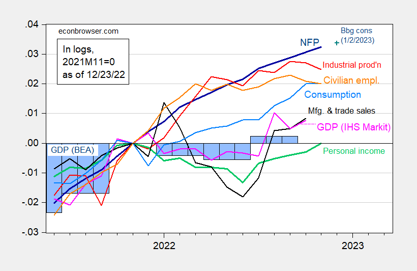
Figure 1: Nonfarm payroll employment, NFP (dark blue), Bloomberg consensus (blue +), civilian employment (orange), industrial production (red), personal income excluding transfers in Ch.2012$ (green), manufacturing and trade sales in Ch.2012$ (black), consumption in Ch.2012$ (light blue), and monthly GDP in Ch.2012$ (pink), GDP (blue bars), all log normalized to 2021M11=0. Q3 Source: BLS, Federal Reserve, BEA, via FRED, IHS Markit (nee Macroeconomic Advisers) (12/1/2022 release), and author’s calculations.
Notice that through 2022H1 nonfarm payroll employment as officially measured is rising, as is industrial production and consumption. Civilian employment rose while flattening off at the end, while GDP (both quarterly and monthly) along with personal income excluding transfers fell (before recovering). However, as noted on several instances, GDP will be revised over and over again over time.
What about alternative indicators? The Philadelphia Fed provides a coincident indicator for the nation. I plot this, along with aggregate hours worked, and Mr. Kopits preferred measure, vehicle miles traveled, again normalized to 2022M11.
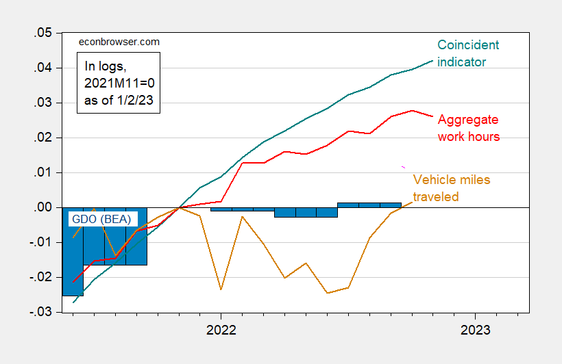
Figure 2: Coincident index for US (teal), aggregate weekly hours index for private nonfarm payroll employees (red), vehicle miles traveled (tan), and GDO in Ch.2012$ (blue bars), all seasonally adjusted, in logs 2021M11=0. Source: Philadelphia Fed, BLS, FHA via FRED release), BEA, and author’s calculations.
It is true that vehicle miles traveled dipped in H1. I don’t think this is a big mystery.
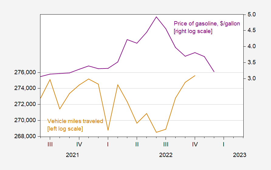
Figure 3: Vehicle miles traveled, s.a. (millions/mo) (tan, left log scale), and price of gasoline ($/gallon) (purple, right log scale), n.s.a. Source: FHA, EIA both via FRED.
I’d guess the dropoff in H1 was more due to gasoline prices being elevated (remember, in basic microeconomic analysis, there is usually a income and price motivation for demand), while the January dropoff was due to the omicron variant surge. So, I view VMT as an unreliable indicator (and in any case, works lousy as a coincident indicator of recession as defined by the NBER, using a probit framework).
What about viewing labor market developments “holistically” as Mr. Kopits has suggested. I have plotted in Figure 3 a set of indicators that have been referenced, including the Philadelphia Fed’s implied benchmark revision.
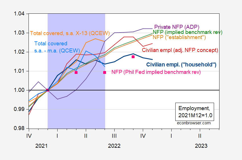
Figure 4: Civilian employment over age 16, FRED series CE16OV (bold blue), civilian employment adjusted to nonfarm payroll concept (red), nonfarm payroll employment, FRED series PAYEMS (tan), nonfarm payroll employment series adjusted to reflect preliminary benchmark revision by author (green), nonfarm payroll employment adjusted by Philadelphia Fed to reflect preliminary benchmark revision (pink squares), Quarterly Census of Employment and Wages (QCEW) total covered employment, adjusted by Census X-13 by author (orange), QCEW adjusted by geometric moving average (sky blue), all expressed relative to 2021M12 values, all seasonally adjusted. Lilac shading denotes hypothesized (by Mr. Steven Kopits) 2022H1 peak-to-trough recession.Source: CE16OV, PAYEMS from BLS via FRED, preliminary benchmarked series constructed by author using data from BLS, Philadelphia Fed, civilian employment adjusted to NFP concept from BLS, QCEW from BLS, and author’s calculations.
Mr. Kopits has relied heavily on the calculations by the Philadelphia Fed to support the argument that incremental job gains from March to June were small. As the Philadelphia Fed authors note, their adjustment was not as detailed as that undertaken by the BLS, while it is generally more timely (the BLS revision takes place once a year, in March). It’s interesting to me that, as noted in the brief, and in the longer article underlying the brief, the focus is on getting more accuracy in the state-level estimates. In addition, to fit the most recent data, the Philadelphia Fed made an adjustment to the seasonal adjustment method.
To reduce potential impacts of extreme employment changes during the pandemic period on our seasonal adjustment processes, we included data only through December 2019, switched from a multiplicative to an additive seasonal adjustment process, and forecast seasonal factors for 2020 through 2022.
That suggests to me some sensitivity to the method of seasonal adjustment, something that is consistent with the differing estimates I obtain for QCEW-covered employment (compare the orange line in Figure 4 with the sky blue one, with the former using Census X-13 throughout and the latter using a geometric moving average throughout).
I am also a little surprised that the preliminary benchmark revision for March 2022 data (published in August) and iterated forward using CES monthly data places nonfarm payroll employment so far away from the Philadelphia Fed’s estimate for June (March 2022 matches pretty closely). Here I have no sure answer; QCEW employment additions might come close — but it (again) depends on seasonal adjustment.
I will note that taking the civilian employment series and adjusting it to the NFP concept (dark red) shows similar growth in the establishment series (tan). The ADP private NFP — based on a different data set and methodology — shows an acceleration in employment in Q2.
So, in this holistic assessment, I view the question of whether employment actually grew in Q2 (it clearly rose by all accounts in H1) as an open one. On the other hand, given the evolution of macro variables — and discounting the usefulness of VMT as signaling NBER-defined recession — I think the argument for recession in 2022H1 is extremely weak. (On the other hand, an argument that the economy is weakening as we enter 2022Q4 is stronger, given the trajectory of industrial production, aggregate hours, and high frequency (weekly) indicators.
Aside: Mr. Kopits writes:
Finally, if productivity is imploding when jobs are up, you really need to take a pause and put together some sort of narrative as to why that might be happening. It suggests something anomalous in the data which requires closer inspection.
Well, mechanically speaking, increased employment, stagnant output (GDO) growth in 2022H1, exactly implies negative productivity growth. Literally, (real) output per hour in the nonfarm business sector (NFB) is (real) output in the NFB sector divided by NFB employment. Man, you can’t make up this kind of stupidity. There is an interesting question why productivity is down, but that wasn’t the issue that puzzled Mr. Kopits.
More By This Author:
One Year Ahead Inflation Expectations, January 2023How Many Ways Can One Be Wrong on Employment
Weekly Macro Indicators, Through December 24


Comments
Log in or sign up to join the conversation.