Seasonal Adjustment In The Wake Of Big Shocks, Economic And Otherwise
Consider the following three examples of seasonally adjusted vs. not seasonally adjusted data.
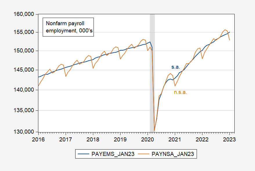
Figure 1: Nonfarm payroll employment, 000’s, seasonally adjusted (blue), not seasonally adjusted (tan). NBER defined peak-to-trough recession dates shaded gray. Source: BLS via FRED, NBER.
The deep trough associated with the 2020 recession can cause distortions in the process of estimating seasonal factors. It’s not as if the statistical agencies are unaware of the challenges of extreme events. Here’s the BLS take from 2022 on employment, and for CPI/PPI.
Here’s the picture for GDP.
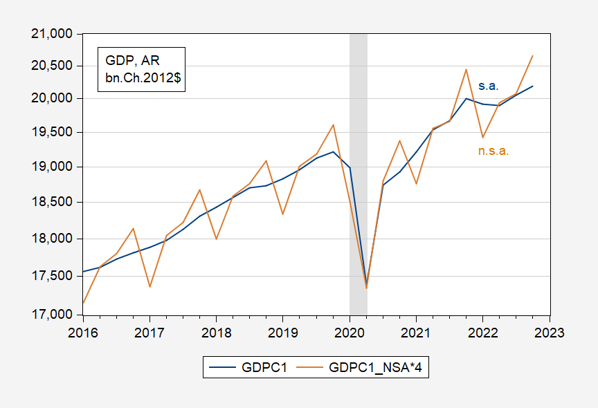
Figure 2: GDP in bn Ch.2012$, annual rates, seasonally adjusted (blue), not seasonally adjusted (tan). NBER defined peak-to-trough recession dates shaded gray. Source: BEA via FRED, NBER.
And here is goods exports.
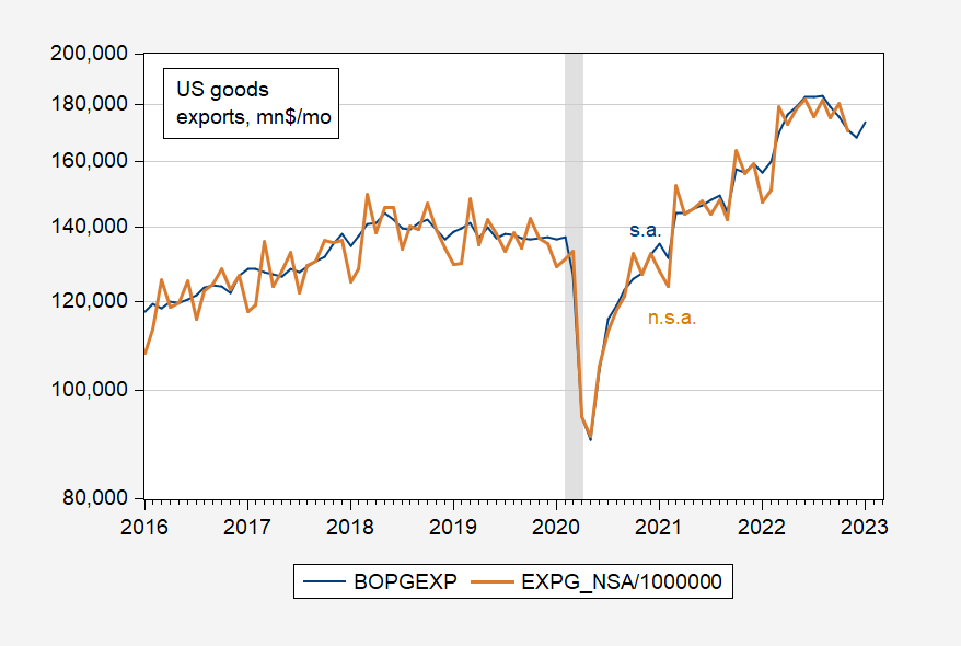
Figure 3: Goods exports, millions$/month, seasonally adjusted (blue), not seasonally adjusted (tan). NBER defined peak-to-trough recession dates shaded gray. Source: Census via FRED, NBER.
Here’s a Census presentation on adjustment post-pandemic.
What to do in the wake of big occurrences like the pandemic? Jonathan Wright writes on “echo” effect in seasonals, post-Lehman (BPEA 2016), and post-Covid (NY Fed). Abeln and Jacobs (JBCR 2022) discuss Covid and typical filters.
Previous discussion of seasonal adjustment in the Covid era, here.
What about anomalous weather (although what anomalous weather is in these times is getting harder and harder to define)? SF Fed has an adjustment, relying on county-level data. Blue is the standard series on change in nonfarm payroll employment.
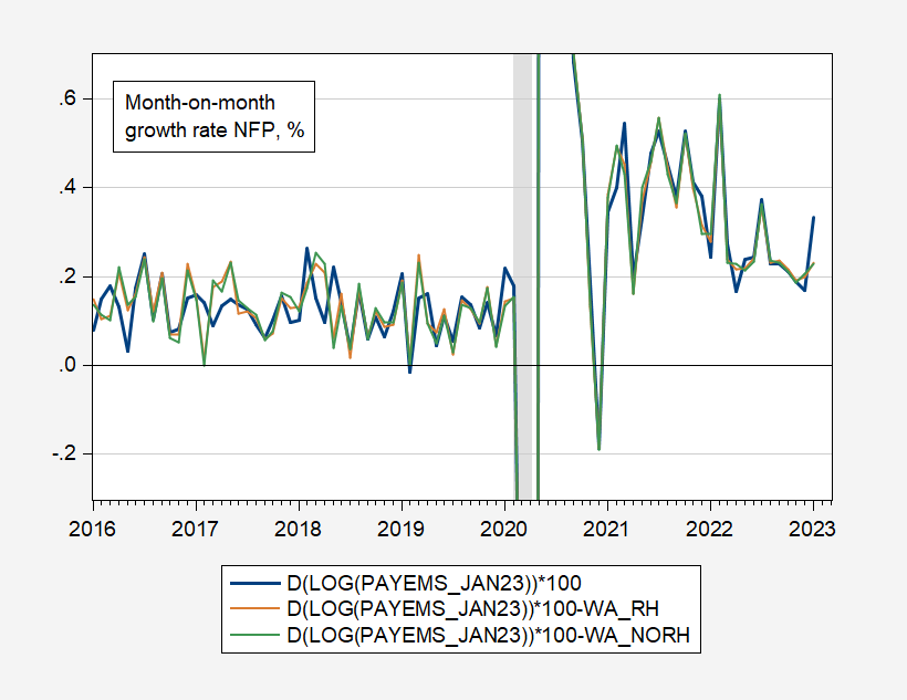
Figure 4: Month on month percent change in nonfarm payroll employment, seasonally adjusted (blue), adjusted with regional heterogeneity (tan) and without regional heterogeneity (green). Source: SF Fed, accessed 3/1.
It’s hard to see the importance of this weather adjustment using this span of data. here’s a detail
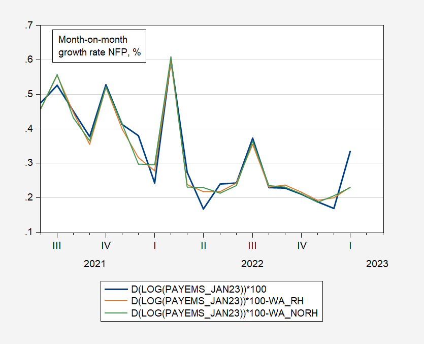
Figure 5: Month on month percent change in nonfarm payroll employment, seasonally adjusted (blue), adjusted with regional heterogeneity (tan) and without regional heterogeneity (green). Source: SF Fed, accessed 3/1.
Basing the adjustment to 2015, the SF Fed calculates the January change in NFP at 389 to 393 thousand, versus the official 517 thousand.
Boldin and Wright (BPEA 2015) present several approaches of adjusting for weather.
If you want to complain about the seasonally adjusted data, by all means, do so. But you should identify what aspect of the seasonal adjustment is bohering you. And you should do so after reading what the statistical agency in question has done. In general, it’s usually possible to do a better job, but at the cost of using some sort of procedure that looks ad hoc from the outside. In other words, there’s often a tradeoff between better procedures and transparency of methods, in turbulent times.
More By This Author:
Volatility In External Demand
PCE Inflation – Headline, Core, Trimmed Month-On-Month And Instantaneous
Dealing With Seasonality With 12 Month Changes: The QCEW


