
A long running debate between reader JohnH and just about anybody else on this website involves UK 2015 (1) inflation, and (2) real wages, with JohnH quoting from various documents. I thought it useful to GET THE DATA MYSELF to resolve the question. Below are three graphs, of consumer price level, year-on-year inflation, and the CPI deflated wage.
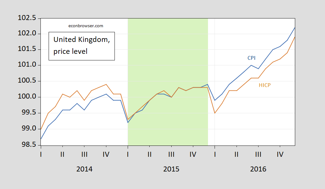
Figure 1: UK CPI (blue), HICP (tan), on log scale. Source: ONS, MEI, Eurostat via FRED. Light green shading denotes 2015M01-2015M12.
Both CPI and HICP are higher in 2015M12 than in 2014M12. One can see this same information conveyed in a different from by looking at the year-on-year values of inflation for 2015M12.
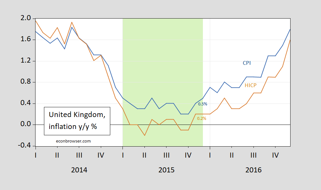
Figure 2: Year-on-year UK CPI inflation (blue), HICP inflation (tan). Source: ONS, MEI, Eurostat via FRED. Light green shading denotes 2015M01-2015M12.
Year-on-year inflation in 2015 was 0.5% (using the CPI), and 0.2% (using the HICP).
So, y/y inflation was not zero or negative in 2015, although individual months might have recorded a m/m negative reading.
What about real wages? I take the OECD’s measure of average hourly earnings in the private sector (2015=100), and

Figure 3: UK Average hourly earnings in private sector (2015=100) deflated by CPI, on log scale. Source: MEI via FRED, OECD, and author’s calculations. Light green shading denotes 2015M01-2015M12.
Average real wages rose over 2015, from 98.4 in 2014M12 to 100.1 in 2015M12, or 1.6% in log terms.
I might venture to guess that real wages rose because the output gap nearly halved going from 2014 to 2015 (according to latest IMF WEO estimates). Note that inflation was much higher in 2016 (1.8% CPI y/y), and yet real wages rose 1.3%.
While real wages did rise in 2015, ignoring the longer span of data can mean that one can take the increase out of context. Here is the real wage over a period encompassing the beginning of Cameron’s austerity measures.
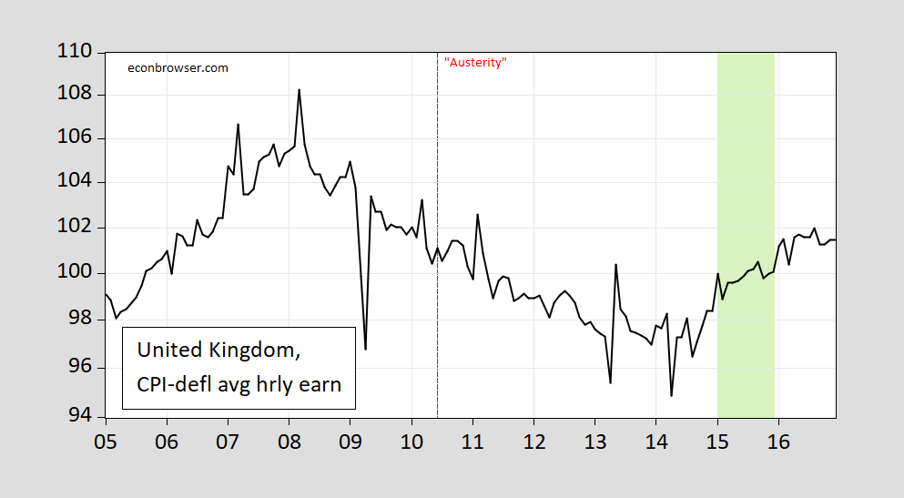
Figure 4: UK Average hourly earnings in private sector (2015=100) deflated by CPI, on log scale. Source: MEI via FRED, OECD, and author’s calculations. Light green shading denotes 2015M01-2015M12. Red dashed line at June 2010 (Osborne budget speech).
By the end of 2015, real wages were down 1% relative to the announcement of specific austerity measures in June 2010,
Bottom line: Instead of endlessly quoting numbers (for e.g., year through September), look at the darned numbers themselves. You can find almost anything you need in one of the sources listed in this blogpost, “Data Source Compendium [Updated]”.
Also, for median wages, earnings, etc., that JohnH could not find before, see this post.
Addendum, 6:34PM Pacific:
Interesting that the UK’s own Office of National Statistics is not listed among the reliable statistical sources. Where do these other sources get their data from, if not ONS? (I relied on ONS data for the most part.)
Yet I have remarked in the past on discrepancies between FRED data on the UK and the UK’s own ONS. Perhaps it’s exchange rate related?
But in the legend to Figures 1 and 2, ONS is explicitly cited. But I have retrieved the ONS series from https://www.ons.gov.uk/economy/inflationandpriceindices/datasets/consumerpriceindices
and used series D7TB in the spreadsheet, described as: “CPI INDEX 00: ALL ITEMS 2015=100”. I plot this series compared to the series listed as HICP in Figure 1. This procedure yields the following figure.
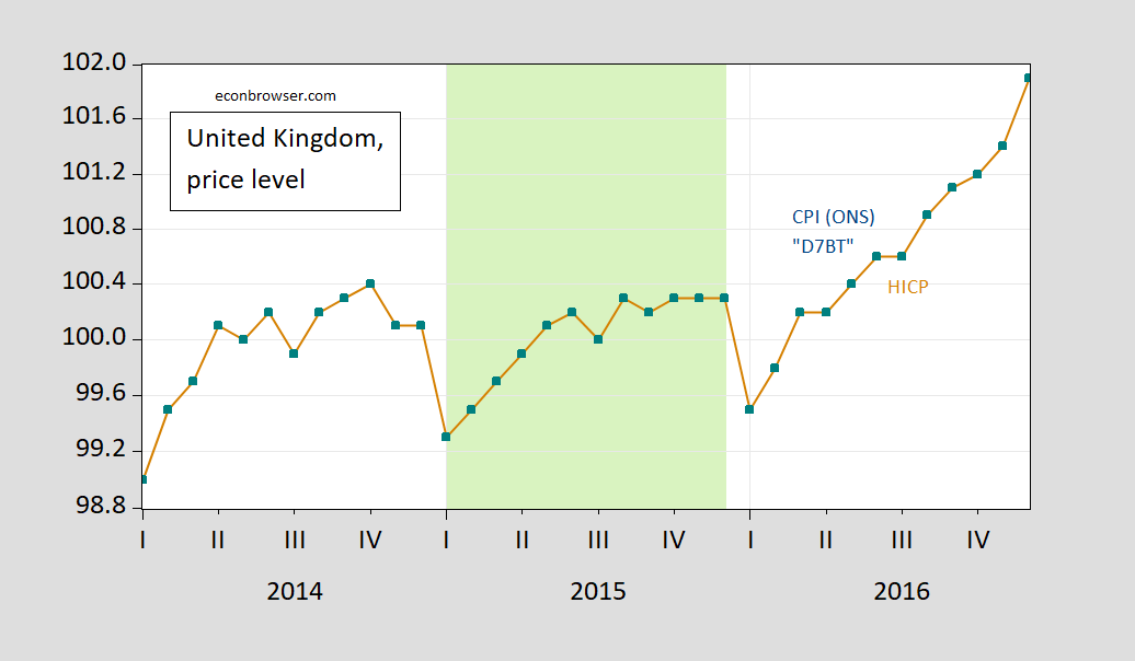
Figure 5: UK CPI all items from ONS (teal squares), HICP (tan), on log scale. Source: ONS, Eurostat via FRED. Light green shading denotes 2015M01-2015M12.
Even the not particularly astute reader will be able to tell these are exactly the same series…
More By This Author:
CFNAI on the Putative Recession of 2022H1
Business Cycle Indicators At Mid-November
The GDP Outlook: Nowcast Vs. Forecast


Comments
Log in or sign up to join the conversation.