
USDU - An Important Perspective On The US Dollar
We started following this US dollar index, USDU, about a year or so ago which has a more equal weighting of different currencies than the $USD. Even though I don’t post it much, this alternative US dollar index has some very interesting Chartology on it which may be giving us an important clue as to the intentions of the Dollar .
If you recall the Standard US dollar index ($USD) was testing a major inflection point in May around the 92 area earlier this year. It did finally bottom but left some unfinished business behind. This is the daily chart I was following at the time for the USDU which shows the H&S top in place and the decline that took the price action down to the low at the 25.50 area. From that low the USDU began a decent rally but couldn’t trade above the neckline extension line at reversal point #2 before the bears took charge again. The bulls were able to stop the decline at reversal point #3 and a laborious rally took the USDU back up to the top of the trading range where the neckline extension line came into play again along with the 200 day moving average.
Reversal point #4 started the next decline back down to the bottom rail of what we can now call a triangle that has four completed reversal points when the price action hit the bottom rail recently. The bulls were able to only put in a modest rally over next four days when the bears took charge again. As you can see, yesterday the bears were able to break the bottom rail of the blue triangle and today that was followed by a large gap down. When you’re following a well defined chart pattern and you see a gap over an important trendline that generally signals the pattern is finished building. It’s never 100% but generally that is a good sign.
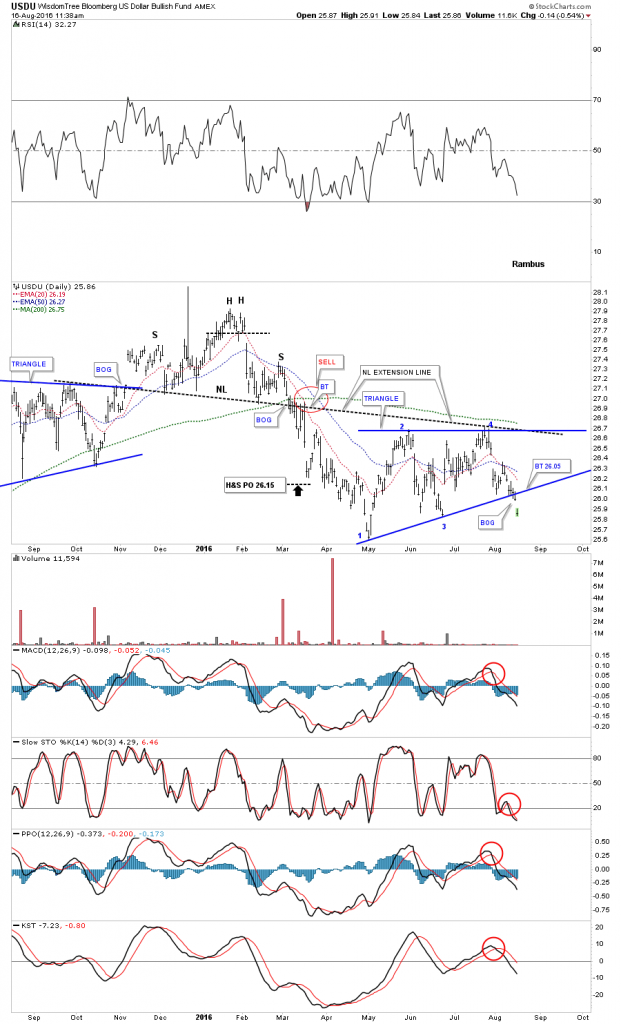
As always, it’s important to put the consolidation pattern in perspective to see how it fits into the bigger picture. The weekly chart below shows the potential of what might be happening. As you can see, the blue triangle is breaking down this week, which may very well be the right shoulder of a much bigger H&S reversal pattern with the big neckline #2 being part of a double H&S top.
The next thing we’ll be watching very closely is how the price action interacts with big neckline #2. There is a good possibility that we could see a ping pong move between NL# 2 and the bottom rail of the blue triangle consolidation pattern as shown by the black arrows. That’s what I would expect to happen but there is no way to know ahead of time. So now we can watch the price action and let it tell us what it wants to do by the way it trades between the neckline and the bottom rail of the blue triangle. If the bears are really in charge and the bulls are extremely weak then we could see a breakout gap below neckline #2. At least we have something concrete to work with now.
One last note on the weekly chart below. I’ve added two red arrows that show how this index could reverse symmetry back down if this big H&S top plays out. How the price action went up is often how it comes back down over the same area when there has been a strong move with small or no consolidation patterns that formed. Stay tuned. If this pattern plays out we could be witnessing a large trend reversal in the most important chart on the planet .
![]()
Disclosure: None.


Hi, Thankyou for sharing your chart analysis on USD. I am keenly interested in deciphering DXY so took a detailed look in to your idea in this article. I have never before checked this particular instrument (EFT), however, I think (unless I am missing something) there is possible data issue from Stockchart.com.
I have checked this chart with Freestockchart.com and Tradingview, and feel that Stockchart.com appears to be the odd one out and seems to give different perspective than the other 2. For comparison here is the Tradingview snapshot of weekly chart - https://www.tradingview.com/x/jb214mqF/
It does not seem to have the same feel in structure and comparative H&S patterns you have show on your chart. From my perspective we have close to 78.6% retracement of the May 2014 low to Dec 2015 high which appear to have abc decline possibly completing in May 2016 low. If so then retracement bounce could be in progress and wave b low (magenta) should form above 25.5 with wave c (magenta) developing with 27 zone as possible target.
Would be interested in your feed back. Thanks.
Great catch @[Dan Varasani](user:8599), I'm curious to hear more about this too.
Well I was hoping too, but it seems that the Author do not have the time for these questions to be answered directly.
It might just be something about the Data Feed or charting programme. But for what it’s worth here is a link to snapshot of the same instrument from Freestockchart.com which seems very similar to my chart from Tradingview in above comments.
http://www.screencast.com/t/oOJcBr180G
July 2014 low around 24.50 Approx and high Dec 2015 is around 29.4 = approx 4.9
4.9 * 78.6% = 3.85 Therefore $25.4 – $3.85 = $25.55 which is 6th May 2016 low so it has retraced 78.6% as shown in both my charts.
But may be best we leave it here.
The only thing I note is that the ETF has been running since 2013 and data on both my charts only starts from 2014. So based on that the Fib retracement I am showing on my charts are in correct. Where as the Author’s chart shows earlier data from lows in $21 region. So that is the discrepancy. Still both charts of same instruments look different which is puzzling
Hi
I am Rambus Manager and Editor. he does not do responses personally ( a time thing)
I see your point
I believe Rambus Chart is Log Scale but that shouldn't make such a large difference on this short a time period
All we can do is watch the charts. Rambus uses Stockcharts Exclusively
The big difference in the two charts is the left armpit area is much higher on your chart
Hard to understand how there could be a great difference. Data Feed?
Regards
Gary ( for Rambus Chartology)
Further to my above reply. This Chart Below Argues for the problem being with Your trading View Chart
UUP overlaid with $USD and also with the USDU show none of these have come close to a 78% Fibo Retrace....barely 32%
stockcharts.com/.../ui
comments?
Thankyou for your reply. As I have commented above it seems that commencement of data for the ETF on both my charts is from July 2014 where as the ETF commenced in Dec 2013. So the fib retracement I mentioned is wrong. But also there is some difference in other data as I explained which do not quite line up with your observation.
Regardless I am anticipating a partial retracement from here before reverting to downside.
Thanks again.
Thankyou for your reply. Will be sure not to bother him again.
I am responding to you. I am the Author see my response below
thanks for sharing