
Using flash estimates for Euro Area HICP. US inflation m/m, q/q falling:
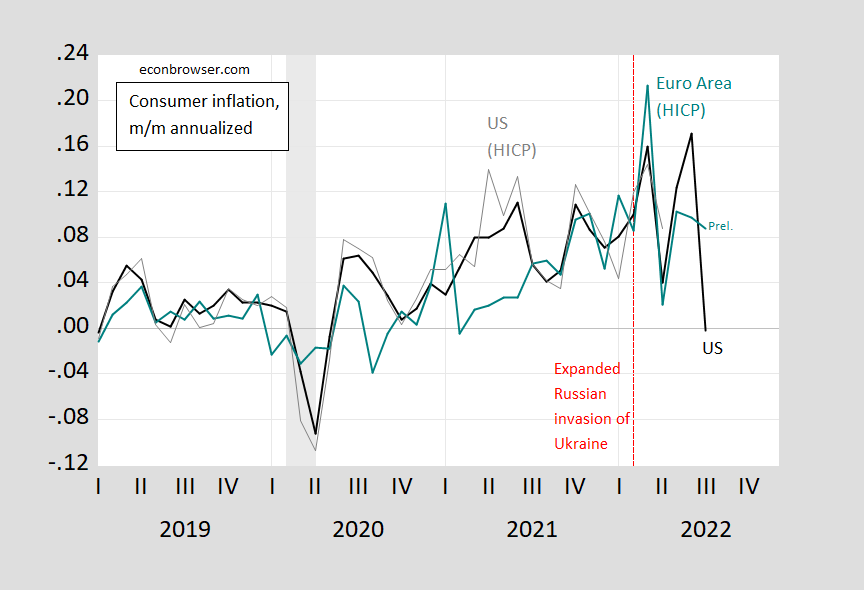
Figure 1: US m/m annualized CPI headline (black), HICP headline (gray), Euro area (teal). Euro area July is flash estimate. HICP seasonally adjusted using X-13, log transformation. NBER defined peak-to-trough recession dates shaded gray. Source: BLS, EuroStat, via FRED, and author’s calculations.
This is true using 3-month changes in the monthly data, as well.
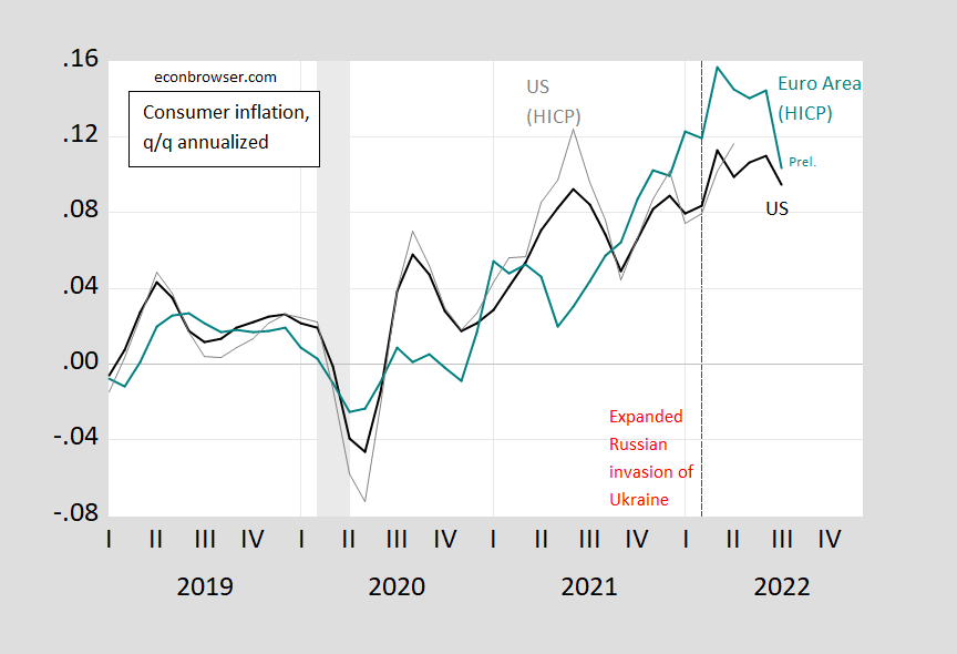
Figure 2: US q/q annualized CPI headline (black), HICP headline (gray), Euro area (teal). Euro area July is flash estimate. HICP seasonally adjusted using X-13, log transformation. NBER defined peak-to-trough recession dates shaded gray. Source: BLS, EuroStat, via FRED, and author’s calculations.
Here’s the month-on-month annualized differential between US CPI and EA HICP.
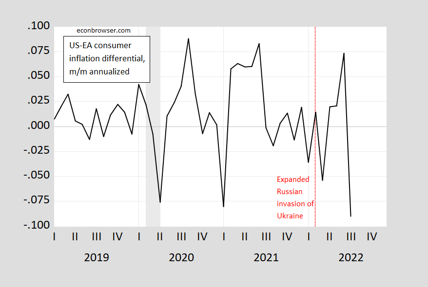
Figure 3: US_Euro area m/m annualized headline differential (black). Euro area July is flash estimate. HICP seasonally adjusted using X-13, log transformation. NBER defined peak-to-trough recession dates shaded gray. Source: BLS, EuroStat, via FRED, and author’s calculations.
While headline rates have converged, core differentials would show a different story. Energy is a bigger component of headline in the Euro area. Expect this divergence to continue as long as energy (particularly natural gas) prices remain elevated relative to the US.
More By This Author:
One Year Ahead Expected Inflation
So You Think We’re In A Recession As Of Beginning August
July Inflation Undershoots Expectations


Comments
Log in or sign up to join the conversation.