
Sectors Dislocations Between Europe And The U.S.
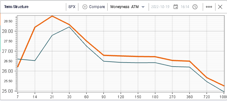
Slow drift lower yesterday with the SPX losing around 0.67%, the NDX -0.4%, and the DJIA -0.33%. Implied volatilities remarked marginally higher as seen on the below term structure for the SPX.
(Click on image to enlarge)
In yesterday’s market update, we discussed the performance of Equity indices over the past 10 days and found that despite all the concerns surrounding the European economies, the EU equity indices have continued to outperform their US counterparts.
Today we want to study some sector performances over the past 10 days in both regions in order to better understand that dislocation.
In the US, one sector stands out over the past 10 days and that is the energy segment with a performance over the past 2 weeks of around +4%.
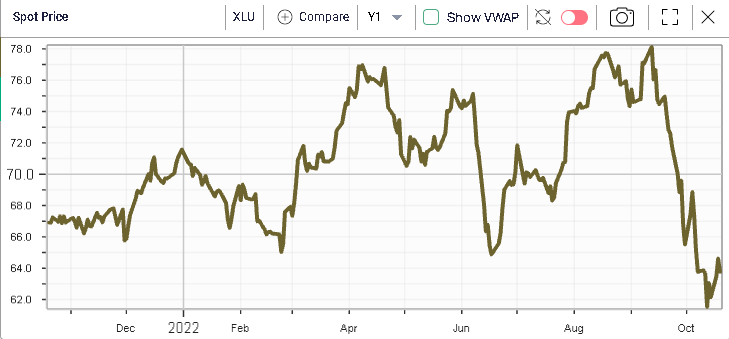
What is particularly interesting is that this positive price return has happened at a time when USO generally underperformed as seen on the below chart.
(Click on image to enlarge)
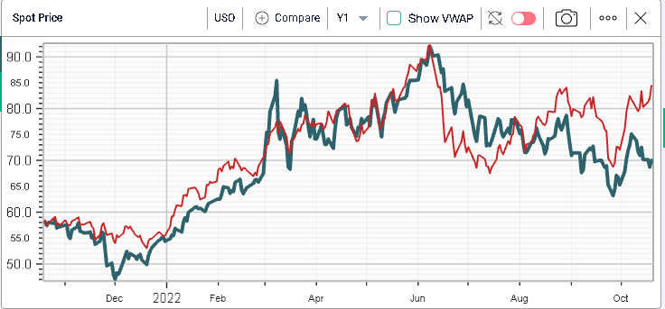
In fact, we are now seeing a strong divergence between the price of the Energy Equities and the price of Oil, something that has hardly ever happened over the past 12 months.
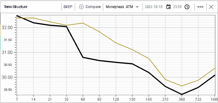
Looking at implied volatility below, we can see that the implied volatilities have increased slightly in the short-term but that longer-dated maturities are essentially lower.
(Click on image to enlarge)
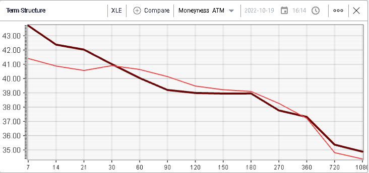
Furthermore, it is interesting to note that we have not really seen the same price action in European Oil & Gas companies which have lost around 1% in the past 10 days.
(Click on image to enlarge)
Looking at IV for the Oil/Gas sector in Europe we find a similar picture with long-dated implied volatilities moving lower in the last 10 days.
(Click on image to enlarge)
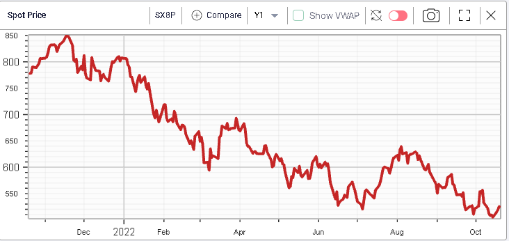
The worst-performing US sector over the past 10 days has been the Utilities segment which has lost almost 6%. This is something we studied in previous market updates with Utilities (generally perceived as defensive names) completely breaking down over the past month as can be seen on the below chart.
(Click on image to enlarge)
European Utilities show a similar performance although they seem to have outperformed in the same period with a loss limited to around -2%.
The below chart puts some context around this performance as we see that European Utilities have been under much more pressure in 2022 than their US counterparts.
(Click on image to enlarge)
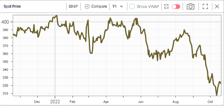
The sector is down 21% YTD in Europe while it has only lost 10% in the US.
Technology stocks have also underperformed in the US with the sector down around 4.5% in the last two weeks.
(Click on image to enlarge)
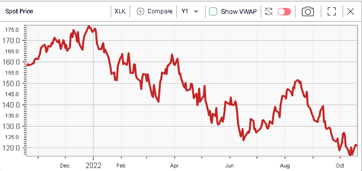
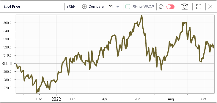
The same can be said about European technology companies which have lost around 5% in 10 days and display a very similar price action to their US counterparts.
(Click on image to enlarge)
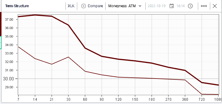
Implied volatilities across all terms for Tech stocks have increased in the US as seen on the below chart displaying in bold yesterday’s closing IV and alongside the term structure as of 10 days ago.
(Click on image to enlarge)
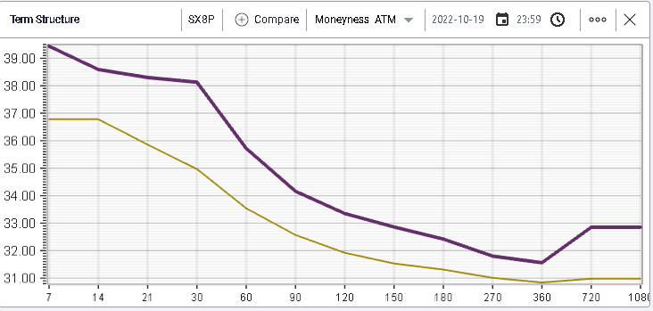
The same shape and changes are also visible in Europe.
(Click on image to enlarge)
One of the key differences over the past few weeks that can explain the outperformance of European equities relative to their US counterparts is how Banks have reacted.
US Banks have dropped around 1% in the past 10 days while European Banks have managed to gain around 2.5%.
In the below charts, we show respectively the performance of US Banks in green over the past 12 months and the performance of European Banks in yellow.
(Click on image to enlarge)
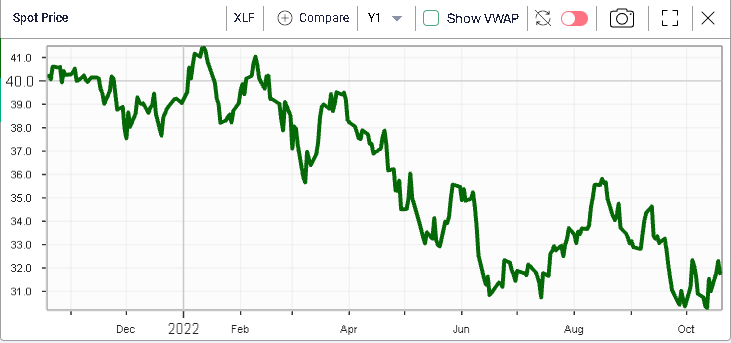
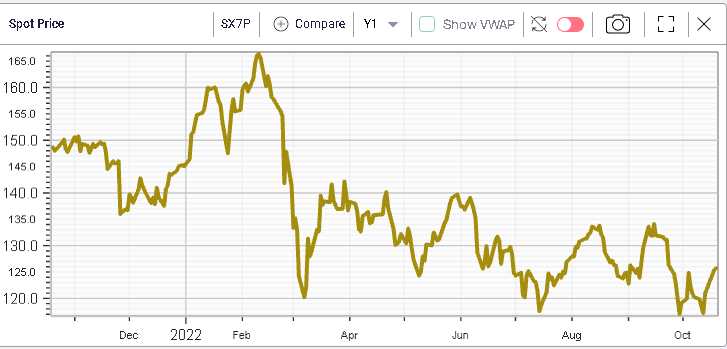
Both performances are extremely close although we can see that European Banks repriced very aggressively at the start of the year before essentially trading sideways (albeit in a fairly large range) for the past 6 months. On the other hand, US Banks have seen a slow drift lower throughout the rest of the year.
As a result, European Banks are now trading 14% lower on the year while US Banks have lost almost 20%.
Much more could be said about the relative performance of sectors and it would be very interesting to dig deeper to try and understand the performance of European Banks relative to their US counterparts. Are market participants getting worried about credit quality in the US where rates have reached 4.12% for 10-year Treasuries while in Europe they remain around 2.4% for 10-year German Bunds.
Could this difference be explained by the revenue mix of banks for instance with Investment Banking revenues being larger than Lending activities or is this related to differences in valuations.
More By This Author:
CPI Key Reversal
CPI Figures Take Center Stage
Minor Island Top
Disclaimer: IVolatility.com is not a registered investment adviser and does not offer personalized advice specific to the needs and risk profiles of its readers.Nothing contained in this letter ...
more

