
We live in an age where tons of data are easily available. It is highly unlikely that the US government is suppressing data, e.g., median hourly wage data, in an effort to provide an overly optimistic picture of the US economy. That’s an unlikely conspiracy.
Here’re two graphs of the average real wage (AHETPI from FRED), and median real wage for all workers (from Cleveland Fed Wage Tracker), first year-on-year change, and second cumulative growth from 2018M12.
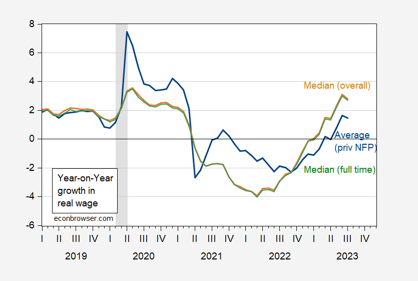
Figure 1: Year-on-year growth in real average hourly earnings (blue), in real median hourly earnings for full all workers (tan), for full time workers (green). NBER defined peak-to-trough recession dates shaded gray. Source: BLS via FRED (AHETPI, CPIAUCSL), and median wages from Atlanta Fed, NBER, and author’s calculations.
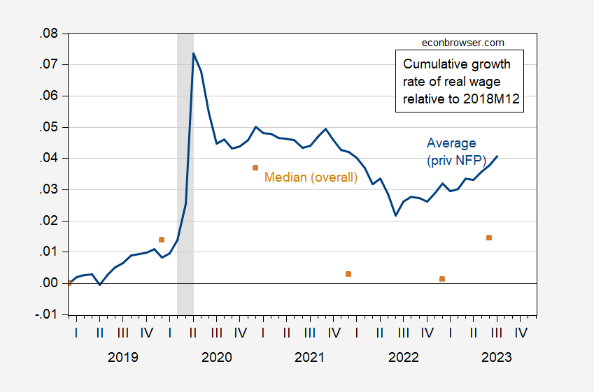
Figure 2: Cumulative growth in real average hourly earnings (blue), in real median hourly earnings for full all workers (tan), since 2018M12. NBER defined peak-to-trough recession dates shaded gray. Source: BLS via FRED (AHETPI, CPIAUCSL), and median wages from Atlanta Fed, NBER, and author’s calculations.
Casual inspection of Figures 1 and 2 will show that in recent months, the real median wage has been rising faster than the real average wage.
See previous attempt to explain to some particularly obtuse readers what data are available, here.
*Attributed variously to Adlai Stevenson or Eleanor Roosevelt, or a variation on a Chinese proverb. On the latter, I confess to never hearing my parents ever say it.
More By This Author:
Inflation In July: Central Tendency Down
Chinese Inflation In July
CPI Inflation At Annual Rates, Using July Nowcast


Comments
Log in or sign up to join the conversation.