

Image Source: Pixabay
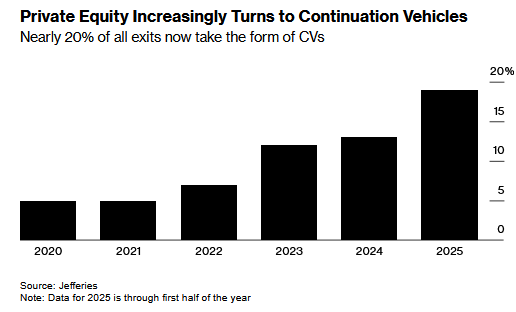
Private equity funds often buy assets intending to sell them and realize a profit over a specific period. However, recently it’s become more common that their assets are not ready to be sold when they had initially forecasted. While the fund can hold the assets longer than expected, fundholders may demand liquidity. Instead of selling the assets before they achieve the maximum potential, private equity funds are using CVs to meet their clients’ demands and hold onto assets. CVs are new private equity funds that allow a firm to hold onto assets longer than its original expectations and provide liquidity to its existing fundholders.
The graph below, courtesy of Bloomberg and Jefferies, shows that almost 20% of the time when private equity returns cash to its fundholders, the money is not coming from the sale of an asset, but from CVs, or new fundholders buying the asset. Furthermore, the usage of CVs is increasing rapidly. Interestingly, we are also seeing that older CVs are now being funded with newer CVs, or CV-squareds.
While using CVs to allow assets additional time to accrue to an acceptable valuation makes sense, it also raises a question. Why are the assets not attaining their expected value on time? Or said differently, why are the time-weighted returns less than what was initially projected? Money has been pouring into private equity funds. Consequently, fund managers have more competition for deals to invest in and must therefore accept a lower return and or investments with more questionable outcomes. As a result, the quality and potential returns are declining. Essentially, the private equity market is maturing, and returns are heading toward those of the public equity markets.
What To Watch Today
Earnings

Economy
(Click on image to enlarge)

Market Trading Update
Yesterday, we noted the market’s breakout to all-time highs on the back of the inline inflation report. This morning, we will get the Producer Price Index (PPI), where tariffs will be most evident if they create inflationary pressures. We will see what happens, but one area that should be the most negatively impacted by tariffs is the small and mid-cap companies, which are the most susceptible to higher input costs. Over the last few weeks, we have seen a notable pickup in the Russell 2000 index (IWM), which has caught investors’ attention.
We have noted that the NFIB Small Business Survey (looking at the annual rate of change) has been a good proxy for the Russell 2000 (, as shown. The improvement in the index supported the rebound in the Russell 2000. While the rate of change in the NFIB survey has weakened recently, there is an anticipation that there will be an improvement in the index by year-end as rate cuts by the Fed lead to a more optimistic outlook. As such, will the Russell 2000 follow suit?
(Click on image to enlarge)

The Russell 2000 has already had a very strong rebound from the April lows and is back to more overbought conditions, while deviating from the 50-DMA. While the index is close to triggering a momentum buy signal, the upside may be somewhat limited in the near term, so caution is advised before chasing media narratives.
(Click on image to enlarge)

Over the last five years, the allure of significant gains from small and mid-cap stocks has been a constant hope. However, these companies are the most susceptible to economic weakness; roughly 40% are non-profitable, with approximately the same amount classified as “zombie” companies, where debt must be issued to continue operations. While investing in the Russell 2000 can be profitable, given you have the right entry point, from a diversification standpoint, the small and mid-cap markets have failed to keep up with the performance of their large-cap brethren.
(Click on image to enlarge)

While the Russell 2000 is currently being pulled up by performance chasing, the last 15 years have been a strong lesson in the “death of diversification,” where the Russell 2000, emerging, and international markets have failed to hedge against market declines and substantially dragged on performance returns against the S&P 500 and Nasdaq.
(Click on image to enlarge)

Manage your allocations accordingly until there is clear evidence that a regime change is underway.
The Benefits Of Free Markets And Capitalism In One Graph
We stumbled across the graph below and thought it was worth sharing. We have written volumes on the benefits of capitalism and free markets. Additionally, we spend a lot of time writing about hindrances to capitalism, be it from the government, the Federal Reserve, or private sector actions. Instead of the tens of thousands of words we have spilled on the topic, the graph below shows with no uncertainty that economic freedom is extremely correlated to the aggregate wealth of a nation’s citizens. Simply, the more economic freedom a nation’s citizens and corporations have, the greater the wealth per person.
If we were to make one criticism of the graph below, it would be that we would want to see if the graph looks the same using median incomes instead of total income per person. The point being that as the wealth divide widens, the benefits of economic freedom are tilted toward the wealthy and not the broader population. In other words, how much do the hundreds of billions in income earned by the likes of Jeff Bezos and Bill Gates skew the data?
(Click on image to enlarge)

The Index Isn’t Always Accurate
How was the weather yesterday in the United States? You could answer by citing an average temperature or precipitation level. However, doing so would severely misrepresent the weather in many parts of the country. Similarly, the typical response to “What did the market do today?” is often to quote the change in the S&P 500 index. While stock indexes generally give a broad idea of what is happening, they can greatly overlook the performance of many individual stocks. Likewise, and related to this article’s topic, most people quote the change in the ten-year US Treasury yield as an index of how bonds performed. Although this index of bond yields can be somewhat helpful, it can also be very misleading.
Treasury bond yields across the maturity spectrum, also known as the yield curve, tend to move together on most days. However, the size of changes across different maturities can vary significantly. These variations happen because different economic and monetary policy factors, along with investor sentiment and narratives, affect yields differently along the yield curve.
Tweet of the Day

More By This Author:
Is Bad Breadth The Norm, Not The Exception?
A 50 BPS Rate Cut Is Not Out Of The Question
Meme Stock Trading & Livermore’s Approach To Speculation


Comments
Log in or sign up to join the conversation.