
What Is Volatility Skew?
Sometimes known as the volatility smile, volatility skew is the difference in implied volatility between out-of-the-money, in-the-money, and at-the-money options. Volatility skew is affected by investor sentiment, as well as supply and demand in the market. It provides insights for investors as to whether there is an overall preference for fund managers to buy puts or calls.
The volatility skew is a relatively recent phenomenon in the context of the long history of global markets, coming about as a result of a major stock market crash in the late 1980's. By reviewing the aftermath of the crash, we can explore how and why the skew exists, understand its importance to traders, and learn how to leverage the insights it provides to improve our options trading results.
The Black Monday Crash
On Oct. 19, 1987, the United States stock market plunged. Known as Black Monday, the stock market crashed, experiencing the largest one-day percentage drop in history with the S&P 500 declining more than 18%.
It precipitated a knock-on effect to markets around the world, with every one of the 23 major markets around the world suffering declines. Almost half suffered declines of 29% or more.
The crash was so severe that it caused worldwide losses estimated at $1.7 trillion US dollars, and sparked fears of major economic instability and the resurgence of the Great Depression. While markets and economies eventually recovered, Black Monday served as an important lesson for investors in managing downside risk.
In response to the crash, investors sought ways with which to protect their portfolios. One of the main ways to do this was through option insurance. The surge in demand from investors for option insurance helped evolve the options market into what we see today.
One of the key evolution stages of the options market was the formation of the volatility skew. In the next section we will explore how this came to be.
Why Volatility Skew Exists
To understand why volatility skew exists, it’s important to appreciate the composition of stock market participants. In general, the majority of market participants go net ‘long’ with stocks, meaning they hold stocks with an expectation that they will go up in price over time.
In addition, the market is composed of many different types of participants, from individuals, trading firms, and governments, through large scale hedge funds, mutual funds, and retirement schemes. The largest participants can hold positions worth hundreds of millions and even billions of dollars.
As a result of the size of their portfolios, getting into and out of positions is difficult. These groups can’t just sell their entire position on a whim, so they need to have a way to protect themselves from market downturns. The way these groups protect themselves is to purchase portfolio insurance in the options market.
The way they do this is through long put options that are deep out-of-the-money. Thus should there be a market crash, then these out-of-the-money puts will suddenly be worth a lot of money, mitigating some of the losses in stocks that the portfolio may experience.
In the aftermath of Black Monday, so many participants were seeking portfolio insurance, that there was a significant gap between demand and supply. Option traders began to discover that there were market participants assigning more volatility to the downside than to the upside. This meant that those market participants were valuing downside protection higher than upside speculation, thus being willing to pay more for options that provided downside risk protection on stocks.
When traders began plotting implied volatilities against strike prices on a chart, they noticed two patterns forming which they called the ‘volatility smile’ and the ‘volatility smirk.’
The Volatility Smile and Volatility Smirk
Normally, option pricing models assume that regardless of strike price, implied volatility should be identical for options with the same underlying and expiration. However, the post Black Monday demand and supply imbalance started to create irregularities in the implied volatility of some options, where downside strikes had greater implied volatility than upside strikes.
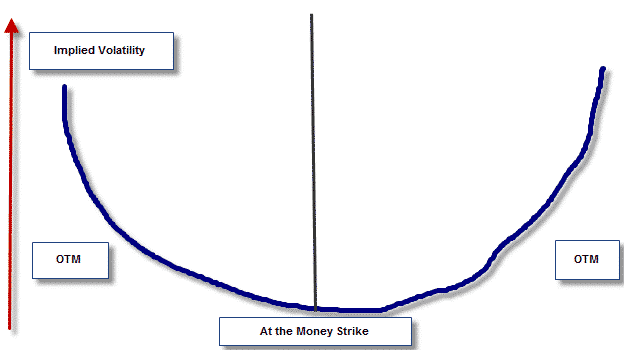
This gave birth to the volatility skew, in particular the ‘volatility smile’ and the ‘volatility smirk.' By taking implied volatility and plotting it on the vertical axis of a graph with strike prices on the horizontal axis, you will be able to see the volatility skew. In situations where there is more demand for options that are further in-the-money or out-of-the-money, implied volatility will be higher at the very edges of the curve.
This creates a u-shaped pattern in the data which ends up looking like a human ‘smile,’ hence a volatility smile. A volatility smirk is found by plotting exactly the same data points, except that when the curve is created, it will be weighted more to one side. This gives the appearance of a person smirking and hence this pattern is referred to as the volatility smirk.
Now that we understand how a volatility skew is formed, we will explore what insights it provides and how you can use it in your trading.
What Insights From The Volatility Skew Can I Use When Trading?
Broadly speaking, there are three key insights that the volatility skew can provide. The first insight is where the general market believes there is the most risk. When the market believes there is greater downside risk (i.e. an increased risk of a decrease in the underlying), then the volatility skew will be weighted towards the downside.
However, if the opposite is true and the general market consensus is that there is greater upside risk (i.e. an increased risk of an increase in the underlying), then the volatility skew will be weighted towards the upside. This information can be useful in cross-checking your trades relative to the broader market consensus and reviewing your portfolio to ensure you have adequate protection.
The second key insight that the volatility skew provides is to indicate how implied volatility will change relative to changes in the underlying. When there is a volatility skew weighted to the downside, it means that the implied volatility of the underlying will typically increase if the stock price falls. Charting these results will show you the relationship and provide an indication as to how changes in the price of the underlying are likely to influence the implied volatility of relevant options.
While not a fail-safe prediction, this information serves as a useful indicator for strategies based on trading delta and vega. The final key insight is a broad appreciation for the price of put and call spreads. In general, when volatility skew is weighted to the upside, put spreads are cheap while call spreads are expensive.
This dynamic benefits traders who are buying put spreads and selling call spreads. The exact opposite happens with a volatility skew weighted to the downside, with call spreads trading cheap while put spreads trade expensive.
One final note, if you are trading straight puts and calls and/or vertical spreads, understanding the volatility skew can be very useful. As the slope of volatility is not linear, you can keep an eye on the volatility skew to identify opportunities where a particular strike is being sold or bought more than the other strikes near to it.
You can leverage this insight to buy strikes with lower volatility and sell strikes with higher volatility; to kick off your trade with volatility already in your favor.
How To See The Volatility Skew
If you’re ready to start using volatility skew in your analysis, there are two main ways you can get the data. The first option is to use programs that have this feature built in, however for newer option traders this programs may be too costly and potentially too advanced. The second option is by using the data from the option chain to create the graph yourself.
Take a spreadsheet and pull up the option chain (which you can see on your broker platform or using free tools online such as nasdaq.com). Take the implied volatility of several strikes each day and record them in a spreadsheet, plotting implied volatility on the vertical axis (y-axis) and strike prices on the horizontal axis (x-axis).
Use the 10 and 20 Delta puts and the 10, 25, and 50 Delta calls to give you a good range of option data. While this is a manual and tedious process, it will help you see how the skew changes over time and provides a clue as to current market sentiment.
Volatility Skew Examples
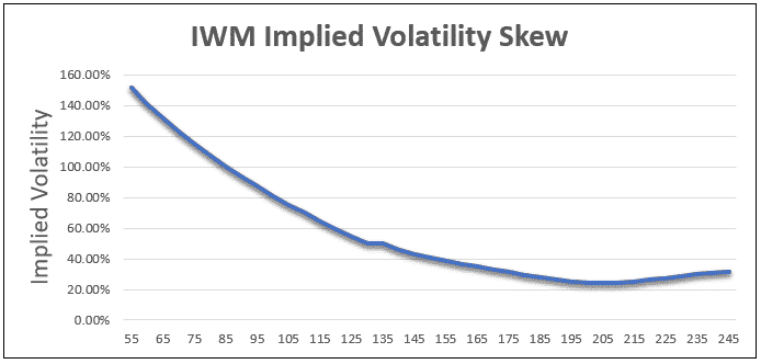
Let’s take a look at a couple of examples, using two very different underlying instruments – TSLA and IWM. First, let’s take a look at IWM. The below skew graph shows one-month options when IWM was trading around 190. IWM is an ETF tracking the Russell 2000, which is an index that tends to move fast when it moves lower.
As such, we can see that there is a lot of put skew. Traders are willing to pay a lot more for out-of-the-money put protection than they are for out-of-the-money call speculation.
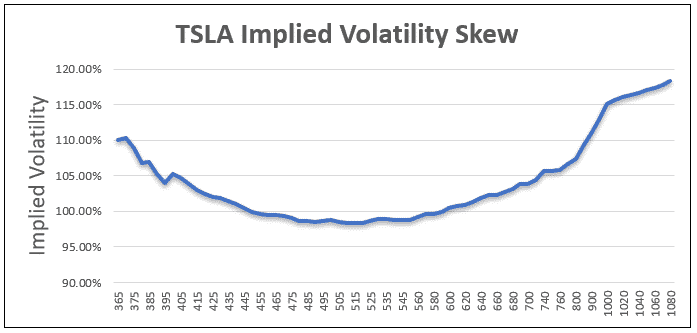
Let’s compare that with the skew of one-month options for TSLA when it trading around 600. TSLA is a stock that is subject to a lot of speculation and has had a tendency to ramp higher very, very quickly. As such, traders are bidding up the price of out-of-the-money calls due to the rampant speculation.
Conclusion
Volatility skew shows the difference in implied volatility between out-of-the-money, in-the-money, and at-the-money options. It serves as a useful barometer of overall market sentiment in the context of upside vs downside risk.
It is a phenomenon largely driven by the outcomes of the Black Monday stock market crash, which resulted in investors with large, inflexible positions seeking a method for protecting their portfolio from future crashes. As these large market participants sought similar protections, they created a supply and demand imbalance of options that could serve as portfolio insurance.
The imbalance of options that are further in-the-money or out-of-the-money led to a curve in implied volatility when graphed against strike prices. In the case where both edges of the curve have higher implied volatility, a u-shape is created, referred to as a volatility smile. Whereas if only one edge is curved, a volatility smirk is created.
The volatility skew can be used to draw insights as to the market consensus of where risk lies (to the upside or downside), how implied volatility will change relative to changes in the underlying, and a broad appreciation for the price of put and call spreads.
To see the volatility skew you will need to either use special programs, or you can plot them manually by taking the implied volatility of several strikes each day and using an option chain.
Disclaimer: The information above is for educational purposes only and should not be treated as investment advice. The strategy presented would not be suitable for investors who are ...
more


This is excellent- thanks for sharing.