
After the close yesterday, I got a call from a reporter asking if I’d noticed that the VIX futures curve had closed with a minor inversion. She knew who to call – of course, I had. Meanwhile, the yield curve – specifically the 2-10 portion of the curve – has gotten ever closer to normalizing. Both of these are of significance to investors. Here’s why.
It is important to note that in normal times, the shapes of the VIX futures and US Treasury yield curves tend to resemble each other. They typically slope upwards from left to right. The bond yields typically rise with greater time to maturity. In the case of Treasuries, it generally stems from liquidity preference. Bond investors typically demand a greater yield for longer-dated bonds. The prices of longer-dated bonds are more sensitive to changes in interest rates, making them more volatile. Because bond investors (and in theory, long-term stock investors) should prefer less volatile instruments (all things being equal, which they rarely are), investors are usually willing to pay higher prices – demanding less yield – for shorter-term bonds than longer-term alternatives.
Interest rates are a key reason why most futures curves -including VIX – have a similar shape. Futures tend to have advantageous margin requirements, meaning that an investor can control a certain amount of a commodity while only using a small percentage of the money required to buy it when the futures contract expires. The money that is not utilized can be invested in risk-free assets, such as T-bills, so that gives the futures curve an upwards slope. Nearer-term futures tend to have lower prices than their longer-term counterparts. That is called contango, and the opposite situation is called backwardation. (We explained this in greater detail in this piece from May 2021 and in this Trader’s Academy lesson.)
When a commodity that is typically in contango slips into backwardation, it means that there is an imbalance of demand that outstrips the near-term supply of that commodity. In the case of VIX (Cboe Volatility Index), the commodity in question is volatility protection. Those who wanted volatility for the past year, have found it in plentiful supply. This was the case even during March’s banking crisis and as the conflict in the Middle East took root. But as of this week, the demand for volatility protection finally outstripped the currently available supply. In the graph below, note not only how VIX has risen sharply over the past month, but also how the shape of the futures term structure has flipped:
VIX Futures Term Structure, Today (yellow, top), Last Week (red, top), Last Month (magenta, top), with 1-Week (red, bottom) and 1-Month Changes (magenta, bottom)
(Click on image to enlarge)
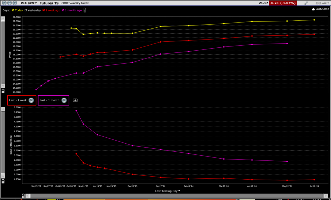
Source: Interactive Brokers
While the minor backwardation at the front end of the current curve is unusual, making it notable, it is hardly at the sort of levels that indicate panic.
We’re far from that, at least so far. While some traders view an inverted VIX curve as a contrarian indicator, I believe that is incomplete. Major selloffs do often end while the VIX curve is in steep backwardation, but I believe that to be a necessary, but hardly sufficient requirement for a bounce. The curve can stay in backwardation for some time, and the sell-offs end when the demand for protection becomes so extreme (very steep backwardation) that it reveals a highly oversold condition.
As for the yield curve, we see a very similar pattern. The chart below compares the current yield curve with those from last month and two years ago. Of course, the overall level of rates was much lower two years ago, but the shape of the curve was relatively normal. Compared to last month, we can see how the long end of the curve has risen while the short end remains relatively stable. That means that the inversion has eased considerably:
US Treasuries Active Yield Curve, Today (green line), Last Month (yellow), 2 Years Ago (green dashes)
(Click on image to enlarge)
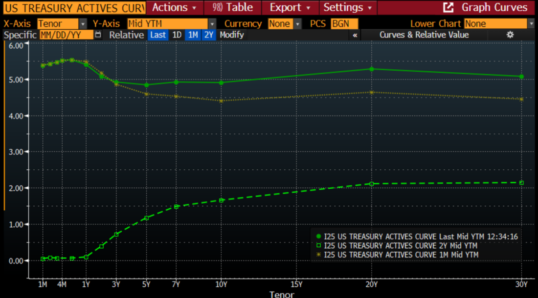
Source: Bloomberg
The significance here is one we have pointed out before. While inverted yield curves are almost perfect harbingers of impending recessions, the recessions only begin after the inversion is over. This is evident in the chart below:
30 Years, 2-10 Treasury Yield Spread (blue/white bars) vs. NBER-defined Start (red) and End (green) of US Recessions
(Click on image to enlarge)
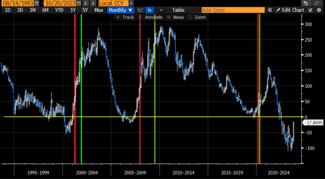
Source: Bloomberg
Neither of these findings should have an immediate influence on markets. But they sure as heck can and should have an influence on the paths of stocks, bonds, and the economy over the coming days and weeks. Stay tuned!
More By This Author:
High, Not Higher, For Longer (And A Tesla Recap)
Options Market Expectations For Tesla Earnings
Mr. Market Does Like Mondays (At Least Lately)

Comments
Log in or sign up to join the conversation.