
We are in a very quiet period in the financial markets, including precious metals, due to the holiday-shortened week in the U.S. (with Monday being Memorial Day) and because all eyes are on a possible imminent peace deal between the U.S. and Iran, as President Trump has repeatedly promised.
In addition, the U.S. Personal Consumption Expenditures Price Index (PCE) report on Thursday morning has the potential to move markets as another key inflation data point. While we wait for these developments, I’d like to share some interesting mining sector charts that I am keeping an eye on.
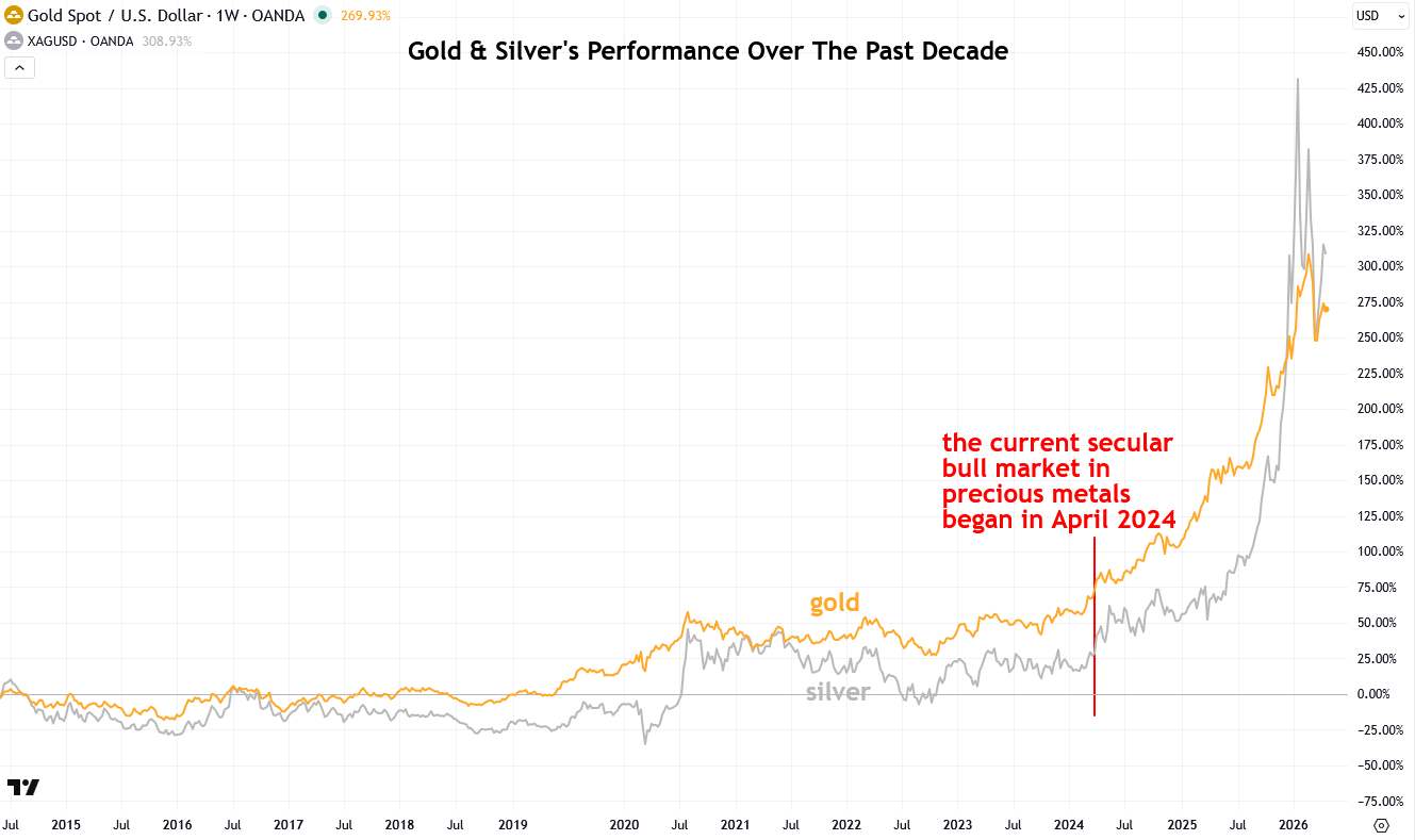
In addition to being bullish on precious metals themselves, I am also highly bullish on gold and silver miners, and I was positioned that way before they really took off in 2025. Unsurprisingly, after their sharp surge, they have been in a cooling-off period over the past few months, but that is normal and healthy behavior within a bull market that I expect to last at least another eight years based on historical precious metals and mining stock cycles.
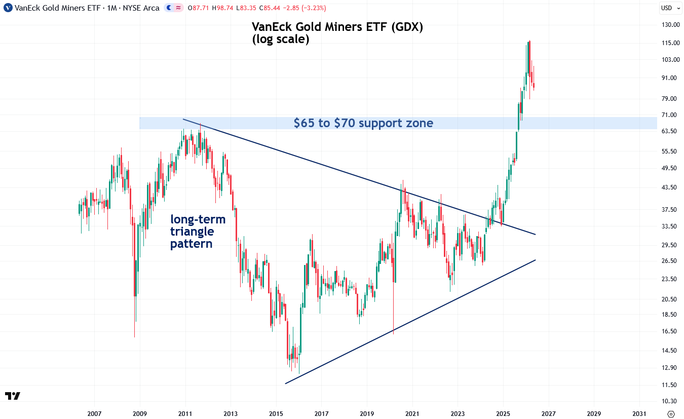
I now want to show you the mining sector charts I’m watching, starting with the popular VanEck Gold Miners ETF (GDX), which I use as a proxy for the gold mining sector. From 2011 to 2024, GDX traded within a triangle pattern, compressing tighter over time as pressure steadily built before breaking out explosively and ultimately tripling. Despite the recent cooldown, this bull market is still very much alive and has much further to go, given the sheer magnitude of that 13-year-long triangle pattern.
A major resistance zone formed at the 2010–2011 highs, roughly $65 to $70, and ever since GDX smashed through that level in a strong show of strength, it has become a major support zone, or floor. Although GDX is still consolidating as it works off overbought conditions, the breakout remains intact as long as it holds above that support zone.
To learn more about support and resistance zones, I recommend reading my two-part tutorial on the topic (Part 1 and Part 2).
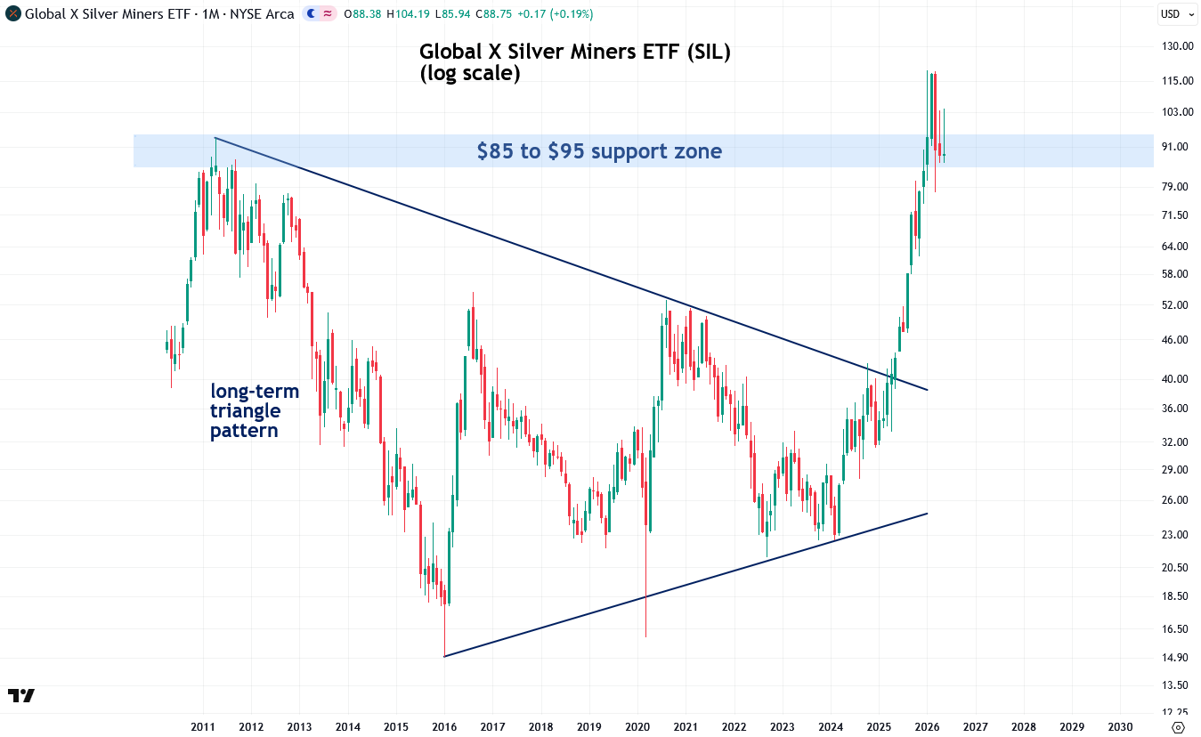
Next, let’s look at the long-term chart of the Global X Silver Miners ETF (SIL), which I use as a proxy for the silver mining sector. Similar to GDX, it broke out of a 14-year-long triangle pattern last spring, resulting in it tripling in price. Despite those impressive gains, the sheer magnitude of that triangle pattern implies that the bull market in silver miners still has many years ahead of it.
A major support and resistance zone formed at the 2011 highs, roughly $85 to $95, and SIL has pulled back to that zone during its recent correction. Ideally, I would like to see that support hold and for SIL to rebound from it, but even a brief dip below the zone would not be the end of the world.
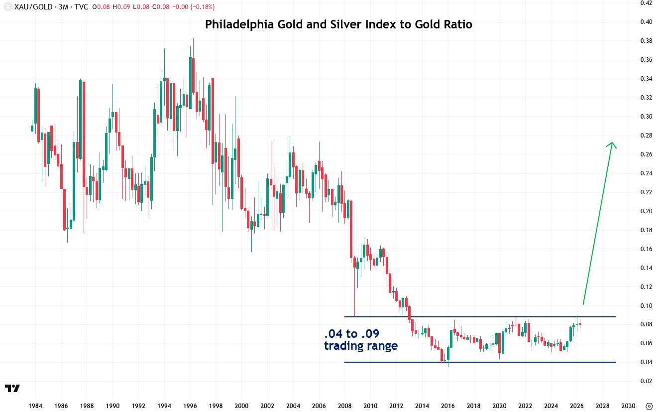
Another chart I am closely watching is the ratio of the Philadelphia Gold and Silver Index (XAU) to gold. The XAU is the oldest index of precious metals mining stocks, which is why I’m using it in this example. However, it is highly correlated with GDX, so the two can be used interchangeably for this type of analysis.
For the past thirteen years, the XAU-to-gold ratio has traded in a tight range between 0.04 and 0.09, but my bet is that when this ratio breaks out—and it’s not far away—that is when gold and silver miners will really take off and begin to outperform the metals themselves, as is typically the case once precious metals bull markets get seriously underway.
I also want to point out that the fact this breakout hasn’t occurred yet is, in itself, a sentiment indicator that the broader precious metals bull market is still in its early stages. Because mining stocks are more speculative and leveraged to the metals, their relatively subdued performance confirms that the sector remains largely ignored by Western investors, though I expect that to change as this bull market matures.
Another chart I find valuable is the real, or inflation-adjusted, Philadelphia Gold and Silver Index, as it’s important to account for inflation when measuring true performance, especially over long periods. This also helps determine whether mining stocks are merely keeping pace with inflation or are actually generating real gains.
Starting in 1987, the real Philadelphia Gold and Silver Index entered a long-term downtrend, with a clear downtrend line acting as overhead resistance. What’s notable is that in the summer of 2025, the index finally broke above that resistance and continued to surge, a strong indication that the mining sector’s multi-decade stagnation has come to an end.

Comments
Log in or sign up to join the conversation.