

It’s the Monday after the jobs report, and as usual there is no new data today. So let’s take a look at a few of the salient trends from Friday’s report.
First of all, this was the fourth good report in a row. Furthermore, it isn’t just goods-producing jobs (red in the graph below, *2 for scale) that have rebounded (as has been signaled by the regional Fed and ISM reports since late last year), but service jobs (blue) as well:

To some extent, this may have been signaled by the uptick in monthly real retail sales (light blue in the graph below), which typically lead employment (red) by several months:

In the above graph, I also included real personal spending (dark blue), which has been steadily increasing YoY, and doesn’t seem to provide much explanatory power.
But in support of the idea that increased retail spending has led to an increase in service-producing jobs, here is the last year of the weekly Redbook retail sales report:

The increasing trend in YoY sales is apparent. In fact, since the first of the year, there were only two weeks (in January) that saw gains of less than 6% YoY. And every week in the past six have been prints of over 7% YoY.
I trace this all back to the AI Boom (or bubble), which has led to a sharp YoY increase in stock prices, which in turn has likely led to a pronounced “wealth effect.”
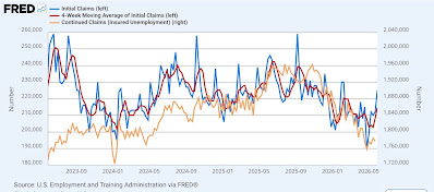
Next, the unemployment rate remained steady at 4.3% for the third month in a row. So has my forecast for a decline towards 4% been busted? I don’t think so, as shown in the graph below of initial+continuing jobless claims (blue, right scale), the unemployment rate (orange, left scale), and the raw data on which it is based; namely, the number of unemployed vs. the number of people in the entire labor force (red):

The trend in the raw data is indeed a decline, especially if we look on a three-month moving average basis. The steadiness in the unemployment rate has been a function of rounding. The bottom line is that I still expect the unemployment rate to decline towards 4% in the next few months, based on 60 years of history.
Finally, let’s look forward to how this Wednesday’s CPI report might impact important employment data.
Friday’s report showed a nearly .25% increase in average nonsupervisory wages, and a nearly .45% increase in aggregate nonsupervisory payrolls, that rounded to 0.2% and 0.4%, respectively:

Two important forecasting tools I use are real nonsupervisory hourly wages (blue in the graphs below) and real aggregate nonsupervisory payrolls (red). The first graph shows their absolute values, normed to 100 as of their recent peaks:

Real wages are down -0.9% from their February peak, and real aggregate payrolls down -0.7% from January.
As of today, the Cleveland Fed is forecasting that May inflation will be reported up 0.5% on Wednesday, which would increase those declines to -1.2% and -0.8%, respectively. These would be significant declines frequently - but not always! - consistent with the onset of a recession.
Here’s the same data YoY for the past three years:

Real wages are already down -0.1% YoY, while real payrolls are up 0.7%.
Here is the historical pre-pandemic look at both:

A YoY decline in real wages has been a feature of every recession except for the shallow, producer-led 2001 recession; but from the 1980s through at least 2015 they were also negative for extended periods without there being a recession.
On the other hand, a YoY decline in real aggregate nonsupervisory payrolls has been a perfect indicator, with the exception of the extended decline during 2002-03 (the one month each of nearly negative readings in the 1960s and 1990s were strike-related).
Last May real average wages increased 0.4%, while real aggregate payrolls were unchanged. If inflation is as per forecast by the Cleveland Fed, YoY real average wages will be down -0.4% YoY, and real aggregate payrolls will be up 0.6%. If that happens, those will be yellow “caution” signals, but not “red flag” recession indicators.

Comments
Log in or sign up to join the conversation.