


Chaikin Analytics is not by any means the only place where you can find stock price charts that include technical indicators. But it may well be the best place to interpret, derive a story, from such charts.
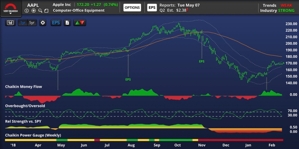
Here is a typical Chaikin chart. As will be explained below, the story is developed by reading it from the bottom up.
Phase 1 – Start With The Indicators at the Bottom
Chaikin Power Gauge (Weekly)
This is a multi-factor model containing 20 factors allocated among four broad groupings; Financials, Earnings, Technicals, and Experts. It covers a lot of ground, the full range of the elements of a sound stock strategy. While the exact details are proprietary, you can get a pretty good idea of what’s in the model by clicking here. In my capacity at Portfolio123,I worked with Marc Chaikin as he developed the model and subsequently wrote a white paper evaluating it.
By starting at the bottom of the price chart, and noting not only where the rank stands now but how it has progressed over time, you establish a bullish, neutral or bearish context for everything else you’ll see as you to continue to progress upward through the rest of the chart.
Rel Strength vs. SPY
This tells us what the label suggests, how the stock has been performing relative to the S&P 500, measured specifically by the S&P 500 SPDR ETF (SPY). Although this sounds simplistic, it really contains a lot of valuable information. While Power Gauge tells us how we think the stock should be doing relative to the market, this bar (green for excess performance, red for unfavorable relative performance and yellow-orange for neutral) tells us how the stock actually has been doing, based, presumably, not only on Power Gauge factors but on the countless other notions that can motivate investors to buy or sell. This bar represents so much collective judgment of market participants, we think of it as the personality of the stock and we favor stock’s with bullish personalities. Of particular interest, for better or rose, are when stocks experience changes in personality (i.e. when the bar shifts from red to green or vice versa), especially when those changes are confirmed by a Power Gauge rating that matches the new personality.
Overbought/Oversold (OBOS)
Many technical indicators one way or another discern and interpret trends. These are important in a world in which change is more often evolutionary than revolutionary (and more sophisticated varieties of trend analysis are undertaken to detect the potential for changes in trends). Overbought/oversold (OBOS) is part of a different category of technical indicator; the oscillator. These recognize that few if any trends are straight lines. It’s typical for a trend to be a summary description of what, on close examination, is a collection of zigs and zags.
An overbought stock is one that may have zigged too far upward making it vulnerable to a reversal, even if and when the overall trend is bullish. On the other side of the coin are Oversold stocks. This status can and does attach at times even to the best (fundamentally speaking) of stocks and even when they are in the process of prolonged rallies. A strong stock can become oversold for any number of reasons, such as the institutional rebalancing (institutions will sell even good stocks when their market values rise to levels that cause a stock’s percentage within a portfolio to exceed tolerable limits. A strong stock can be oversold because longtime holders decide the time has come to take some profits. One could go on an on. The key is that overbought or oversold conditions are often temporary.
Where possible, try to focus buying when OBOS tallies are low (below 30 is best) or at least declining. Look for high and/or rising OBOS when contemplating sale.
Chaikin Money Flow
This is a long-established indicator created by Marc Chaikin that measures the flow of money into or out of a stock. It’s a volume-weighted moving average that considers not just the stock’s close but where the close stands in relation to the high-low range for the day. In today’s institutional-driven marketplace, it tells us what the institutions, the big guys, are doing.
We can’t necessarily assume the big guys are always right about the stock’s future. But considering that in a world where prices are set by supply and demand (as is the case in the stock market), might makes right — at least in the short term. So whether you (or Power Gauge or Relative Strength or OBOS) are aligned with trends in big-money supply or demand, it’s important to at least know, and consider, what the big money (and in this day and age, the information age, we could well add the phrase smart money) is and has been doing.
Phase 2 – Pause and Reflect
We haven’t actually looked at any stock prices yet, but the four indicatorswe considered already tell us quite a bit. We know how Power Gauge believes the stock should be doing, we see what the stock has been doing (the stock’s personality), we see whether the present may be a time to act or possibly a time to hold off and wait for a better near-term buying or selling opportunity, and we see if the decision we’re contemplating is likely to face a headwind or be supported by a tailwind from what the big guys are doing.
Ideally, all four notions will point you in the same direction. But this is the real world, not the idea world. So you may often find occasion to act contrary to what one or more indicators are saying. For example in a very strong rally, all or most stocks are likely to be showing positive money flow and vice versa during a market correction. So you may, especially if you want to buy low or sell high, trade against the Money Flow. Or you may decide if enough things are pointing in one direction, that you might be willing to trade against OBOS reasoning that it tends to be a short-term indicator.
I recommend that you take seriously the bottom up approach and:
- Make sure Power Gauge and Rel Strength vs SPY are pointing in the same direction as the contemplated trade.
- Second choice: At least make sure that neither Power Gauge nor Real Strength vs SPY are pointing against you (i.e. that neither is worse than neutral)
- Try to favor stocks where at least one of the other two Phase 1 indicators is bullish and preferably, if the other is not bullish, that it be no worse than neutral.
Phase 3 – Study The Chart
This is where you can get into the meat of technical analysis. There are many things to think about and rarely if ever will you find each item pointing in the same direction That’s why it’s a good idea to approach the chart after having built a big part of the story by considering the four Phase 1 indicators. The list below includes some of the many things you can consider as having bullish implications (with the reverse being bearish).
- The Long Term Trend line (the solid orange Double 200 day Exponential Moving Average trend line) is rising
- The 21 Day EMA (Exponential Moving Average) is rising
- The 21 Day EMAis above the Long Term Trend
- A rising 21 Day EMA is above a rising LT Trend Line
- The stock is above the LT Trend line
- The stock is above the 21 Day EMA
- The stock is above a rising LT Trend Line
- The stock is above a rising 21 Day EMA
- The stock is making higher highs (the latest recent peak is above the previous short-term peak and the latter is above the one before it, etc.
- The stock is making higher lows (the latest recent valley is above the previous short-term valley and the latter is above the one before it, etc.
- The stock has moved above a previous peak that had held for a while (resistance)
- The stock is not sustaining movement below a previous valley that had held for a while (support)
- The stock is bumping up against the higher band (as plotted on the chart) without moving significantly lower
- The stock moved above the upper band and has been staying there.
This is by no means an exhaustive list of everything you can see in a price chart. But as noted, it’s already numerous enough that you won’t be able to answer every question in the affirmative. At the very least, however, make sure you don’t answer too many questions like these in ways that contradict the preliminary conclusion you reached as a result of Phase 1.
Phase 4 – Drill Down Into The Power Gauge
You can do this by clicking on the down arrow in the upper left box that tells you where Power Gauge stands; that opens the basic presentation that shows the four factor categories.
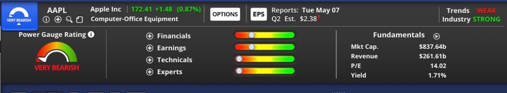
Each of those is preceded by a + sign which, if clicked, will open a similar presentation for the five factors contained within each category. (As you might expect, if the indicator is toward the right, the green part of the bar, you can assume the factor is influencing the overall rank in a positive way and vice versa).

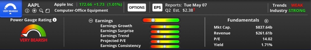
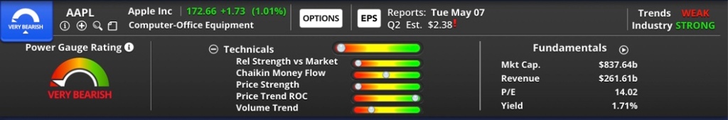
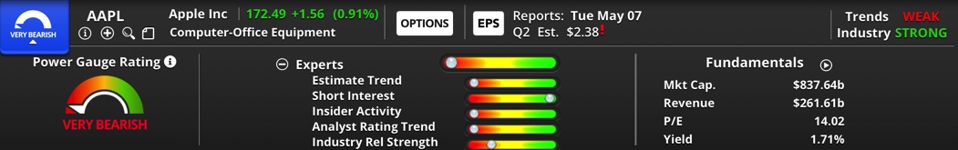
Not everybody will want to drill down to this extent, but I find it helpful to look into the underlying 20 factors, particularly to see if there are any extremes that might make me less comfortable with what I’m thinking after Phases 1, 2 and 3. For example, I might be concerned if I delve into a stock toward which I’ve developed bullish inclinations and see:
- Very unfavorable valuations
- Very high debt (companies are rated relative to industry peers)
- Very unfavorable analyst opinion
- Etc.
None of the negative extremes, should any appear, would be an inherent deal breaker; with a 20-part multi-factor model, I have to expect at least some negatives (the world isn’t perfect and neither are stocks or companies). But negative extremes in areas of particular interest to me would motivate me to investigate further before buying.
It’s About The Story
The foregoing is not by any means the only way to read a chart; many well known indicators are not used. But however one proceeds and whatever sources one consults, the ultimate goal is to develop a story that supports a sound investment decision. The goal of this four-step process, bracketed at the beginning and the end by the multi-factor Power Gauge ranking system, can help an investor do just that.
Practice Makes Perfect
Subscribers to Chaikin Analytics should keep up with Chief Market Strategist Dan Russo’s daily Morning Insights and Marc Chaikin’s weekly Market Insights, where you’ll find not only market-related commentary but also real-life examples of chart interpretation. As noted above, no chart can be expected to be all bullish or all bearish. As you read through Russo’s and Chaikin’s stock- or ETF- specific commentary, note not only which features they mention, but also which ones they omit. As you keep doing this, you’ll develop your own sense of how to prioritize among the many signals each chart presents.
Also, the primer Finding Long and Short Ideas and The Chaikin Investing Blog are available to subscribers and non-subscribers.
