You Party, I Party, Chart Party
I’ll be on a soccer field in a few hours, watching a herd of six-year-old girls travel around in a pack behind a soccer ball.
This herd is no different from the wild pack of algorithms, institutions, retail investors, and others… all with the same names…
Over and over… stimulus pump by stimulus pump… rate decision by rate decision… nothing changes. I’d commented that this market has acted the same for 16 years…
Stepping back, the evidence is overwhelming that Fed-driven returns have been a significant factor in the market since at least 1993 when the central bank quietly started its 2% Inflation Target.
Understanding this historical context can provide valuable insights into current market behavior.
It was just post-2008 that the party started.
There’s a scene in Live Die Repeat (my favorite science fiction film) where Tom Cruise’s character waits for a fellow soldier to attack him. Having been relieved the same day over and over thousands of times, he puts both arms behind his back, closes his eyes, dodges two punches, and slams the soldier into a wall.
Are we also living on the same day?
We likely got the cooperation we expected from China, Japan, and the U.S.
We will likely learn of this cooperation sometime in the next few months.
Insiders have loaded up on stocks at the fastest pace since February. China will likely pump and support its economy at some point. Now, let’s get to the charts.
Chart No. 1: It’s the 1970s on Steroids
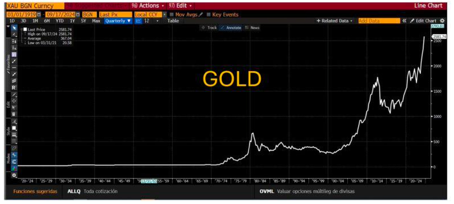
In 1970, gold closed at $38.90.
The following year, it hit $44.60.
By 1976, gold had pushed to $106.48.
By 1980, it was $665.
This decade followed the Gold Standard’s demise. But it also complemented an explosion in the Federal budget, ongoing military spending, the explosion in Federal bureaucracy, massive spending on the great society, massive increases in Cost of Living Adjustments, and much more. This roster of things forced Arty Burns to flee to Yugoslavia, where he explained his challenging role as Fed Chair.
Across the U.S. spectrum… the monetary debasement is very similar.
As I’ve noted… we’ve already been up $1,600 to $2,650 since Michael Howell outlined the Global Liquidity bottom in October 2022. It’s been going similarly to where we were back then.
The chart you’re looking at now starts its ascent for gold prices in the 1970s. That big move on the far right… that’s just the last ten years. It correlates with the global liquidity pool explosion - especially in the wake of… 2008.
Bloomberg, Syz Group
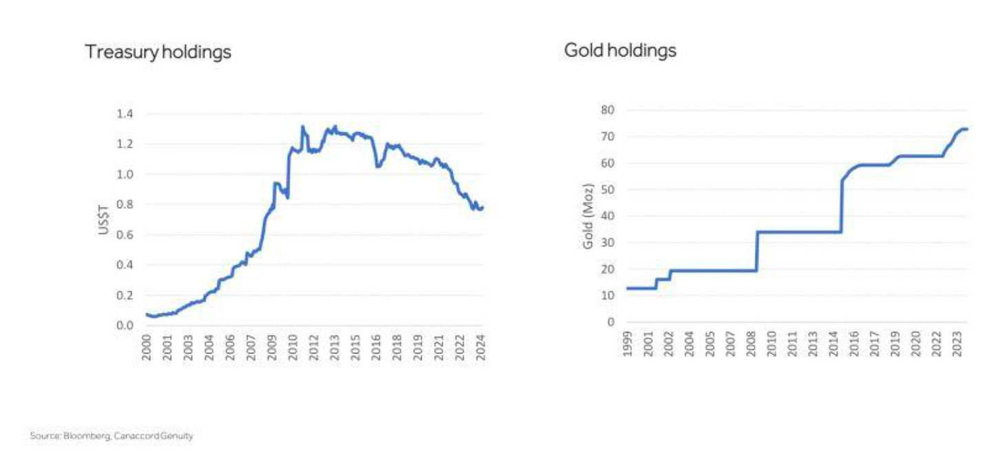
I stress that gold protects purchasing power. As the global money supply expands, gold holds its value. You don’t need a lot. I allocate about 10% gold to my liquid assets, especially in this monetary debasement period.
If you’ve got $100,000 in stocks and cash, then $10,000 in gold is adequate.
It would take a very serious liquidity crisis to bring gold back to its October 2022 lows. With every central bank buying up gold over the last two years, it remains very uncertain what this global debt system will resemble. For example, China’s been dumping U.S. Treasuries in favor of gold… since… 2008, of course.
Bloomberg, Syz Group
I expect rampant upheaval in my lifetime.
Chart No. 2: Live, Die, Repeat
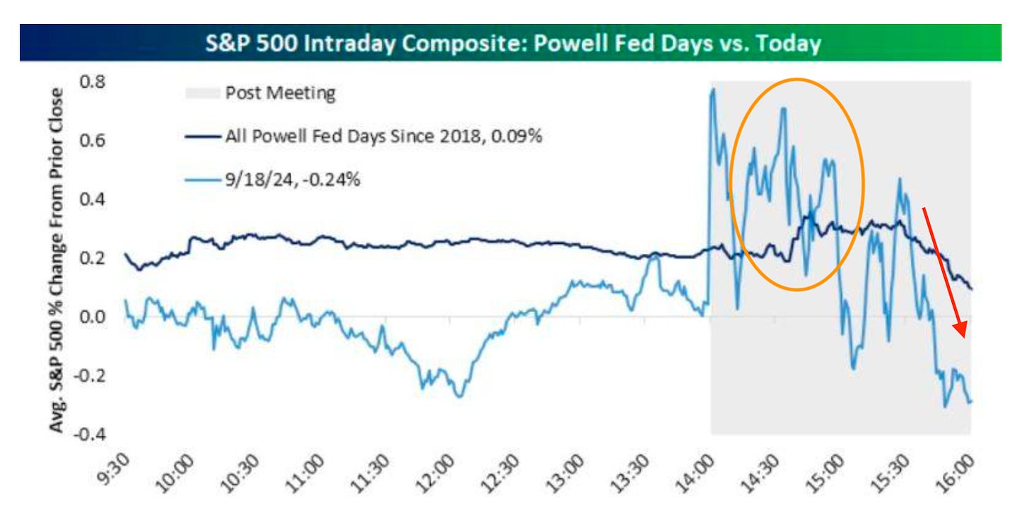
I’ve outlined the intraday action for two years on the days that Fed Reserve Chairman Jerome Powell speaks. At 2:35 pm, after just a few minutes of his rabble… the algos tend to load up, and we see a short-term spike That sucks traders and investors in.
Now, we have visual proof. Bespoke shows Wednesday’s move over the average price action of Fed conference days since 2018. The darker blue line pushes up from an average 0.2% gain to a 0.4% gain right around the same time.
Bespoke
But wait… there’s more. As I’ve explained repeatedly, the 3 pm hour is where things tend to go south. That’s where institutions are returning for the final hour. And as I’ve noted, the purpose of a market is to “SELL.” They use the short-term pops from the first 30 minutes of Powell’s chatter to exit certain positions and rotate capital.
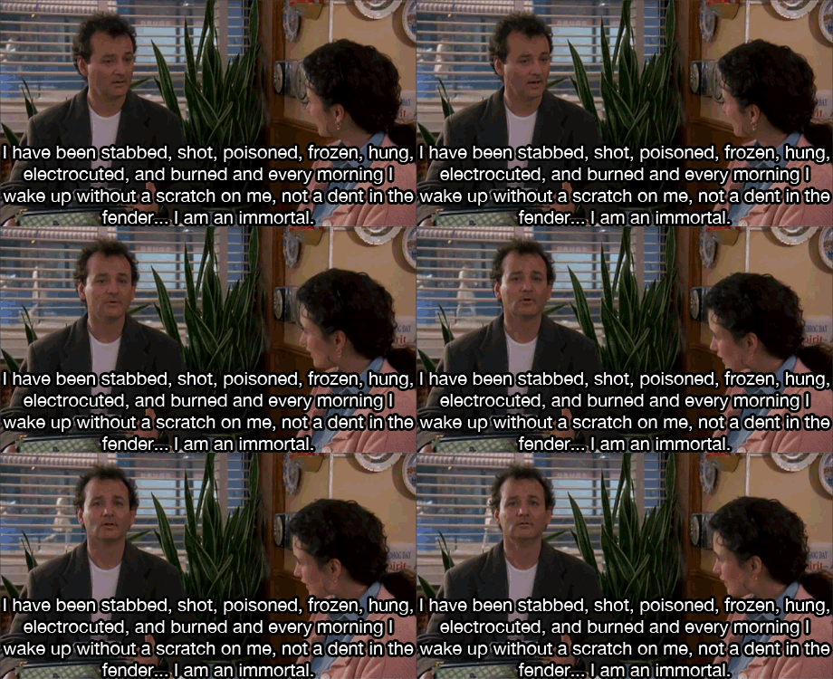
Yep… it’s Groundhog Day… again.
Chart 3: The Big Question
There’s no shortage of people saying the same thing online.
“The last time the Fed cut by 50 basis points, the markets did X.”
Who cares?
What does a rate cut in 1987 have to do with the market today?
There was no inflation targeting back then, no passive investing in the 1980s, no activist central bank like we have today, and we haven’t watched our economy become fully financialized yet. It’s a different world.
But… I will concede a caveat. Take a look at this chart…
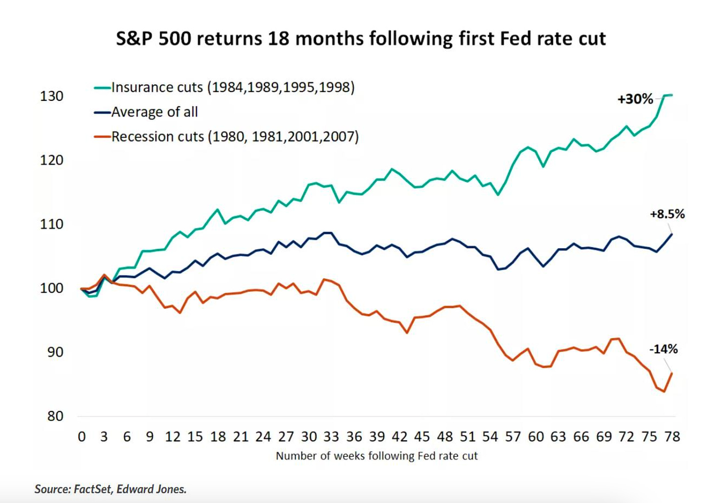
This is interesting… as it’s the average market return following the first rate cut.
What you’ll see is two different paths. The first is the cuts made to keep a lid on the economy from running too hot (Insurance cuts) and recession cuts (fueled by weakness in the economy. The 2007 experience remains fresh in everyone’s minds… so does the cut in late 2018.
FactSet, Edward Jones
Here’s the problem.
Naturally, everyone is concerned about recessionary forces.
No one likes the kid raising his hand in the class and going contrarian. But apparently, all of my degrees in economics are useless. We changed the definition of recession in 2022 for political reasons.
Then, we’ve double-counted government financing for U.S. oil production and exports. At various times in recent years, the U.S. government bought oil and stored it—which counts as the investment part of the GDP equation. Then, it sold oil (which counts positively as part of the Export side of the equation).
Louis Navalier points out that this math technically kept us out of a recession in late 2022.
Then… this year… we’ve borrowed 6% to 7% of GDP.
And we’ve printed just 3% economic growth in the process.
That’s a negative net of 3%.
That’s a shadow recession.
What would happen if we stopped borrowing to pay these bills?
What happens if we don’t spend money on stimulus and boost the government side of the equation (which is drawing us)?
Exactly… let’s pretend we aren’t pumping to stop a recession or worse.
In what universe do you borrow at that level and print growth?
It’s unsustainable, and no one is home.
The next two to three years will likely see massive amounts of borrowing, coupled with fiscal repression and more shenanigans to keep the Federal budget from blowing out. But all this borrowing is why gold is going through the roof.
Why is Bitcoin going higher? Why are people putting faith in something that they know is dangerous? The thing that’s become the bigger danger is paper currency.
Chart 4: Shadow Recession
Why else did the Fed cut?
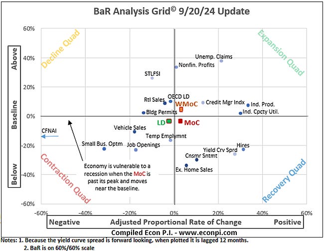
Our leading economic indicators have moved into the Retraction Quad (LD).
EconPi
The Mean of Coordinates has moved from Contraction to Recovery… but the LD is still negative. Small businesses (the heart of America) have seen their optimism plunge. Job openings are contracting, temp employment is weak, and auto sales are down.
They’re trying to keep building permits from collapsing - because they would be very bad for the housing market. The problem is that cutting rates is also bad for the supply side of the housing equation. They’re really bad at this.
Chart 5: Oil Rebounds
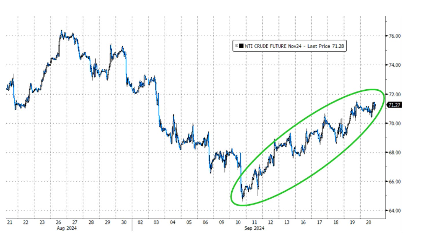
This was the best week for oil since… October 2023.
Once again… a short-term bottom, a period of solid insider buying, a period of strong Equity Strength Signals, and a period of changes to fiscal policy to help bend the yield curve lower.
Bloomberg, ZeroHedge, Syz Group
Insider buying in the oil patch has been strong over the last twenty days, with insider purchases on names like Epsilon (EPSN), Crescent (CRGY), and Matador (MTDR).
I wouldn’t be shocked to see Warren Buffett make a move on Occidental (OXY) as soon as this week.
For now…
More By This Author:
A Gasoline Salesman in a HurricaneRisk: A 50-Basis Point Cut And a Change of Shorts
Postcards: Yes, The Market Game Is Rigged - The S&P 500 Goes Red For An Hour
Disclosure: None.


