
“Those whom the gods would destroy they first make proud.” ~ Sophocles

In this week’s Dirty Dozen [CHART PACK], we look at what fund managers are doing, go over the extremes in bearish sentiment and positioning, run through the multiple signals of an inbound bullish run over the short-term. We then look at housing, labor markets, inflation leads, record low positioning in crude, and further bullish evidence for the BTCUSD long, plus more…
- According to the latest Global Fund Manager Survey out of BofA, “investor sentiment close to levels of pessimism seen at lows of past 20 years…” Summary of the report below, with highlights by me.
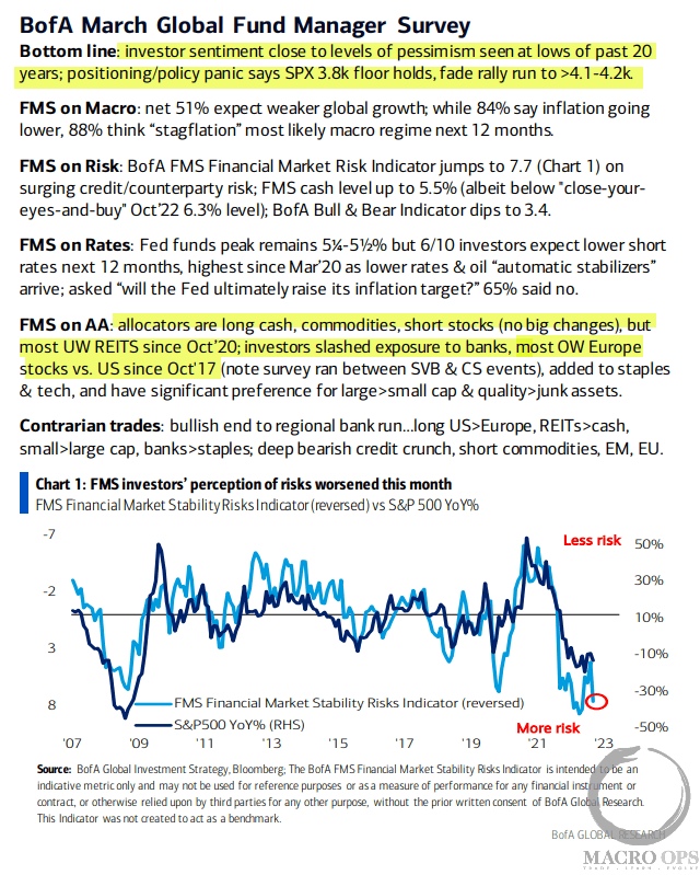
- And here are the top charts from that report. Markets are never easy but sometimes they’re just a flaming bag of snakes. This is one of those times… so many conflicting signals, it’s enough to make one’s head hurt.
My base case is we’re in a primary bear market and we should enter a recession in the latter half of this year, though odds say we should see a continued bullish counter-trend move over the coming weeks. With that said, looking at charts like those below, makes me uneasy about my bearish bent.
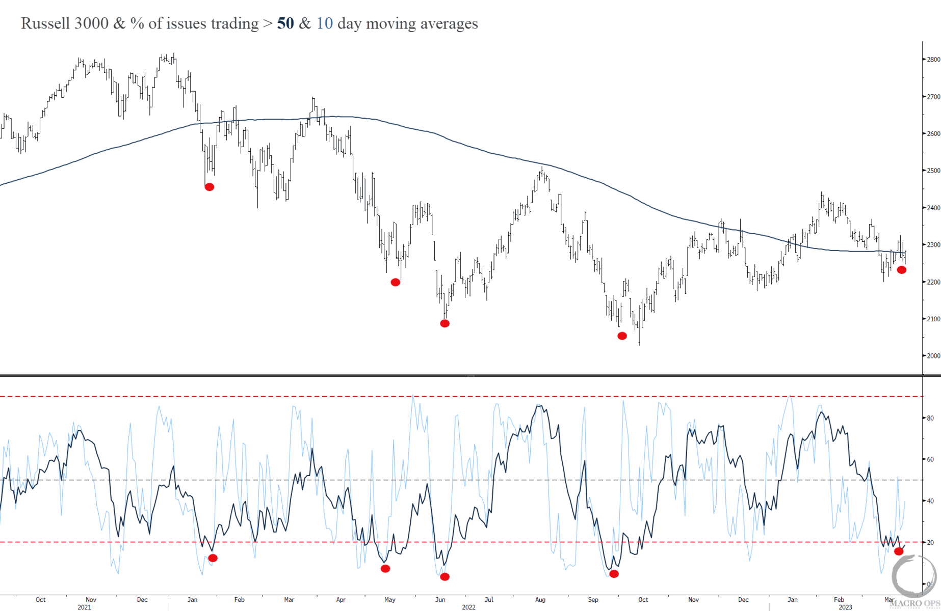
- In support of our short-term bullish view here’s a chart of the Russell 3k and the percentage of stocks above their 10 and 50-day moving averages.
Red dots mark instances where both the 10 and 50-day indicators dip below the 20% level, indicating deeply oversold breadth.
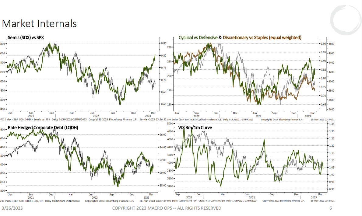
- And I’ve been pointing to this one for the last month as we should see these charts roll over before the broader market does. But, right now, they continue to either rip higher, in the case of semis vs SPX. Or, at the very least, confirm the bullish advance in the broader market.
Not bearish…
- Our Trend Fragility indicator (a composite measure of positioning and sentiment) dropped last week to its 14th percentile. A move below 10% has a strong track record of marking durable bottoms.
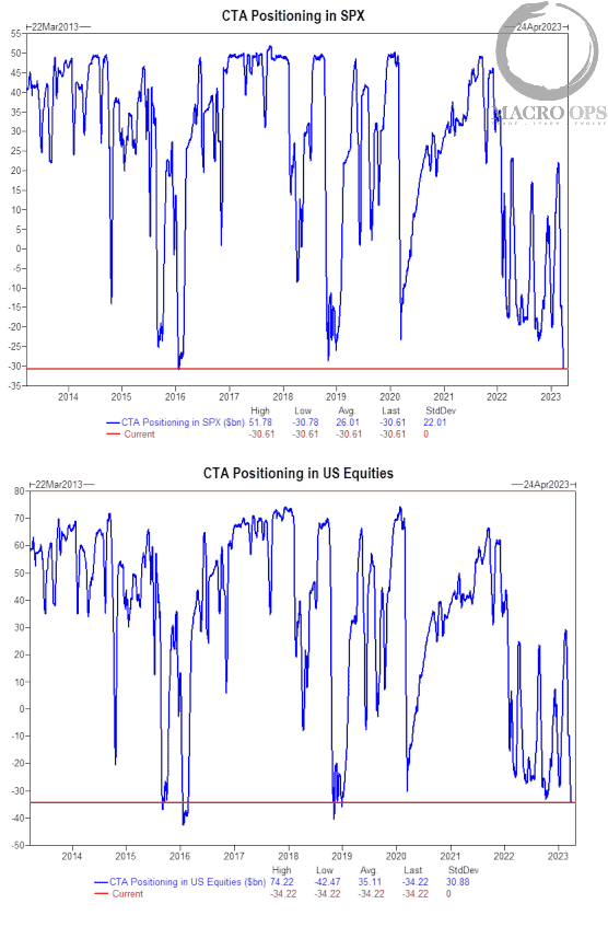
In addition, these charts from GS show CTA positioning in stocks is near its all-time lows.
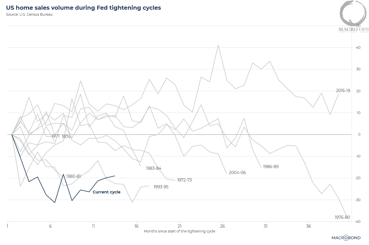
- This is a chart showing US home sales volume during Fed tightening cycles. The blue line marks the current cycle and shows how much this tightening cycle has put a hard freeze over this housing market.
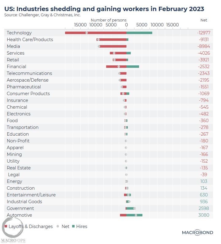
- I’m currently trialing a sub to MacroBond, hence the shiny new charts you’re seeing. Here’s a breakdown of labor market gains/losses by industry. This measure has been steadily deteriorating over the last couple of months but remains far from levels indicating a recession is nigh.
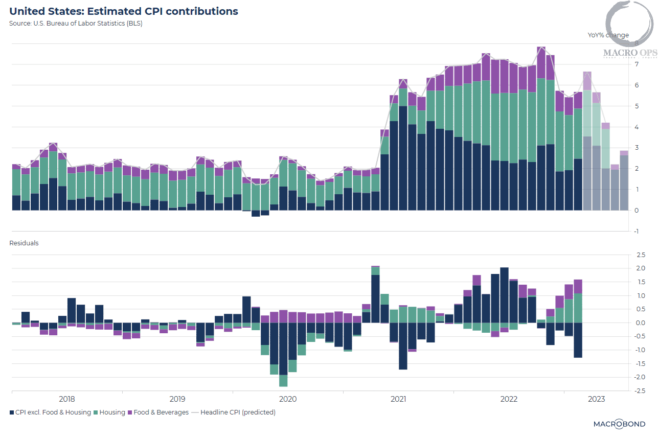
- Here’s a chart that aims to forecast CPI using a number of leading indicators. According to MB, this indicator “leads the specified component by 5 to 13 months” and “based on the historic correlation… our model predicts inflation will moderate — posting a 4.2% YoY increase in May 2023. This would be consistent with a recession and weaker oil prices.”
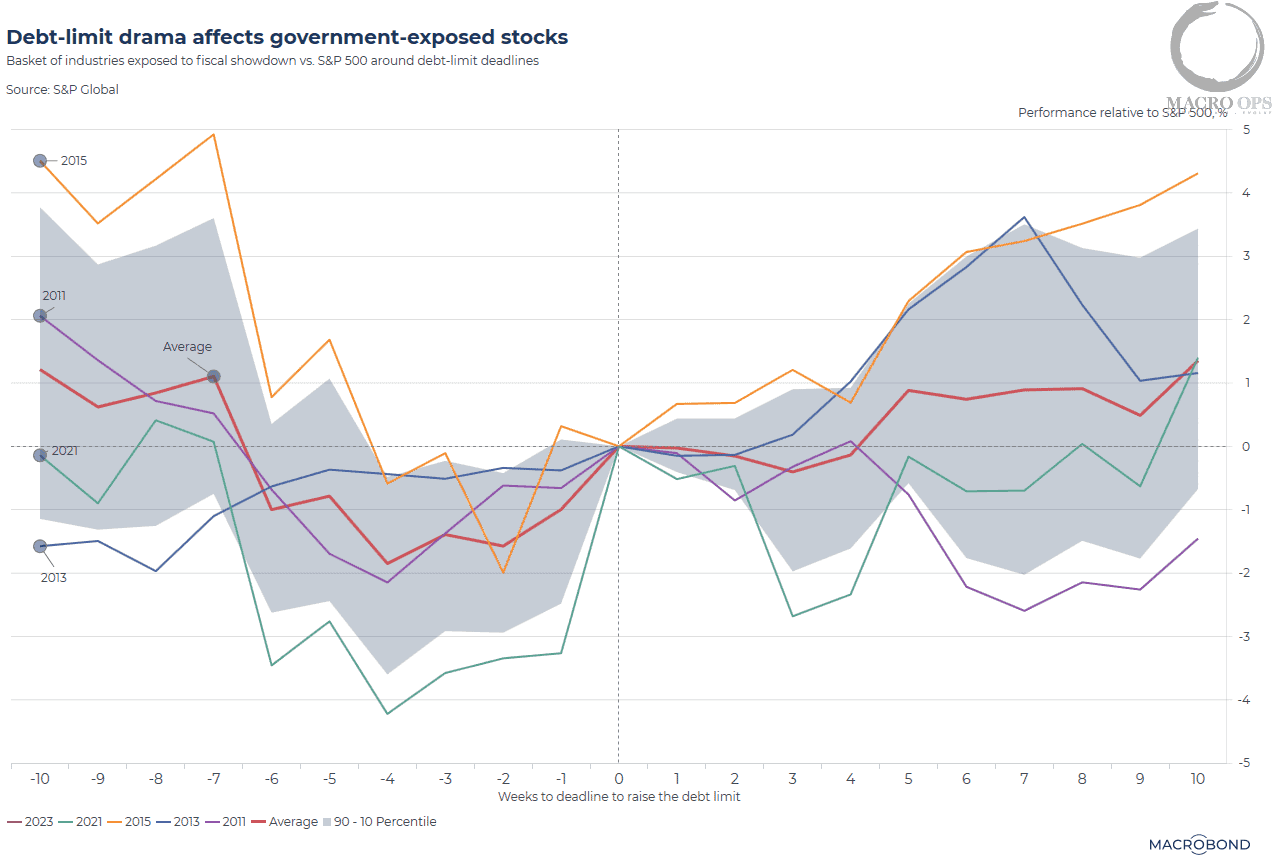
- The Treasury’s General Account (TGA), which essentially is the Federal Government’s checking account, has been drawing down its cash pile in order to cover the govie’s expenses. This is because the Treasury is unable to issue new debt until the ceiling is raised.
This has been a positive offset to QT but the Treasury will run down its cash sometime in June. While all past debt ceiling crises have been resolved, the market doesn’t like the drama. This chart shows the market’s decline over the preceding 10 weeks up until the eventual resolution and lifting of the ceiling.
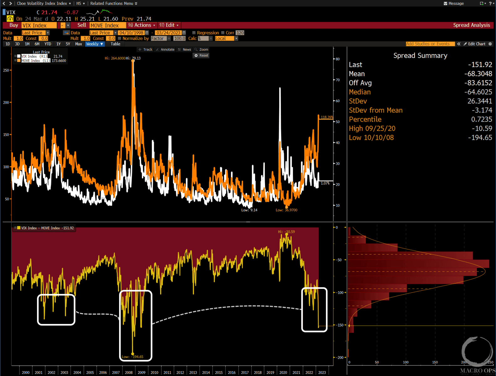
- Here’s a chart I shared in my weekly note to Collective members. It shows BofA’s MOVE index, which is a measure of bond volatility (orange line). And the VIX, which is a measure of equity vol in white, along with the spread between the two in the lower chart.
The spread is at its widest levels since the GFC. Historically, this wide of a spread resolves with a spike in the VIX.
- Positioning in crude, both commercials and managed money, are at levels that drive long-term bottoms. @AndurandPierreUpdate tweeted this along with the following chart last week “on oil spec positioning with today’s COT data. Wti, Brent, gasoil, gasoline, heating oil, futures, and options delta. Lowest since that data is available (2011)”
Still need the tape to confirm but this is something to watch.

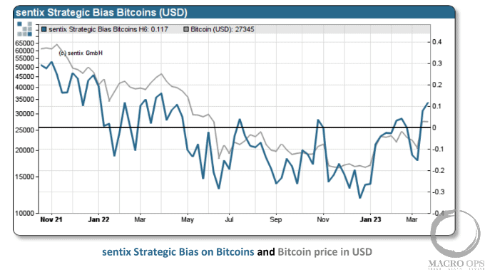
- I pointed out the completed inverted H&S bottom in BTCUSD last week (link here). Now it looks like sentiment is a tailwind as well. Here’s the latest from Sentix with highlights by me:
“Investors are rediscovering the crypto market as an escape vehicle from the traditional monetary system. The Strategic Bias for Bitcoins climbs to its highest level since 01.04.2022. This reflects a newly awakened willingness to buy Bitcoins, which could further fuel the price trend. A 12-week bias increase of more than 38 percentage points has occurred a full 6 times in data history. As a result, the Bitcoin price rose by an average of 30 (!) percent after 8 weeks (hit rate 67%).”
Thanks for reading.
Stay frosty and keep your head on a swivel.
More By This Author:
Tighter Lending = Looser LaborCashless Earnings…
A Dwindling Cash Buffer…

Comments
Log in or sign up to join the conversation.