
Deflation Continues As The Driving Force In The Stock Market
Mr. Bear has begun clawing back inflated market valuations in the stock market. The Dow Jones has deflated by over 6% since last Friday’s close; everyone can see Mr Bear’s handy work in the BEV chart below.
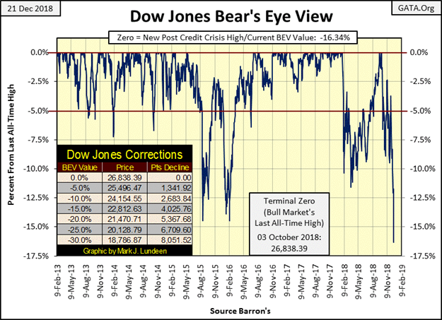
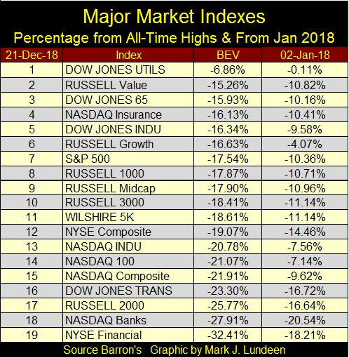
How have the other major indexes fared? The table below tells us what we need to know: market valuations in the broad stock market are deflating. The BEV column informs us how far these indexes have declined from their last all-time highs. Most of these indexes’ BEV Zeros happened sometime in 2018. However some predate 2018, for example the last all-time high for the NYSE Financial Index was on 09 May 2007, that’s eleven years ago.
The 02 Jan 18 column shows how these indexes have performed since the close of the first NYSE trading session of 2018. Most are down by double-digit percentages and none of them are positive for the year. I expect when I return from my vacation in mid-January they will all be down significantly more.
Seeing the NYSE Financial and NASDAQ Banking indices (#18 & 19) leading the other indexes down isn’t good. Remember the sub-prime mortgage crisis of 2007-09 was primarily a credit crisis in the global banking system. A crisis in the mortgage market placed at risk the entire global payment system. Had that system failed in 2008-09, economic activity such as purchasing gasoline, groceries and buying from your favorite internet shopping site would have become impossible. People would have stopped going to work as their employers could not have paid them for their labor.
Unfortunately the “policy makers” did nothing to fix the banking system. So, sometime before this bear market concludes, Mr Bear will once again attack the global banking systems’ payment infrastructure. If he’s successful in taking it down, it will be horrible; making this bear market as deep and as profound as the Great Depression Crash of 1929-32.
Is this possible? In our heavily “regulated” markets and financial system I expect anything to the downside is possible. One thing most market regulators have in common is a desire to leave government service and get a cushy job at one of the banks they currently regulate; the one thing that isn’t going to happen if they “regulate” the economy and financial markets too enthusiastically.
One shouldn’t complain unless one has a solution to a problem, and the solution to our current corrupt market regulation would be a return to a mark-to-market at the end of the day standard for the banking system. Illiquid assets like OTC derivatives and sub-prime debt should be prohibited assets for any financial institution that holds deposits for savers and businesses.
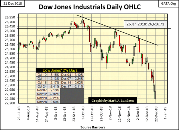
Below is an ugly chart; the Dow Jones in daily bars. We saw another Dow Jones 2% day on Monday. We could have had three or even four 2% days last week, but at the end of the day someone came into the market buying in volume, lifting the Dow Jones up above a -2% loss for the day.
It doesn’t matter, as this chart is screaming BEAR MARKET. Keep in mind the Dow Jones sees its largest daily percentage ADVANCES during big-bear markets.Large daily advances of up to 15% from a previous day’s closing price happened during the early 1930s, typically following a series of big down days as seen below.
So, if during my absence from market commentary, should Dow Jones see one or more huge percentage daily gains in the stock market, it’s only Mr Bear giving the short sellers their fair share of bear-market grief. After which he’ll be back doing what he does best; clawing back inflated market valuations from financial market assets.
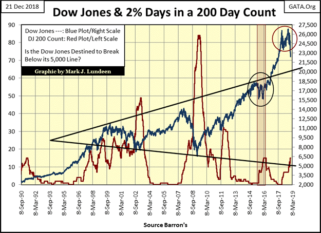
Next is a chart of the Dow Jones (Blue Plot) plotted with its 200 count (Red Plot); the number of Dow Jones 2% days (days of extreme volatility) in a running 200 day sample. Rising daily volatility (rising 200 count in the Dow Jones) has been a hallmark of bear markets since 1885, and below you can see how a rising 200 count impacted the Dow Jones during the High-Tech and Sub-Prime Mortgage bear markets.
The 200 count lifted off Zero last February 2nd, and increased to seven on April 6th as the Dow Jones completed an 11.5% correction. As the Dow Jones increased to new all-time highs in October, it stopped seeing these days of extreme volatility. However, on October 8th (five days after the Dow Jones last all-time high) it once again began seeing 2% daily moves. Since then the 200 count has increased to fifteen as the Dow Jones deflated 16.32% (4,383 points) from its last all-time high.
If you’re a bull you must believe the Dow Jones will stop seeing daily moves of +/- 2%, that the current Dow Jones 200 count of fifteen will be the peak of the cycle.
But I’m not a bull; rather I’m a raging bear on this market because I realize what it is that Mr Bear is actually after. Market commentators too often fix their comments on points and percentages moves in indexes like the Dow Jones in both bull and bear markets. Well, bull markets go up because “liquidity” from the Federal Reserve flows into share valuations, and the means of how this “liquidity” gets there can be very creative.
There are many hundreds-of-trillions of OTC derivatives currently standing as potential liabilities to the big banks. Currently they are not a problem as they haven’t yet come into the money. But sometime in the months or years ahead of us Mr Bear is going to force these OTC derivative contracts to come into the money, and that will be a day to be long remembered by generations to come.
It would take only one call of $1 trillion from the banks’ counter-parties to wipe them out.
Corporate America’s debt burdens are historic, and much of this debt was assumed to buy back their shares in the open market. When the economy winds down, these corporations, many with famous names will default on these bonds and declare bankruptcy in the process. And then there are the many $trillions in single-family mortgages and school loans, as well as credit card debt that average wage earners currently are carrying.
Mr Bear doesn’t give a damn if the Dow Jones makes history to the down side in the years to come. What his actual plans are is to stress test every balance sheet in the economy: General Electric’s and yours and mine in this bear market and most will fail the test.
Today the economy and business conditions seem good; most corporation, local government and people have no problems servicing their debts with their income.
But what happens when mass layoffs occur, and the employment conditions remain depressed for a few years. How many wage earners will be forced into bankruptcy proceedings as they default on their debts? The same will be true for corporations and local government now burdened with pension liabilities they’ve picked up since the 1970s.
As financial leverage now present in most balance sheets is historic, I expect the Dow Jones is going to make history on the down side as economic entities are forced to write down and write off assets by the hundreds-of-trillions as this bear market progresses.
Liquidation in market valuations during the pending hurricane of counter-party failure in the debt and derivative markets will become the driving force as this bear market matures. That the MSM has yet commented on pending counter-party default tells me we are still in the early phases of the Bear Market.
So, before this bear market concludes, expecting a Dow Jones decline below its Great Depression’s 89.19% market bottom seen in July 1932 is not unreasonable.
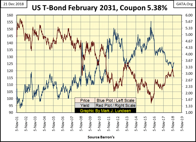
In the chart below T-bond yields (Red Plot) have declined, and prices (Blue Plot) have risen since early November as people sought “the safety” of US Treasury debt.
Decades ago market commentators (now long passed away) would have said gold and silver, assets with no counter party risks were the safe-haven assets in a market decline. Let’s see what happens to this T-Bond when Mr Bear gives the US Treasury his stress test as the bear market progresses. I expect gold and silver will reclaim their safe haven status once again, and in a big way.
Gold and silver may have a big future ahead of them, but presently the best thing to be said about them is that as 2018 comes to a conclusion they’re not deflating by double digit percentages like everything else. Come to think about it, that’s not a small thing in today’s world.
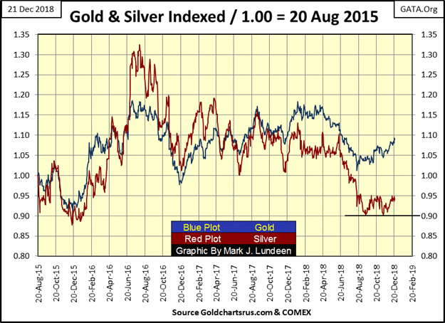
I’m anticipating that sometime in 2019 daily volatility for gold and silver is going to explode. +/- 3% daily moves in gold and +/- 5% daily moves in silver will become common market events as the old monetary metals seen above once again surge towards new all-time highs. What is required for that to happen is yet more deflation in the stock and bond markets.Patience is a virtue as 2018 draws to a close.
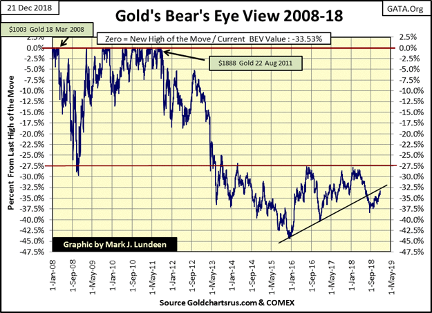
Looking at gold’s BEV chart below, gold continues advancing off its bottom of last August, but at a snail’s pace. The BEV 27.5% line ($1370) has offered considerable resistance since 2014. I’d like to see gold smash through this line, and then advance enthusiastically towards a new BEV Zero (new all-time high). But that isn’t going to happen until deflation in the stock and bond markets motivates refugee dollars fleeing Wall Street to seek the safety of gold and silver.
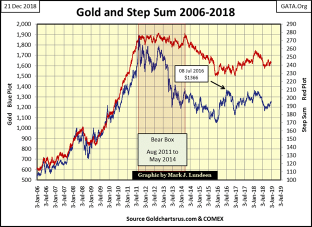
Here’s gold’s step sum chart.Nothing much is happening here, but it’s interesting noting the multi-year bear box from August 2011 to May 2014. For five years (2006-11) gold (market reality) and its step sum (market sentiment) charged upwards to new highs.
Then in August 2011 market reality changed from bullish to bearish, as market sentiment refused to follow for the next four years, forming the bear box in the chart. Note how the price of gold had already sustained most of its losses before market sentiment (the step sum plot) turned down in May 2014. That’s very typical of a bear box.
I bring this fact up as I believe that the Dow Jones and its step sum have started a bear box in the chart below.
Come January 3rd the Dow Jones would have been declining for three months, yet its step sum plot has so far refused to follow the Dow Jones down. What this means is the bulls currently see the big down days in the Dow Jones as buying opportunities, as they did above in the gold market from August 2011 to May 2014.
How long will it be until the bulls understand that these big down days in a bear market aren’t buying opportunities, but opportunities to lock in long term capital losses? They may wise up before I return in late January, or they may stay in denial for the next few years.
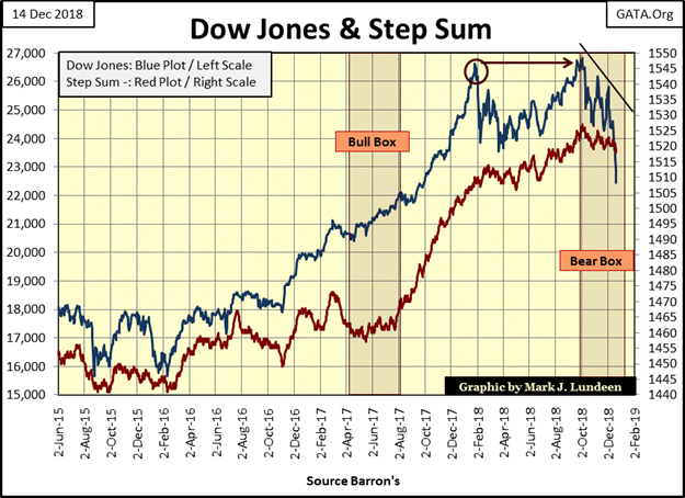
But seeing a bear box develop, and go on for a prolonged period of time will make my life of commentating on the market considerable simpler. That’s because the Dow Jones will not bottom until market sentiment (the step sum plot) recouples with the Dow Jones’ valuation plot.
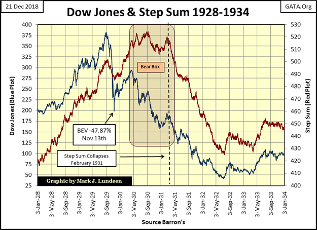
Take a moment and study the bear box and its resolution in the gold chart above, and the bear box the Dow Jones developed during the Great Depression crash below.
The question in my mind is how long will the bear box now forming with the Dow Jones and its step sum last?It could go on longer than you or I believe it could, because the big bulls in this market are the “policy makers” who control the Federal Reserve and have unlimited access to inflationary funding.
But if this is the bear market I believe it to be, in the end even the “policy makers” will have to surrender to Mr Bear and his deflation, and we’ll see the Dow Jones’ step sum collapse along with its valuation as this bear market approaches its bottom.
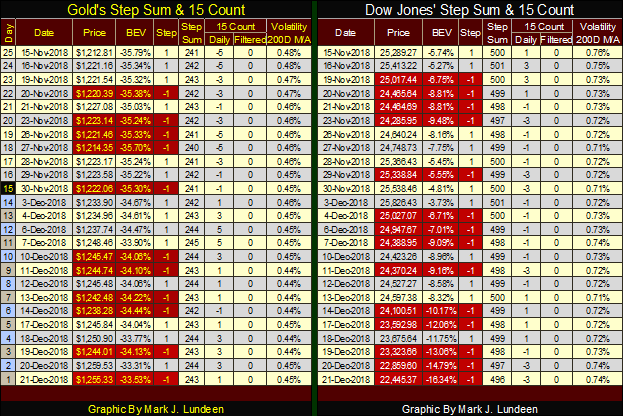
Here’s the step sum tables for gold and the Dow Jones. Gold’s advances as the Dow Jones declines as neither of their step sums are doing much, suggesting market sentiment for both markets is one of doubt and confusion. But that’s okay by me as it’s under such market conditions that big market moves are made.
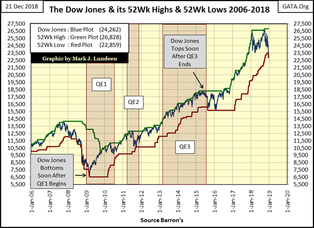
Some data sets are just better than others, such as NYSE 52Wk Highs and Lows. But first what are 52Wk Highs and Lows? I have an example below using the Dow Jones. The daily published value for the Dow Jones is the Blue Plot, its 52Wk High is green and its 52Wk Low is in red, and for your information the Dow Jones just made two new 52Wk Lows this week on Wednesday and Thursday.
The Dow Jones, just as any listing trading at the NYSE can on one day advance, while the next decline in both good and bad markets. But for any asset trading daily to go from a 52Wk High to a 52Wk Low takes some time.The Dow Jones last 52Wk High was on October 3rd. Its first 52Wk Low since January 2016 happened on Wednesday December 19th. During the 54 NYSE trading sessions that separate these two dates market psychology has changed; where once it was optimistic, it’s now increasingly pessimistic.
The chart above is just for the Dow Jones, a stock average from the 19th century that contains 30 big blue-chip stocks. But the NYSE contains about 3,000 issues that trade daily. Looking at the NYSE’s 52Wk Highs and Lows, how are things going over there?
The top section of the table records the daily data from late last January, a time when BEV Zeros (new all-time highs) were plentiful and 52Wk Highs dominated 52Wk Lows. The bottom section is a year later, and what a difference that year has brought to the stock market.
Thursday this week the NYSE saw a 52Wk Net H-L of -1266 on a day where the NYSE saw 3083 issues trading. That’s about 40% of the shares trading at the NYSE closing at a 52Wk Low. Is that a market extreme? I’d say it is, and to place Thursday’s market action into historical context look at the chart below showing only those days where the NYSE 52Wk H-L saw nets of greater than +/-300. I circled the market action of the past few weeks (also see table above).
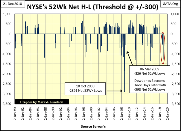
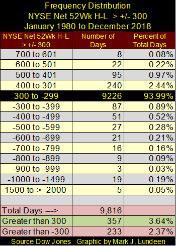
For a breakdown of what we are looking at in the chart above I’ve created the frequency distribution table below listing the number of days the NYSE 52Wk H-L nets were > +/- 300. Since 02 January 1980 there have been 9816 NYSE trading sessions. Looking at the 300 to -299 row, we see 93.94% of them closed with a 52Wk H-L net of less than +/-300, or in other words normally nothing exciting happens at the NYSE.
Since January 1980, during strong market advances there have been 357 NYSE trading session that saw 52Wk nets of greater than 300, with the greatest of 665 seen on 26 April 2010. During market declines there have been 233 NYSE trading sessions where the 52Wk nets have been greater than -300. The greatest negative 52Wk net was -2891, seen during the sub-prime market meltdown on 10 October 2008.
Returning to the NYSE 52Wk net chart above, from 1980 to 2003 daily +/-300 NYSE 52Wk H-L nets were relatively rare when compared to their frequency following the inflation of the sub-prime mortgage bubble and its aftermath; which I include the 20,000 point advance in the Dow Jones since March 2009.
It takes a lot to push the Dow Jones up by 20,000 points; a lot of “liquidity injected” into the financial system by the FOMC. It doesn’t hurt when corporate management helps in inflating their share values by trashing their balance sheets by selling bonds in the debt market to fund their share buyback programs, and they’ve been doing exactly this for the past decade.
MSM outlets for the most part are worthless as sources of financial information, unless you know how to read between the lines. Zero Hedge and David Stockman have been reporting on corporate America trashing their balance sheets to fund their share buyback and dividend programs for years. And now with the Dow Jones actively deflating, "Fake News" CNN now reports on this ancient history as if it’s news? Of course they managed to interview a bearish Alan Greenspan in this link.
But then again CNN suggests maybe this is a good time to scoop up some bargains in the market.
But if CNN proves to be wrong on that, it’s all President Trump’s fault.
Disclosure: None.


Many thanks to Mark Lundeen for his informative charts and commentaries. Bears can make money in volatile markets. Mr. Lundeen convinces us that we are in a down cycle. No doubt there will be some great buying opportunities, but on the whole we are heading downward for the short term, maybe longer. A question I learned in trying to sell companies to Walmart was, "how low can you go?" I would love to hear from others as to how low they think we can go before the Dow Jones and other indices stop bleeding?
I'm becoming too afraid to answer just how low I fear this may go!
Deflation is not usually the term used for a stock market swoon just like you don't say there is inflation in the Dow Jones Industrials when prices rise. Asset price collapse or asset contraction is a better term.
Thanks for the clarification.