
Summary
- Bond yields may rise during the first half of January 2021, equities should rise, and the VIX may decline. With RobinHooders running rampant, allow for overshoot in terms of time/price.
- There's a recurring (even persistent) seasonal decline in liquidity flows after the first half of January which persists until the middle of March. This tendency may happen again this year.
- This seasonal liquidity drought may be exacerbated by weak US growth outlook during Q1 2021, which may cascade into Q2. That could push yields and equities lower, and the VIX higher.
- No technical growth recession in Q1/Q2 period, and if COVID-19 vaccines deliver their promise - these are unalloyed positives for growth but maybe not for the stock markets. Reason: There will be less pressure for the Fed and the Treasury to keep the money printers whirring. That's not optimal for stock markets, which have risen in lock step with the growth of global central banks' balance sheets.
- If growth recovers robustly, that may force the Fed to end its unprecedented easy money policy sometime later in the year. Yields may rise, while stock markets could trend sideways, even fall. 2021 could very well play out the opposite of 2020 - the economy grows (and yields rise) but the equity markets fall or stay flat.
This 2021 outlook in fixed income, equities, and the VIX was prepared at the behest of our partners in Switzerland who were awed by the vast amounts of debt that the Biden government said it will likely issue in 2021 to forestall further worsening in the US economy.
Everybody is assuming that interest rates (bond yields) will rise given the huge amount that will be added to the deficit. But so far, all we have seen are narratives (very little graphical evidence), so we prepared this presentation to see just how the narrative stacks up, and compares to, the actual data.
The charts in the presentation are very "noisy" - there's a lot of data in every chart. It has been our experience that the juxtaposition of multiple data in one place has frequently provided additional information that would have been missed by striving for "clean charts," so our apologies in advance. The charts are labeled, however, so as to provide some clarity.
The origin of all the analytical platforms starts in September 2008, when the Fed started Quantitative Easing (QE). The period before that time are useless in the analysis of the behavior of asset class prices because the data pre-QE is totally irrelevant to the manner that asset prices behave today. Like it or not, assets prices are anchored to the rise and fall in money/liquidity coming from the US Federal Reserve and US Treasury.
Laying The Ground Work Of The Presentation
Here's the chart (below) laying the groundwork of this presentation.
- US GDP vs. US total debt (issuance), Fed's balance sheet, bank reserves, Treasury Cash Balances (TCB).
- The growth of debt issuance, Fed's balance sheet, bank reserves, and Treasury cash balance is countercyclical to GDP growth.
- The growth of all these variables is response to the inverse growth of US GDP, to mitigate the loss of revenues (see chart below).

In September 2008, the Fed unleashed Quantitative Easing (QE1), creating money "ab nihilo," and bought government securities in the market. That expanded the balance sheet rapidly, and in the process, the level of bank reserves rose sharply. QE1 was followed by QE2 and QE3 one year apart (see chart below).
The initial bond market response to the QE monetary policy experiment was the rapid decline of rates and bond yields and rise in equities after a short lag (see chart below). That remained the relationship for some time, but after QE3 in September 2012, yields stopped declining, as the Fed paused, and waited to see the impact of its new monetary experiment.

After that point, the inverse relationship between the Fed's balance sheets (proxy: Bank Reserves) and yields flipped - so a further rise in the levels of bank reserves sent rates and bond yields (proxy: 10yr yield) higher (see chart above and below).
Inflationary fear also began to creep into the market's outlook for longer-term bonds, and so the bond yield term premium began driving the trends of the long bond yield (see chart below).

Moreover, with increasing levels of QE, the Fed started to lend less securities to Primary Dealers which are now flush with cash - and buy the securities themselves, rather than borrow those securities temporarily from the Fed (see chart below).

It turned out that by not lending securities to Primary Dealers, the Fed has made dis-functional one tool with which to tighten liquidity. Therefore, rising bank reserves plus falling securities lending optimized the negative correlation between rising liquidity and rising bond yields (falling bond prices), and vice versa (see chart above).
Short-Term Outlook
In fact, the change rate of the Fed's securities lending has given us a benchmark to judge how tight or loose systemic liquidity is. And it has become a super tool for us because it leads the changes in bond yields by several weeks (see chart below).

Of course, bank reserves (BRs) are still the primary mover of all these activity, but the changes in BRs are not granular enough to fine-tune expected changes in long bond yields. Changes in the securities lending routine provide some of that granularity which we seek (see chart above).
Applying the tool tells us that bond yields will likely be rising during the first half of January, but will probably decline thereafter until the first half of March (assuming the correlation holds in an equity universe dominated by RobinHooders).
We document our claims that inflationary fears forced a flip over in the erstwhile negative correlation of the long bond yield to a positive cointegration by showing the chart below. Since September 2012, the 10yr bond term premium has driven both the changes and trends of the 10yr yield and the 30Yr/3Mo yield curve (see chart below).

Term premium includes a large inflation risk premium, and that has driven the large changes in the movement of the long bond yield since after QE 1 was unleashed to the world. No doubt, the term premium will remain the primary driver of the 10yr yield's trend over the coming years as Modern Monetary Theory and its variants are unleashed globally, pushing up actual and expected inflation trends.
Tools Supporting The Short-Term Outlook
"Nesting" Inflection Points of Fed Balance Sheet, Bank Reserves Plus, Treasury Cash Balance vs the 10Yr Yield

We expect yields to be suppressed for a few days (from Dec. 27, when the presentation was prepared), but yields should thereafter rise during the first half of January 2020. The chart above shows a simple "nesting" of various liquidity flows, without much data manipulation, retaining the weekly format of the data (except for the Fed's balance sheet, see chart above).
This is the raw form, the starting point of our work in fine-tuning, and trying to get the inflection point of liquidity flows, and lagged impact on asset prices, in daily data mode.

Remember, too, that asset prices link to liquidity flows via their first difference (see chart above) - so the correlation tends to become clearer with the proper juxtaposition of liquidity flows and the first difference in asset prices. This is consistent with the principle of matching flows with flows to get the correct relationships. Matching nominal asset prices with liquidity flows don't provide that much clarity.
Tools Supporting The Near-Term Outlook
DECOMPOSITION: SOMA TRANSACTIONS, TCB, BANK RESERVES, 10YR YIELD, SPX (March 1, 2020 to Jan 30, 2021)

The modeled data also shows several days of suppressed yields (from Dec. 27), but should rise thereafter, then dip again before rising further into the first half of January.
DECOMPOSITION: SOMA TRANSACTIONS, TCB, BANK RESERVES, 10YR YIELD (March 1, 2020 to March 30, 2021)

We added a forecast of what the TCB may do further out with Vector AutoCorrelation (TCBs are highly seasonal) - and we get the outlook of a possible top in yields during first half of January, then a drop in yields until the middle of March.
And that exactly matches the outlook provided by the securities lending tool of the Fed - a much lower bottom in yields by March (see chart above).

Which should not be a total surprise considering the very high likelihood that we will see a double dip growth recession during the Q1-Q2 2021 time period (chart above).

Here's how the seasonality of TCB affects the trajectory of the 10yr yield (chart above).
- Seasonality of Treasury Cash Balances (Raw Values, NSA) , Jan. 1 to March 30, following year.
- Note the severe historical drought in TCB seasonal flows during the first three weeks of March (see chart above).
Finally, we present the seasonality of the aggregate US Financial Systemic Liquidity vs S&P 600, the VIX (Inverted) and the 10yr Yield in the chart below.
We show the various modality of the Fed's QE vs risk assets adjusted to remove the Masters of the Universe (MOTU) front-run; assets set back seven Trading Days.
We also show that the VIX, SPX and 10Yr Treasury Bond Yield, with the MOTU front run removed, hew to the progress of the 2020 Treasury Cash Balances.

Key takeaways from this presentation with short- and near-term implications:
1. Bond yields may tend to rise during the first half of January 2021, equities should rise, and the VIX may decline. With RobinHooders running rampant, allow for overshoot in terms of time and price.
2. There's a recurring (even persistent) seasonal decline in liquidity flows after the first half of January which persists until the middle of March. I have illustrated that seasonality in the pink box in the chart above. I also showed that this tendency may happen again, based on the juxtaposition of US systemic liquidity flows historic data (blue box, chart above). And that seasonality could again influence bond yields this year (see chart below).

3. This seasonal liquidity drought may be exacerbated by weak US growth outlook during Q1 2021, which may even cascade into Q2. That could push yields and equities lower, and the VIX higher until the middle of March. During the prior three growth recessions, the equity market declined each time, with declines as small as 6% and as big as 38% for a calendar year.

4. There's no doubt that the Fed and the US Treasury will team up to pour more money into the US financial system if that growth recession happens, but first they need weak, hard data to cover their asses. Therefore, new money would be getting into the system only in late April or early May (Q1 2021 GDP will be published on April 29. The Fed and the Treasury may be unable to do much money printing before then).
5. If there's no technical growth recession in Q1/Q2 period, and if COVID-19 vaccines deliver their promise, that's an unalloyed positive for growth in the next subsequent quarters. However, the more robust the economy recovers, the worse it may be for the stock markets - there will be less pressure for the Fed and the Treasury to keep the money printers whirring. That's not optimal for stock markets, which have risen in lock-step with the rise of the central bank's balance sheet (see chart below).

6. In fact, if the economy rebounds strongly enough, that may force the Fed to end its unprecedented easy money policy sometime later in the year. Let's not overlook or forget how sensitive equity prices and valuations are to the slightest change in Fed monetary policy. Hark back to the time when the Fed announced the end of the asset purchase program - equity markets reversed course and recorded larger declines relative to the time when policymakers talked about lifting official rates above the 2% mark.

7. It may happen that when growth recovers, and recovers robustly, yields may rise, while the stock market may tend to trend sideways, even fall. We see that divergence happening later in the year. 2021 could very well play out the opposite of 2020; the economy grows (and yields rise) but the equity markets fall or stay flat.
The Long-Term Outlook
We do have some evidence that global growth (and the price of risk assets) will be on an uptrend for the entire 2021 fiscal year. This is based on the impact of the G5's global central banks' balance sheet (their Monetary Base (M0), and their aggregate M2 Money Supply (see chart below).
G5 central banks: The Federal Reserves, the European Central Bank, the People's Bank of China, the Bank of Japan, and the Swiss National Bank.

However, the music stops (again) in early 2022. It will be very interesting to see if the global central banks will continue to sustain and extend the usage of the money printing presses beyond 2021. Do note the leading function of the Global Monetary Base over the Global M2 Money Supply.
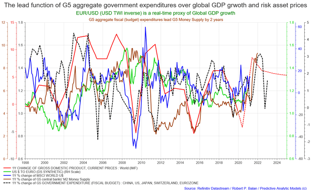
Growth in 2021 and potential growth slowdown as from early 2022 is structural - sort of already baked in the cake. Based on the indications derived from the behavior of the G2 Monetary Base (M0), global M2 Money Supply will be significantly lower in 2022, which also will correspond to the published government expenditures of the G5 nations. Taken on aggregate, these are the most significant indicators of future global growth and future asset prices (see chart above).
Comments
Log in or sign up to join the conversation.