
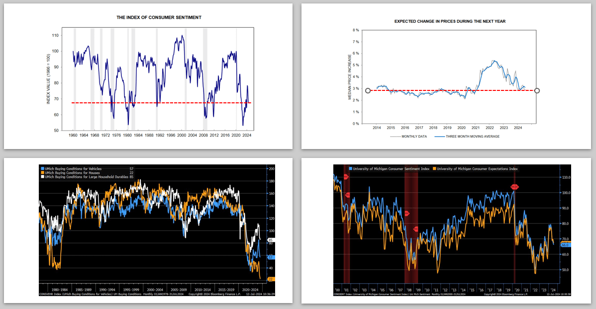
The University of Michigan consumer sentiment survey (UM) unexpectedly fell sharply a month ago after steadily improving. The report aligned with recent consumer surveys, retail sales data, and revenues from retail-oriented companies. Last Friday, the latest UM survey further confirmed a downshift in consumers’ sentiment. Let’s start with some perspective on the latest data. The July UM sentiment figure was 66, above the 53.2 set when inflation raged in August 2022. However, it is well below the nearly fifty-year average of 84 and aligns with levels recorded during recessions, as the red dotted line shows in the upper left graph.
Inflation expectations further confirm consumer weakness within the UM survey. As shown in the upper right corner, the expected inflation rate over the next year is back to pre-pandemic levels. The graph on the bottom left shows that house buying conditions are the worst in at least 45 years. Buying conditions for vehicles and durable goods have also retreated significantly. Lastly, the graph on the bottom right shows that expectations for the future are declining in line with current sentiment.
It’s tricky to decipher this analysis. Is the decided decline in consumer sentiment and spending habits based on political preferences and trepidations surrounding the election? Otherwise, it may be that the consumer is running out of gas, having depleted their pandemic-related savings and normalized their spending habits.
What To Watch Today
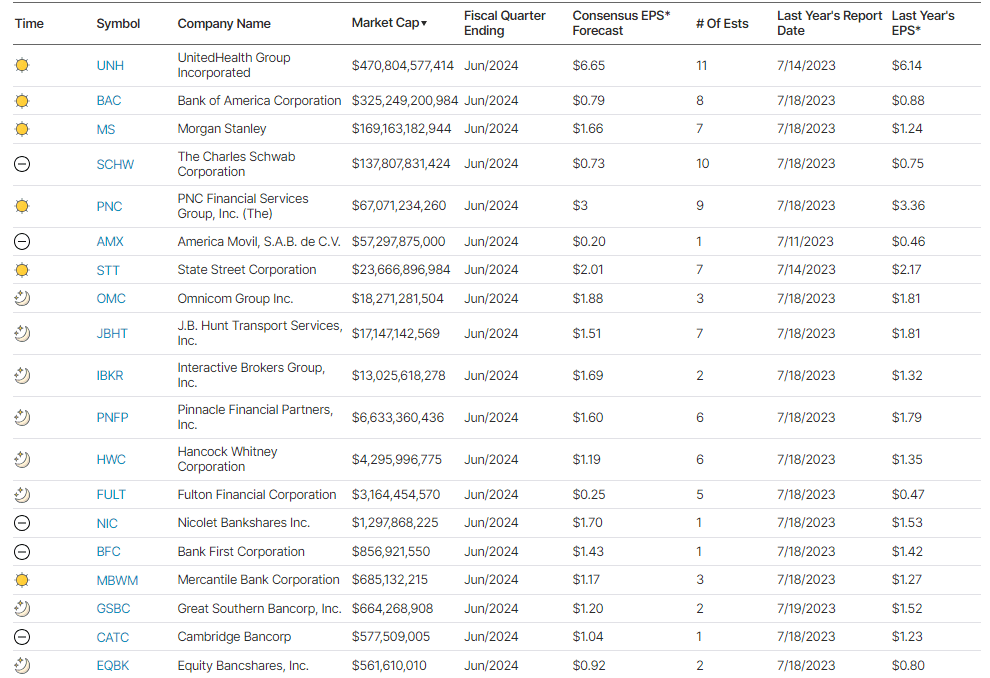
Earnings
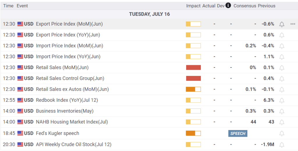
Economy
Market Trading Update
As noted yesterday, the broad market is overbought, and rallies are sold into, limiting the current upside. However, small and mid-cap stocks have been on fire for the last few days, surging higher. It is unsurprising to see narratives popping up as to why these stocks will now take leadership, but many problems still plague these companies.
First, nearly 40% of the Russell 2000 is unprofitable. As we discussed previously:
“However, some issues also plague smaller capitalization companies that remain. The first, as noted by Goldman Sachs, remains a fundamental one.
“I’m surprised how easy it is to find someone who wants to call the top in tech and slide those chips into small cap. Aside from the prosect of short-term pain trades, I don’t get the fundamental argument for sustained outperformance of an index where 1-in-3 companies will be unprofitable this year.”
As shown in the chart by Apollo below, in the 1990s, 15% of companies in the Russell 2000 had negative 12-month trailing EPS. Today, that share is 40%.”
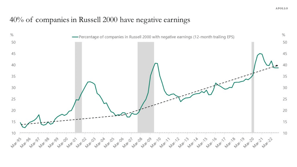
“Besides the obvious fact that retail investors are chasing a rising slate of unprofitable companies that are heavily leveraged and dependent on debt issuance to stay afloat (a.k.a. zombies), these companies are susceptible to actual changes in the underlying economy.”
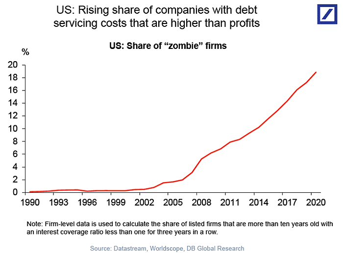
With a slowing economy, these companies depend highly on the consumer to generate revenues. As consumption decreases, so does their profitability, which will weigh on share performance.
Secondly, these companies do not have the financial capital to execute large-scale buybacks to support asset prices and offset slowing earnings growth by reducing share count.
Lastly, unlike the Mega-caps that dominate the ETF world, small and mid-cap companies do not benefit from the passive flows that continue to support their large-cap brethren. The underperformance of small and mid-caps, relative to large caps, has been a long-term issue.
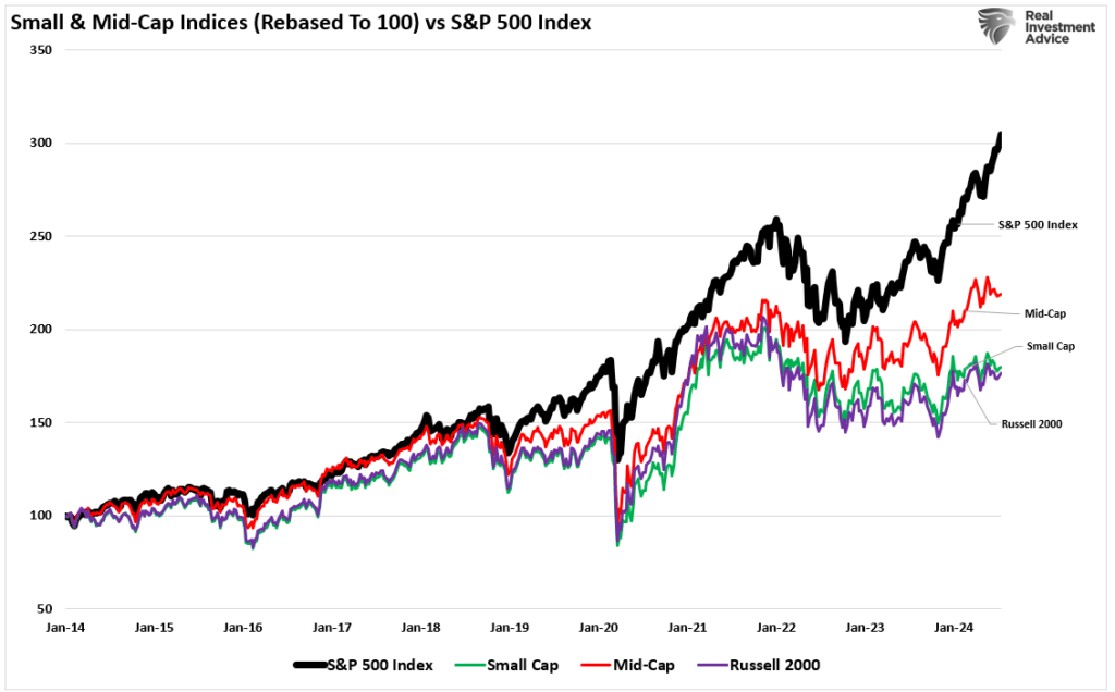
Technically speaking, the Rusell 2000 index (which comprises both small and mid-cap stocks) is 3 standard deviations overbought. Furthermore, other technical measures suggest the recent move is a bit extreme. Notably, while the recent increase in the Russell 2000 index is encouraging, it should be noted that the index remains well below the previous high in January 2022.
(Click on image to enlarge)
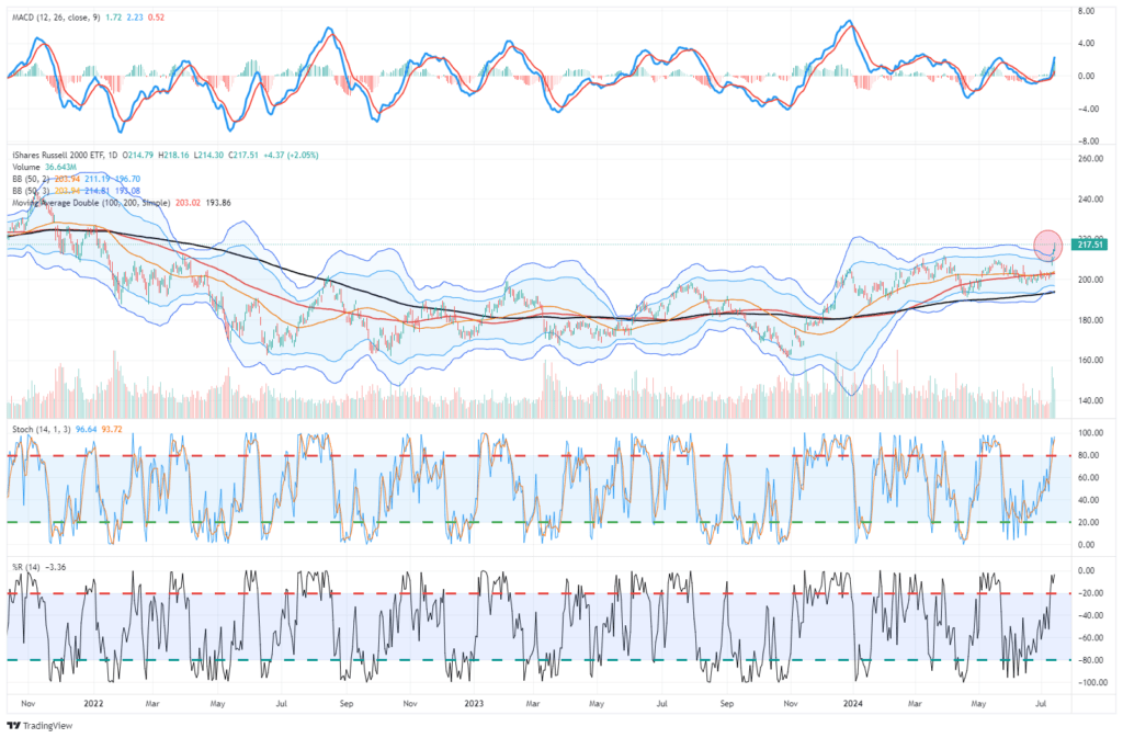
While the Russell 2000 has provided traders with decent opportunities, it is difficult to suggest the recent move is the beginning of a major market shift.
Maybe it will, but there will be plenty of time to make that decision. In the short term, the recent “Trump trade” higher in these stocks has likely run its course, and profit-taking would seem to be a better decision than trying to “jump on that trade” at these levels.
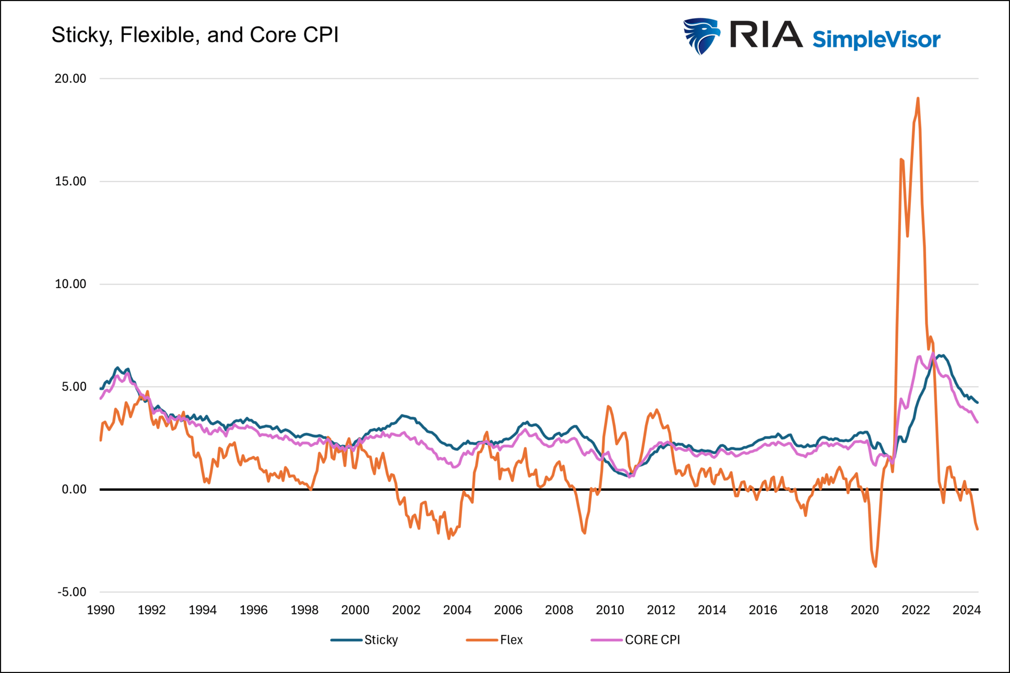
Atlanta Fed Sticky and Flexible Core CPI
Following last week’s CPI data, we thought we might share a unique look at inflation to gain more insight into inflation trends. The graph below compares core CPI to its sticky and flexible components. Sticky prices are those goods that tend to change in price infrequently. Often, economists use sticky inflation to gain confidence in their inflation expectations. Conversely, flexible prices are more volatile. These prices tend to be much more responsive to economic conditions.
The graph below shows that core CPI and sticky prices track each other well. Flexible prices are highly volatile, but they provide helpful information. Often, sharp changes in flexible prices precede changes in sticky prices and CPI. The latest CPI report shows flexible prices are down 1.9% annually. In the last 35 years, they have only been lower twice. The first was at the onset of the pandemic, and the second was almost 20 years ago. While flexible CPI is volatile, it argues that the deflationary trend in core CPI will likely continue.
Market Breadth Improves
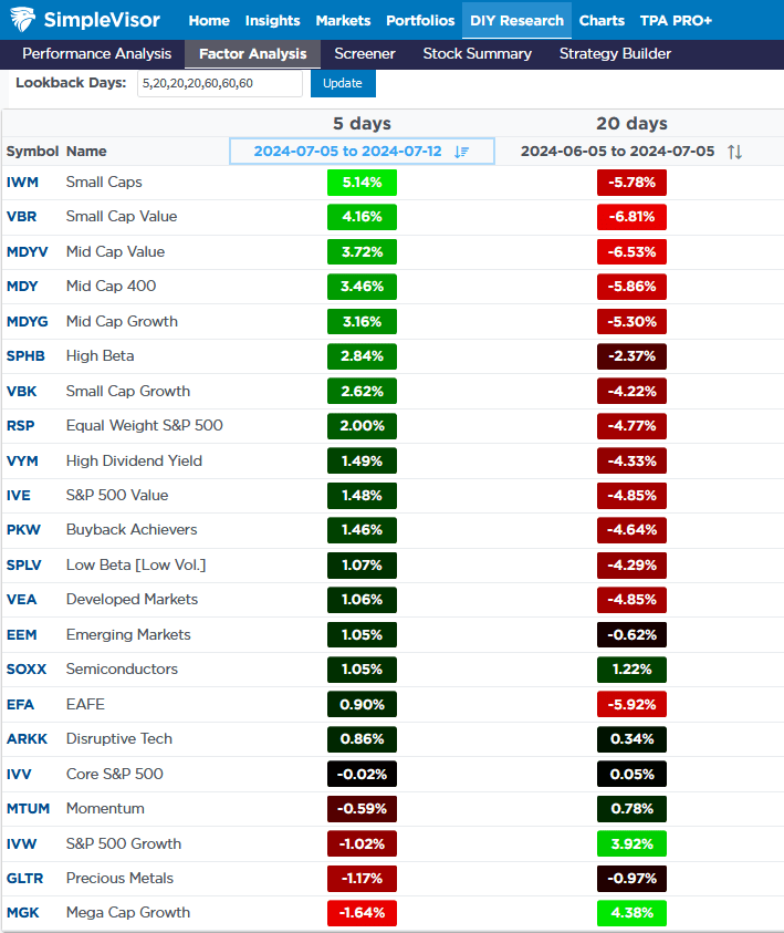
The market breadth improved last week. Per the SimpleVisor table below, small-caps, small-and mid-cap value led the way. Mega-cap growth, the best performer over the 20 prior days, was the worst last week, down 1.64% despite the S&P 500 up nearly 1%.
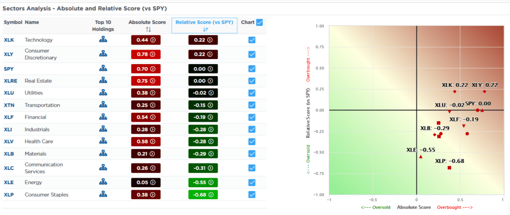
The better breadth can also be seen in the second graphic. Technology and consumer discretionary are not as overbought on a relative basis as they were. Furthermore, the graph on the right shows every sector has a positive absolute score. Additionally, the distance between the highest and lowest has narrowed.
Tweet of the Day
More By This Author:
Fed Rate Cuts – A Signal To Sell Stocks And Buy Bonds?
The Credit Widening In The Coal Mine
Put Option Hate & The Need For Insurance


Comments
Log in or sign up to join the conversation.