
Market Breadth Improves Amid Massive Rotation
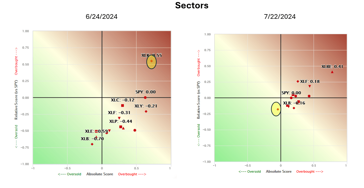
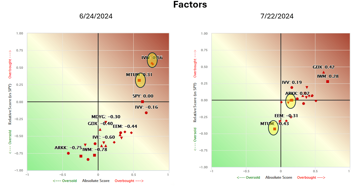
To show the dramatic shift in market breadth, we compare the SimpleVisor Absolute/Relative sector and factor analysis from yesterday to one month ago. The top graphs show that technology (XLK) was the only sector with a positive absolute and relative score a month ago. Today, every sector except technology has a positive absolute score, and most have positive relative scores. Consequently, XLK is now the most oversold sector. The factor graphs are similar. A month ago, S&P 500 growth (IVW) and Momentum (MTUM) were the only factors overbought on an absolute and relative basis. Today, MTUM is the most oversold factor when using both measures. IVW is close to fair value.
The two important takeaways are the massive market rotation from large cap and tech to small cap and value and the improving breadth. Regarding the market breadth, note in both graphs how much closer every sector and factor is to each other. This grouping tells us the sectors and factors are more aligned technically than they were. However, the market’s breadth could worsen if the rotation toward value and small caps continues. Furthermore, it could revert to prior conditions.
What To Watch Today
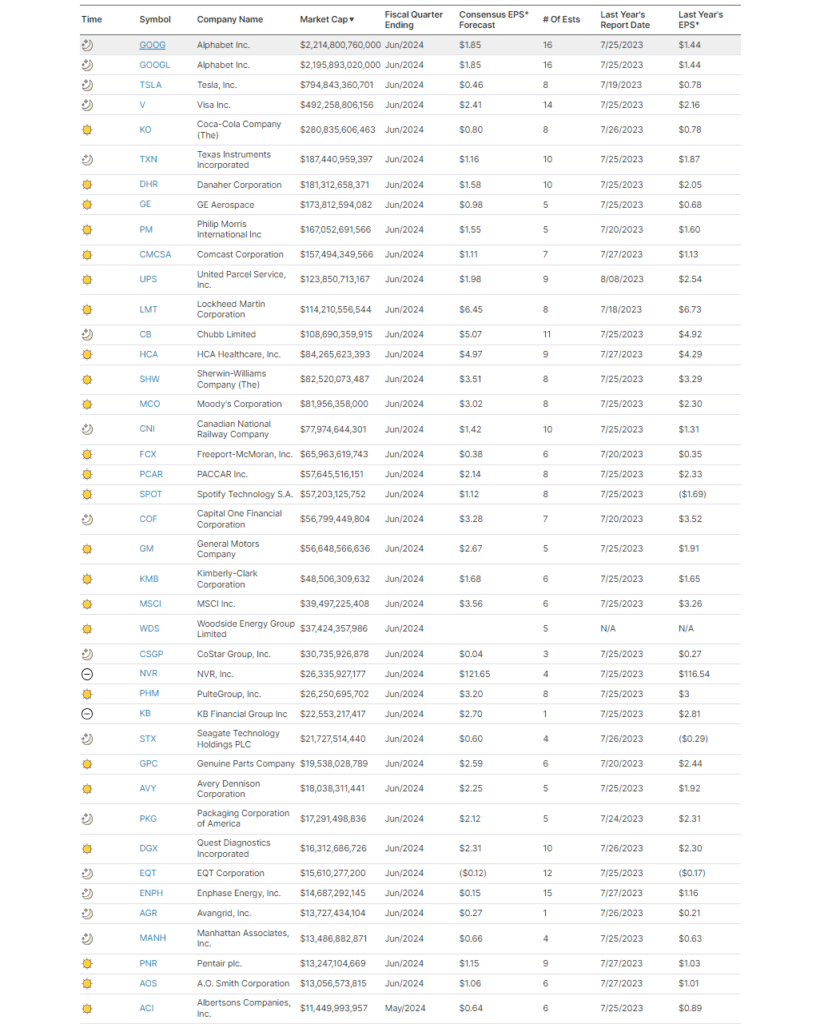
Earnings
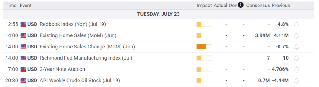
Economy
Market Trading Update
Well, that didn’t take long. As we noted yesterday, small caps dominated the market last week. However, that changed on Monday, with the “Mega-caps” stocks roaring back to life and volatility dropping sharply. Such is seen in the market’s heat map.
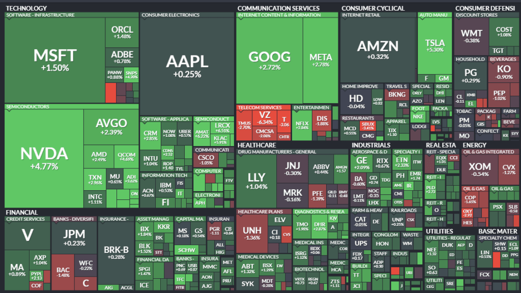
The quick return to the previous leaders is not surprising. As we discussed in yesterday’s post, “Can Mega-Caps Continue Their Dominance,” nothing has derailed that trade currently. These stocks provide a lot of liquidity for portfolio managers and hedge and pension funds. They also provide the bulk of earnings growth for the entire market. Furthermore, they are the biggest buyers of their shares.
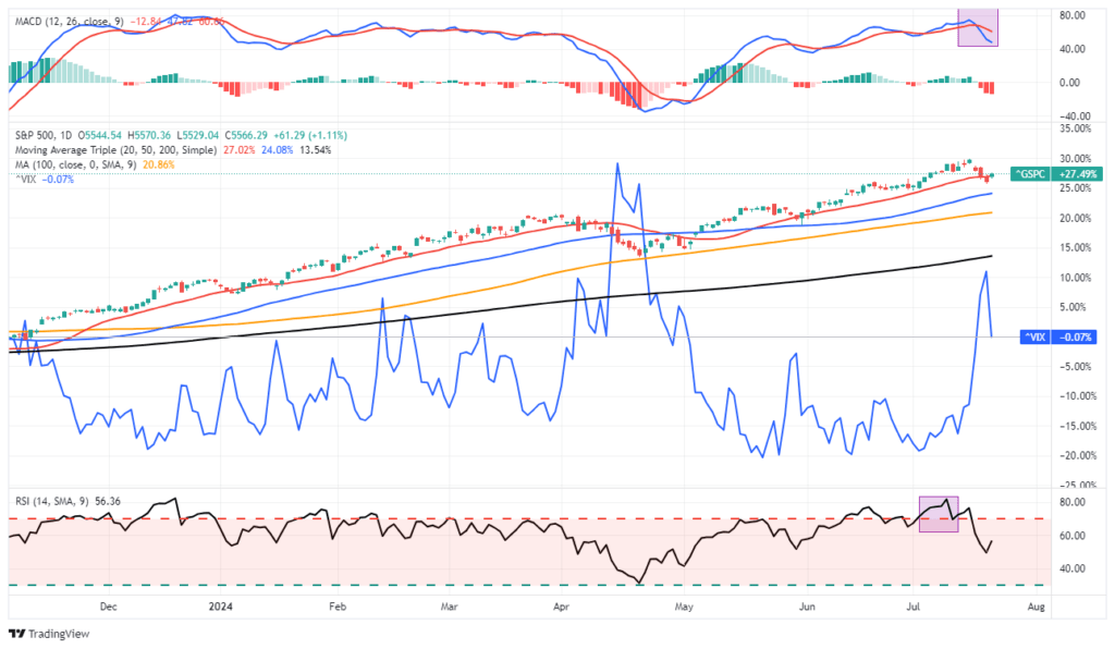
The good news is that the market regained the 20-DMA, which negates the break on Friday. So far, this is a successful retest of support and suggests the bullish trend remains intact. With volatility declining, a return to previous market highs would be unsurprising. However, the market remains on a short-term MACD “sell signal,” which may limit any upside to the market in the near term. Given that we took profits out of holdings last week, there is not much we need to do currently. However, we are watching closely for any further cracks that suggest a corrective process is continuing.
(Click on image to enlarge)
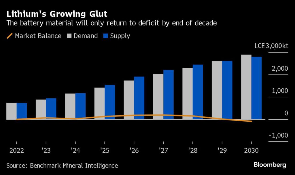
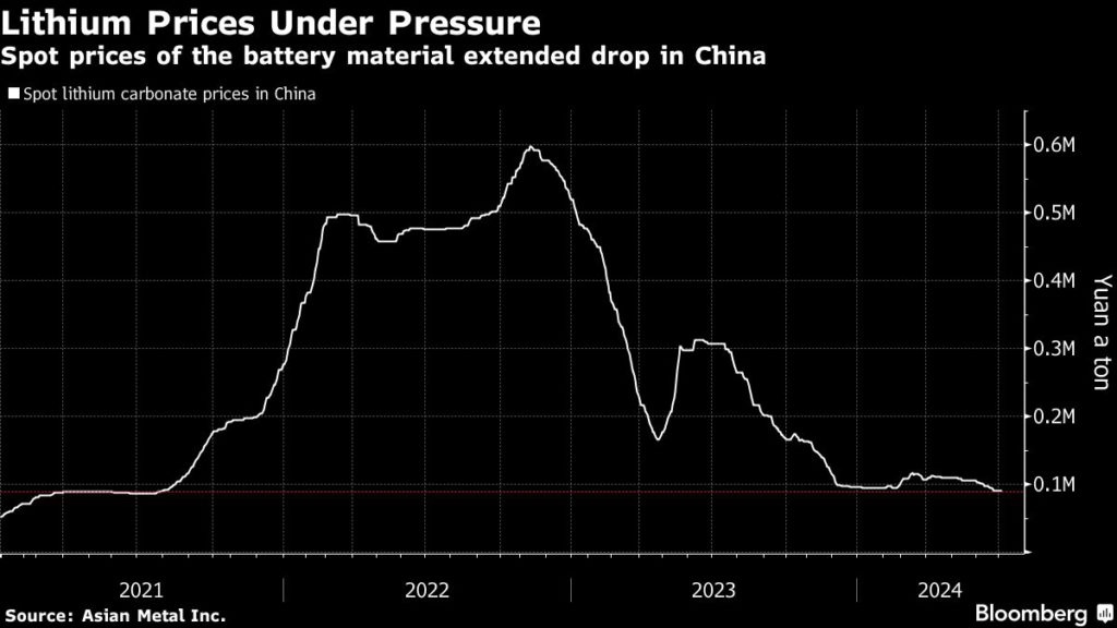
Lithium Prices Languish
Mining.Com wrote a telling article about the state of lithium and lithium producers- With no recovery in sight, lithium prices force miners to reevaluate output. The article talks about the growing glut of lithium in the market. The first graph below shows an expectation that the lithium supply will exceed the demand until 2029. As a result, lithium prices are declining alongside the share prices of lithium producers, as we share in the second and third graphs.
While the article depicts a case for lower lithium prices, it also points to an important factor that may argue against that. Specifically, as lithium prices fall, so does the profitability of lithium miners. Consequently, they invest less in future production to help bring supply back into balance. Per the article:
A prolonged period of low lithium prices could “trigger a renewed wave of mine supply cuts and project delays,” said Alice Yu, the lead metals and mining research analyst at S&P Global Commodity Insights.
The article offers that coming earnings reports may guide how miners are reacting to the supply glut.
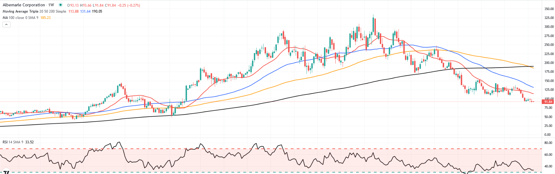
Clearer indications of the intentions of some top miners may be revealed in the coming weeks with the release of quarterly production reports or earnings. The insights from Pilbara Minerals Ltd., Mineral Resources Ltd., Albemarle Corp. and Arcadium Lithium Plc may provide clues on what the supply response might look like.
(Click on image to enlarge)
Yield Curve Update
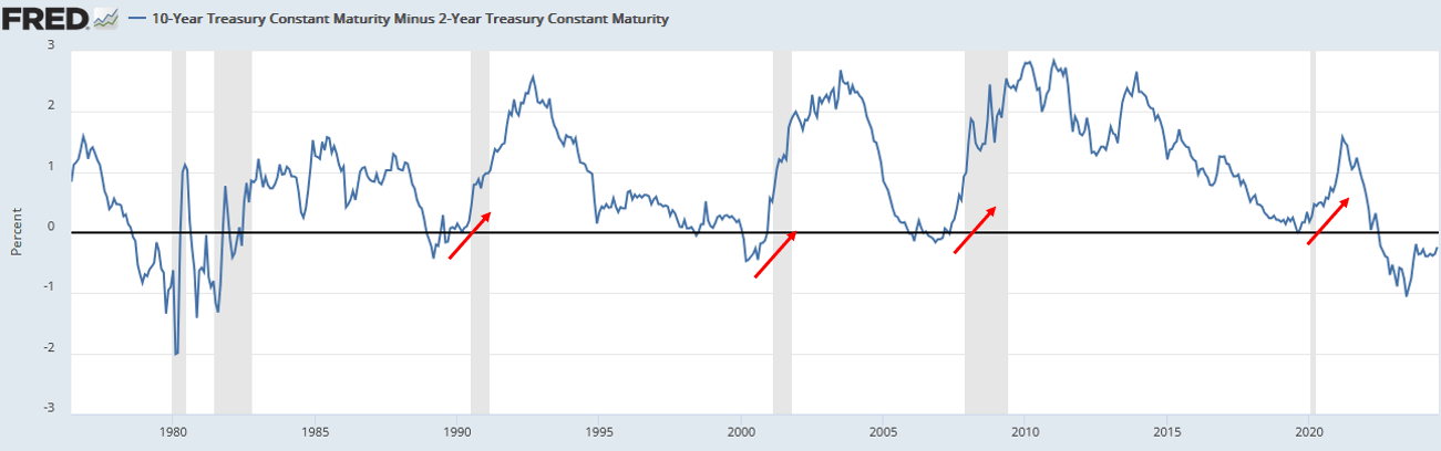
The Treasury 2-10-year yield curve has been inverted for over two years. Such is the longest since at least 1975. The graph shows that the un-inversion of inverted yield curves preceded the last four recessions by 6-18 months. However, the uninversion coincided with the onset of the two prior recessions. The yield curve is off its lows but remains inverted near levels seen before the 1990, 2000, and 2008 recessions. Hence, we need to ask ourselves whether the yield curve will uninvert.
The answer is primarily dependent on the Fed. If the market starts pricing in more aggressive rate cuts and the Fed does indeed cut rates, the yield curve would most likely uninvert. Consequently, the Fed and investors would take the odds of a recession more seriously.
Tweet of the Day
More By This Author:
The Bull Market – Could It Just Be Getting Started?Small Stocks Dominate Large Ones - What Comes Next?
Russell 2000 Explodes Higher As Rotation Takes Hold
Disclaimer: Click here to read the full disclaimer.


