
It’s times like this in financial history when predictions are all over the road and arguments get heated and prognosticators put themselves in high-risk situations no matter what they forecast. I’ll admit it, I don’t have the balls for that, and that’s when I like to hide. Why stick your neck out? You have maybe a 20% probability of getting it right and, if you do, either nobody notices or they’ll say “he got lucky”. And even if you get lucky, what does it bring you?
Also, there is value in doing what people really want more than they even realize, which is a summary of “where we’re at.”Because that makes it easier to size up the predictions that are out there by placing them in a context of a known baseline. This can be used both to size up current forecasts as well as to look at where we are in the context of market history.
Sometime after Mario Draghi made a well-known habit of saying “we will do whatever it takes,” the era of Yellen and Bernanke gave way to jay Powell’s tenure, and to his credit, which he isn’t getting a lot of these days, Powell wanted to put the brakes on, correctly anticipating that all those years of quantitative easing since the mortgage meltdown would eventually have an inflationary impact. Powell was also mindful of the fact that monetary stimulus didn’t begin with the policies addressing what happened during 2007 – 2009, but that in fact, the massive monetary stimulus had been going on continually since Paul Volcker passed the reins to Alan Greenspan, continual downward interest rate trends since 1984.
But two huge constituencies didn’t want Powell to do that. The first was Wall Street, the folks who know that easy money has more to do with the stock market than earnings because that’s how banks fund hedge managers whose desire for leverage is inexorable. The second was Trump and his coteries both near and far because they knew that an unorthodox and widely hated outsider like Trump needed to have easy money and that any blip in the market would be seized upon to devour him. Trump jawboned Powell mercilessly to keep rates down and Powell folded like a cheap camera. The SPX was still below 3,000 at that point so I would look to 600 – 700 points below where we are now as a key level.
This is my rough thumbnail commentary describing the past six years or so to describe what we are dealing with in looking at the current state of markets and the backdrop for how monetary policy is being discussed.I also find it very remarkable that all this is being put on Powell’s shoulders and none of it is being put on the legislature’s, despite deficit spending amounting to trillions annually. Greenspan used to blame congress for putting all the onus on him and never reining in their spending and congress wasn’t spending like it is now. Powell never blames congress. When he goes there to testify he sits there and lets them heap it all on him. This is something I really don’t get.
There is no consciousness at all, apparently, or none anyone wants to share, about how debt to finance debt is so institutionalized these days that it’s no longer about what debt as a percentage of GDP is; it’s that we are headed to a situation where interest cost alone could be 12% of GDP and this is simple arithmetic and is not far away and when we get there we don’t know if inflation will have been tamed. Completely extraordinary.
Ok, so I’ve shot my dumb mouth off, now let’s look at the charts.
(Click on image to enlarge)
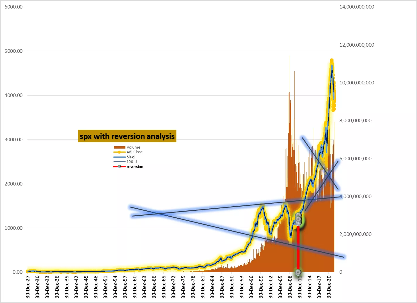
The above chart has more history than necessary to exhibit what forecasters mean when they say “the market will revert to trend”. It is just a handful of lines connecting the major tops and bottoms that have occurred since the new millennium started, along with a backdrop in tan that gives you an idea about volume trends.
(Click on image to enlarge)
_637998072810437789.webp)
The above chart is something I do a lot, which is to chart moving average percentages rather than moving average prices. That way you can compare bottoms, especially the long averages which are in gray (200-d) to get any idea when significant damage occurred over the long term and what it took to put in a bottom.
(Click on image to enlarge)
_637998073635013700.webp)
The above chart is the same as the previous chart, only it’s a couple of lenses closer in on the microscope, going back to the mid-1990s instead of all the way back to the roaring twenties.
_637998074688002632.webp)
The above chart focuses on the 200-d in percentages going back to the roaring twenties with a 200-d trend line of the percentage action. Again, you are looking at what it takes to put in a bottom at various points in time.
(Click on image to enlarge)
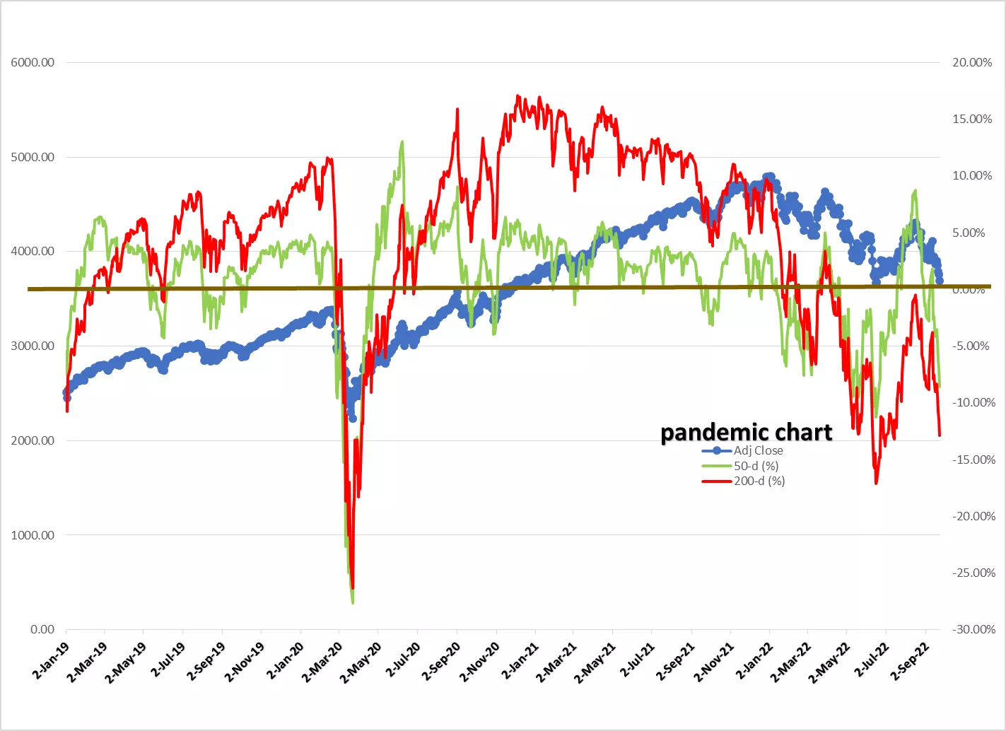
I call the above the pandemic chart because I don’t think it’s clear in most people’s consciousness how volatile things have been over the past three or four years unless you look at that knife in the belly of early 2020 when prices declined down to 2190ish. But when you use the percentage depictions of the moving averages you really see it.
(Click on image to enlarge)
_637998093557348696.webp)
The above chart is something I’m surprised you don’t see more of. Which is the fact that the decline this year has been very orderly and steady up till July when it broke out of the channel. Now it’s back down to the top of the channel and it’s 50/50 if it goes back in or bounces. If it bounces, that bounce could be significant but not necessarily something that retrieves bullish proportion, even if it’s quite large.
(Click on image to enlarge)
_637998093560786382.webp)
Here’s another way of showing that same channel this year as shown in the previous chart, only instead of using a channel, using stacked moving averages in percentage terms.
_637998093564223629.webp)
Again and again you will find if you labor over stock market data the way I obsessively and neurotically do that 12-year patterns often show you that not much happens even when it seems like a lot is happening. Yet the experts will continue to drone about 9% compound annual returns over the long term. Which of course means not a hill of beans if it’s retirement time and you need to cash out during a bad speed bump. That phenomenon is a big untold story negatively affecting many people these days, especially in the bulging baby boomer demographic.
(Click on image to enlarge)
_637998093566880145.webp)
I don’t need to comment here on the above chart because my comment is already embedded on the chart in a text box. The point of the chart is to try to get inside the heads of people experiencing the great crash leading up to the great depression and why so many of them, even those who realized the huge extent of the tumult, had no idea what was coming in the 1930s. Remember, the great crash and the great depression were connected, but they were not the same thing, and in between you had a huge wave of bank failures. It took almost three years for stocks to bottom in the summer of 1932. Then it took till two years into the Eisenhower presidency in 1954 to get back to the top preceding the great crash.
(Click on image to enlarge)
_637998093572192461.webp)
One reason the above chart depicting the 1970s and 1980s is important is because it embraces the transition from Volcker to Greenspan. Another is because it shows you how quickly 50% of the market cap disappeared from the top of 1973 to the bottom of 1974. Still, a third reason to study this chart is to see how quickly the market recovered from the crash of 1987, which was by some measures bigger than the great crash of 1929. But then came the “Asian contagion” and the Long Term Capital Management hedge fund meltdown, shockwaves of which required billions in federal bailouts. After that was the smooth sailing 1990s boom aided and abetted by Greenspan's easy money and the very hot tech sector.
(Click on image to enlarge)
_637998093575786193.webp)
More By This Author:
Crosscurrents, Shocks, Surprises, Murkiness, Confusion And So On
Is A Crash Coming?
Relationships & Investing


Comments
Log in or sign up to join the conversation.