The Short-Term Uptrend Continues As Things Get Interesting

Image Source: Pexels
The short-term market uptrend looks set to continue. I have been traveling and have not been watching the market anywhere near as much as I usually do, and when I returned home I didn't watch the market because I found it so nice to be taking a break from it. But now I've had my rest and I'm ready to jump back in, and the timing is good for refocusing on stocks because things are getting interesting again.
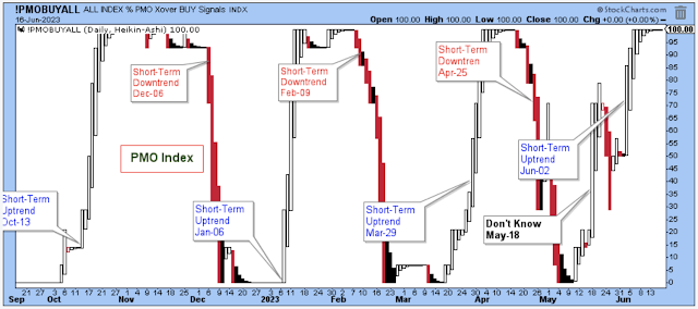
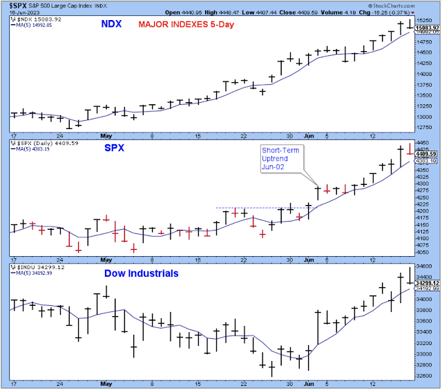
The PMO index shown above has been at the top of its range for well over a week, and when that happens we need to start watching for signs of market weakness in order to be ready for the next short-term downtrend. The first sign of weakness is to see one of the major indexes close below its five-day average. I should emphasize that a close below the five-day is only an initial sign of weakness, and it isn't a signal that the trend is changing.
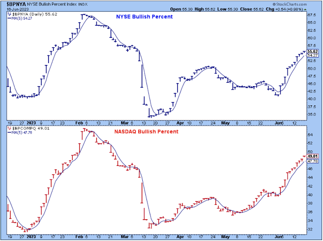
Another thing to look for is weakness in market breadth, so if one of these bullish percent indexes of the major exchanges were to close below its five-day, then it would be a signal to think about taking partial profits and to be prepared for stocks to head lower in the short-term. So far, there is no sign of weakness in the chart below.
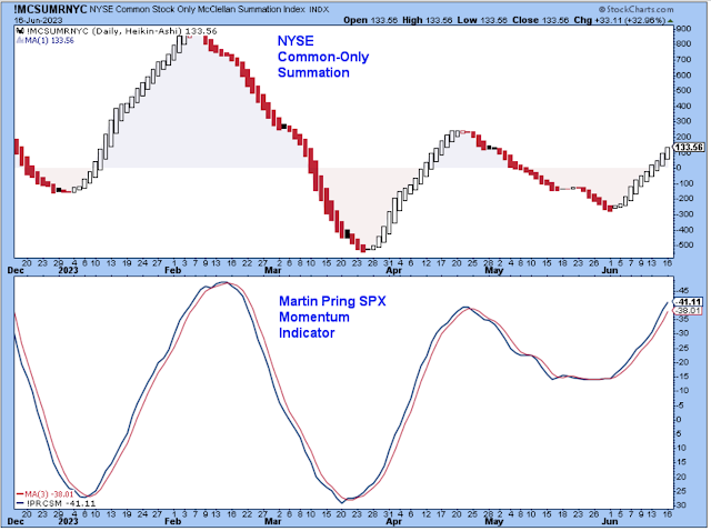
A confirming signal of the next short-term downtrend would be to see a solid red candle in this chart of the NYSE common-only summation index shown below. This summation index has been an outstanding short-term timing tool. I highly recommend using it. I've added Martin Pring's momentum indicator in the bottom panel so that the chart shows both breadth and momentum.
Over the past six months, the two indicators have been confirming each other quite nicely. This chart also shows that the late April to late May period was a choppy, difficult period to trade. So, if you are like me, and didn't do all that well reading the market during that period, this tells us why.
However, starting in early June the indicators turned upward in a convincing fashion, so our trading should be back in sync with the overall market. This is a nice chart for traders.
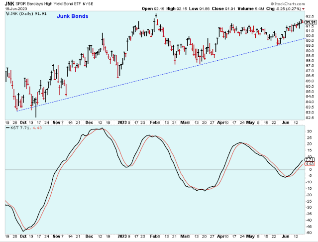
The chart of the junk bond ETF shows junk bonds trending slightly higher for about six months, and while this ETF trades higher, market risk diminishes. Or, I should say that while the ETF trades higher, the risk of a significant market pullback is a lot lower than if the ETF were selling off or trading downward. The rule of thumb is to own stocks while junk bonds are performing well.
The SPX made a very bullish move this past week by breaking above the July-2022 high in convincing fashion. If this were a stock, then I'd be a buyer. This is a good-looking chart.
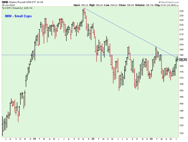
The chart above is quite bullish for stocks, but the chart below shows a market still on the fence. The small-caps have to participate in order for me to consider this to be a bull market. The small-cap ETF has rallied nicely over three weeks, but it is only up to a resistance level so far.
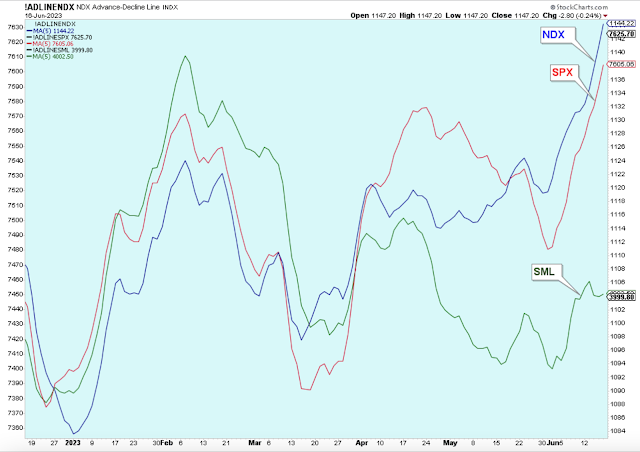
The chart below shows why the small-cap ETF has lagged the market. The advance/decline line has been poor for small-caps while the A/D lines for the large-cap indexes have been excellent.
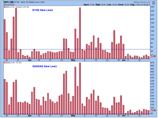
About three weeks ago, the chart of the NYSE 52-week new lows gave a major bullish signal when they suddenly dropped down to harmless levels. There can be no doubt about it. NYSE new lows being at such harmless levels is very bullish for stocks.
The level of new low for the Nasdaq also dropped down considerably, but it is still a bit elevated. Maybe not so elevated that we need to worry about a significant sell-off, but enough to remain skeptical about how long stock prices will continue to run higher.
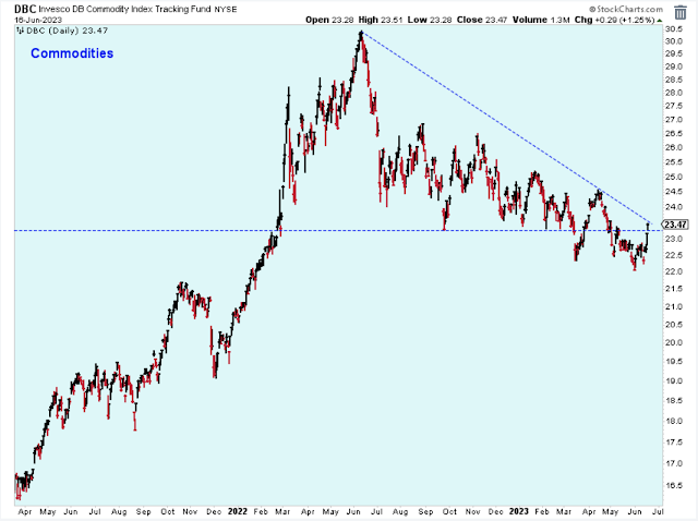
This chart shows commodity prices in decline (but off from quite an elevated level) for over a year. At first, the weakness was a sign that inflation pressures were diminishing, but then when it broke down below support early this year, it was potentially a sign that the economy was in the early stage of recession -- or maybe getting close.
I'm watching this chart closely to see if the commodity ETF breaks out above the downtrend, which would be bullish stocks, or if it fails at resistance, which I'd interpret as negative for stocks. This is similar to the chart of small-caps.
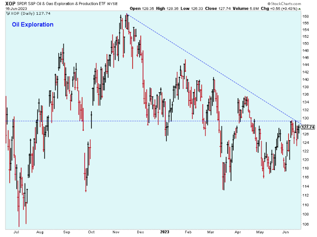
The commodity ETF shown above is dominated by the price of oil shown below, which is at resistance.
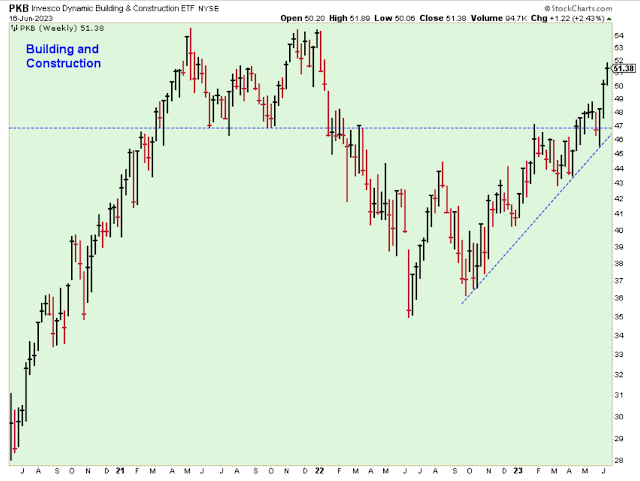
One of my favorite areas of the market is construction stocks. Many of the stocks in this group are showing excellent earnings and price momentum at reasonable valuations. This group looks like it will soon be challenging its late-2021 highs.
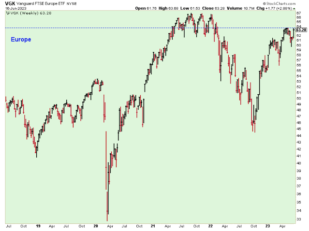
I'm back in the European stock market trade, only this time instead of being short I am long, and with only a half position. If this ETF breaks above resistance, I will fill out to a full position long.
The main reason that I am still a stock market bear is because of this chart from the ECRI. Their leading index is still well below zero, and as long as that is true, then I am a stock market skeptic.
Outlook Summary
- The short-term trend is up for stock prices as of June 2.
- The economy is at risk of recession as of March 2022.
- The medium-term trend is uncertain for Treasury bond prices as of Feb. 4.
More By This Author:
Friday May Have Started A New Short-Term UptrendUncertainty In An Uncertain Market
The Short-Term Downtrend Continues Despite The Nasdaq Rallying
Disclaimer: I am not a registered investment adviser. My comments reflect my view of the market, and what I am doing with my accounts. The analysis is not a recommendation to buy, sell, ...
more
