
Relative Rotation – Unlocking The Hidden Potential

Image Source: Unsplash
Investors seeking to optimize their portfolio returns through bull and bear markets have various options. For instance, they can shift asset allocations to and from stocks, cash, or other asset classes based on perceived risk and valuations. Hedging is another popular alternative. At times, options trades, short positions, and inversely correlated assets like bonds can provide stability during bear markets and peace of mind when bull markets get long in the tooth. Lastly, there is relative rotation.
Relative rotation, which can and should be employed with other tactics, entails shifting between different stocks, sectors, and stock factors. The strategy can add significant value to portfolio management if done well.
Part one of this article defines relative rotation and presents charts that will stun you, as they did ourselves. Part two will share our proprietary relative rotation models and tools we offer SimpleVisor subscribers. These tools allow you to spot relative rotation opportunities and take advantage of opportunities that are not well followed.
While this article focuses on two equity factors and their associated ETFs to highlight the value of relative rotation, the concepts we introduce equally apply to individual stocks and sectors.
Key Takeaways
- What is relative rotation?
- The absolute performance of a pair of stocks, sectors, or factors can be deceiving.
- The relative performance of the same two securities can vastly differ from their absolute performance.
- A trading example using relative rotation.
Relative Rotation
Individual stocks, factors, and sectors constantly move in and out of favor.
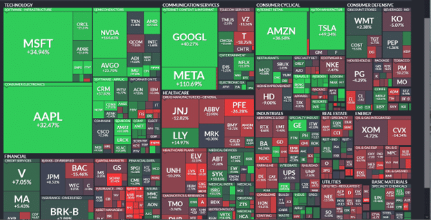
During the equity downtrend of 2022, energy and dividend value stocks outperformed the markets, while technology and consumer discretionary stocks were among the worst performers. This year, large mega-cap stocks, including technology and discretionary stocks, are taking the market higher. Most other stocks, sectors, and factors are underperforming in the S&P 500.
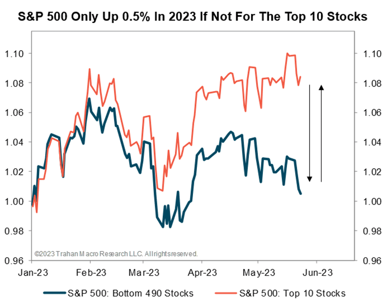
The Finviz heat map below shows a handful of stocks in bright green that are almost solely responsible for this year’s gains in the S&P 500. Most of the other stocks, as displayed in the shades of red, are flat to lower. As evidence, the equal-weight S&P 500 is lagging behind the weighted S&P 500 by 11% year to date. The second graph from Trahan Macro Research shows that the S&P 500 would be flat for the year without its top ten stocks.
To further highlight the recent extreme rotations we wrote the following in a recent Daily Commentary.
The graph below puts the wide divergence of May’s monthly index returns into context. To construct the chart, we took monthly performance changes for the Nasdaq 100, S&P 500, and the equal-weighted S&P 500 and calculated the performance difference for each combination of the two indexes. For instance, the largest performance gap in May was 11.69%. That comprises the Nasdaq, up 7.42%, and the equal-weighted S&P 500, down 4.27%. The 11.69% difference is a four-standard deviation (sigma) move! The average sigma of the three relationships (black) is the highest in at least 20 years. The only other time we witnessed divergences anywhere near May’s magnitude was in March 2020, when the pandemic wreaked havoc on markets.

Relative rotation to mega-cap tech stocks from almost all other stocks, sectors, or factors would have significantly improved your returns this year, even if your overall allocation to stocks was reduced considerably.
Visualizing Absolute Performance
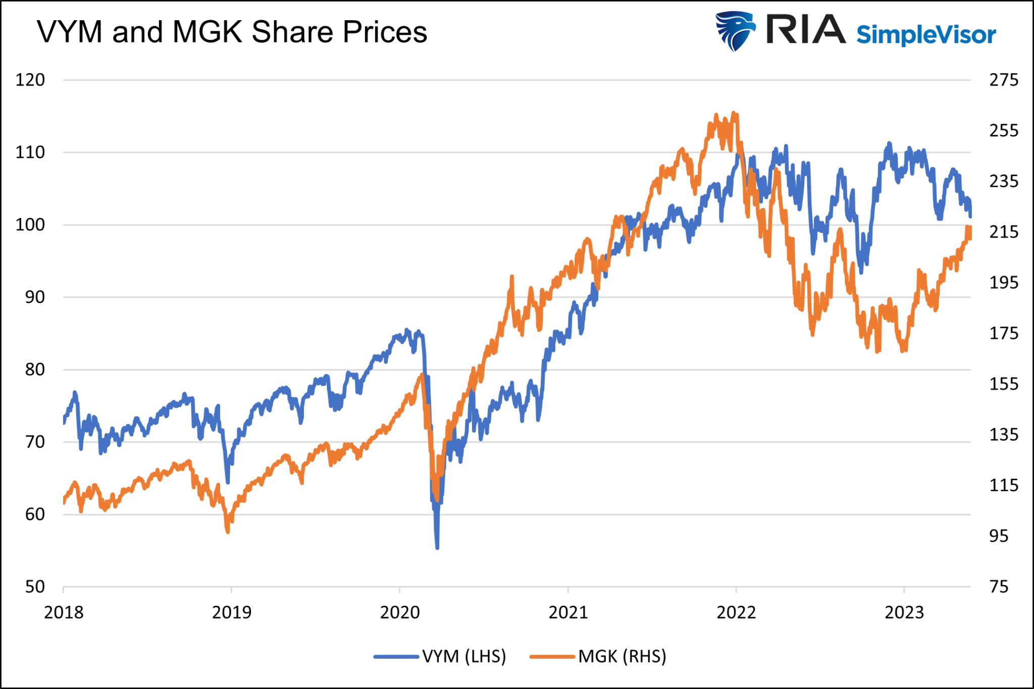
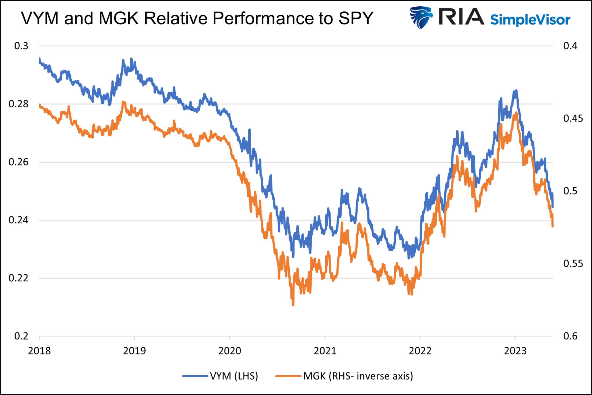
The graph below charts the prices of the mega-cap growth ETF MGK and the high dividend yield ETF VYM. Besides the last few months and other short instances, their prices correlate well.
The following graph confirms what our eyes see. The scatter plot compares daily price changes for the two ETFs since 2018. The R-squared is statistically robust at .6073. Further, the 45-degree slope of the trend line indicates that we should expect daily percentage changes for the ETFs to be similar.

Despite the visual and statistical correlation between VYM and MGK, there are vast differences in performance. Since 2018, VYM has been up 39%, while MGK has risen by 100%. The S&P 500 is up about 68% over the period. The returns do not include dividends.
The graphs above fail to show stark relative performance differences between the two ETFs.
Visualizing Relative Rotation
The following graph, which highlights the value of relative rotation, is stunning. It compares the relative prices of VYM and MGK. To make them relative, we calculate the ratio of the price of each ETF to the S&P 500 (SPY).
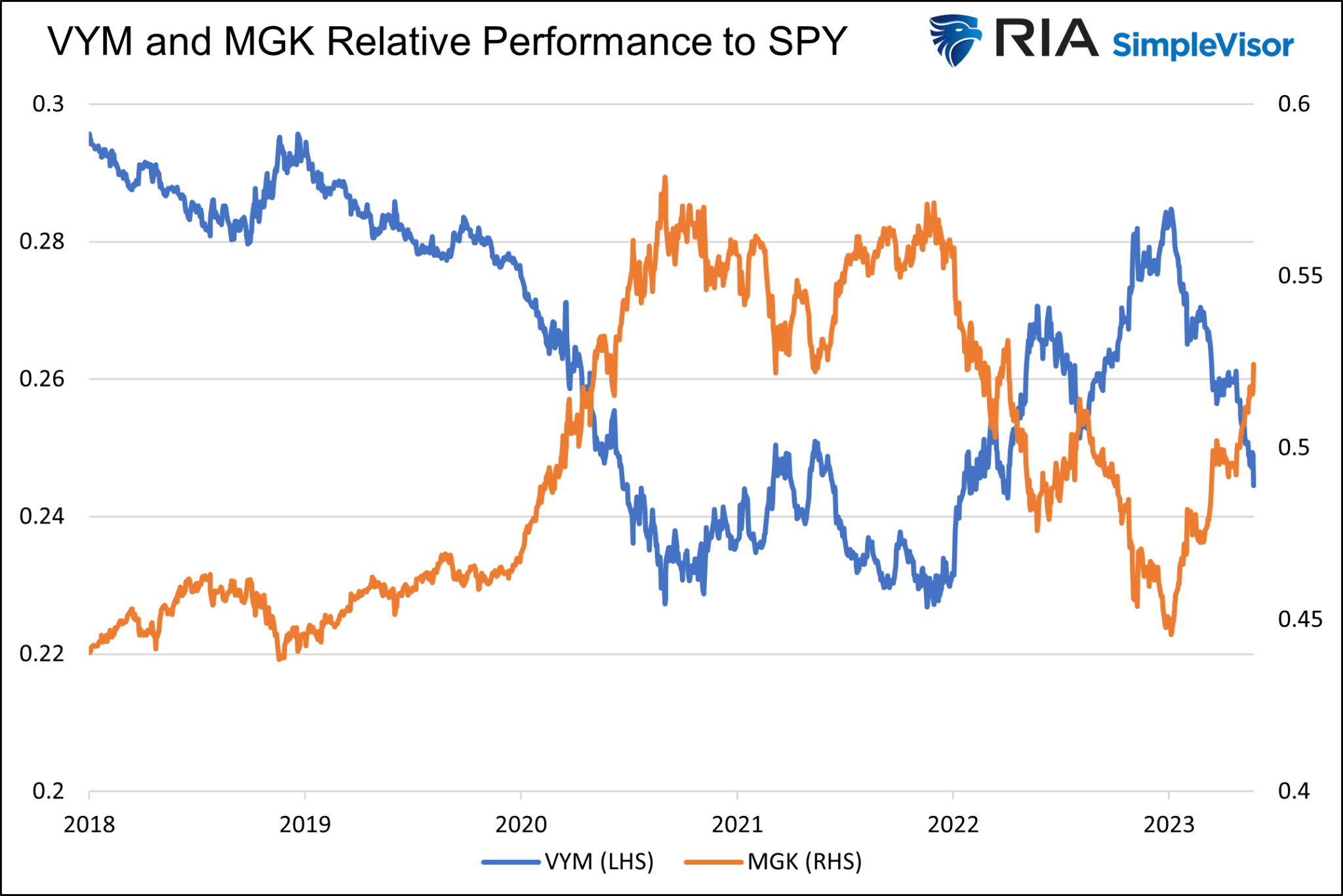
The two lines are mirror images of each other. Below we present the same data but with the MGK axis on the right-side inverse. Again, the correlation is spectacular. Two ETFs that travel on similar paths have entirely different performances compared to the broader market.
Trading a Relative Rotation Strategy With VYM and MGK
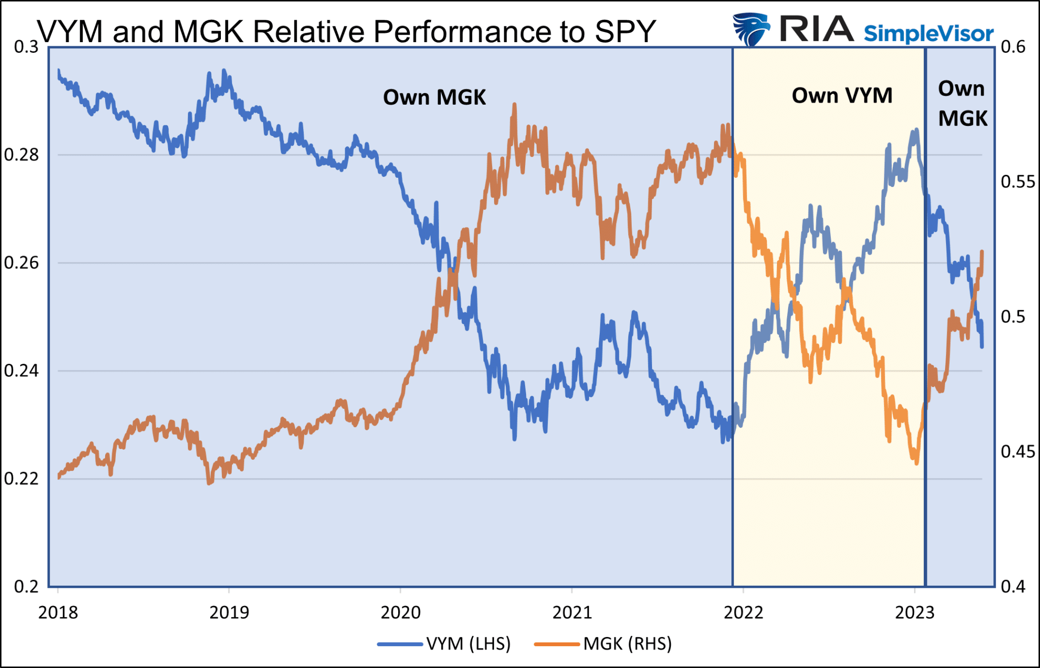
Understanding that relative relationships can look vastly different than price trends is the critical first step in allowing investors to take advantage of pairs of stocks, sectors, and factors that exhibit strong inverse relationships. In this case, and with the benefit of hindsight, an investor could easily have outperformed each ETF and the S&P 500 by switching between MGK and VYM at various points.
To help appreciate the potential outperformance, the graph below assumes we only held MGK during the periods shaded blue and VYM during the beige-toned period.
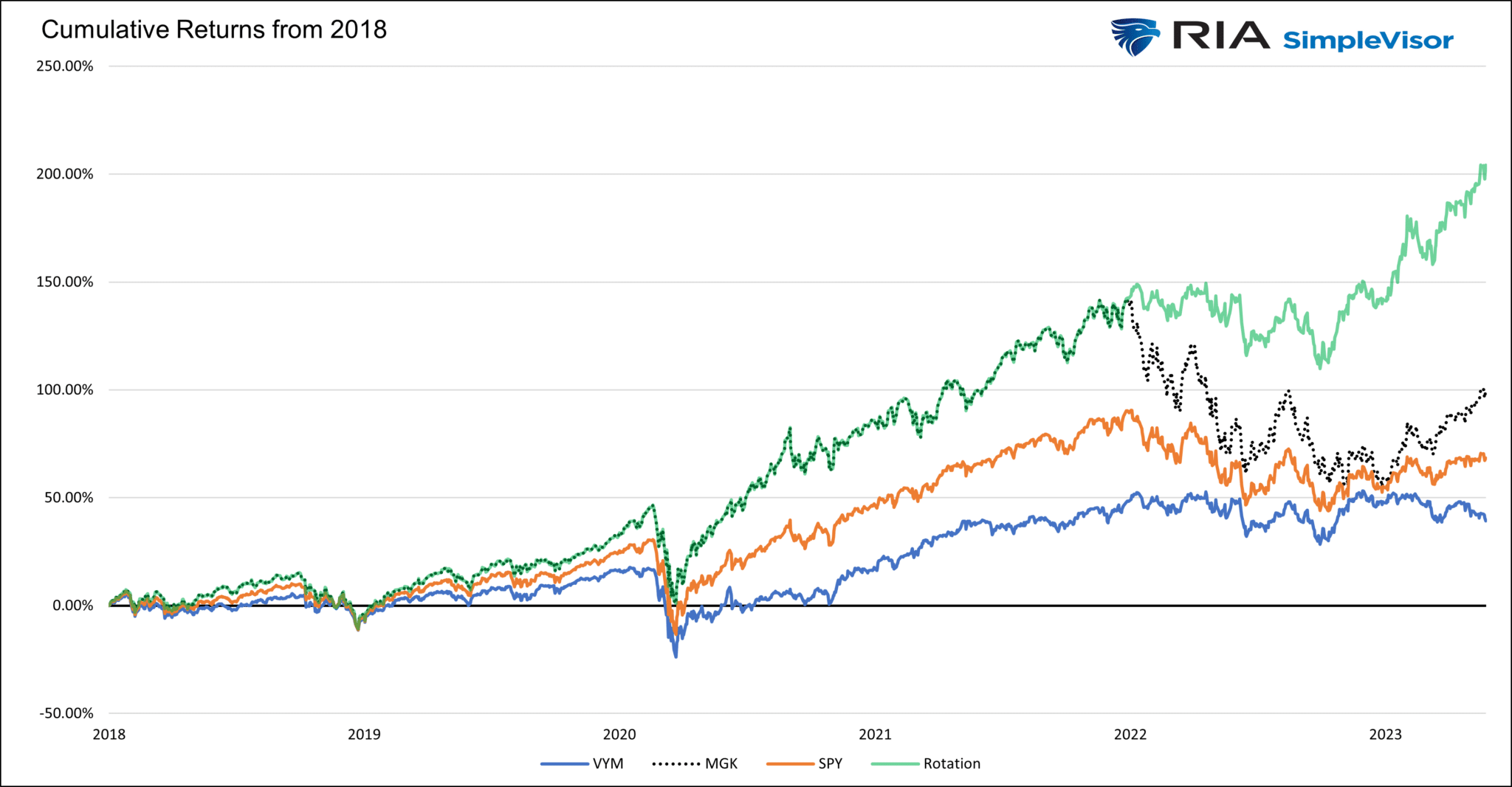
The second graph shows the cumulative returns of the strategy, which only executed three trades in five years. We could have increased the number of transactions and improved the returns, but we kept it simple.
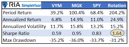
The summary table above highlights that the Sharpe Ratio, measuring return per unit of risk for the rotation strategy, is nearly double that of the three ETFs.
In our example, we cherry-picked two ETFs with a robust and durable negative relative relationship. In practice, investors should prefer several pairs of securities.
Summary
Relative stock, sector, and factor rotation can be meaningful sources of returns. It allows an investor to run with the bulls and protect from the bears more efficiently.
In hindsight, as in our example, knowing when to rotate from one holding to another is simple. In the real world, statistical relationships between pairs change over time. Further, the relative returns of pairs with strong inverse relationships do not necessarily normalize because they are statistically very extended. For these and other reasons, it can be challenging to know when to rotate and what to rotate into and out of.
While difficult, it’s not impossible. Having the right tools that measure relationships, track their relative returns, and allow for technical analysis of the relationship can make the task manageable.
More By This Author:
CBDC - Navigating Pros And Cons To Ease Apprehensions
Headwinds To Lower Bond Yields
Risk And Return Imaging
Disclaimer: Click here to read the full disclaimer.


