
Some More Correlations On Mass Shootings In The United States
Read Part 1: Some Time Series Data on Mass Shootings
Estimating through end-May, count regression (negative binomial, maximum likelihood):
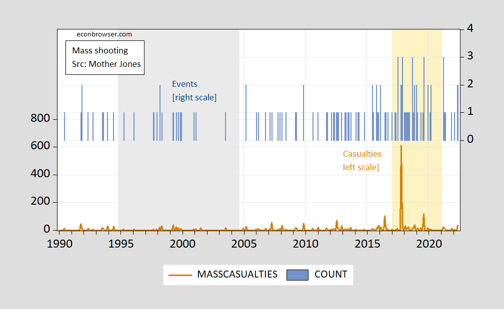
Figure 1: Mass shooting casualties (killed+wounded), left scale (brown), and mass shooting events (blue bar, right scale). Gray shading denotes assault weapons ban. Orange shading denotes Trump administration. Source: Mother Jones database.
We can analyze correlations using regression analysis (negative binomial for casualties, Poisson for events).
casualtiest = –1.72 – 0.72 bant + 1.21 trumpt – 0.14 bident +0.00001popt
Adj-R2 = 0.022, SER = 32.6, NOBS = 389. Bold denotes significance at 10% msl, standard errors corrected for overdispersion (GLM option in EViews).
For number of mass shooting events, count regression (Poisson):
eventst = –5.27 – 0.55 bant + 0.55 trumpt + 0.014 bident +0.00001popt
Adj-R2 = 0.100, SER = 0.565, NOBS = 389. Bold denotes significance at 10% msl, standard errors corrected for overdispersion (GLM option in EViews).
Population for April, May extrapolated using previous year’s worth of population data (in log first differences).
Disclosure: None.


Can someone please explain what this means in lay terms?
Read his earlier post. The charts conclusively show that each year under the assault weapons ban, 71% less people were injured or killed. In contrast, in each year under the Trump administration, total casualties were 145% higher. Quite shocking!
https://talkmarkets.com/content/economics--politics/some-time-series-data-on-mass-shootings?post=357048
It looks like the blue lines are the number of mass shootings. The orange lines are the number of people killed in those shootings.
Next look at the grey shaded area - that covers the 10 years that the assault ban is in place. It looks like there was a significant drop in both the number of mass shootings, and the number of people killed.
Lastly, look at the orange shaded area - that covers the Trump years, which show a large increase in both attacks and number of casualties. I wonder what could possibly account for this increase during those 8 years, other than Trump himself? Perhaps all those mean tweets had a far greater impact than people realized. Hate does spread and he certainly made it "okay" to say such things.
#Trump did not kill those people. Saying mean tweets, even encouraging violence which he did from time to time, does not force anyone to pick up a gun and kill people. Only crazy people do that.

So how do you account for the massive increase during the Trump years? The last year of which there were none only because everyone was on lockdown. Bad economy? Nope, the Trump years were booming. Hate spreads and Trump fueled it in every which way.