Just How Bullish Gold Stocks’ Strength Really Is?
Today’s analysis is posted a bit later than usual, but there’s a good reason for it. I wanted to check today’s relative performance of gold, silver, and mining stocks, as it seemed to me that we might see topping confirmations. And we did. During the beginning minutes of today’s (Mar. 24) session, the silver price shot up (SLV is up by 2%), while gold moved higher just somewhat (GLD is up by 0.41%), and gold stocks are underperforming (GDX is up by 0.23% and GDXJ is down by 0.08%). This is a very short-term indication that the top is likely in, or at hand.
Having said that, let’s discuss the relative valuations in greater detail, as – given the lack of significant directional action in the recent past - this is the most informative part of the current trading landscape in the precious metals sector.
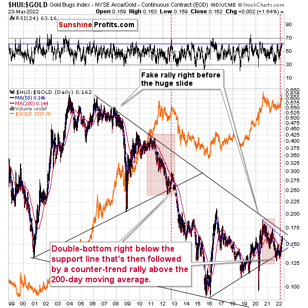
Gold stocks (GDX, GDXJ, HUI Index) have recently been quite strong relative to gold. Ok, but is this necessarily bullish? It might be until one considers the fact that we saw the same thing at the 2012 top! This changes everything, and it does so because the links between now and that top are almost everywhere: in gold, in silver, in gold stocks, and even in their ratios.
And it is the gold stocks to the gold ratio that I would like to start with today. That’s the flagship proxy for the relationship between these two markets.
As it turns out, gold stocks to gold ratio are behaving almost identically as they were behaving at the 2012 top in the precious metals sector.
In both cases, the ratio moved below the rising medium-term support line, then formed a double-bottom below the line, and invalidated the breakdown, which resulted in a counter-trend rally. The rally ended shortly after the ratio moved above its 200-day moving average (marked with red). That’s what happened recently. What happened next in 2012? The decline not only continued – it accelerated!
Consequently, the recent action in the ratio is not really bullish. In other words, the fact that gold stocks were recently (in the short run only) strong relative to gold doesn’t make the medium-term outlook for the precious metals sector bullish. Conversely, it remains bearish.
Interestingly, the ratio itself moved to its declining resistance line, indicating that the corrective upswing might already be over or almost over. We get the same indication from the RSI indicator. It’s not above 70, but in the case of most local tops, the RSI didn’t have to move above 70. It just moved to more or less the same levels – I marked it with a horizontal, blue line.
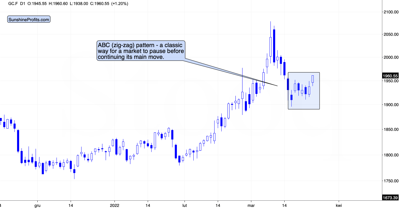
On a short-term basis, we see that gold price moved higher, but it’s well within what one might consider normal during corrections. In fact, gold appears to be forming a classic ABC (zigzag) pattern. This – along with today’s outperformance of silver and underperformance of mining stocks – is an indication that the big decline is about to continue.
Disclaimer: All essays, research and information found on the Website represent the analyses and opinions of Mr. Radomski and Sunshine Profits' associates only. As such, it may prove wrong ...
more


