

Image Source: Jakob Owens on Unsplash
My wife took a little while to get ready for dinner last night, while I often take a whopping four minutes.
So, while I was waiting and trying to get my dogs inside, I read an article over at Yahoo! Finance that effectively supports my thesis on extraction and deeper concerns about the U.S. financial/political system.
Four out of every ten Boomers and more than 25% of Gen Xers say they plan to start collecting Social Security at 62, the earliest possible age, even though it permanently slashes their benefits by 30%.
When asked why, the top answer wasn’t something like “I need the money right now.” It was worse. They said, “I don’t think it’ll be there when I need it in the future.” As in, Social Security itself is the problem and not their own financial conditions.
Tens of millions of Americans are willing to take a permanent pay cut on the single largest retirement benefit they will ever receive because they don’t trust the system to keep its promise. This is a fast-approaching train wreck. Let’s do some quick math.
The “magic number” for what people think they need to retire comfortably has increased to $1.46 million. That’s up 15% from 12 months ago -- and four years ago, that figure sat at $1.25 million. If we annualize that increase, it comes out to roughly 3.5% per year, which is barely half the actual rate at which the dollar is losing purchasing power.
The target is moving faster than people think. They’re aiming at a number that will be obsolete by the time they hit retirement.
The government could try to fix the financial situation of Social Security. Cutting benefits won’t work because of voters. Raising the retirement age would boost outrage. The third strategy is to raise rates or further hike the cap on taxable income for the program, but that will have an economic impact on existing workers now.
I’ve covered this multiple times. But let’s talk about the real issue, one even bigger than the retirement program itself.
We know about the fact that a smaller number of workers employed today fund the retirement of today’s older generation than they once did, creating incredible strain on a system and making it, in many ways, even with reform, unsustainable. But the real issue is that Social Security doesn’t have a pile of money in a vault. It has Treasury bonds, which are IOUs the government wrote to itself.
When withdrawals exceed contributions, which is happening right now, the system redeems those bonds, which means the Treasury has to issue new debt to pay retirees. That means every Social Security check is now, functionally, financed by the same strained debt market, repo plumbing, and leveraged hedge-fund basis trades that we’ve been tracking in the domino chains all year.
The question, "will Social Security be there for me?” is now the same question as, “will the Treasury market function in the future as debt explodes?”
People feel the gap between what the system promises and what their dollars buy. They just don’t have a name for it yet. Meanwhile, the “financial experts” on TikTok are telling retirees to take Social Security at 62 and dump it into the stock market. Which, as you can see, is having a very normal and not at all terrifying week.
Tomorrow, I’ll talk a bit about this. And while I plan to release it as the monthly article, I will be opening it up to all readers.
Now then, it's time to look at some charts.
Chart No. 1: $11.9 Trillion Vanished in One Month
In the words of John Tuld, “It’s just money… It’s made up…” The global stock market’s capitalization fell by nearly $12 million in March. No big deal. Check out the one-month moves in the circles that mark the worst declines since 2005.
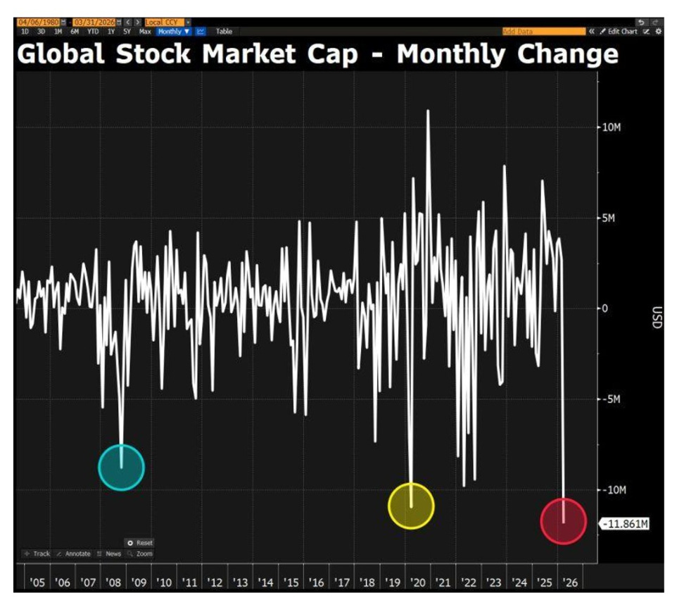
Image Source: David Ingles via Bloomberg
The first was 2008. The second was COVID in 2020. The third is right now.
I keep saying that we’re in a financial crisis, and people need to act like it. I also say that we are living in suspended animation, just moving from one crisis to the next since COVID.
You can’t just blame the war for this. It’s not like we haven’t had military problems and nuclear weapons thrust into the sea in the past 20 years. But the war acted as that final snowflake that fueled the avalanche this year.
The last two times a circle appeared on this chart, they named the crisis after it. This one doesn’t have a name yet. I think we should name it after the co-CEOs of Blue Owl Capital, but that’s just me.
Chart No. 2: The Monthly Channel Is Breaking
Here's more evidence of what I’m talking about. Behold the S&P 500 on a monthly chart going back to 2017, when we financed the Tax Cuts and Jobs Act with more short-term issuance on our debt curve.
The index has traded inside a rising channel for nearly a decade. Every major pullback, such as what was seen in 2018, 2020, and 2022, bounced off the lower trendline like a fat cat on a trampoline.
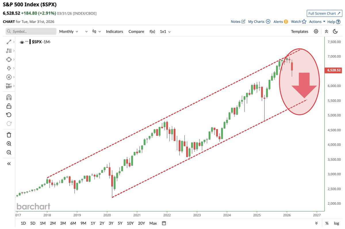
Image Source: Barchart
Of course, every event was also accompanied by sizable insider buys in real-dollar terms, as measured by the buyer-to-seller ratio.
And we also had policy accommodation, typically monetary expansion. In 2018, it was the Powell restarting QE, in 2020, it was helicopter money, and in 2022, it was a shift in policies across multiple central banks in the wake of the GILT Crisis -- and what CrossBorder Capital called “Stealth QE” in December 2022.
Right now, it is failing at the upper half of the channel and rolling over. If this breaks to the downside on a monthly close, the measured move targets the lower trendline somewhere around 5,400-5,500 -- that’s just the technical stuff.
I’m not predicting that, but it wouldn’t shock me given the current state of affairs, the questions around the carry trade, the Fed’s balance sheet shakeup, and what’s going on all around the world, that, in this credit cycle, we get there.
The chart is showing this, and I’m just the guy reading it out loud (and predicting that this sort of downside is more likely in the cards if there isn’t a sizable print in the future, but don’t worry -- we’ll have some new program at some point that they won’t call QE, as they pat us on the head and tell us not to believe our own eyes). Isn't the economy just wonderful?
Chart No. 3: Where Equity Returns Are Coming From
Here’s one from The Compound. There are four sources of earnings in this environment. This week, the S&P 500 was down 5.1%, year-to-date.
Earnings contributed +5.18%. Dividends added 0.28%. But P/E multiple compression took away 10.56%.
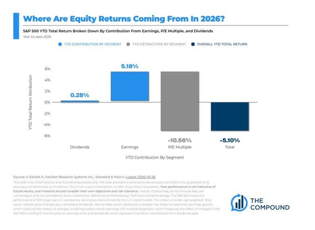
Image Source: The Compound and Daily Chartbook
Companies are making more money, and the market is going down anyway. That is not an earnings problem. There’s something bigger happening in the plumbing of the financial system, and it’s enough to lead to the slowdown in momentum.
Recall that we have previously discussed this. When multiples contract while earnings grow, it means investors are looking ahead and quietly deciding that the future is worth less than the present -- and it’s not just because of momentum, it’s because of a paradigm shift aligning with liquidity.
It’s the Waterfall Theory in motion, and very comparable to what happened in 2022.
Chart No. 4: Prime Brokers are Dumping
This chart shows trailing six-week net flows from prime brokerage books in U.S. equities. The current reading is approximately negative 2.7 standard deviations. For those of you who did not take statistics, that means this almost never happens.
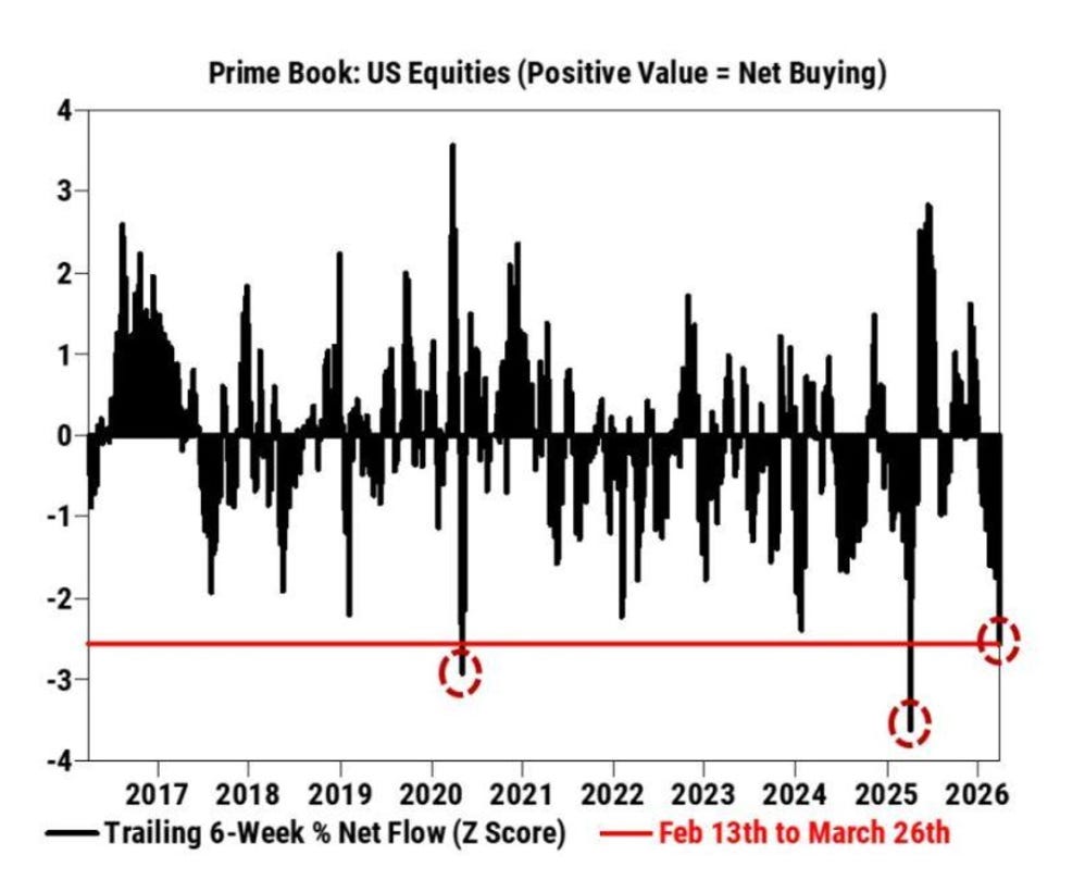
Image Source: Markets and Mayhem
The only two comparable episodes in the last decade are March 2020 and mid-2025.
This is not retail investors’ panic-selling in their Robinhood accounts. This is Goldman and Morgan Stanley’s institutional clients bailing for the exits at a pace that statistically occurs once every three to five years. We’re probably going to need a bigger print, won’t we?
Chart No. 5: Persian Gulf Oil Flows
This map by JPMorgan should be on the front page of every publication this week. It shows the physical flow of oil from the Persian Gulf and Southeast Asia to the rest of the world. See the dotted lines that say “most deliveries stop” with dates in March and April?
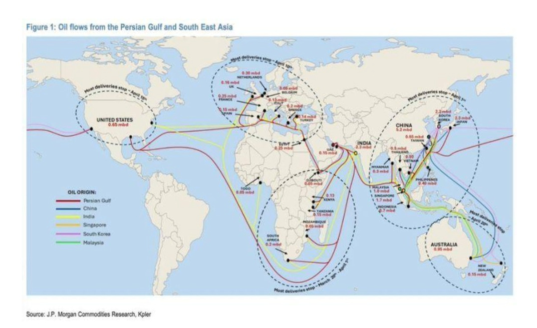
Image Source: JPMorgan
That means new tankers are being rerouted, delayed, or held.
When physical oil stops moving on schedule, the price of the oil that does arrive reprices everything downstream. And the damage is clearly done, based on what we’re seeing in diesel, gasoline, fertilizer, plastics, and ultimately food prices. This is the supply shock. This is exactly what I laid out at the start of the war.
Chart No. 6: The Energy Chessboard
Here’s the U.S. National Security Strategy on one slide. It reads like it’s a strategy outline of the game Risk or Age of Empires.
The goal appears to be to cut China’s energy lifelines, wall-off America’s economy, secure Venezuela’s oil reserves as a buffer, and defend the petrodollar. Every color is a sphere of influence.
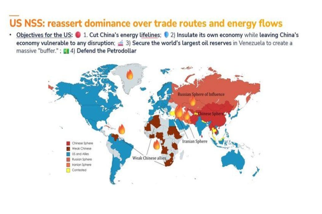
Every fire emoji is a flashpoint.
If you’ve been wondering why oil is acting the way it is, why the Strait of Hormuz keeps showing up, how China plays into this story, Greenland pops up, and why Venezuela is suddenly in every other headline, stop wondering. This is the answer.
They’re separating the hemispheres, it seems - almost like Spain and Portugal did in 1494. The money is just how they keep score.
Chart No. 7: Crude Oil Spread Goes Parabolic
This is the spread between June and December crude oil futures. For three years, it was basically a flat line. Then it went vertical. This is a “did someone unplug the chart?” vertical. The spread between May and December is still $40.
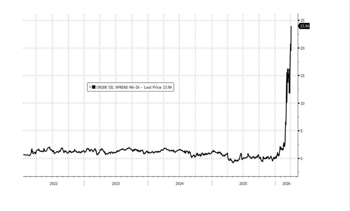
Image Source: ZeroHedge, Bloomberg
A spread at nearly $24 to $25 between June and December means the market is paying an enormous premium for oil right now versus oil six months from now.
That is called severe backwardation, and it means the physical supply is either disrupted or about to be disrupted. This chart looks like a heart monitor that flatlined for years and then spiked. When oil spreads, it is never about speculation. It is about scarcity. The question is how much the market will start to focus on the long-term now.
I talked about this in my recent video.
Chart No. 8: Treasury Volatility Is Elevated
The TLT VIX, which measures implied volatility on long-duration Treasury bonds, spiked from around 12 to nearly 18 in late February, and it has been grinding in a higher range since.
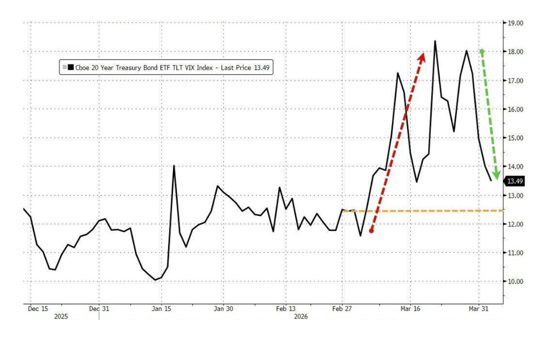
Image Source: ZeroHedge, Bloomberg
It has been sitting at 13.49, which makes it seem like everything is fine. It isn’t. Before this move, the index spent months below 12.5. The new floor is higher.
The MOVE Index has plunged from 108 to 81 over the past week, but it’s clear that we’re not out of the woods, and refinancing challenges wait on the horizon. When the bond market gets nervous, it doesn’t always scream.
Chart No. 9: CLO Equity Funds — One-Way Ticket
Let’s look at five CLO equity funds, all down between 40% and 68% since January 2025. Oxford Lane. Carlyle Credit Income. Eagle Point. Sound Point Meridian. And Pearl Diver.
These are the equity tranches of collateralized loan obligations, the first-loss layer of leveraged corporate debt.
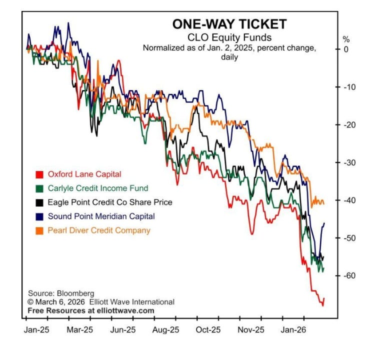
Image Source: Elliot Wave International
When they all fall in unison for over a year, it means the credit market is repricing risk from the bottom up.
This is the canary in the private credit coal mine. The canary has been on the floor for fourteen months.
Chart No. 10: Nine Thursdays in a Row
The S&P 500 has now fallen on nine consecutive Thursdays. According to FactSet and Carson Group, this has only happened twice before since 1928 -- in 1929 and in 2001.
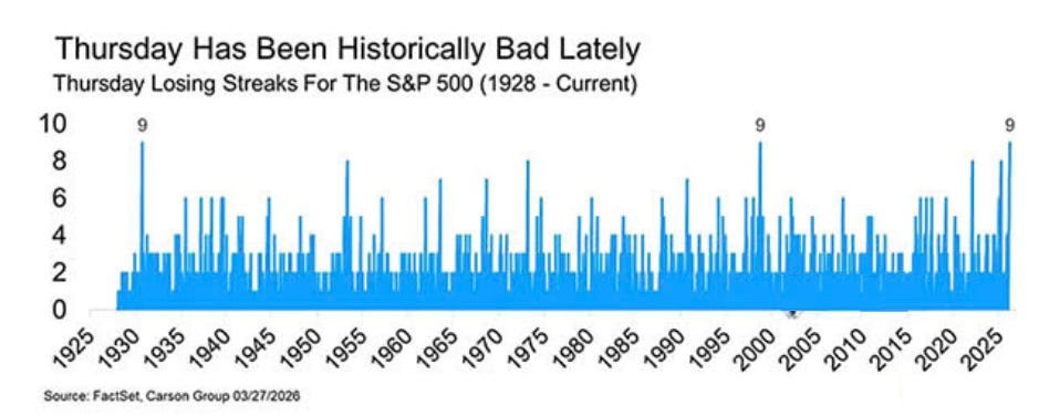
Image Source: FactSet and Carson Group
That’s not a great company to be in historically. But as I said, it’s especially disturbing given that the markets underwent a major rewire after 2008.
I don’t know why it’s Thursday specifically. It could be a weekly options expiration. It could be that funds are using any short-term weekly pop to then sell into pressure over the weekend (at least that's my thesis). It could be institutional desks trimming risk before the weekend. It could be that Thursday is simply cursed now.
Whatever the cause, a streak this long has historically coincided with structural weakness in the broader market rather than bad luck. When the pattern matches 1929 and 2001, you don’t need to know why. You just need to know they occur.


Comments
Log in or sign up to join the conversation.