
.jpg")
This week we’re doing something a little different.
You’re getting your weekly dose of charts…
Right now it’s important to pay attention to the state of the market…
Of course… this is a bit. Not a very good one… not a nice bit.
And most of you will hate this bit… but I’m just entertaining myself this morning while my wife, daughter, and her friend are at the pool…
This is going… “to bomb.”
This is already off to a great start…
Chart 1: Concentration as a Percentage of Market Cap
The AI Bubble is the term that has everyone now becoming an expert in the history of bubbles. Everyone… everywhere knows everything about the South Sea Bubble… the Mississippi Bubble… and - of course - the railroad bubble.
What’s being cited is that that the AI Big 10 stocks are sitting at 39% of US market cap… They are telling everyone that this is somehow unprecedented.
But it’s not...
Railroads in the 1880s hit 63%.
The 1920s utilities and telco peak hit 36%.
The Nifty Fifty in 1972 hit 40%.
Japan inside MSCI ACWI (ACWI) hit 44% in 1989.
The TMT bubble hit 41% in 2000.
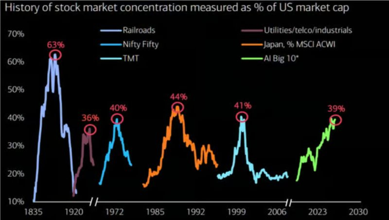
We are now at 39% with the AI complex. That means… this can still run a while, so long as liquidity remains ample and markets are willing to finance the build out…
Every prior peak ended ugly… but the market kept compounding through it anyway.
Concentration cycles are not the end of the story.
That’s why we watch momentum, every buyer constructs, leverage… and more. Because these are really hard to time if you don’t know how money flows out on the edge where the marginal buyer and seller lives…
And that marginal seller is who we are always watching…
These busts… they sometimes feel like all is great… and then…
“Come out of nowhere…”
RKO Out of Nowhere…
Anyone… anyone?
(Crickets).
Chart 2: June Investment Grade Bond Issuance Went Bananas
June is normally a sleepy month for investment grade issuance.
But it’s been very active this year.
We’re heading toward $170 billion in a single month with Nvidia (NVDA) and SpaceX accounting for the bulk of the growth, roughly $25 billion each.
Nvidia just borrowed in size against the AI capex cycle. They needed $25 billion in debt, and it was oversubscribed as the market offered… (checks notes)… $85 billion.
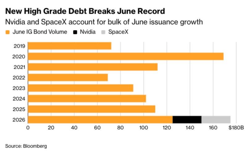
SpaceX is funding the Starlink and orbital infrastructure build.
Both are using cheap-ish IG credit to lock in long-duration financing while spreads are still tight.
I want to point out that this debt cycle is still early for the AI hyperscalers, and none of this indicates stress at the moment. This is opportunistic capital structure work at scale by the two most aggressive capex stories on planet Earth.
What matters now is that you… watch… where…
The money lands?
Chart 3: Treasury Rollover is Massive
So… where can all the stress come from this market?
I’ve highlighted the carry trade in Japan.
But I want to point out that there could soon be a major refinancing challenge, especially if the Fed raises rates while Treasury has to refinance trillions…
All while commercial real estate, AI buildouts, and other global debt attempts to refinance existing debt that was issued in the very low interest rate environment that happened just after COVID.
Let’s look at just the U.S. government part of this…
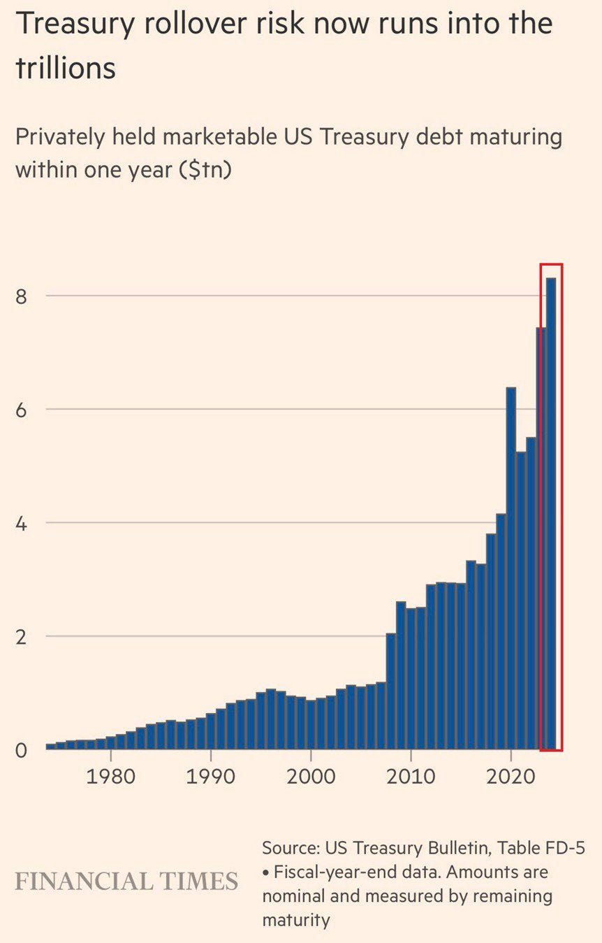
Financial Times
Privately held marketable U.S. Treasury debt maturing within 12 months has hit roughly $8 trillion. In 2000 it was about $1 trillion.
In 2020 it was about $5 trillion.
Now it sits at $8 trillion and climbing… all of that becomes a major problem as the Fed and Treasury have used this mechanism to keep economic conditions loose…
Now… every dollar of that has to be refinanced at whatever rate the market sets when it comes due. Treasury is hiding most of it at the front end through bills. The Fed is absorbing the bills through the Reserve Management Purchase program.
The wall is real and the architecture around it is real.
At some point… the pain comes…
And pain… will be…
“Sharp.”
Yeah… this is going great…
Take it away… Norm.

Nailed it!
Chart 4: Apple (AAPL) Inflation…
CNBC just dropped this and almost nobody outside of memory analysts noticed. Apple raised prices on every major product because of higher memory costs.
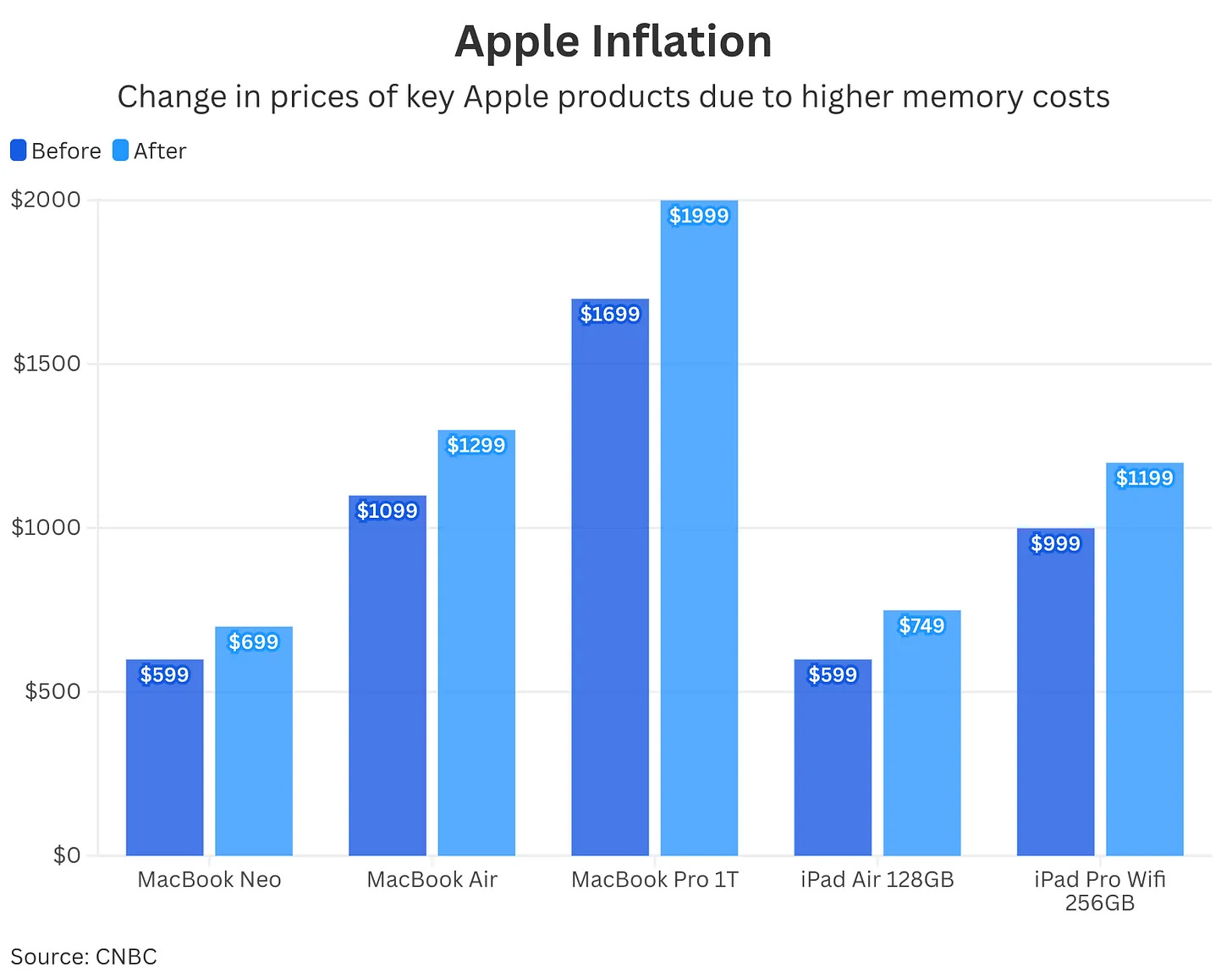
CNBC
A MacBook Pro 1T went from $1,699 to $1,999.
The MacBook Air went from $1,099 to $1,299.
The iPad Air jumped from $599 to $749.
The iPad Pro Wifi 256GB goes from $999 to $1,199.
And the MacBook Neo has increased from $599 to $699.
This is… evidence that AI is creating inflation… despite all of the predictions about the deflationary impact on labor. The cost of memory is going up… and the memory that should be going into phones is now redirected to all of this AI data centers…
The Micron earnings piece I wrote up this week is arriving at your kid's school next week as a higher checkout price.
The memory shortage is now a consumer price story.
Watch this work its way into CPI prints later this year.
And don’t be…
“Stunned” by the prices…
Man…

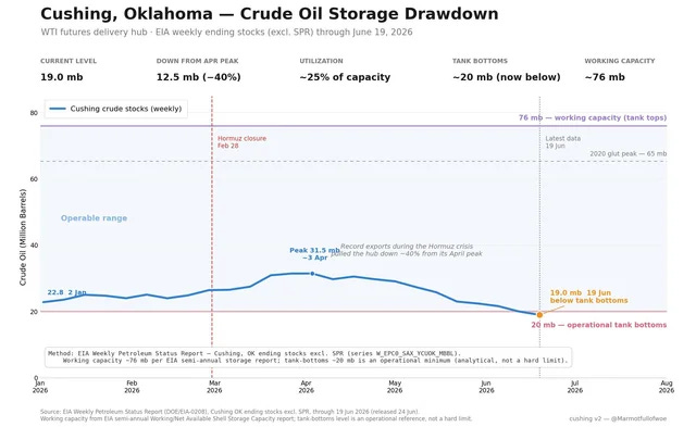
Chart 5: Hitting Rock Bottom in the Energy Space
This terrible bit… and it is a terrible bit… is because Grey Rabbit Finance posted this…
“Rock bottom”… he says… I can make terrible jokes around this…
Okay…
So…Cushing, Oklahoma is the WTI futures delivery hub.
Working capacity is about 76 million barrels.
As of June 19, 2026, the inventory sits at 19 million barrels, down 40% from the April peak and below the operational minimum of roughly 20 million barrels.
Energy Information Administration
The delivery hub for the most important crude futures contract on Earth is below its tank bottoms after record exports during the Hormuz closure.
Anyone telling you oil is fine on inventories is reading a different chart than the one EIA actually publishes this Wednesday at 10:30 Eastern.
Those numbers are hitting… Rock bottom…
ROCK BOTTOM!
…
…
…
…
…
Oh man…
I… am… bombing up here…

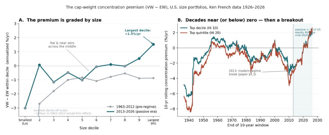
Chart No. 6: Finally… The Passive Flows Pick Up
This is the academic version of the chart I have been describing for two years.
This comes from Michael Green on June 14… talking about passive flows.
From 1926 to 2012 the cap-weight concentration premium against equal weight was flat to negative across the top decile.
You’d hold the largest names, and you’d slightly underperform the equal weight basket.
That was the consensus for 86 years.
But then 2013 hit and the modern passive era reached critical mass.
Michael Green…
The top decile premium started to break out…
Passive flows mechanically bid the biggest names.
The biggest names compounded…
The concentration became self-reinforcing… That’s how markets started to function differently than anything we’d ever seen before…
The textbook finally got rewritten in real time.
I’ll talk about the policies that drove this in our latest What Are We Missing episode.
So, it’s important that you… adjust your…
Attitude…
Accordingly.
Good night everyone.
Bless you all…
And be sure to tip your waitress…


Comments
Log in or sign up to join the conversation.