

One of the fascinating things about bitcoin is that even though the network is largely open source, data analytics are not always consistent. This makes for some interesting metrics and anomalies for crypto-analysts like myself to ponder on.
For example, data on the blockchain is objective and fairly consistent but things like volumes on exchanges and trading data will probably be different depending on where you look.
At the moment, several sites have published headlines that...

In fact, I find these headlines misleading because they are all referring to data from a single exchange and certainly not from the entire market.
Our data, here at eToro shows an entirely different story. In this graph, provided by one of our top data scientists, we can see an index that displays the level of trader shorts on the platform since the beginning of 2017.
(Click on image to enlarge)
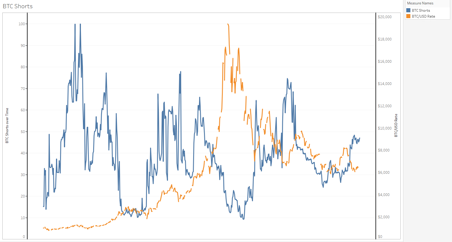
As you can clearly see, shorts are up from last month but are still not even close to the highest levels.
Today's Highlights
- Buy Italian Debt??
- Euro Head & Shoulders
- Bitcoin's Bullish Indicator
Traditional Markets
So this is a peculiar one...

Donald Trump has managed to make things even more interesting by offering to help Italy by buying their bonds. Apparently, the above offer came at his meeting with Italian prime minister Giuseppe Conte last month but I'm having trouble finding any details further to this recent article and a brief mention on Bloomberg television this morning.
With the overwhelming protectionist stance from the US President, it's certainly surprising to hear him offering to lend an American hand to a European debt issue. However, as with many things Donald Trump does, we can only ponder what the motivations might be.
Here's a graph of the Euro/Dollar to see where we're holding. The Euro has been falling since late April. Some technical chartists might see the entire month of August as a gigantic reverse head and shoulders.
(Click on image to enlarge)
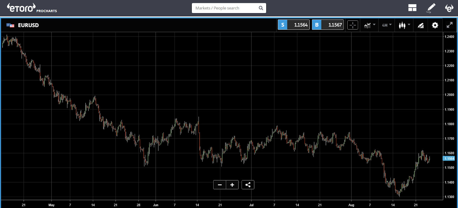
Remember, watch out for updates from the Jackson Hole Symposium that we discussed yesterday.
Bitcoin's Bullish Indicator
Though the trends of bitcoin and other digital assets always seem to me to be somewhat fundamental, there have been very specific cases lately that show that short-term movements and price points can be derived directly from the charts.
One that I've personally been toting lately is the 200-day moving average. A favorite of technical chartists in the finance world that has recently proven significant for bitcoin.
Today, I'd like to get a bit more technical. Now, those of you who are familiar with my analysis know that I usually stick to the simple support and resistance lines, and sometimes spice things up with a moving average or an RSI.
However, we are now seeing signs that the MACD indicator may in fact hold some clues as to what might happen next.
In this graph, we can see the MACD line in white and the 'signal line' in red. The theory goes when the MACD breaks above the signal line, it could be considered a bullish signal.
For your convenience, I've highlighted 5 specific times that this happened recently and was indeed followed by a significant upward movement. Of course, it has given a few false signals as well as you can probably spot.
(Click on image to enlarge)
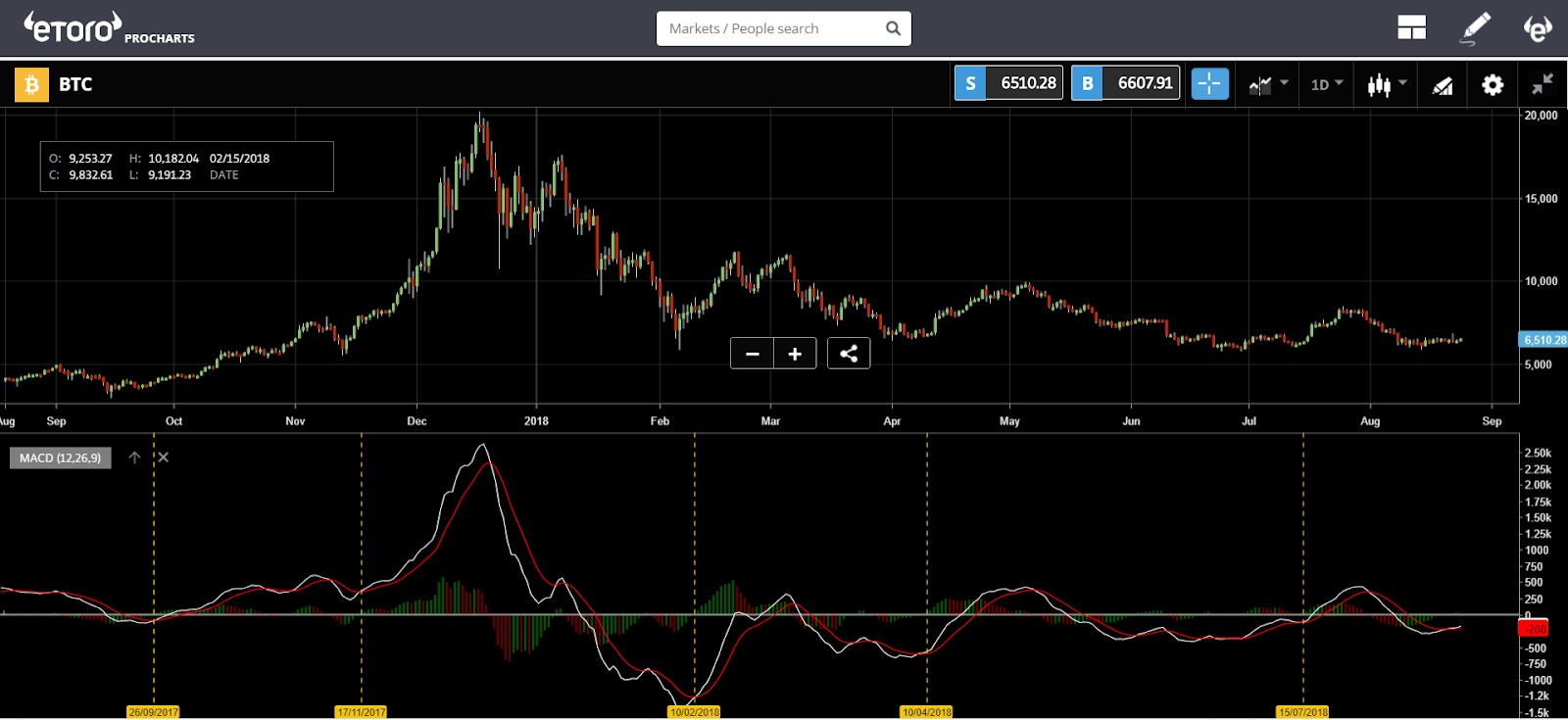
Take a look at the last few days. It seems like the white line is indeed rising above the red.


Comments
Log in or sign up to join the conversation.