


That’s the claim by two prominent names. I respectfully disagree.
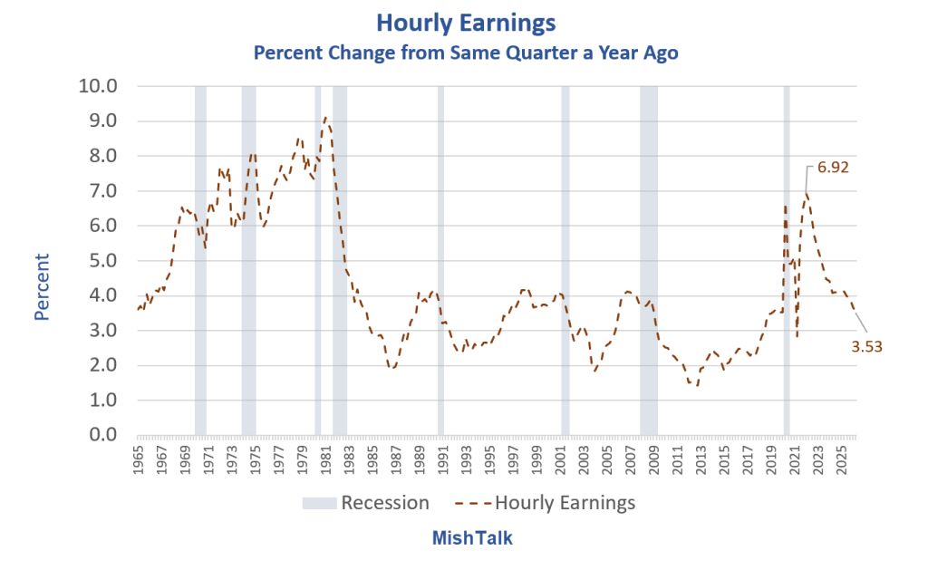
The lead chart shows the percent change in hourly earnings for production and nonsupervisory workers from the same quarter a year ago.
That change is 3.53 percent. If we use percent change from the same month ago and we use all workers instead of production workers it’s 3.15 percent.
I use production and nonsupervisory wages because the all workers data series only dates to March of 2006.
I use quarterly averages for smoother numbers.
The Claim
Statements and Brief Bios from X
Cullen Roche: “Wages simply aren’t growing fast enough to cause sustained high inflation.”
Edward Dowd: “Correct. It’s not the 70’s where we had the boomers entering the workforce.”
Cullen Roche is Founder & CIO Discipline Funds and author of Your Perfect Portfolio & Pragmatic Capitalism
Edward Dowd is founder Phinance Technologies and author of Cause Unknown: The Epidemic of Sudden Death in 2021 & 2022.
I had to stop and think about this for quite a while because I respect both of them and follow their work
My first thought was the statements sound like disproved theories about the Phillips Curve.
The Phillips Curve is an economic theory stating an inverse relationship between unemployment and inflation.
Although Dowd specifically mentioned the boomer workforce, their statements do not logically require a Phillips Curve relationship where wages or employment growth cause anything.
Yet, I still have several problems with both sets of statements.
Three Problems with Roche-Dowd Theories
This easily could be like 1970, minus the boomer workforce.
Roche’s says “Wages simply aren’t growing fast enough to cause sustained high inflation.” OK but what if something else is? And is Roche’s statement even true at all?
Overall, the discussion smacks of another disproved or at least disputed theory of wage-price inflation. I suggest that theory is backward. That is, wages are more likely to follow inflation rather than lead it.
Let’s explore those three problems in pictures.
CPI, PCE, Hourly Earnings Percent Change from Year Ago
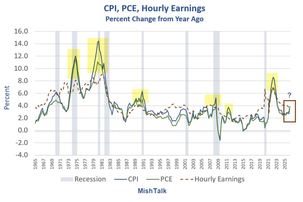
The six highlighted periods are occasions when inflation was substantially above wage growth.
CPI, PCE, Hourly Earnings 1972-1981
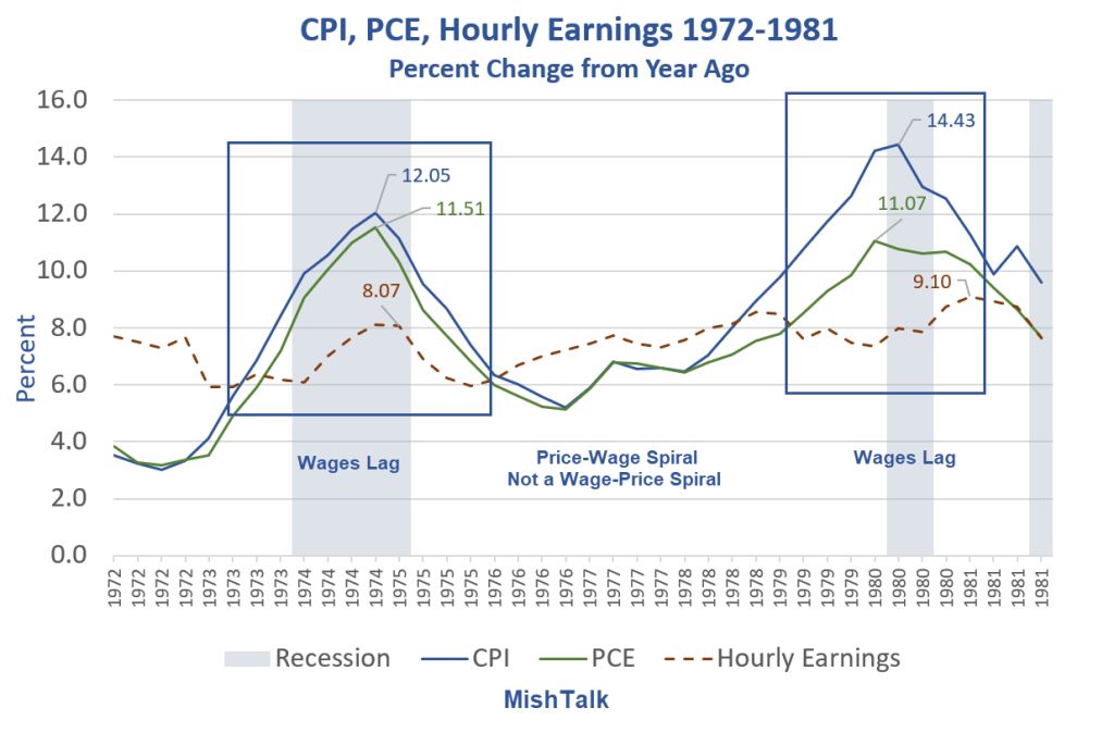
Wages lagged inflation. This is indisputable.
We had a price-wage spiral, not a wage-price spiral. The latter idea was always potty.
Neither Roche nor Dowd gave a satisfactory answer why that won’t or can’t happen again.
CPI, PCE, Hourly Earnings Percent Change from Year Ago Detail
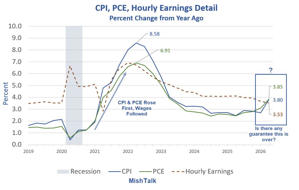
In the 2021–22 surge, CPI and PCE turned up first and more sharply.
Hourly earnings followed with a lag, peaked lower, and then declined more slowly.
This sequence matches the “prices lead, wages catch up” pattern that happened 1972-1981.
Questions of the Day
Is the strait open?
Is the oil spike over?
Are we in the declining part of another wage lag about to turn up?
What will mass boomer retirements do to PCE health care costs?
Will productivity rise due to AI or fall due to experienced workers retiring?
How much will budget compromises increase the deficit (military spending vs social spending – more of this for more of that)?
Copper demand for AI?
Utility costs for AI power?
Lumber spiking due to more tariffs? Tariffs in general?
Recession?
I do not have the answers to those questions and nor does anyone else.
Regardless, there is so much more to the inflation discussion than a wage growth is falling argument to support disinflation theories.
I am not saying disinflation is impossible. Rather, I am saying the reasons presented by Roche and Dowd are woefully weak.
Secular Low in Inflation
My take is that a secular low in bond yields is in the distant rear view mirror.
The Fed had global wage arbitrage, just in time manufacturing, and a huge internet productivity boom as tail winds.
The Fed now has tariffs, trade wars, inadequate rare earth elements, increasing medical expenses due to retiring boomers, decreasing productivity to retiring skilled boomers, and military spending as headwinds.
The major tail wind is AI productivity, assuming it happens.
The Best Argument for Disinflation
Q: What’s the best argument for disinflation?
A: A credit bust wipeout accompanied by a stock market plunge.
To understand how, let’s review some discussion points.
July 31, 2026: How Much Did AI Spending Contribute to Second-Quarter 2026 GDP?
Five charts show the AI impact for every quarter starting 2025 Q1.
AI Contribution to Overall Real GDP
2025 Q1: Undefined Due to Negative Numbers
2025 Q2: 32.17 percent
2025 Q3: 12.12 percent
2025 Q4: 222.73 percent
2026 Q1: 85.47 percent
2026 Q2: 52.75 percent
That is both unsustainable and overheating.
August 3, 2026: Copper Imports Surge the Most in 12 Years in Tariff Front-Running Move
The US copper stockpile is the biggest in history.
Construction Spending
Construction spending details are a real eye opener.
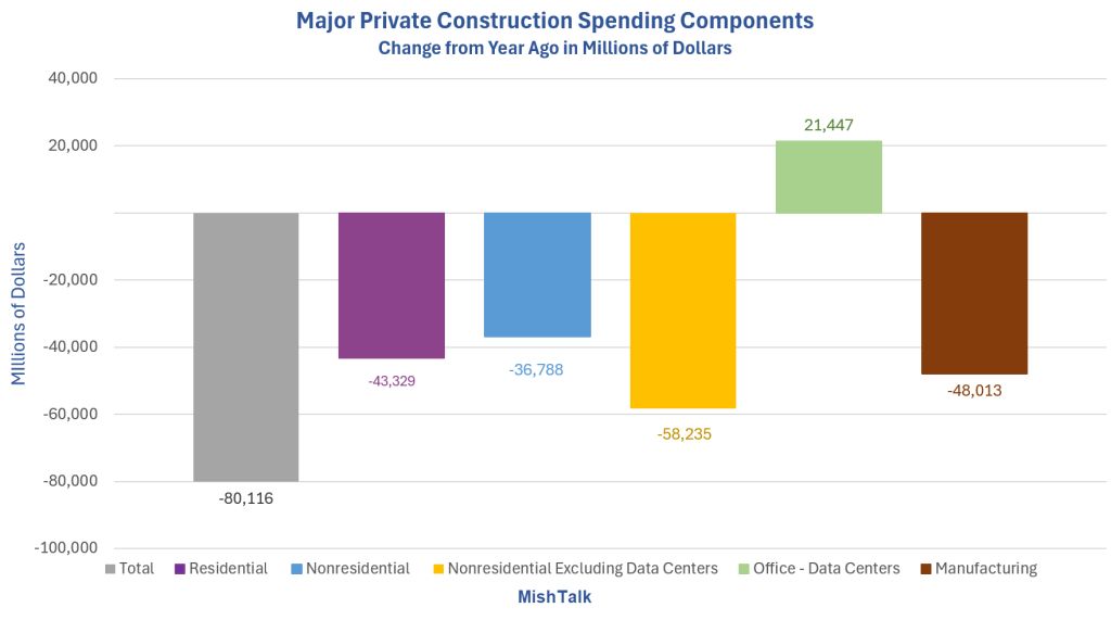
Major Construction Spending Components Year-Over-Year: Residential, Nonresidential, Manufacturing, Data Centers
August 5, 2026: What Is Leading US Construction Spending? Hint, It’s Not Manufacturing
Construction spending details are a real eye opener.
If we have a credit bust (deflationary by definition), accompanied by a stock market plunge (also deflationary to spending), we are going to have not disinflation but deflation in my book.
That is nearly guaranteed at some point, but the question is when.
And I don’t know.
A second, more important question is how long will disinflation/deflation last when it happens?
I can answer that question in general terms. The odds are strong that Congress and the Fed will attempt to inflate out of the debacle like they always do.
But this time the Fed has long-term inflationary headwinds blowing in its face. So, good luck with that.
The Blame Game
Q: Who will get the blame for the next bust?
A: That’s easy. The Fed will get widespread blame for hiking instead of cutting or perhaps for holding instead of cutting.
However, the real problem is neither the Fed nor Congressional spending. Rather it’s conditions that support unsustainable actions by the Fed and Congress.
Total Credit Market Debt Owed vs GDP
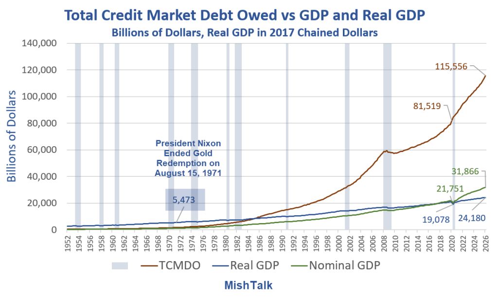
TCMDO vs GDP 2026 Q1
TCMDO: 115.556 Trillion
Nominal GDP: 31.866 Trillion
Real GDP: 24.180 Trillion
On August 15, 1971 president Nixon temporarily suspended redeemability of gold for dollars.
It turned out to be permanent. Since then, there has been no constraints on the expansion of money, national debt, or trade deficits.
Credit vs GDP Between 2020 Q1 and 2026 Q1
TCMDO rose from 81.519 trillion to 115.556 trillion, up 34.037 trillion
Nominal GDP rose from 21.751 trillion to 31.866 trillion, up 10.115 trillion
Real GDP rose from 20.709 trillion to 24.180 trillion, up 3.471 trillion
In the last six years, debt has risen 10 times faster than real GDP and the curve is accelerating dramatically.
Nixon Shock
When Nixon ended gold convertibility in August of 1971, there were no brakes on either monetary policy or fiscal policy. Fiscal deficits and trade deficits soared.
Tariffs cannot fix the problem. Nor can loose or tight Fed policy. This is why we have boom-bust cycles of increasing amplitude over time.
Asymmetrical Fed policy to prevent recessions and to fuel growth adds to the problem. So do demographics and fiscal policy.
Final Question
Q: Does the total credit chart look disinflationary to you?
A: Me either.
Yet, a temporary credit bust is the real reason to be thinking about disinflation, not wages.



Comments
Log in or sign up to join the conversation.