
Image Source: Pexels
The yield curve at the short end is almost as inverted as it was in November 2024. In fact, it’s more inverted than on January 21st, 2025, the day after Trump’s inauguration. Yet, at the long end of the spectrum, 30-year yields are back up to January 21st levels.
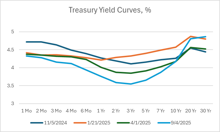
Figure 1: Yields on 11/5 (dark blue), on 1/21/2025 (orange), 4/1/2025 (green), 9/4/2025 (light blue), in %.
The downward movement since January over the 1-month to 3-year portion of the spectrum indicates that future rates are likely to be lower than imagined at the beginning of Trump’s term. Since rates drop in the 6-month to 1-year onward portion since April 1st, at least some of this is due to the tariff-induced growth drag.
The long end (30 years) is consistent with either of three interpretations: (1) belief in unrestrained deficit spending is pushing up real rates, (2) belief a browbeaten Fed will monetize, or (3) sovereign default risk has risen.
More By This Author:
The Employment Picture — Pre-August ReleaseThe Financial System: Some Graphs
Nowcasted “Core GDP” Decelerates


Comments
Log in or sign up to join the conversation.