
<< Read Part 1: What Really Drives Cyclical Inflation - Part 1
In our previous note, we broke down the main driver of cyclical inflation (credit driven demand). Today we’re going to run through how this inflationary period is historically unique and what tools we use that tell us where prices are headed next.
To review, back in 2009, even with all the QE, inflation stayed muted because there was no mechanism to get that newly created money out into the pockets of consumers. It just sat on bank balance sheets, so demand remained anemic while lots of capacity in the system sat idle.
Contrast that with what we’ve experienced over the past 18-months and the environment couldn’t be more different.
This chart from Bridgewater shows the incredibly large spread between US nominal goods demand and the real production of goods. As you can see, in 2021 demand so far outstripped available supply that this spread rose above its previous all-time highs reached in the early 70s.
(Click on image to enlarge)
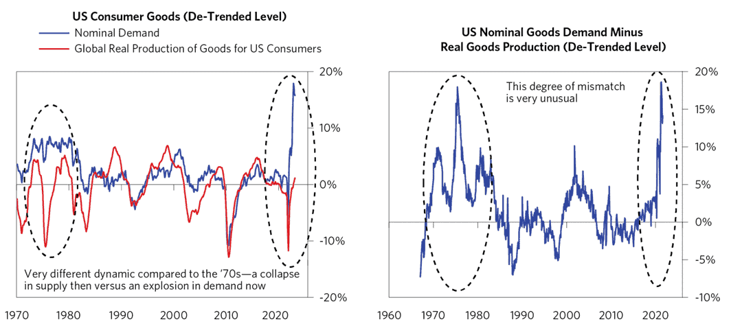
The reason for this stark difference is that this time around, the US embarked on fiscal QE in addition to financial QE. The federal government gave cash directly to consumers which led to an immediate and significant rise in spending (demand).
And while most pointed to inflation being caused by the supply chain bottlenecks from rolling COVID lockdowns in China and the Russian invasion of Ukraine… we can see on the chart above that these were not the predominant drivers of the supply/demand mismatch. It was, in fact, too much of a good thing causing demand to rise well above any available supply.
This isn’t to say that the supply side (a country’s capacity for production of goods and services) can’t play a significant role. It often does. (On the chart above we can see the effects of the 73’ Oil embargo on the US.)
But the impacts tend to be limited in duration — they have a low and slow burn over time.
The supply side of the equation can be broken down into two different groups:
- Shocks: These are pandemics, wars, and unpredictable disasters which quickly knock out a large portion of previously expected supply, causing near-term prices to rise. If this occurs with major economic inputs, such as oil and gas, their price rises can ripple throughout other prices in the supply chain. Shocks tend to be short-lived though, as higher prices incentivize economic actors to quickly adapt and find alternatives to replace the lost production (see EU energy shock from Russia-Ukraine war). So while shocks can cause large price spikes, they tend to be short, therefore having a limited impact on the longer-term inflation trend.
- Capital Cycle Constraints: Capital cycle-driven supply constraints tend to last longer while maintaining a lower, steady impact on trend inflation. An example of this is what we’re just starting to experience in the oil and gas space now. The world doesn’t have enough oil due to a decade of underfunding production. Oil production will therefore fall short of global demand in the years ahead. This will steadily increase prices, which will be a tailwind for broader inflation over the coming years.
To recap what we know so far…
- It’s the demand side, particularly credit-driven demand, that propels cyclical inflation.
- Supply shocks spur price volatility around that cyclical inflation trend.
- And Capital Cycle constraints affect price trends on a lower and longer basis.
But how can we apply this in a practical manner, in a way that helps us better navigate the market when inflation has an outsized influence on equity returns?
Verdad Cap has done some research into various business cycle indicators and input pricing as signals for inflationary dynamics (link here).
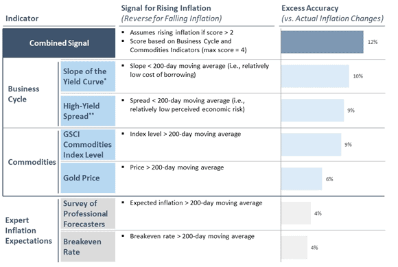
The yield curve and credit spreads are well-documented indicators of where we’re at in the business/risk cycle. And tracking the trend and rate-of-change in commodities give us a real-time look at broader demand pressures.
But we can improve on this further by including leads on economic activity such as ISM new orders, major drivers of the “wealth effect” like changes in home prices, and underlying price measures such as NFIB prices.
This is what we’ve done with our Inflation Lead indicator located on the inflation tab in the HUD (link here). (The HUD is our own proprietary data terminal that Collective members get access to.)
This indicator has a strong 12-month lead on CPI (core shown below, where the relationship is strong but not as significant).
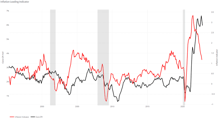
When looking at this indicator, it is the direction and rate-of-change, and not the absolute level that matters.
So viewing it today suggests we’ll see a continued deceleration in CPI over the next six months.
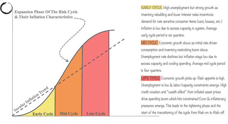
This is to be expected because of where we are in the risk cycle. We’ve already run through the Late Cycle stage and are now on the backend of the total expansion phase. It’s here where tighter financial conditions cause credit creation to collapse. As a result, demand eventually slows below the level of supply, and cyclical inflation falls.
Our MO Regime Indicator (located on the Collective HUD Growth Tab) is a composite of eleven economic, financial, and market data points. It flipped from an Expansion to a Slowdown regime this past January. And in October it entered a Contraction regime.
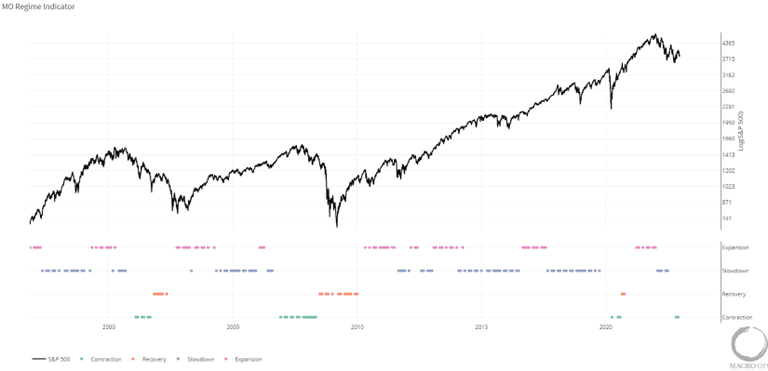
Contraction regimes not only have the poorest forward equity returns, but they’re also the regimes in which cyclical inflation falls the most. This is due to contracting credit and collapsing demand which is the result of tighter monetary policy and restrictive liquidity.
Liquidity is everything. It’s the ultimate lead on economic growth, stock market returns, volatility dispersion and so on. It’s why Druckenmiller, arguably the GOAT, constantly harps on its importance.
Earnings don’t move the overall market; it’s the Federal Reserve Board… focus on the central banks and focus on the movement of liquidity… most people in the market are looking for earnings and conventional measures. It’s liquidity that moves markets.
Our composite Liquidity indicator picked up on the shifting liquidity regime back in October 21’, when it flipped into constrictive territory. We expect it to remain there until the Fed downshifts and begins cutting rates, which is still likely a ways off.
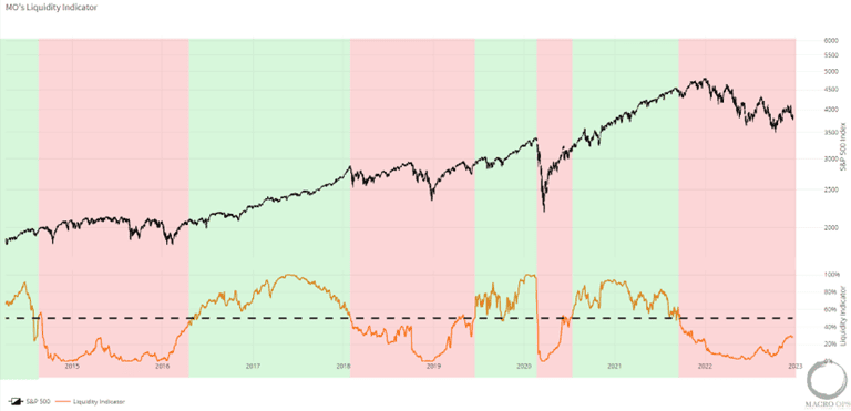
This means we should expect demand to continue to cool and therefore cyclical inflation to drop over the next year.
Again, it’s not rocket science. There’s no need to take apart CPI and try to figure out where the shelter component is going to land in 3-months time. That’s missing the forest from the trees, and is more akin to reading chicken bones.
By just understanding the larger mechanics of inflation (credit driven demand) and what makes it cycle over time, we can quite easily model out a rough picture of its trend and RoC, which for trading and investing purposes is all we need. To quote Keynes, “It is better to be roughly right than precisely wrong.”
None of this is controversial or that illuminating. This is how the progression of these cycles plays out.
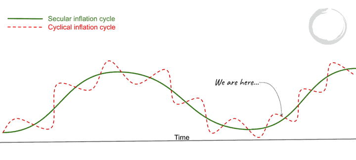
What is interesting though, is where inflation ends up settling and how it behaves in the next expansionary phase of the Risk Cycle. Does it revert back to its trendline characteristics of the last 30+ years, or has something fundamentally changed?
I believe it’s the latter. And that’s what we’ll explore in our next piece on secular inflation. We’ll look at the major secular drivers of price cycles — the things that make price changes “sticky”. I’ll explain why it primarily comes down to wages and the conditions in which wage trends are set.
We’ll talk about why it’s the volatility of prices, more so than their levels, that matter for equity returns. And we’ll finish with a discussion around what a new secular price regime of average annualized 3%-6% inflation and greater volatility around that trend will mean for markets.
More By This Author:
What Really Drives Cyclical Inflation
Cycles Upon Cycles Upon Cycles…
This Is One Bad Apple…

Comments
Log in or sign up to join the conversation.