

Image Source: Pexels
Reader Bruce Hall notes the extreme jump in debt-to-GDP in 2020 was attributable in part to the public health economic lockdowns, to wit:
But the economic shutdowns certainly affected the equation’s denominator in 2020.
I note that using the counterfactual potential GDP as estimated by CBO does not change the picture substantively – I add the red line to the blue line shown in the previous post.
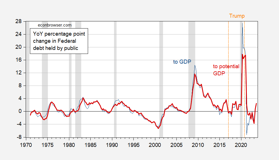
Figure 1: Year-on-Year percentage point change in Federal debt held by public to GDP ratio (blue). Year-on-Year percentage point change in Federal debt held by public to potential GDP ratio (red). NBER defined peak-to-trough recession dates shaded gray. Orange dashed lines at beginning ond end of Trump administration, dated 2017Q1, 2020Q4. Source: US Treasury via FRED, BEA, CBO (February 2024), NBER, and author’s calculations.
More By This Author:
Business Cycle Indicators Plus Monthly GDP. And Heavy Truck SalesSome Pictures Of Federal Debt
Some Cost Implications Of Elevated Frequency Of Extreme Events Associated With Global Climate Change


Comments
Log in or sign up to join the conversation.