
You’re going to hear a lot of talk about the yield curve soon and what it means for “the” yield curve to uninvert (which isn’t a real word but will get used a lot). The difference between the 10 year Treasury note yield and the 2 year Treasury note yield is about to turn positive, the 2 year note yield recently falling a bit more rapidly than the 10 year.

You’ll see a lot of pundits say with great confidence that this means we are on the verge of recession. Which may or may not be true but if we are, I’d suggest that the yield curve is a lot more effect than cause. Let’s take a little walk down yield curve memory lane.
The yield curve has become a notorious recession indicator, with short term rates rising above long term rates before every US recession back to, at least, the 1960s. As I’ve written many times though, the inversion of the yield curve isn’t very useful for investors because the time from inversion to recession is highly variable. It also matters which rates you are comparing. There is no “yield curve” singular. You can compare any two different maturities you want. The most common are the 10 year and 2 year Treasury note but you could also use the 10 year note/3 month T-Bill spread or the 10 year/1 year spread or any number of other combinations. They’ll all give you slightly different numbers but should generally move in the same direction; except, of course, when they don’t.
The 10 year/2 year term spread first inverted in this cycle on April 1, 2022, an appropriate day since that was when the fool’s of finance first started talking about the inevitable recession. Alas for them, it only lasted two days before returning to a positive spread. It finally inverted for good on July 6th, 2022 and we’ve heard almost constant calls for imminent recession ever since. It has now been 26 months since the inversion and recession is still in our future (because we haven’t repealed the business cycle and we will have one eventually). If you sold the S&P 500 when the curve first inverted you would have looked pretty smart for a while. Stocks were down about 5% from the peak when the initial inversion happened but would go on to drop a total of nearly 25% before finding the bottom in October of 2022. It should be noted though that there was no recession during that time and the curve remained inverted so there was no signal from this indicator that said the worst is over, time to get back in.
If you stayed out because the yield curve inverted you’ve missed some gains, with the S&P 500 up 29% since the initial inversion in April ’22; as a market timing tool the yield curve hasn’t done a very good job. To be fair, the research on the yield curve never said it was a good market timing tool, only that it occurred prior to recession. Nevertheless, that is how it has been interpreted by investors and the multitudes now aware of its alleged importance. It seems logical; if recession is coming then surely stocks will take a hit. But, of course, it isn’t that easy because markets – investors – anticipate and stocks will have already fallen by the time recession arrives and may have already risen before it ends. Since the inversion has failed to help anyone except bearish gurus selling subscriptions, you’re going to hear another warning this week, that the real recession signal is the uninversion of the curve, when the spread turns positive after a period of inversion.
You will see confident predictions of imminent recession based on the last 4 recession, in which the yield curve did turn positive right before recession. Well, before anyway; “right before” depends on your definition of “right”. You’re going to see a lot of charts like this one:
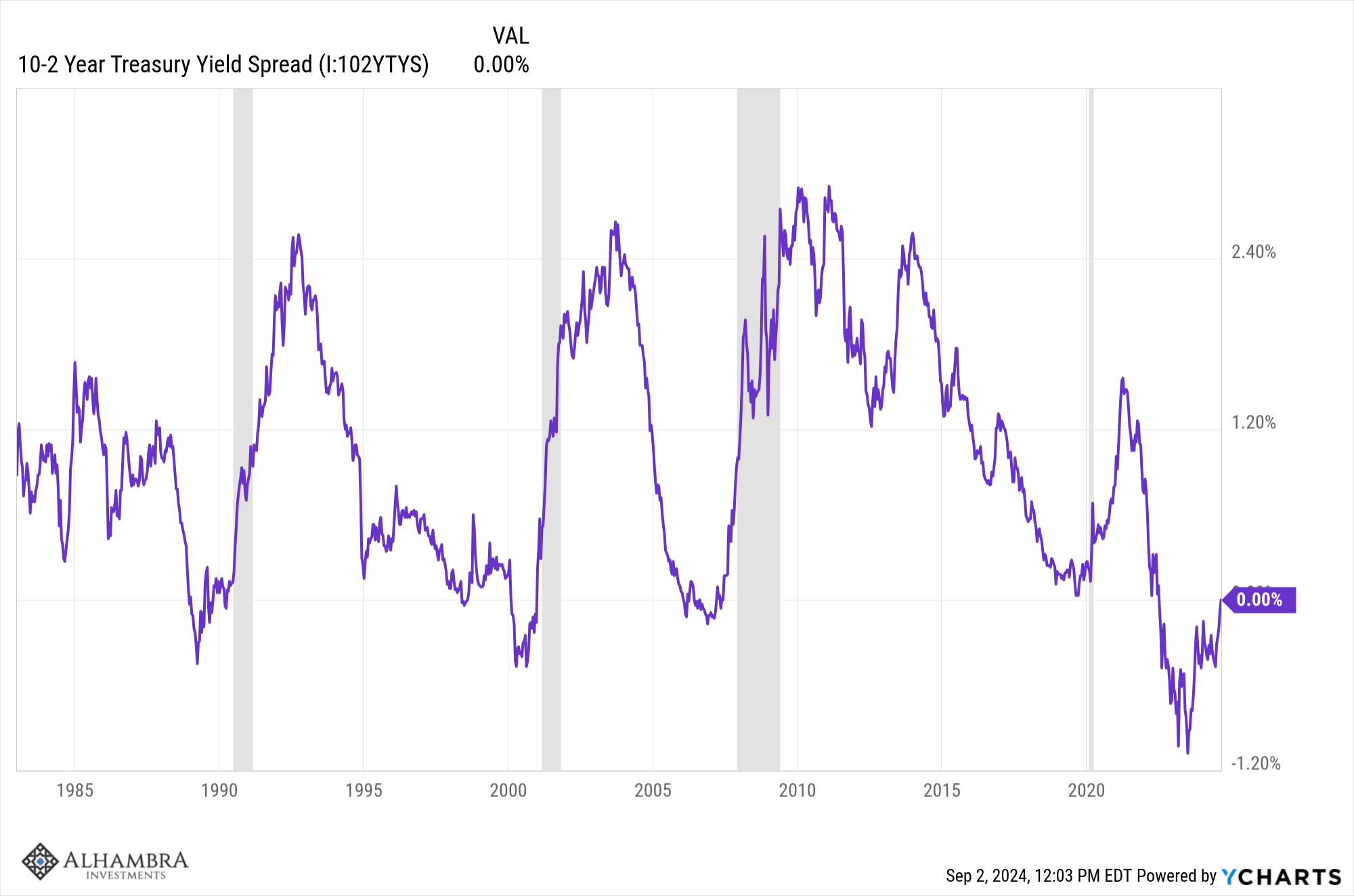
As you can see clearly, the curve does turn positive prior to recession but the timing, again, is highly variable. The longest period from first uninversion to recession is 29 months and the shortest is 6 months. The key word in that sentence, by the way, is “first”. You see the curve often uninverts and then reinverts and uninverts before recession. And if you are going to use this as a market timing tool, you have to take the first signal you get because you don’t know if another inversion is coming. So, even if the curve turns positive this week and recession is “imminent” that could mean a year or more before the recession arrives.
You might have noticed that this chart only goes back to the mid-80s and there’s a good reason for that. Let’s expand it back to the 70s:
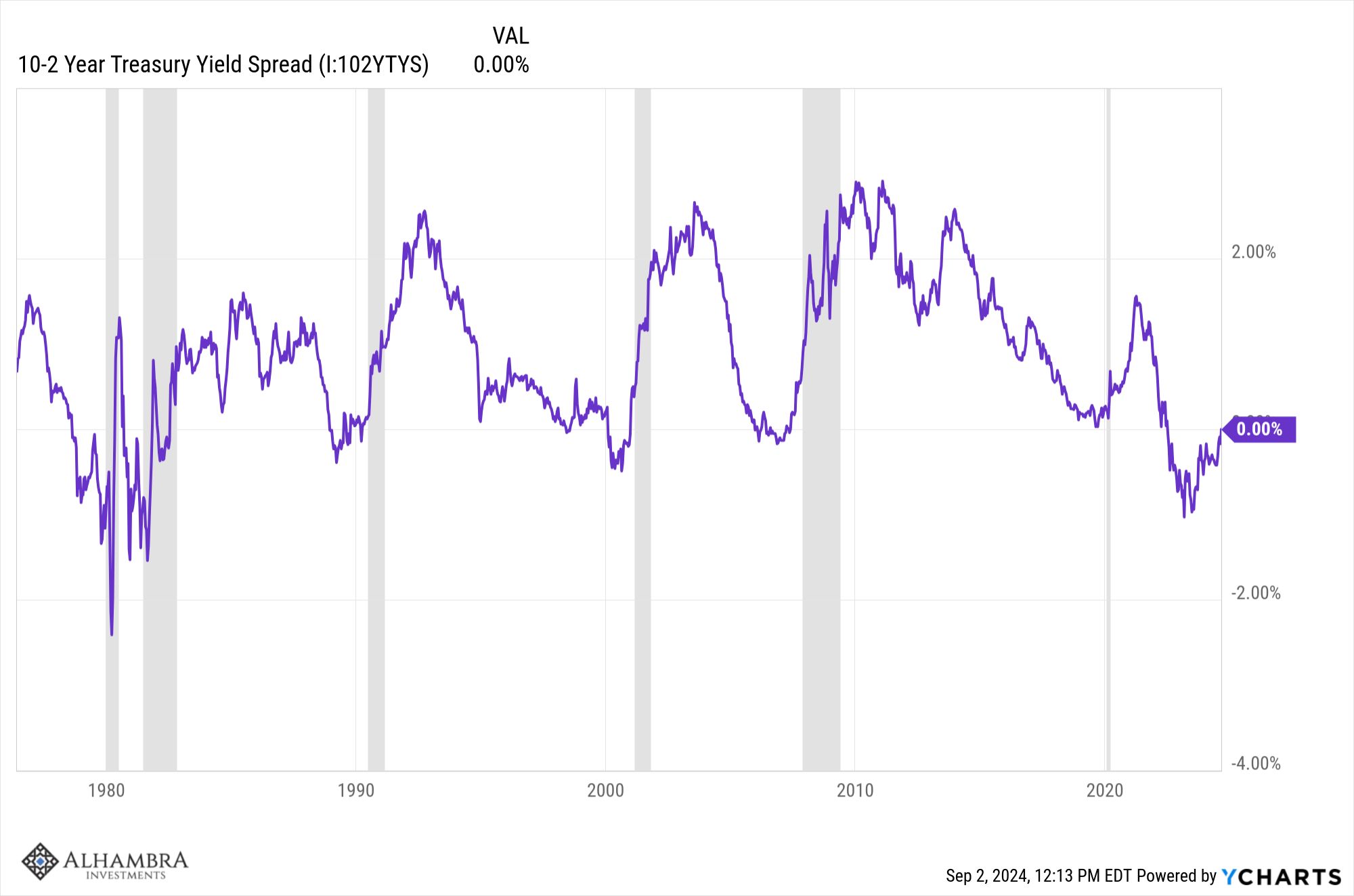
Now what we see is the yield curve doesn’t always turn positive before recession. In neither of the back to back recessions in the early 80s did the curve turn positive before recession. That doesn’t give us any comfort of course, since that might mean we are even closer to recession than everyone seems to think. It may be that the economy today is more like the one that existed in the 70s and early 80s than the one that existed in January of 2020, right before COVID hit. If so, interpreting the yield curve is going to require more than just a cursory review of the last few recessions.
What about other spreads? The next most popular spread is the 10 year/3 month version and if you look at just the last 4 recessions you see a similar pattern of the curve turning positive prior to recession. But, like the 10/2 curve, if you go back a little further you get a different picture and maybe some useful information:
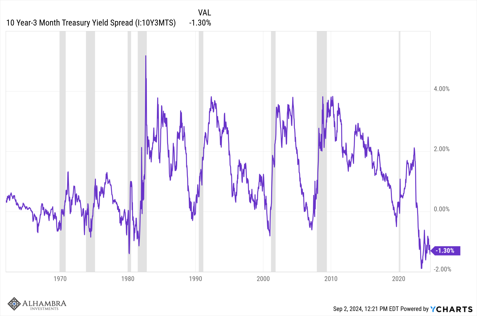
The first thing to notice here is that if this spread is going to turn positive before recession it has a long way to go. But more important I think is how the curve acted in the late 60s and throughout the 70s. What we see there is that the curve was inverted for longer periods of time and even when it turned positive it didn’t get very steep and quickly re-inverted. I think this is where we see what the yield curve is really telling us. The reason the curve acted differently then is because inflation was stubborn. The Fed would tighten policy, inflation would subside…until the Fed eased again. The Fed had to hold short term rates higher, more persistently, to solve the inflation problem. Because of that we had more frequent recessions and a lot more volatility in the yield curve. From the 1960s to the early 80s, the US had four recessions; the next four took 38 years. Are we going back to a more volatile economy? If so, the behavior of the yield curve over the last 40 years isn’t going to be any help at all.
What the yield curve tells us, more than anything, is what the market expects from monetary policy. The reason the 10 year/3 month curve hasn’t turned positive is because the market doesn’t expect a rapid drop in short term interest rates. Futures markets right now are priced such that expectations are that short term rates will fall by about 1% over the next year to roughly 4.15% but still be at 3.75% by early 2027. At the same time, the 10 year rate is expected to fall to about 3% during that time which implies that the 10 year/3 month curve will still be inverted a year from now. The 10 year yield is also a good proxy for the year over year change in Nominal GDP so lower future rates implies a further deterioration in growth, but is it recession? That depends on the inflation rate. If inflation continues to fall to the Fed’s target of 2% then a 3% NGDP growth rate would imply a 1% growth in Real GDP – i.e. no recession. If it doesn’t fall back to 2% – or instead reverses course – then a recession seems a lot more likely.
And here’s the real kicker. None of that futures market pricing is anything more than the educated – or not so educated – guesses of millions of investors who don’t know any more about the future than anyone else. I’ve said many times that markets give you the best glimpse of the future you’re ever going to get but that doesn’t mean it will be right. It also isn’t nearly as accurate as I’ve portrayed here. The expectations I cited above for future short term rates comes from an Atlanta Federal Reserve model that uses SOFR futures to calculate probabilities. What I cited is the mid-point of a range. The most likely range, based on the futures market, is (roughly) 3.5% to 5%. In other words, rates could fall dramatically over the next year or the quarter point cut at the September meeting might be all we get. The market is saying, quite accurately, that we don’t know what rates will be a year from now.
If all this seems clear as mud to you, there’s a good reason for that. We can’t predict the future and no amount of trying is going to change that. Heck, most of the time we can’t even accurately portray the present because we don’t have the ability to collect accurate information about the economy in real time. Most of the “data” that gets released on a weekly basis is estimated and subject to large revisions. And it is least accurate at turning points in the economy. Economic forecasters have proved time and time again that there is no economic crystal ball. Even if there was once it was widely known, it wouldn’t work anymore. Why? Because people would change their behavior which would in turn change the future economy. Economics is the study of human behavior but studying it doesn’t mean we can predict it.
So, what can you do? What we do is try to define the environment in terms that we can see on a daily basis. We can observe the trend in the dollar and the trend in interest rates. We can also review history to see how assets perform when, for instance, interest rates and/or the dollar are falling. The future won’t always look exactly like the past but at least we can get an idea of what has worked before and more importantly, what hasn’t. We can also use our powers of observation to think about how the economy might evolve if certain trends persist or certain economic policies are enacted. Just be sure to check your ego at the door because you will be wrong a lot and you can’t hang onto a failed thesis. That’s just the nature of investing in an uncertain world – which is the only one we’ve got.
Environment

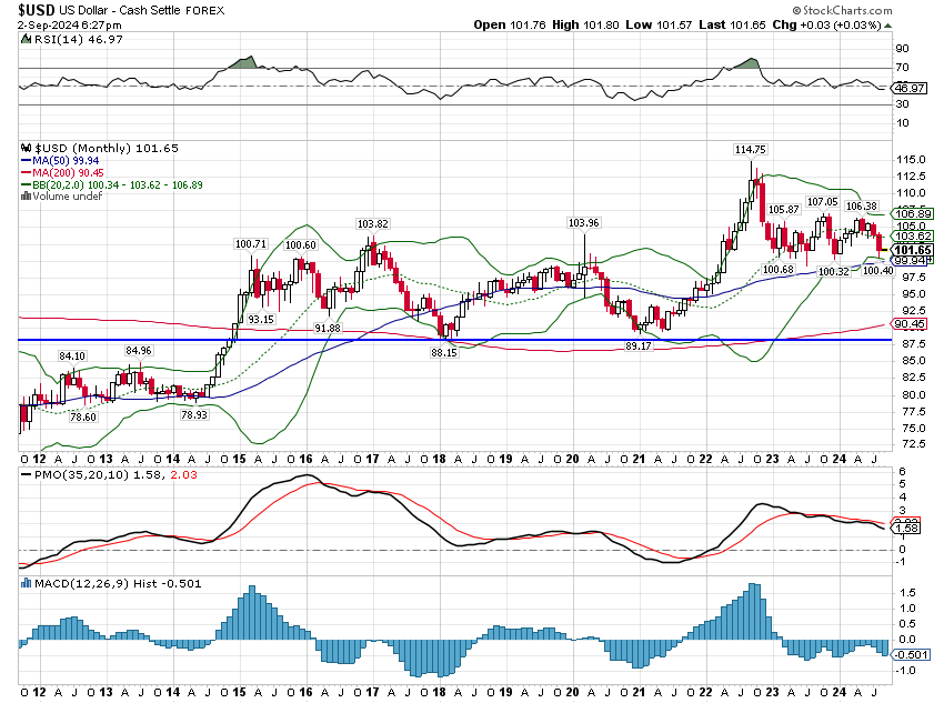
As you can see above, the dollar is down slightly over the last year. It is also down substantially from its high in late September ’22 but unchanged since April of 2022. If you want to think even longer it is unchanged since early 2017 although there was, obviously, a lot of movement in between. As I said above, we care about the dollar trend because can look to the past for clues about what works in that environment. Since the dollar peak in April ’22, gold, international value and Europe have all done well, exactly as history suggests. But, the past isn’t an exact map to the present so commodities haven’t done that well even in a favorable environment.
The short term dollar trend is down while the more intermediate term is essentially no trend at all. If we break decisively under 100, I would expect a move to the low end of the range (88-90).
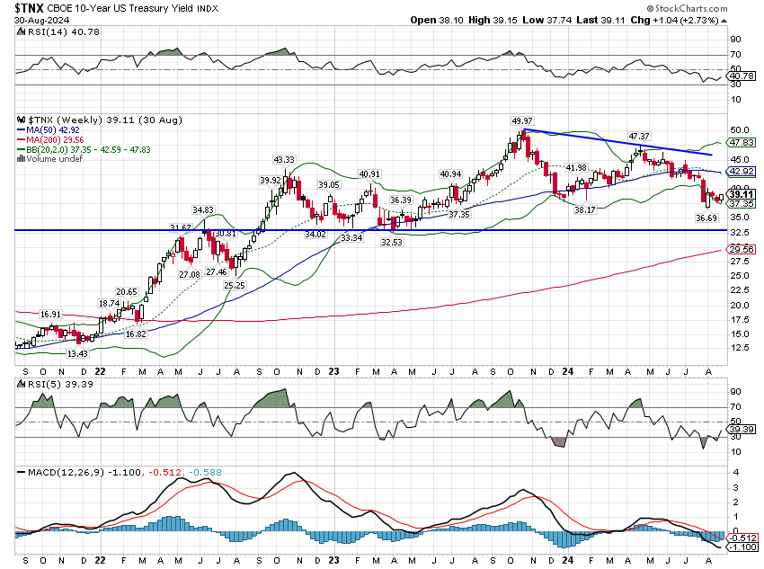
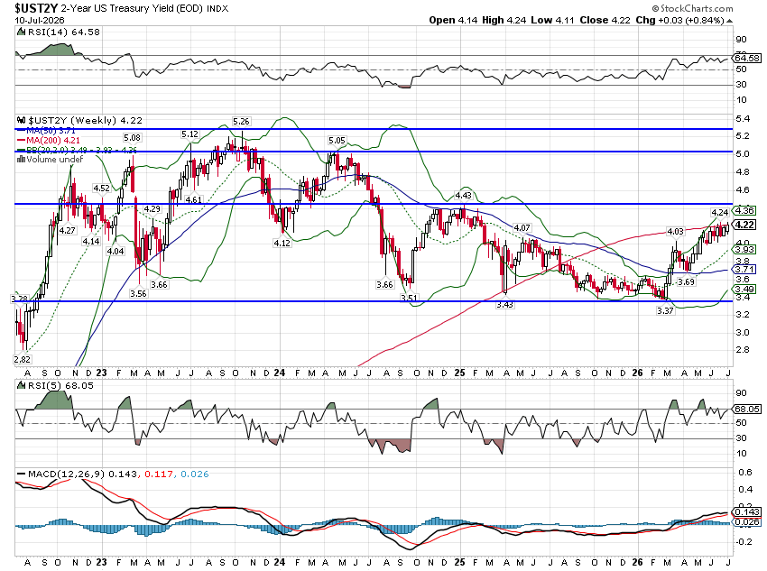
The 10 year Treasury yield is also down a little over the last year and essentially unchanged since early October ’22. The short term trend is still down and like the dollar, the more intermediate term trend is sideways. Right now I’d say that bonds are a little too well loved and traders ought to be expecting a retracement of rates back over 4%.
Markets
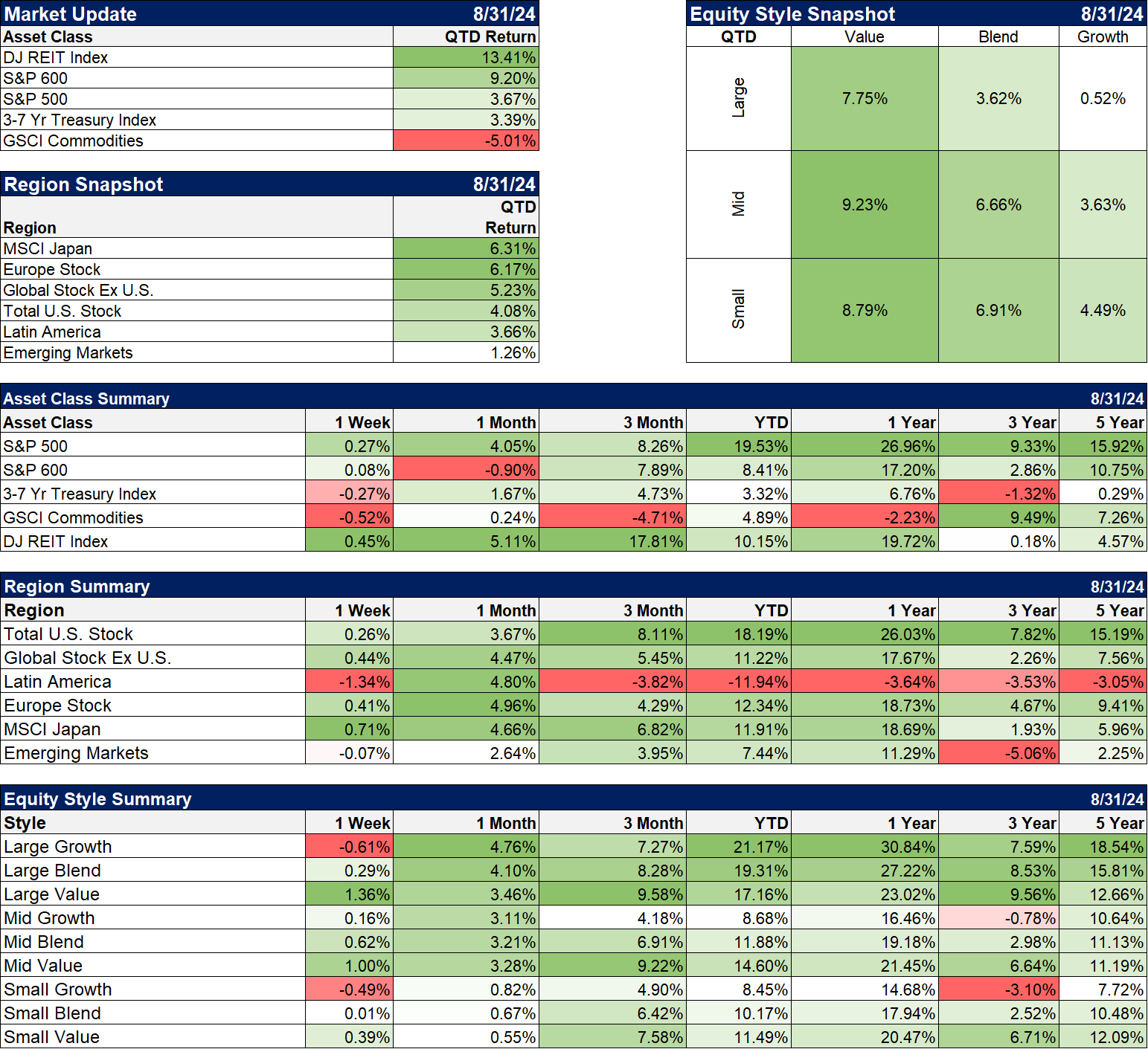
It has been a countertrend quarter with value, small caps and especially REITs outperforming. Large cap value is actually nearly caught up with growth for the year now with just 4% separating the two. REITs, small and midcap value are also up double digits for the year. The laggard continues to be commodities which usually do well with a falling dollar – unless rates are also falling. That’s the case right now but I’m not convinced that will continue to be the case.
International stocks have also outperformed the S&P 500 so far this quarter. That is also driven by a weaker dollar but also by improving economic conditions. The exception is EM stocks which continue to struggle as China’s economy has fallen and can’t seem to get back up. Latin America has done better but commodity prices have been a drag.
Sectors
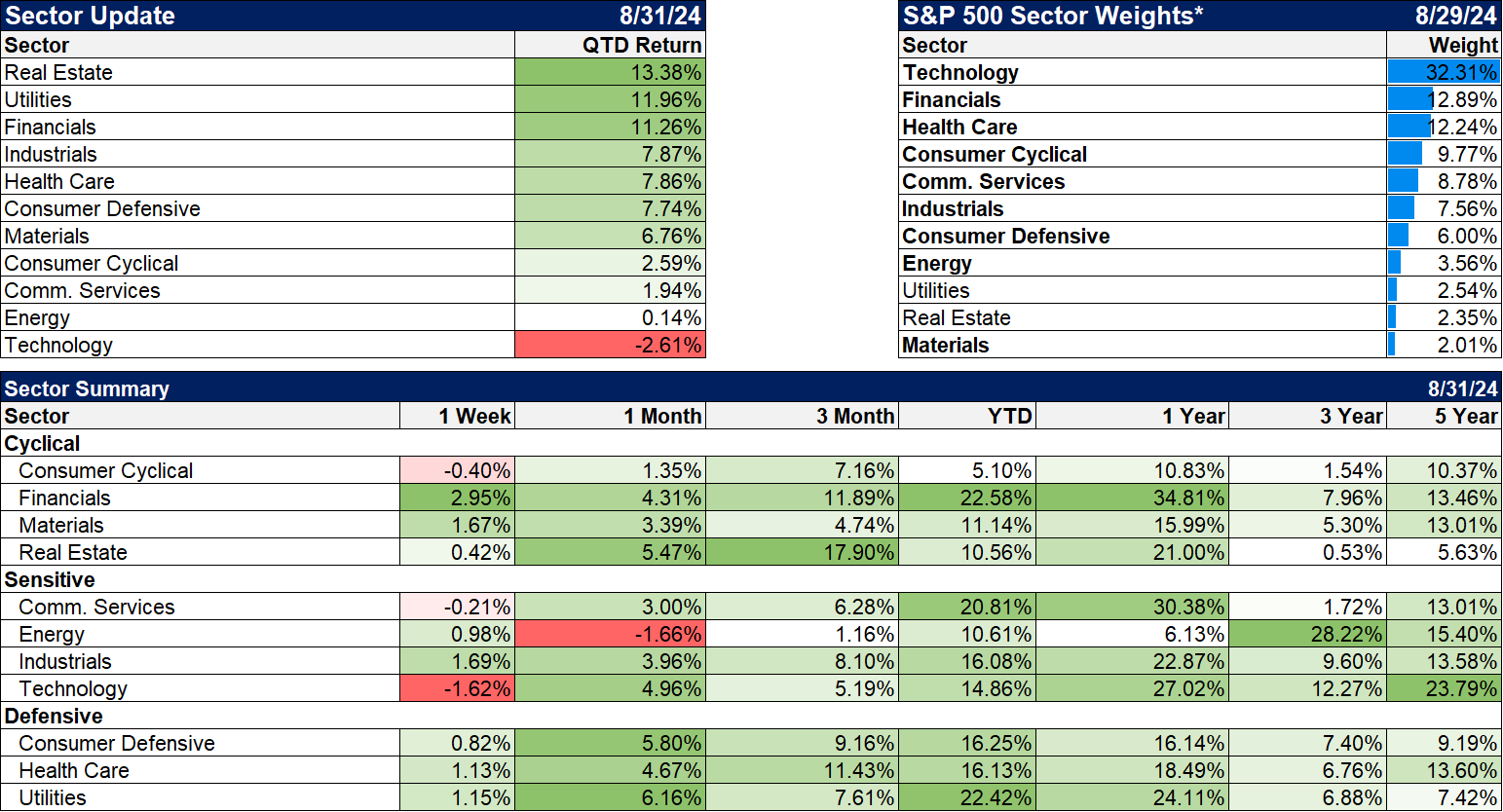
Real estate, utilities and financials, all interest rate sensitive and leading the sector scorecard this quarter although rates were higher last week and they continue to rise.
Technology is taking a breather or maybe something more.
Market/Economic Indicators
Last week’s economic data:
Durable Goods +9.9% but ex-transportation -0.2%, Core capital goods -0.1%
Dallas Fed Mfg. Survey -9.7 but that is an improvement from -17.5 last month
Case Shiller +0.6% mom, +6.5% yoy less than expected but at an all time high
Richmond Fed Mfg. Survey -19 vs -17 last month
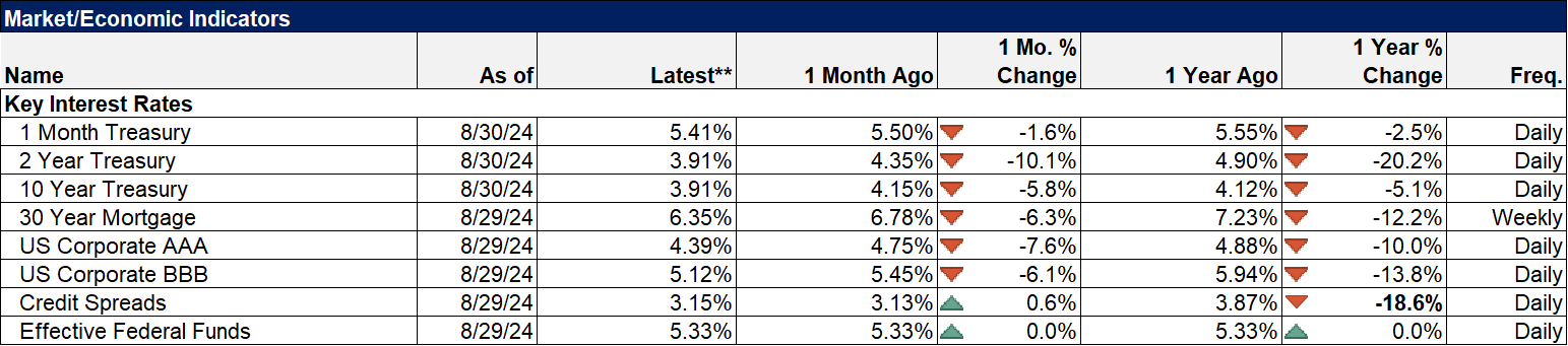
Mortgage rates down again this week, 6.35% but didn’t help pending home sales -5.5% That represents contracts signed in July.
Q2 GDP revised from +2.8% to +3.0%
Jobless claims 231k
Retail inventories ex-autos +0.5% needed because inventories/sales ratio is falling
Personal income +0.3% spending +0.5% both better than expected
PCE inflation as expected at +0.2% mom, +2.5% you
Core +0.2% mom, +2.6% yoy
Credit spreads are back to the lows even as other rates continue to fall.
Joe Calhoun
More By This Author:
The Fed Declares VictoryUnconventional Wisdom
Weekly Recap & DARP Update


Comments
Log in or sign up to join the conversation.