
Weekly Market Outlook – The Bulls Are Running Out Of Chances

Image Source: Pixabay
The market might have started last week on a firmly bullish foot. The ease with which things turned very, very bearish later in the week, though, speaks volumes. The correction effort that first started taking shape back in mid-February is back in full swing. Indeed, one more ugly day could push both key indexes back to new multi-week lows, sparking yet-another wave of selling.
One more bearish leg, however, could be enough to create the full-blown capitulation that we’ve been waiting for… the ultimate, buy-worthy bottom.
The process will be painful and scare while it’s happening though.
We’ll look at this prospect in some detail in a moment. Let’s first look at last week’s top economic reports and then preview what’s in the pipeline for this week.
Economic Data Analysis
Last week was pretty well loaded with economic news, but the biggest of this news was also the worst. That’s consumer sentiment. Although neither is yet indicated on our chart below, the Conference Board’s consumer confidence figure fell to a multiyear low of 92.9, while the University of Michigan’s sentiment score fell to a 57.0.
Consumer Sentiment Charts
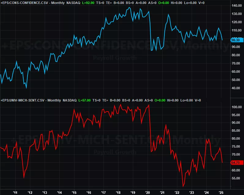
Source: Conference Board, University of Michigan, TradeStation
Yes, this is bad. While there’s an argument to be made that extreme pessimism is also frequently seen at major market lows, somehow things don’t feel quite so contrarian right now.
There are some bright spots though. Like home sales. We heard a couple weeks ago that sales of existing homes perked up just a bit in February, and are even starting to hint at a new uptrend from 2023’s and 2024’s lull. Then last week we heard new home sales are bounced back just a bit from January’s lull. Again, we’re seeing subtle hints of a very shallow recovery here.
New, Existing Home Sales Charts
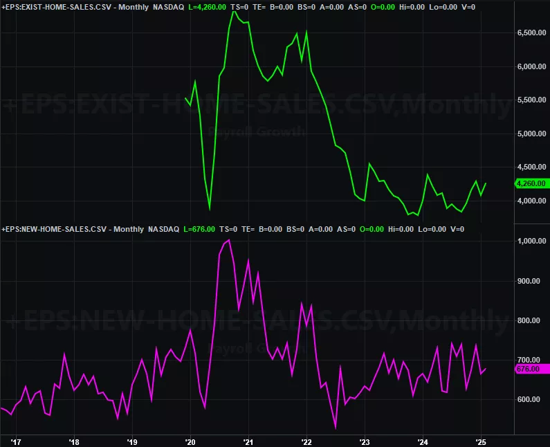
Source: National Assn. of Realtors, Census Bureau, TradeStation
In this same vein, while fewer homes are selling these days, they’re still selling at high and/or rising prices. The FHFA’s Home Price Index continues its ascent (through January), while the Case-Shiller Index’s recent slide at least appears to be leveling off.
Home Price Charts
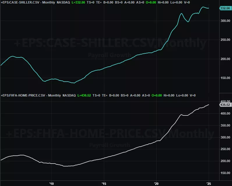
Source: FHFA, Standard & Poor’s, TradeStation
Perhaps last week’s biggest news, however, is the look at last month’s personal income and expenditures data, which is the Fed’s chief barometer when making decisions regarding interest rates. Although we’re not charting it here, expenditures were up 2.5%, and higher by 2.8% on a core basis, in step with income growth. This isn’t “out of control,” but it does make it a bit more difficult to lower rates as the FOMC seems to be aiming to in the foreseeable future.
This week’s biggies are looks at least week’s economic activity numbers from the Institute of Supply Management, and Friday’s jobs report.
The ISM numbers have both been getting better, even if only erratically. Economists are looking for a slight cooling this time, but only slightly. Even though sentiment suggests economic weakness is brewing, actual economic activity is holding steady at reasonably healthy levels.
ISM Services, Manufacturing Index Charts
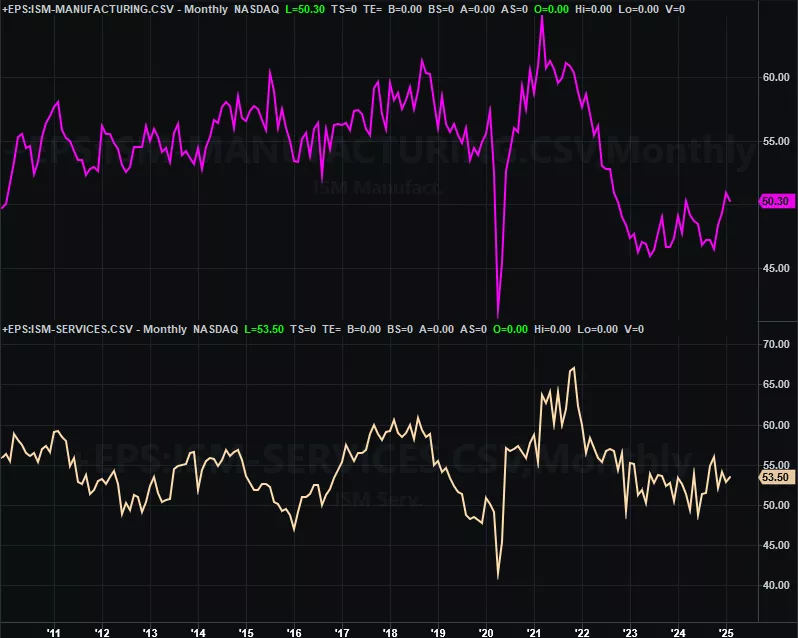
Source: Institute of Supply Management, TradeStation
As for the jobs market, things have remained reasonably healthy on this front as well despite concerns that new tariffs might jump-start economic weakness. Forecasts suggest more of the same steady, healthy employment levels will remain in place.
Unemployment Rate, Payroll Growth Charts
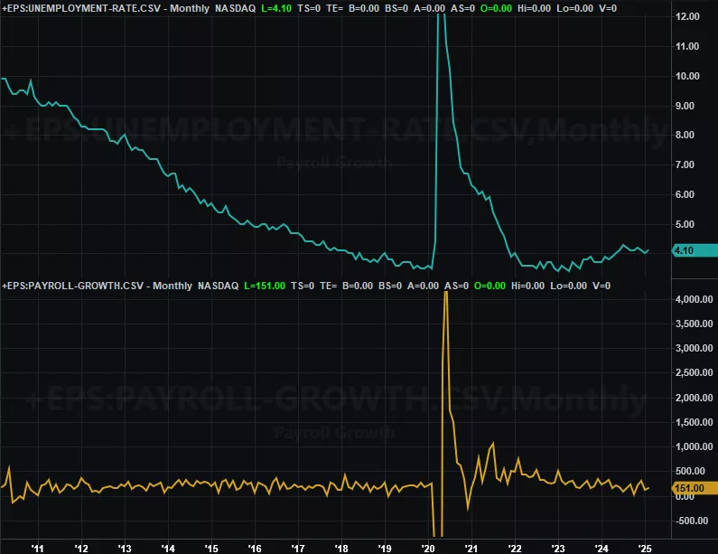
Source: Bureau of Labor Statistics, TradeStation
Stock Market Index Analysis
We kick things off this week with a zoomed-out look at the weekly chart of the NASDAQ Composite simply because we need to paint the bigger picture first before diving into the fine-tuned details. Specifically, notice that with last week’s loss of 2.6% the index is ad far under its long-term support line -- on a weekly-close basis -- that it’s been since this rising floor first started taking shape. The further it is under this support, the further out of reach a quick recovery gets. In other words, the market’s possibly past the point of return. The correction may have to fully play itself out now.
NASDAQ Composite Weekly Chart, with VXN and MACD
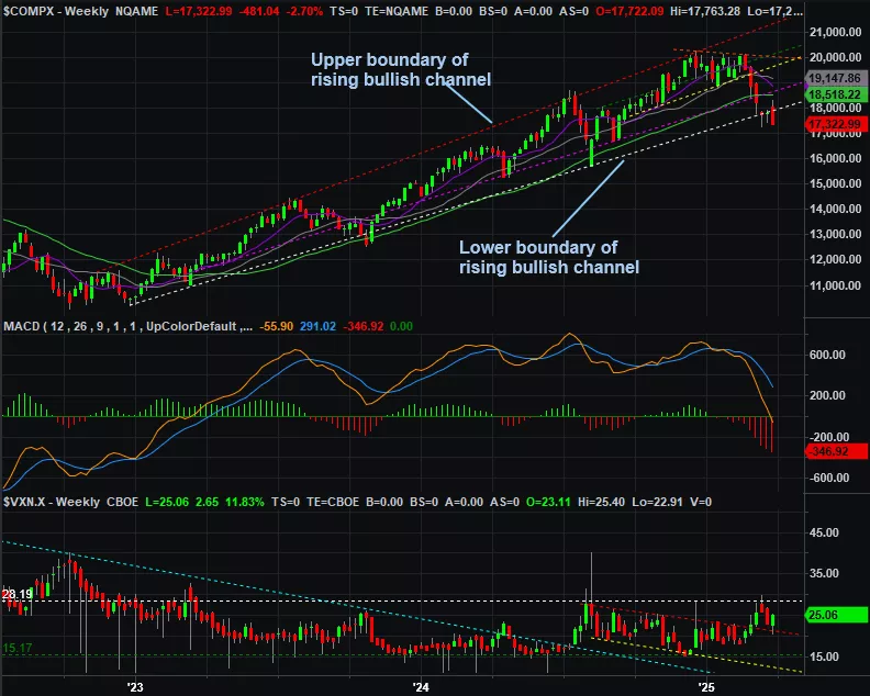
Source: TradeNavigator
Underscoring this argument the way the NASDAQ’s Volatility Index (VXN) at the bottom of the chart above is acting. It’s not spiking at (or even near) a major peak. It’s not even yet testing a not-so-high ceiling at 28.2 (white, dashed) where you’d expect it to bump into a ceiling when the market itself is bumping into a floor. Only when the VXN surges to a high point can one reasonably say the market’s truly capitulated.
Now let’s zoom into a daily chart of the NASDAQ for a bit more detail. Namely, notice that with Friday’s big selloff the index is on the verge of testing the low reached a couple weeks back, near 17,200. It could be a floor this time around. But, with the way the market faked everyone out with a brilliant-but-short-lived bullish surge early last week, most traders are likely thinking they don’t even want to take the chance of getting burned again. If the composite slides under that support around 17,200, again, the bears may become fully willing to drive a full flushout into what turns into a true capitulation. That’ll be good for stocks in the long run, but will hurt in the short term.
NASDAQ Composite Daily Chart, with VXN and Volume
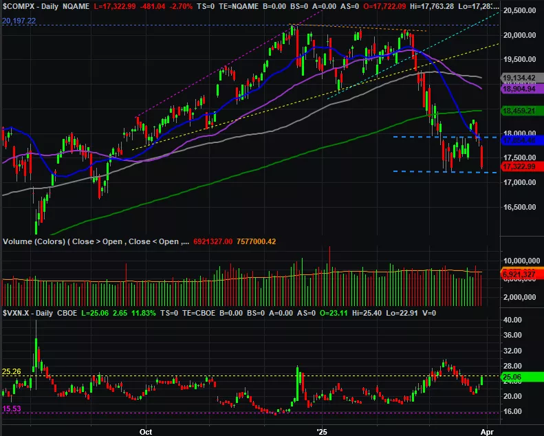
Source: TradeNavigator
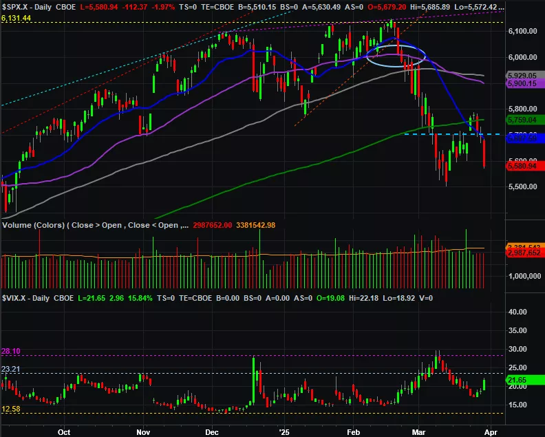
The S&P 500 doesn’t look identical, but does look pretty darn similar. Friday’s big tumble drags it back to within sight/reach of the low reached two weeks ago. And, the S&P 500’s Volatility Index (VIX) is far from reaching a peak that would suggest maximum fear has been reached. Perhaps the most concerning detail here -- for the bulls anyway -- is the way the index teased a cross back above the 200-day moving average line (green) at 5,759 on Monday and Tuesday before pulling the rug out from underneath those buyers. This crowd won’t be in any hurry to take that chance again.
S&P 500 Daily Chart, with VIX and Volume
Source: TradeNavigator
Zooming out to the weekly chart of the S&P 500 shows us this index is in the same basic trouble that the NASDAQ is now. That is, it’s now below the lower boundary of the rising channel that’s been in place since late-2023 (yellow, dashed) as well as below its 200-day moving average line… far enough underneath them so that a quick, easy bounce back above either is out of reach.
S&P 500 Weekly Chart, with VIX and MACD
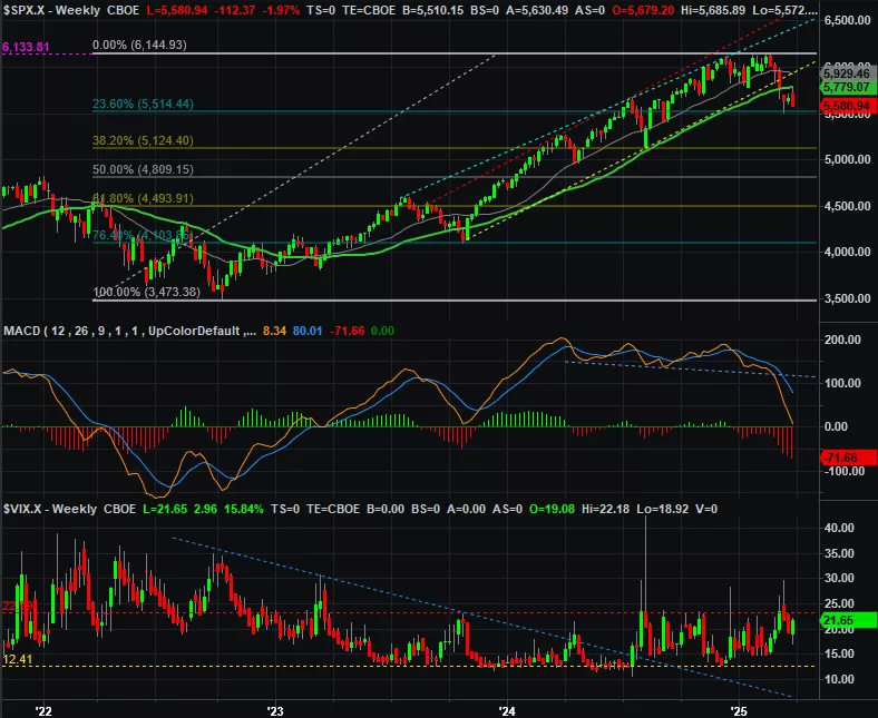
Source: TradeNavigator
That being -- and as was noted last week -- the support being offered by the 23.6% Fibonacci retracement line at 5,514 is still intact. Let’s assume it will hold until we can’t assume that anymore. If-and-when it fails as a floor though, the market might have to make a full pullback all the way to its 38.2% Fibonacci retracement level at 5,124 (where the S&P 500 bottomed in mid-2024). That would be a 16.6% correction, which would be enough to create the true capitulation that’s been missing thus far.
More By This Author:
Weekly Market Outlook – Rough Week, But Still Not Beyond Recovery
Weekly Market Outlook – The Bulls Flinched, But The Bears Didn’t Seize The Opportunity
Weekly Market Outlook – So Good It’s Bad?


