
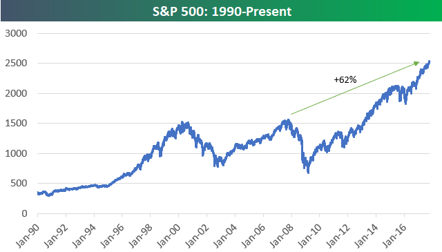
US Stock Market Up 60%+ From Prior All-Time Highs
The long-term price chart for major US equity indices continues to amaze. Below are charts of the large-cap S&P 500 and Wilshire 5,000 (all US stocks) going back to 1990. At this point, the S&P 500 is up 62% from the all-time high it made back in 2007 prior to the Financial Crisis. The index needs to get just above 3,000 to mark a “double” from its prior highs.
The Wilshire 5,000 is up even more from its prior bull market high made in 2007 at +67%.

While the price chart for the S&P 500 shows huge gains versus prior all-time highs, things aren’t nearly as strong for global equity markets. As shown below, the Bloomberg World Index (which still has a big US weighting) is indeed at new all-time highs, but it’s up just 13% from its 2007 bull market high.

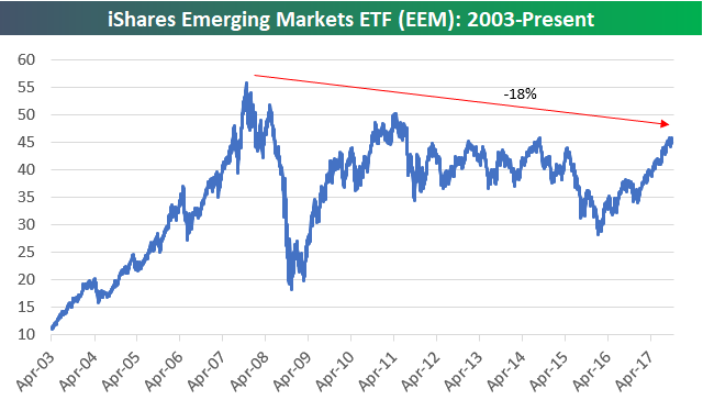
And emerging markets aren’t even at new highs compared to 2007. As shown below, the EEM ETF is still down 18%!
If you had to choose between US equities and international equities, which asset class will perform better over the next ten years?
Disclaimer: To begin receiving both our technical and fundamental analysis of the natural gas market on a daily basis, and view our various models breaking down weather by natural gas demand ...
more

