
The 100 Year Bull Market
I would like to finish off this four part report by looking at some long term charts for many of the US and world stock markets. In regards to the US stock markets the bull market that began in March of 2009 has to be one of the most despised, hated and unforgiving bull markets of all time. To say it has climbed the proverbial wall of worry is an understatement. The bears have thrown everything they have at this bull market including the kitchen sink and still the bull market lives on.
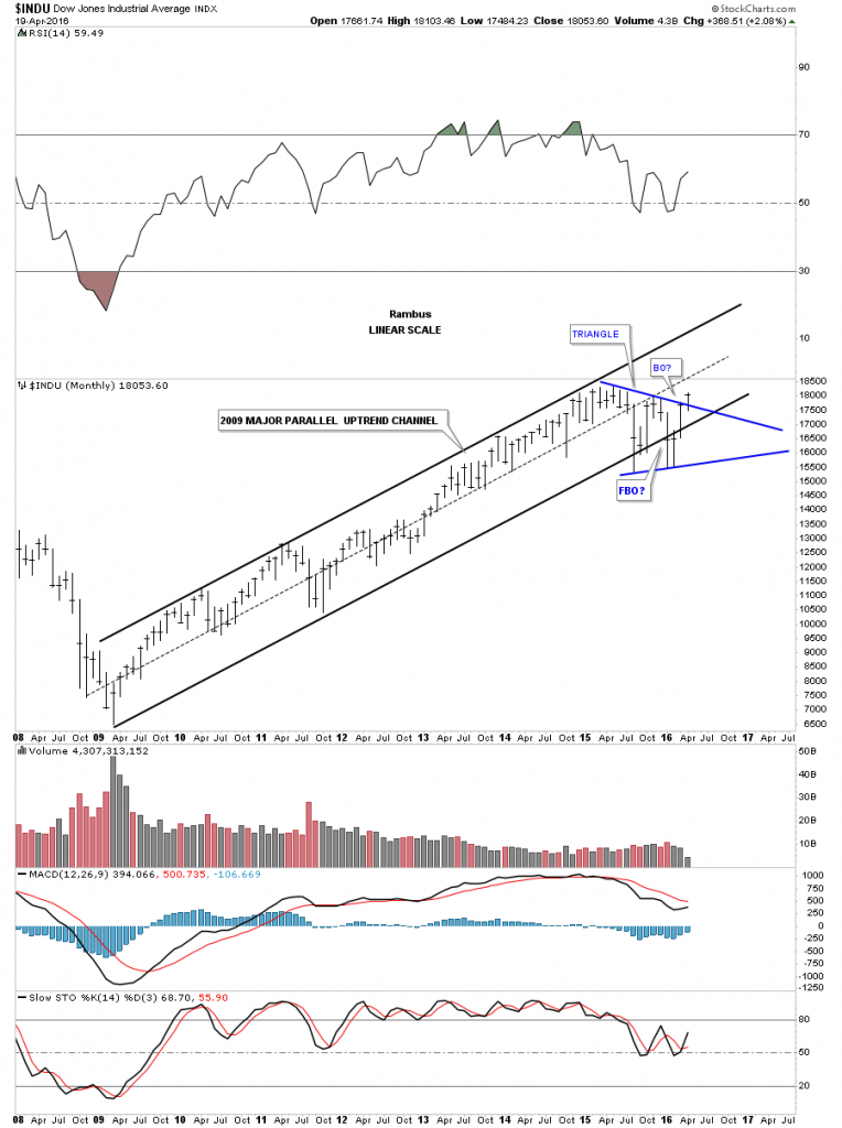
What’s frustrating both the bulls and the bears alike is the long term trading range that really began about a year and a half ago when the INDU had that big spike down in October of 2014. The INDU proceeded to make slightly higher highs but there was no new impulse move up which created our current trading range. The job of trading ranges is to frustrate everyone. If you’re a short term trader then you can take advantage of a trading range which looks much easier to do in hindsight. If you’re a bull you’re frustrated because the markets don’t go up and if you’re a bear you’re frustrated because the market won’t go down. The only one happy is the traders that scalp short term positions, but they will eventually be on the wrong side of the market when the new trend reasserts itself again.
From a Chartology perspective the bull market that began in March of 2009 is still firmly in place as shown by the long term monthly charts. There were some scary times, especially in August of 2015, and then again in January of this year 2016. January of this year had one of the worst starts for a new year in history. How could one not be bearish. The markets have an uncanny ability to shift sentiment from one side of the spectrum to the other leaving everyone frozen like a deer in the headlights. It’s a tough game we choose to play and to the victor goes the spoils.
Lets look at some long term monthly charts which shows the bull market that began in 2009 and is still enforce to this day. The beauty of Chartolgoy is that it clears our minds from all of the fundamental reasons why a stock or a market has to preform a certain way. There are more reasons the stock markets have to go down right now than numbers to count them. Below is the monthly chart which shows the bull market uptrend channel that began in 2009. You can see the sharp shake out that occurred below the bottom trendline which were negated when the price action rallied back inside of the blue triangle. What else is evident on this chart is the blue triangle consolidation pattern that is the biggest consolidation pattern we’ve seen since the bull market began. To really confirm the breakout it would be nice to see a new high made.
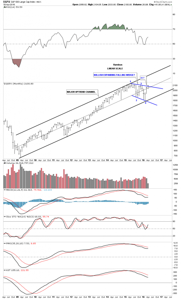
The monthly chart for the SPX shows a very nice parallel uptrend channel with the price action knocking on the door of the top rail of its potential bullish expanding falling wedge. Keep in mind one doesn’t have to be a rocket scientist to see the bull market uptrend channel, just having an open mind can help.
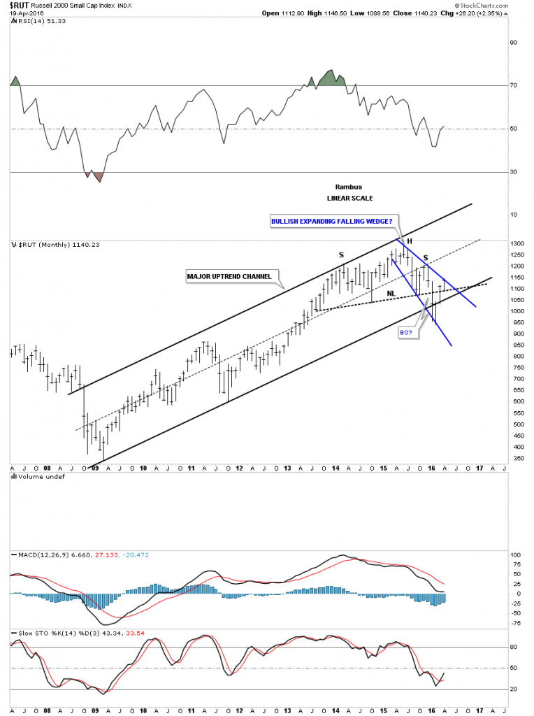
The RUT shows a nice parallel bull market uptrend channel that had just a slight breach of the bottom trendline in January of this year, but that was quickly nullified when the price action traded back inside the uptrend channel. There is another important point I would like to show you on this chart and that is the failed H&S top. Late last year and of course January of this year, which had one of the worst starts in history, alot of potential H&S tops broke out to the downside only to quickly fail. We discussed previously that when we see a failed breakout of a well defined pattern it usually means that we’ll see a big move in the opposite direction, the shakeout before the breakout. As you can see the RUT is now trading back above its neckline which looked so bearish just three months ago. I know how impossible it seems but that blue expanding falling wedge looks like its the real pattern not the failed H&S top.
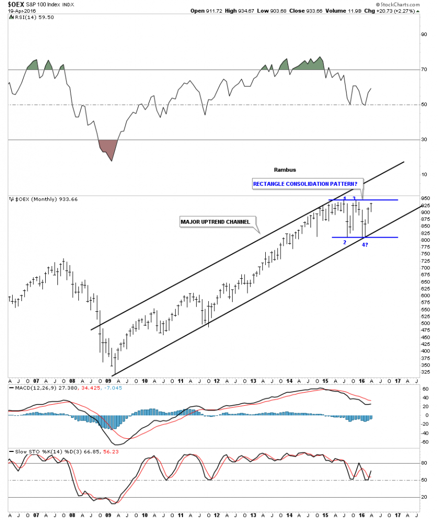
The OEX 100 shows a beautiful bull market uptrend channel with the rectangle getting close to completing the all important fourth reversal point.
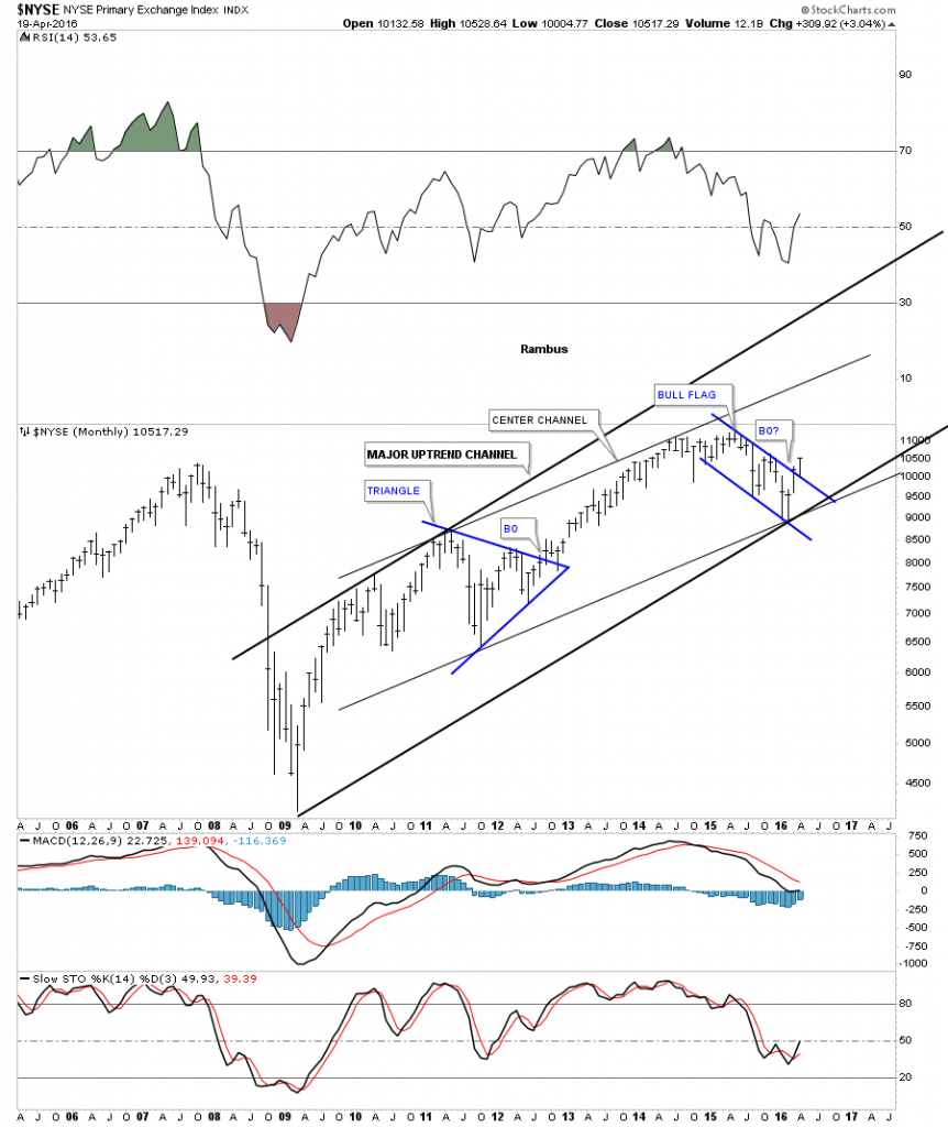
The NYSE is a broadly based index which has a slightly different look to it compared to the other indexes we’ve looked at. Here you can see it has a parallel center channel, which shows the top rail of the blue bull flag with a breakout.
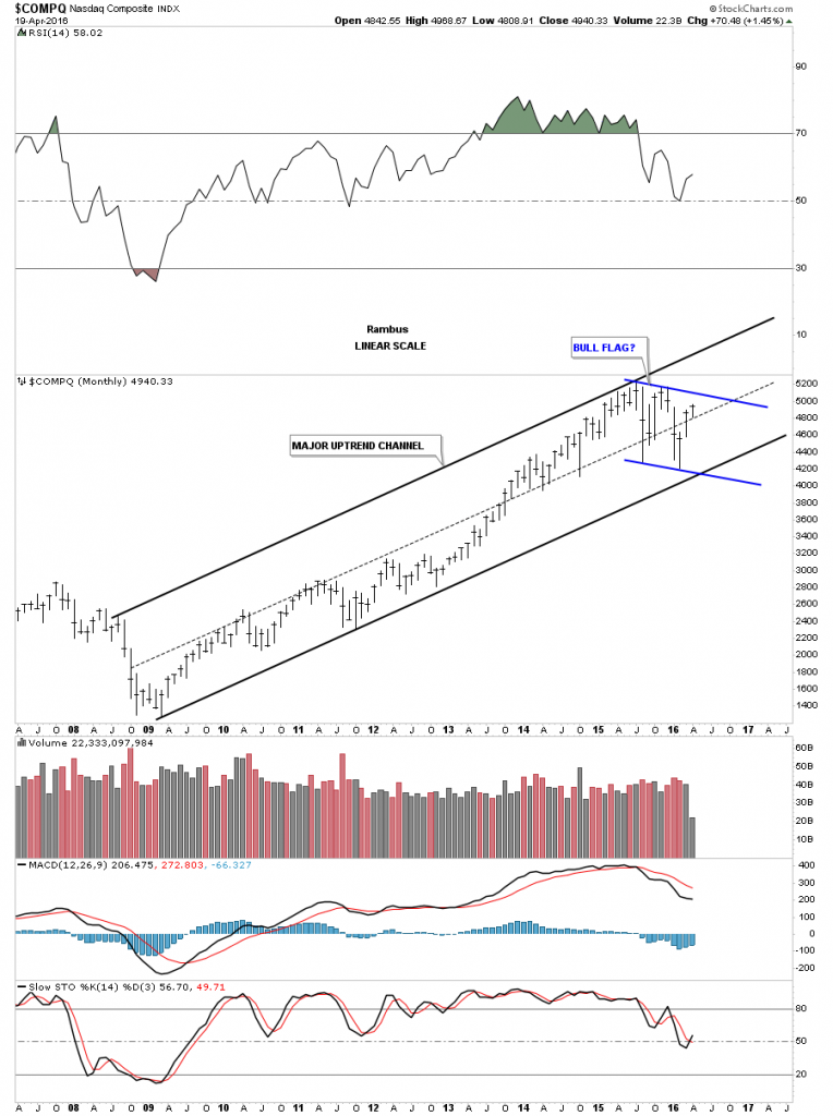
The COMPQ shows a very nice bull market uptrend channel and is working on its fourth reversal point for the potential blue bull flag.
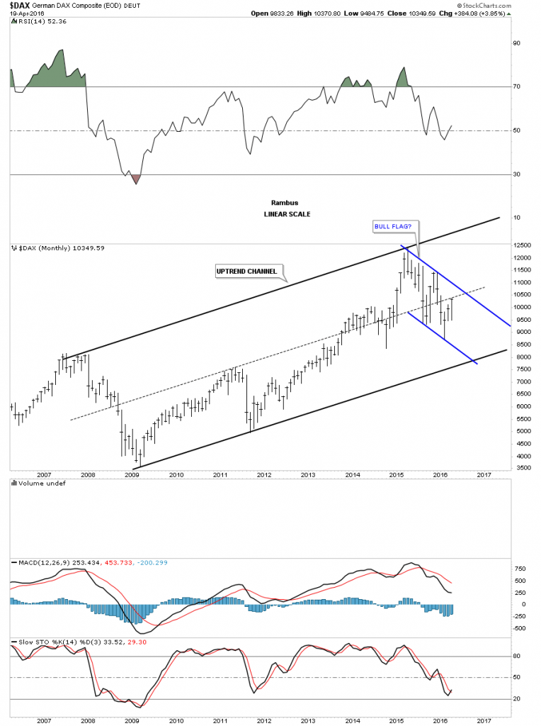
Lets now look at several of the big European stock markets and see how they compare to the US stock markets we looked at on the charts above. The DAX has been in a bull market since the low in 2009 and is currently building out a possible blue flag. As you can see it’s not quite as strong as the US stock markets but it does have a nice lookng bull market uptrend channel.
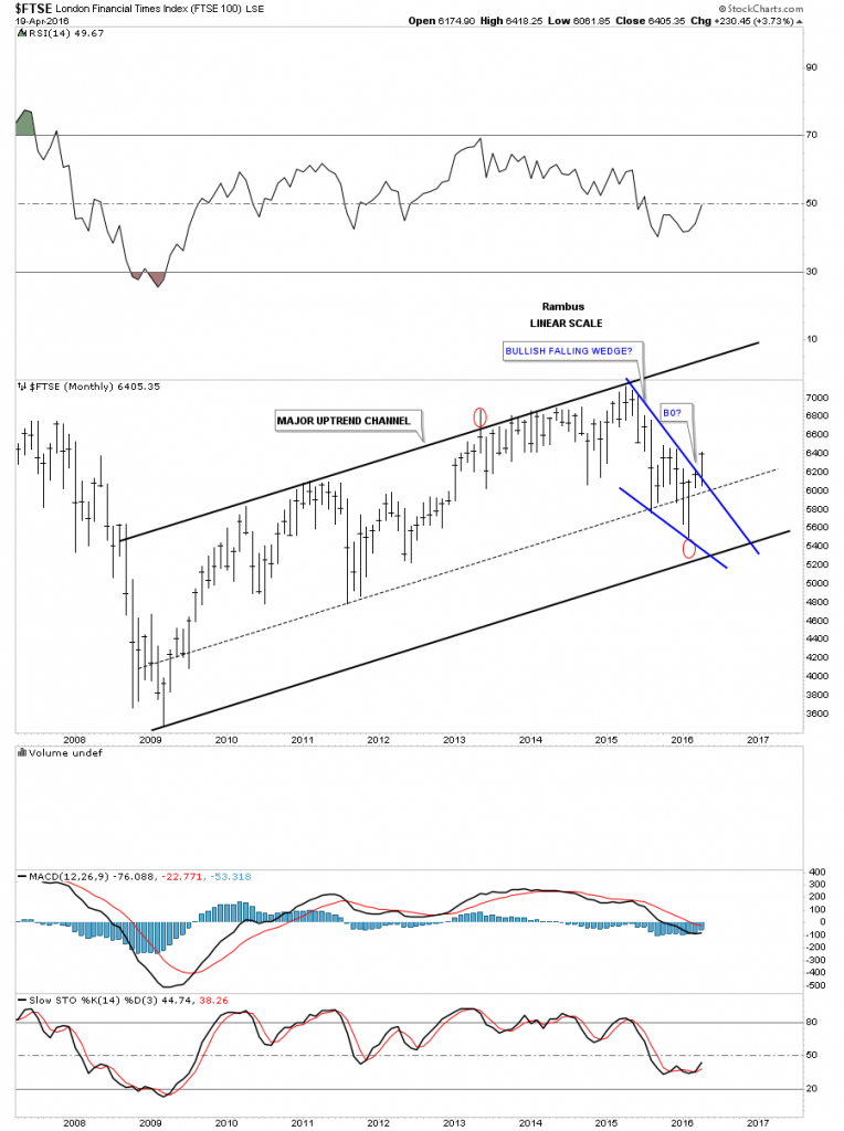
The FTSE is showing a nice bull market uptrend channel and it may have just broken out from the blue falling wedge.
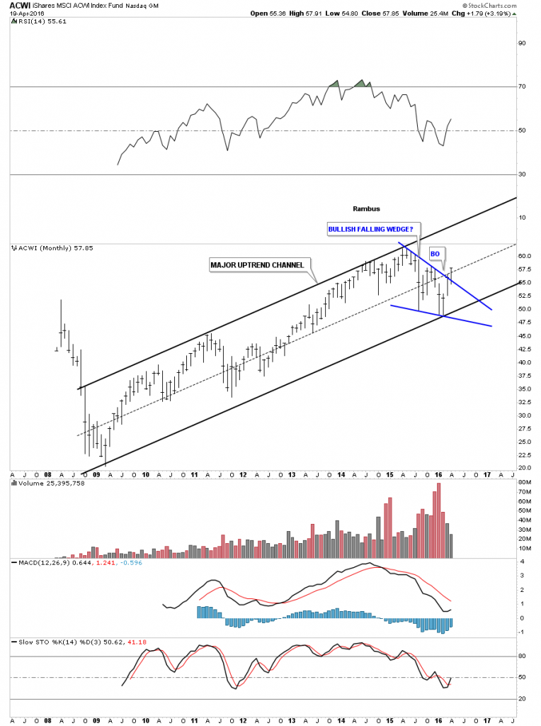
We are constantly preached to on how the world as we know it is coming to an end from an economical point of view. That maybe true but the AWCI, which is an all world index, looks like it’s getting ready to move higher. It has a beautiful major uptrend channel and is just now starting to breakout from the one year blue bullish falling wedge.
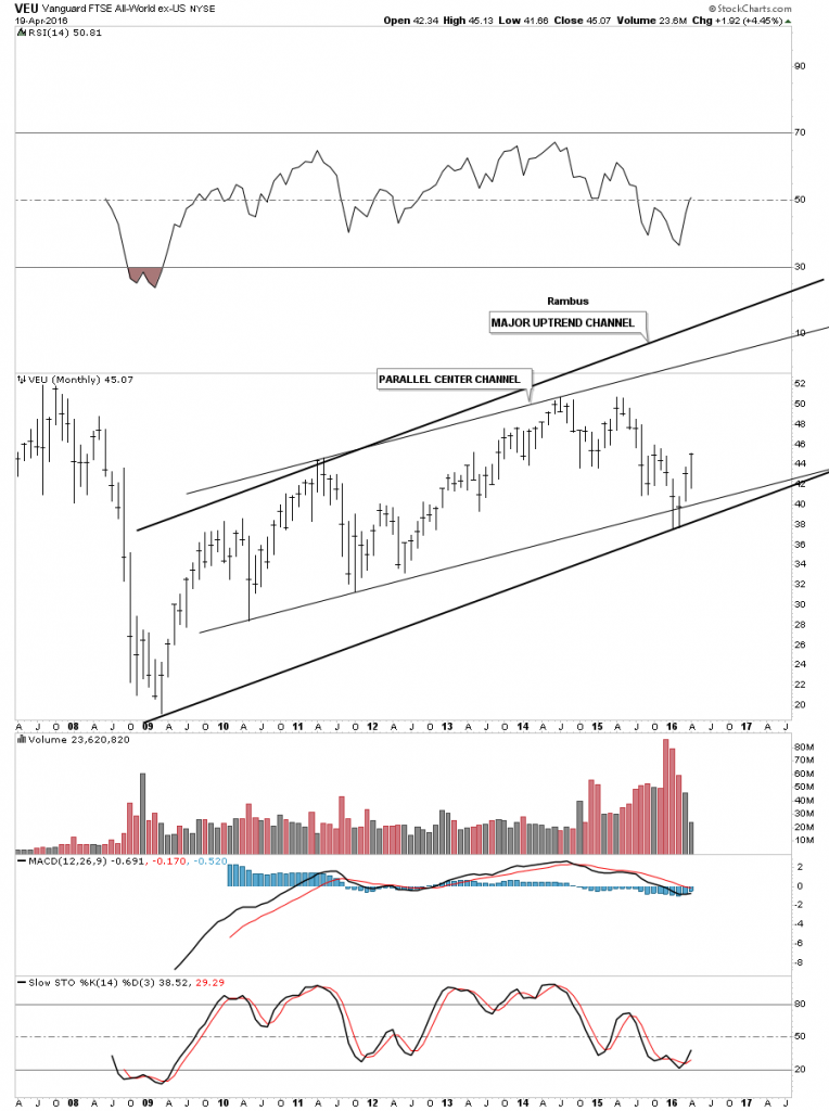
The VEU is an all world stock market index minus the US market.
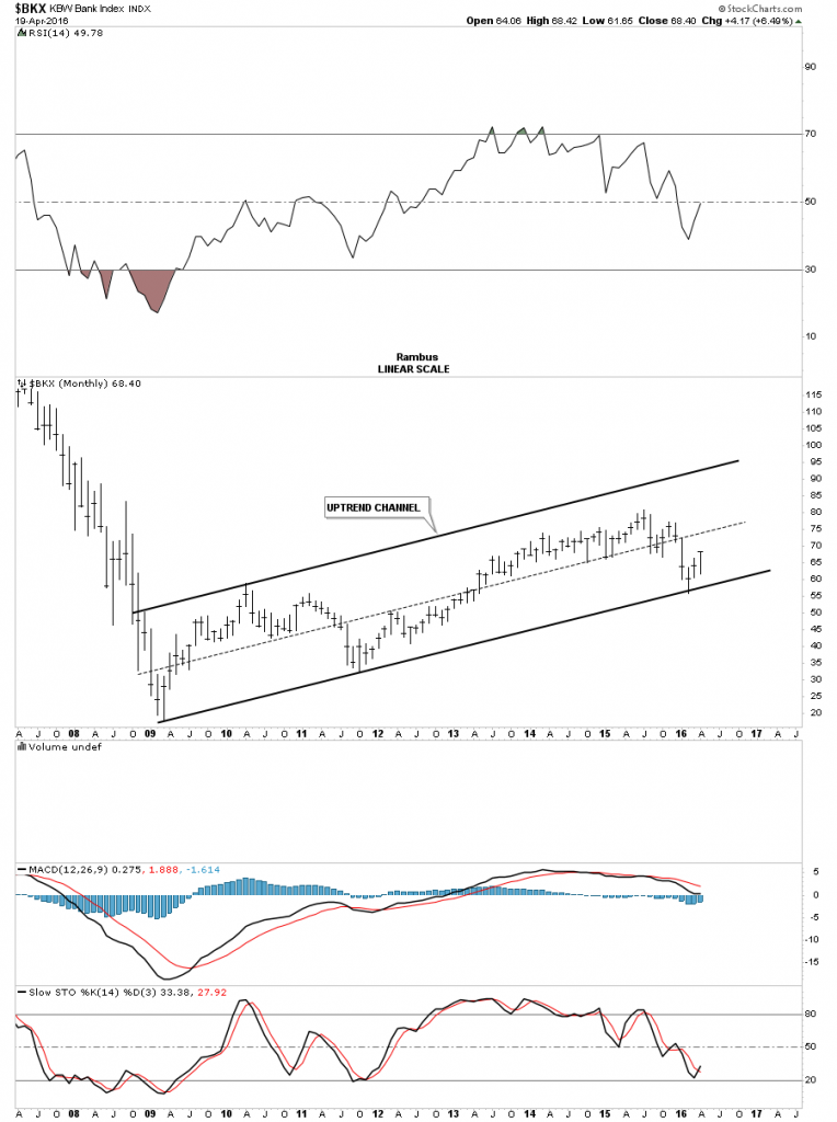
Lets now look at several of the different stock market indices to see if they represent the bull market that began seven years ago. The BKX, bank index, shows a nice bull market uptrend channel with the price action testing the bottom rail in February of this year. It’s not as steep as some of the other indexes we looked at but it’s in a bull market uptrend channel until proven otherwise.
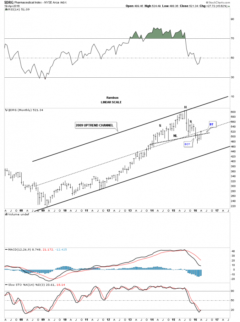
The DRG, Pharmaceutical index, is showing a failing H&S top within its 2009 bull market uptrend channel. The bears need to step up to the plate to get the price action back below the neckline.
I would like to end this report by looking at a 20 year monthly chart for the Transportation Average. Normally the Transportation Average will lead the stock markets higher or lower. Note how ugly this chart looked back in 2009 when it wrecked. From that very ugly low one of the most beautiful inverse H&S bottoms I’ve ever had the pleasure to build occurred. Note how the price action reversed symmetry back up over the same area where the crash happened. That reverse symmetry rally finally came to an end in 2011 which was at the all time highs made back in 2008. Note how the neckline symmetry rail showed the low for the right shoulder. After building out the one year red triangle consolidation pattern just below the neckline, the breakout move was about to get underway. Over the next couple of years the Transportation Average gained around 4000 points before topping out. Over the last 18 months or so this index has consolidated that massive move up by building out a bullish expanding falling wedge. It’s in the process of breaking out this month. This index will be a key driver going forward if the bull market is ready to enter into its next impulse move higher.
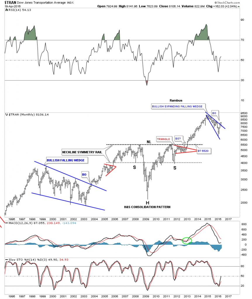
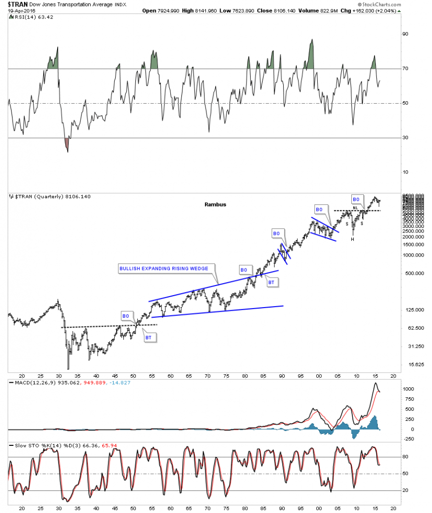
The 100 year chart for the Transportation Average puts that beautiful H&S consolidation pattern in perspective. The beauty of Chartology is that it’s just as relevant today as it was 100 years ago. Human psychology still remains the same when it comes to the stock markets. All the best…Rambus
Disclosure: None.


Great postings, Sir Rambus. You're one of the best. Much appreciated!