
Technical Market Report For January 6, 2024
The good news is:
- Last week's decline in prices was not accompanied by a significant increase in the number of new lows.
The Negatives
Summation indices are running totals of oscillator values.
Short term momentum indicators applied to summation indices make them nearly binary.
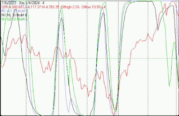
The first chart covers the past 6 months showing the S&P 500 (SPX) in red and momentum of summation indices of oscillators of advancing and declining issues, new highs and new lows and upside and downside volume on the NYSE. Dashed vertical lines have been drawn on the 1st trading day of each month.
After a lot of indecision all of the SI’s are heading downward.
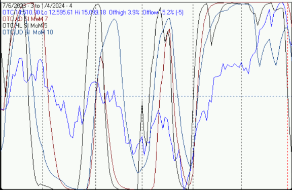
The next chart is similar to the one above; except it shows the Nasdaq composite (OTC), in blue, and the SI’s have been generated from Nasdaq breadth data.
Ditto Nasdaq SI’s.
The Positives
The market is oversold.
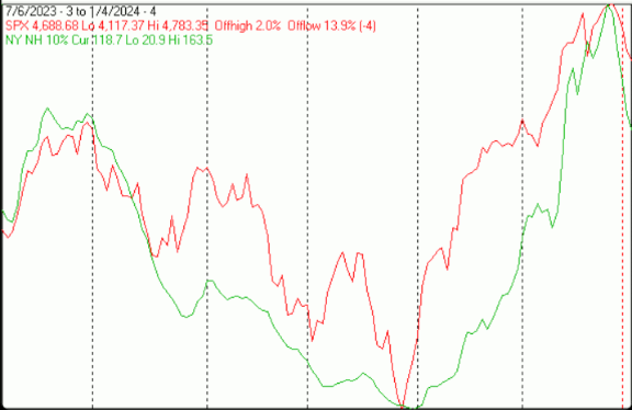
The next chart covers the last 6 months showing the SPX in red and a 10% trend (19 day EMA) of NYSE new highs (NY NH) in green.
NY NH tumbled after confirming the SPX at its new high for the year.
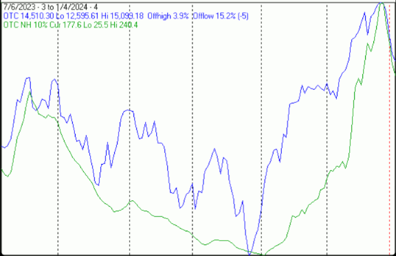
The next chart is similar to the one above except it shows the OTC in blue and OTC NH, in green, has been calculated with Nasdaq data.
OTC NH also confirmed the OTC high for the year.
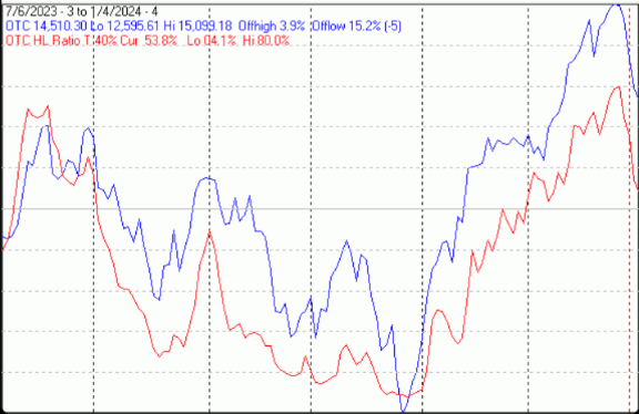
The next chart covers the past 6 months showing the OTC in blue and a 40% trend (4 day EMA) of Nasdaq new highs divided by new highs + new lows (OTC HL Ratio), in red. Dashed horizontal lines have been drawn at 10% levels for the indicator; the line is solid at the 50%, neutral level (equal numbers of new highs and new lows).
OTC HL Ratio tumbled last week, but remained in positive territory.
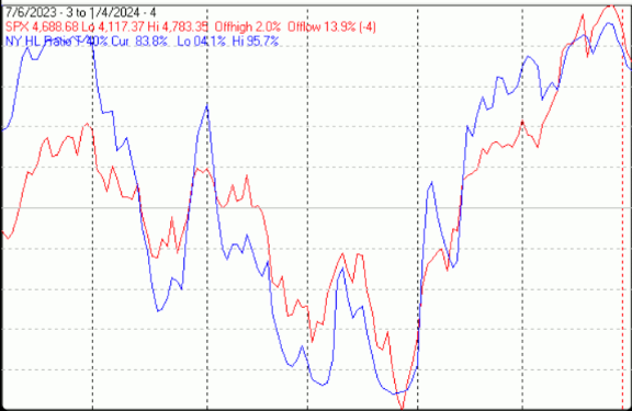
The next chart is similar to the one above except it shows the SPX in red, and NY HL ratio, in blue, has been calculated with NYSE data.
NY HL ratio also fell a little, but is very strong finishing the week at a strong 84%.
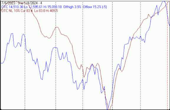
The next chart covers the last 6 months showing the OTC in blue and a 10% trend (19 day EMA) of Nasdaq new lows (OTC NL) in brown. OTC NL has been plotted on an inverted Y axis so decreasing numbers of new lows move the indicator upward (up is good).
OTC NL continued upward in spite of the sharp decline in prices.
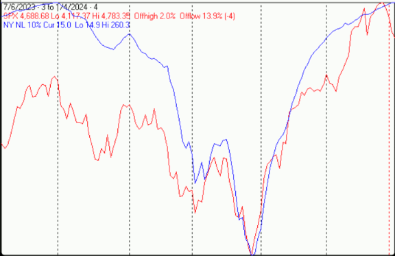
The next chart is similar to the one above except it shows the SPX in red and NY NL, in blue, has been calculated with NYSE data.
Ditto NY NL.
Seasonality
Next week includes the 5 trading days prior to the 2nd Friday of January during the 4th year of the Presidential Cycle. The tables below show the daily change, on a percentage basis for that period.
OTC data covers the period from 1963 to 2023 while SPX data runs from 1953 to 2023. There are summaries for both the 4th year of the Presidential Cycle and all years combined. Prior to 1953 the market traded 6 days a week; so that data has been ignored.
Average returns for the coming week have been positive by all measures.
Report for the week before the 2nd Friday of January.

The number following the year is the position in the Presidential Cycle.

Daily returns from Monday to 2nd Friday.


OTC Presidential Year 4 (PY4)

 Year       Mon     Tue     Wed    Thur    Fri    Totals

 1964-4   0.14%   0.41%   0.38%   0.19%   0.14%   1.26%

 1968-4   0.80%  -0.06%  -0.20%   0.29%   0.38%   1.22%

 1972-4   0.04%   0.47%   0.22%  -0.41%   0.27%   0.60%

 1976-4   0.90%   1.92%   0.90%   0.81%   0.81%   5.33%

 1980-4   0.41%   1.39%   0.61%   1.00%   0.49%   3.89%


 Avg      0.46%   0.82%   0.38%   0.38%   0.42%   2.46%


 1984-4  -0.22%   0.13%   0.02%  -0.02%  -0.27%  -0.36%

 1988-4  -0.67%  -1.26%   0.21%   0.47%   1.77%   0.52%

 1992-4   0.89%   0.73%   1.33%   1.55%  -0.66%   3.85%

 1996-4  -0.11%  -2.00%  -0.86%   2.00%  -0.31%  -1.27%

 2000-4   2.00%  -2.00%  -1.82%   2.00%   2.00%   2.18%


 Avg      0.38%  -0.88%  -0.22%   1.20%   0.51%   0.98%


 2004-4   2.00%   0.49%   0.99%   1.09%  -0.63%   3.93%

 2008-4  -0.21%  -2.00%   1.39%   0.56%  -1.95%  -2.20%

 2012-4   0.09%   0.97%   0.31%   0.51%  -0.51%   1.36%

 2016-4  -0.12%   1.03%  -2.00%   1.96%  -2.00%  -1.12%

 2020-4   0.56%  -0.03%   0.67%   0.81%  -0.27%   1.74%


 Avg      0.46%   0.09%   0.27%   0.99%  -1.07%   0.74%


OTC summary for PY4 1964 - 2020

 Avg      0.43%   0.01%   0.14%   0.86%  -0.05%   1.39%

 Win%       67%     60%     73%     87%     47%     73%


OTC summary for all years 1963 - 2023

 Avg      0.24%   0.06%   0.05%   0.40%   0.14%   0.89%

 Win%       66%     57%     56%     72%     66%     64%


SPX PY4

 Year       Mon     Tue     Wed    Thur    Fri    Totals

 1956-4  -1.40%  -0.79%   0.50%   0.83%  -0.18%  -1.03%

 1960-4  -1.23%  -0.61%  -0.56%   0.55%  -0.03%  -1.89%


 1964-4   0.23%   0.03%   0.41%   0.37%  -0.05%   0.98%

 1968-4   0.71%  -0.12%   0.02%   0.10%   0.10%   0.81%

 1972-4  -0.14%   0.32%  -0.06%  -0.58%   0.39%  -0.07%

 1976-4   1.85%   1.03%   0.45%   0.67%   0.39%   4.39%

 1980-4   0.27%   2.00%   0.09%   0.77%   0.03%   3.16%


 Avg      0.58%   0.65%   0.18%   0.27%   0.17%   1.85%


 1984-4  -0.22%  -0.56%  -0.10%  -0.02%  -0.44%  -1.34%

 1988-4   1.68%  -0.84%   0.16%   0.03%   2.00%   3.03%

 1992-4  -0.33%  -0.13%   0.17%  -0.12%  -0.60%  -1.01%

 1996-4   0.28%  -1.46%  -1.80%   0.70%  -0.15%  -2.42%

 2000-4   1.12%  -1.30%  -0.44%   1.21%   1.07%   1.66%


 Avg      0.51%  -0.86%  -0.40%   0.36%   0.38%  -0.02%


 2004-4   1.24%   0.13%   0.24%   0.50%  -0.89%   1.21%

 2008-4   0.32%  -1.84%   1.36%   0.79%  -1.36%  -0.72%

 2012-4   0.23%   0.89%   0.03%   0.23%  -0.49%   0.88%

 2016-4   0.09%   0.78%  -2.00%   1.67%  -2.00%  -1.46%

 2020-4   0.35%  -0.28%   0.49%   0.67%  -0.29%   0.94%


 Avg      0.45%  -0.06%   0.02%   0.77%  -1.01%   0.17%


 SPX summary for PY4 1956 - 2020

 Avg      0.30%  -0.16%  -0.06%   0.49%  -0.15%   0.42%

 Win%       71%     41%     65%     82%     35%     53%


SPX summary for all years 1953 - 2023

 Avg      0.07%  -0.11%  -0.13%   0.27%   0.01%   0.10%

 Win%       55%     45%     48%     71%     52%     52%
Presidential Year 4 (PY4)
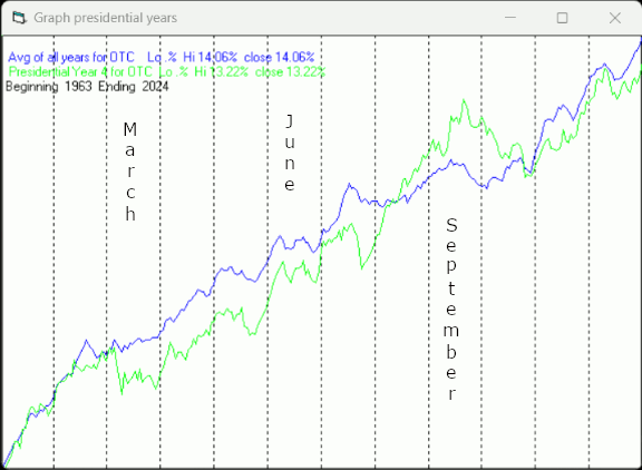
Since 1963, over all years, the OTC has been up 73% of the time with an average annual gain of 13.9%. In the 4th year of the Presidential Cycle the OTC has been up 80% time with an average annual gain of 10.6% making it the 3rd best year of the 4 year cycle. The best ever 4th year for the OTC was 2020 (+43.6%) (2023 was close at 43.4%), the worst 2008 (-40.5%).
The chart below has been calculated by averaging the daily percentage change of the OTC in a pattern similar to what I use to calculate the monthly charts. The monthly charts are then strung together to make an average year. Dashed vertical lines have been drawn on the 1st trading day of each month.
In the chart below the blue line shows the average of the OTC over all years since 1963 while the green line shows the average during the 4th year of the Presidential Cycle over the same period.
Since 1928, over all years, the SPX has been up 67% of the time with an average annual gain of 8.0%. In the 4th year of the Presidential Cycle the SPX has been up 75% time with an average gain of 7.5% making it the 2nd best year of the 4 year cycle. The best ever 4th year for the SPX was 1928 (+38.7%), the worst 2008 (-38.5%).
The chart below is similar to the one above except it shows the daily average performance over all years for the SPX in red and the performance for the 4th year of the Presidential Cycle in green.
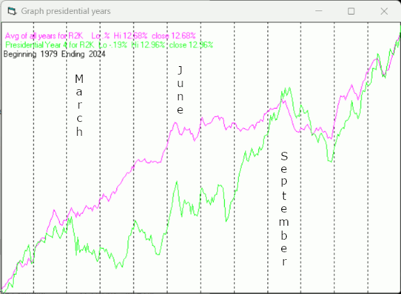
Since 1979, over all years, the Russell 2000 (R2K) has been up 70% of the time with an average annual gain of 10.8%. In the 4th year of the Presidential Cycle the R2K has been up 73% time with an average gain of 9.8% making it the 3rd best year of the 4 year cycle. The best ever 4th year for the R2K was 1980 (+33.8%), the worst 2008 (-34.8%).
The chart below is similar to those above except it shows the daily performance over all years of the R2K in magenta and the performance during the 4th year of the Presidential Cycle in green.
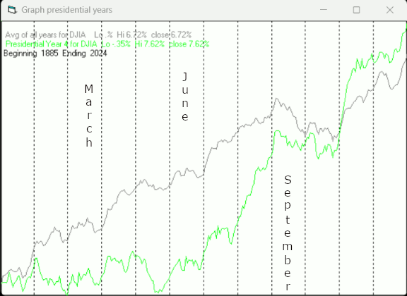
Since 1885, over all years, the Dow Jones Industrial Average (DJIA) has been up 66% of the time with an average annual gain of 7.4%. In the 4th year of the Presidential Cycle the DJIA has been up 71% time with an average gain of 7.1% making it the 3rd best year of the 4 year cycle. The best ever 4th year for the DJIA was 1928 (+48.2%), the worst 2008 (-33.8%).
The chart below is similar to those above except it shows the daily performance over all years of the DJIA in grey and the performance during the 4th year of the Presidential Cycle in green.
Conclusion
The market sold off last week, eliminating its overbought condition.
The strongest sectors last week were Utilities and Biotech while the weakest were Precious Metals (for the 2nd week) and Electronics.
I expect the major averages to be higher on Friday January 12 than they were on Friday January 5.
Last week's positive forecast was a miss.
More By This Author:
Technical Market Report For December 30, 2023Technical Market Report For December 23, 2023
Technical Market Report - Saturday, December 16


