
The good news is:
- New lows disappeared last week.
The Negatives
The market had a very good week last week and is now overbought.
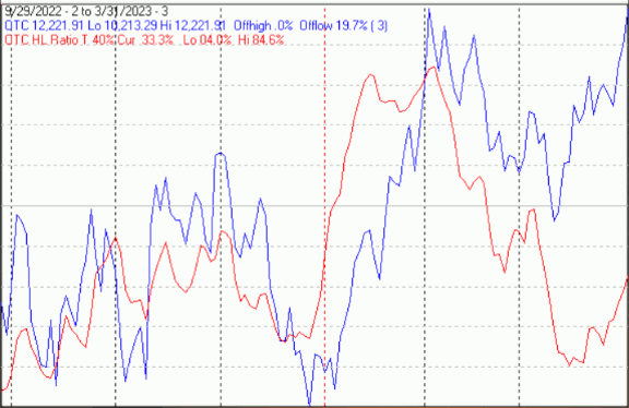
The first chart covers the past 6 months showing the Nasdaq composite (OTC) in blue and a 40% trend (4 day EMA) of Nasdaq new highs divided by new highs + new lows (OTC HL Ratio), in red. Dashed vertical lines have been drawn on the first trading day of each month. Dashed horizontal lines have been drawn at 10% levels for the indicator; the line is solid at the 50%, neutral level (equal numbers of new highs and new lows).
OTC HL Ratio rose sharply last week, but remained in negative territory.
The Positives
New lows disappeared last week.
On Friday, March 24 there were 280 new lows on the NYSE; on Monday, March 27 there were 34.
The numbers were similar on the Nasdaq, but not quite as dramatic.
There were 333 new lows on Friday, March 24 and 147 on Monday, March 27.
The next chart is similar to the first one except it shows the S&P 500 (SPX) in red and NY HL ratio, in blue, has been calculated with NYSE data.
NY HL ratio rose sharply finishing the week in positive territory.

The next chart covers the last 6 months showing the OTC in blue and a 10% trend (19 day EMA) of Nasdaq new lows (OTC NL) in brown. OTC NL has been plotted on an inverted Y axis so decreasing numbers of new lows move the indicator upward (up is good).
OTC NL turned upward last week.

The next chart is similar to the one above except it shows the SPX in red and NY NL, in blue, has been calculated with NYSE data.
NY NL also turned upward last week.

Summation indices are running totals of oscillator values.
The next two charts show summation indices of oscillators of advancing and declining issues, new highs and new lows and upside and downside volume.
Direction is all that matters.
This chart covers the past 6 months showing summation indices generated from Nasdaq data. In the past week they all turned upward.

The next chart is similar to the previous one, but it has been generated from NYSE data.
The pattern is similar, they all turned upward last week

Seasonality
Next week includes the first 4 trading days of April and also the 4 trading days prior to Good Friday during the 3rd year of the Presidential Cycle. The tables below show the daily change, on a percentage basis for that period.
OTC data covers the period from 1963 to 2021 while SPX data runs from 1928 to 2021. There are summaries for both the 3rd year of the Presidential Cycle and all years combined.
Average returns for the coming week have positive by all measures..
Report for the first 4 days of April.
The number following the year represents its position in the Presidential Cycle.
The number following the daily return represents the day of the week;
1 = Monday, 2 = Tuesday etc.
OTC Presidential Year 3 (PY3)

               Day1      Day2      Day3      Day4      Totals

 1963-3       0.13% 1   0.34% 2   0.28% 3   0.75% 4     1.50%

 1967-3       0.36% 1  -0.52% 2   0.06% 3   0.48% 4     0.38%

 1971-3       0.35% 4   0.49% 5   0.29% 1   0.36% 2     1.49%

 1975-3      -0.32% 2   0.27% 3  -0.89% 4  -0.29% 5    -1.23%

 1979-3      -0.30% 1   0.74% 2   0.32% 3   0.47% 4     1.22%


 Avg          0.04%     0.26%     0.01%     0.35%       0.67%


 1983-3      -0.76% 1   0.04% 2  -0.88% 3   0.10% 4    -1.50%

 1987-3      -0.40% 3   0.87% 4   1.22% 5   0.10% 1     1.79%

 1991-3      -0.30% 1   2.15% 2   0.78% 3   0.51% 4     3.14%

 1995-3       0.10% 1  -0.53% 2   0.32% 3  -0.31% 4    -0.42%

 1999-3       1.30% 4   2.68% 1   0.12% 2  -0.73% 3     3.36%


 Avg         -0.01%     1.04%     0.31%    -0.07%       1.28%


 2003-3       0.53% 2   3.59% 3  -0.01% 4  -0.94% 5     3.18%

 2007-3       0.03% 1   1.16% 2   0.34% 3   0.51% 4     2.04%

 2011-3       0.31% 5  -0.01% 1   0.07% 2   0.31% 3     0.67%

 2015-3      -0.42% 3   0.14% 4   0.62% 1  -0.14% 2     0.19%

 2019-3       1.29% 1   0.25% 2   0.60% 3  -0.05% 4     2.09%


 Avg          0.35%     1.03%     0.32%    -0.06%       1.63%


OTC summary for PY3 1963 - 1029

Averages      0.13%     0.78%     0.22%     0.07%       1.19%

% Winners       60%       80%       80%       60%         80%

MDD  4/6/1983  1.60% --  4/4/1975  1.23% --  4/4/2003  .95%


OTC summary for all years 1963 - 2022

Averages     -0.05%     0.28%     0.06%     0.23%       0.51%

% Winners       53%       68%       65%       57%         63%

MDD 4/4/2001  10.95% --  4/4/2000  9.27% --  4/5/1973  4.63%


SPX PY3

               Day1      Day2      Day3      Day4      Totals

 1931-3      -1.02% 3  -0.42% 4   1.34% 6  -1.02% 1    -1.12%

 1935-3       0.83% 1  -0.47% 2  -0.24% 3   1.06% 4     1.18%

 1939-3       2.28% 6   0.27% 1  -2.13% 2   0.36% 3     0.78%


 1943-3       0.09% 4  -0.26% 5   0.17% 6   0.09% 1     0.09%

 1947-3       0.40% 2  -0.07% 3  -0.26% 4  -0.07% 6     0.00%

 1951-3      -0.37% 1  -0.28% 2   0.66% 3   1.36% 4     1.36%

 1955-3       1.01% 5  -0.32% 1   0.68% 2   0.24% 3     1.61%

 1959-3       0.45% 3   0.56% 4   0.79% 5   0.28% 1     2.08%


 Avg          0.31%    -0.07%     0.41%     0.38%       1.03%


 1963-3       0.42% 1  -0.01% 2   0.78% 3   0.73% 4     1.91%

 1967-3      -1.06% 1  -0.02% 2   0.64% 3   0.17% 4    -0.28%

 1971-3       0.08% 4   0.17% 5   0.23% 1   0.71% 2     1.19%

 1975-3      -0.86% 2  -0.25% 3  -1.12% 4  -0.77% 5    -3.01%

 1979-3      -0.68% 1   1.49% 2   0.24% 3   0.59% 4     1.65%


 Avg         -0.42%     0.27%     0.15%     0.29%       0.29%


 1983-3       0.04% 1  -0.74% 2  -0.56% 3   0.48% 4    -0.78%

 1987-3       0.24% 3   0.42% 4   2.31% 5   0.51% 1     3.48%

 1991-3      -1.04% 1   2.21% 2  -0.15% 3   0.22% 4     1.24%

 1995-3       0.23% 1   0.68% 2   0.07% 3   0.10% 4     1.07%

 1999-3       0.57% 4   2.12% 1  -0.24% 2   0.68% 3     3.13%


 Avg          0.01%     0.94%     0.28%     0.40%       1.63%


 2003-3       1.21% 2   2.61% 3  -0.51% 4   0.27% 5     3.59%

 2007-3       0.26% 1   0.93% 2   0.11% 3   0.30% 4     1.60%

 2011-3       0.50% 5   0.03% 1  -0.02% 2   0.22% 3     0.73%

 2015-3      -0.40% 3   0.35% 4   0.66% 1  -0.21% 2     0.41%

 2019-3       1.16% 1   0.00% 2   0.21% 3   0.21% 4     1.58%


 Avg          0.55%     0.79%     0.09%     0.16%       1.58%


SPX summary for PY3 1931 - 2019

Averages      0.19%     0.39%     0.16%     0.28%       1.02%

% Winners       70%       57%       61%       83%         83%

MDD  4/4/1975  2.98% --  4/4/1939  2.13% --  4/2/1931  1.44%


SPX summary for all years 1928 - 2022

Averages      0.11%     0.24%     0.05%     0.22%       0.63%

% Winners       62%       61%       53%       62%         68%

MDD 4/5/1932  7.93% --  4/4/2001  4.92% --  4/1/2020  4.41%
April
Since 1963, over all years, the OTC in April has been up 67% of the time with an average gain of 1.6%. During the 3rd year of the Presidential Cycle April has been up 93% of the time with an average gain of 3.7%. The best April ever for the OTC was 2020 (+15.4%), the worst 1970 (-18.5%).
The average month has 21 trading days. The chart below has been calculated by averaging the daily percentage change for each of the 1st 11 trading days and each of the last 10. In months when there were more than 21 trading days some of the days in the middle were not counted. In months when there were less than 21 trading days some of the days in the middle of the month were counted twice. Dashed vertical lines have been drawn after the 1st trading day and at 5 trading day intervals after that. The line is solid on the 11th trading day, the dividing point.
In the chart below the blue line shows the average daily performance of the OTC in April over all years since 1963 in blue, while the black line shows the average during the 3rd. year of the Presidential Cycle over the same period.

Since 1928 the SPX has been up 64% of the time in April with an average gain of 1.4%. During the 3rd year of the Presidential Cycle the SPX has been up 83% of the time with an average gain of 2.6%. The best April ever for the SPX was 1933 (+42.2%) the worst 1932 (-20.2%).
The chart below is similar to the one above except it shows the average daily performance over all years since 1928 for the SPX in April in red and the average daily performance during the 3rd year of the Presidential Cycle, over the same period, in black.

Since 1979 the Russell 2000 (R2K) has been up 64% of the time in April with an average gain of 1.5%. During the 3rd year of the Presidential Cycle the R2K has been up 73% of the time with an average gain of 2.9%. The best April ever for the R2K, 2009 (+15.3%), the worst 2000 (-6.1%)
The chart below is similar to those above except it shows the average daily performance of the R2K, in April, over all years since 1979 in magenta and the average daily performance during the 3rd year of the Presidential Cycle in black.

Since 1885 the Dow Jones Industrial Average (DJIA) has been up 61% of the time in April with an average gain of 1.3%. During the 3rd year of the Presidential Cycle the DJIA has been up 76% of the time in April with an average gain of 2.9%. The best April ever for the DJIA 1933 (+40.2%), the worst 1932 (-23.4%)
The chart below is similar to those above except it shows the average daily performance during April, over all years in grey and the average performance during the 3rd year of the Presidential Cycle in black.

Conclusion
It looks like there was a cycle low in the breadth indicators a week ago.
Seasonality is strong until the end of June.
The strongest sectors last week were Precious Metals (for the 3rd week) and Basic Materials while the weakest were Biotech and Banks.
I expect the major averages to be higher on Friday, April 7 than they were on Friday, March 31.
Last week's negative forecast was a miss.
More By This Author:
Technical Market Report For March 25, 2023
Technical Market Report For March 18, 2023
Technical Market Report For March 11, 2023
Comments
Log in or sign up to join the conversation.