

Image Source: Pexels
Some macro series. One observation does not make a trend – but still…
(Click on image to enlarge)
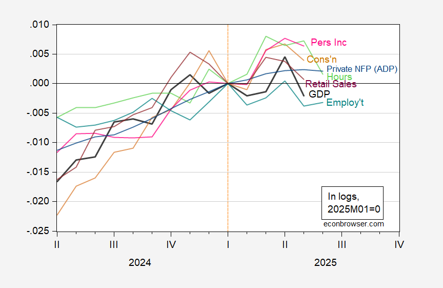
Figure 1: Monthly GDP (black), private nonfarm payroll employment-ADP (blue), civilian employment w/smoothed population controls (light blue), aggregate hours (light green), consumption (tan), personal income ex-transfers (pink), real retail sales (purple), all in logs 2025M01=0. Real retail sales is 3 month centered moving average of retail sales, divided by chained CPI. Source: S&P Global, ADP-Stanford, BLS, BEA, Census, and author’s calculations.
Note that NBER’s Business Cycle Dating Committee places primary emphasis on employment and income.
Series that continue to rise include the Philadelphia Fed’s coincident index. For a more complete tabulation of series, see this post.
More By This Author:
West Coast Port Traffic DownSigns Of A Slowing Russian Economy: CBR Drops Rate 200 Bp
Nowcasts Of GDP And “Core GDP”


Comments
Log in or sign up to join the conversation.