Pending Home Sales Chart – Housing Inflation Despite Weak Sales As Inventories Stay Tight
The National Association of Realtors (NAR) Pending Home Sales Index (PHSI) number for December fell by 8.7%, crushing clueless Wall Street economists whose consensus guess was for a decline of 0.2%. The headline number is a seasonally adjusted representation of the trend, and may or may not reflect actual market conditions at the time.
Actual Pending Home Sales
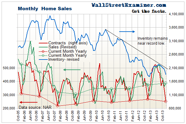
The actual, not seasonally adjusted number of pending home sales (sales going under contract) for December was approximately 250,800, based on the historical average ratio of the PHSI to actual final sales. That was a drop of 86,400 from November. The average December decline going back to 2005 was a drop of 62,000. The December reading was the lowest level of sales since December 2010 when a sales vacuum followed the expiration of the second home buyers tax credit housing stimulus program.
The current pending home sales index was down 6.1% from the year ago period. Blame the weather if you want, but any way you slice it, it was a bad performance. The disastrous seasonally adjusted representation was actually on point.
Pending Home Sales Fall But Listing Inventories Remain Tight
The NAR released closed sales and inventory for December earlier in January. It showed that listing inventories remained just above the record lows set the year before.
Pending Home Sales and Inventory Chart – Click to enlarge
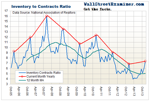
As a result of the fall in pending home sales, the inventory to contracts ratio, a measure of market tightness, rose from 6.1 in November to 7.4 in December. This is normal seasonality. Listings typically increase more than sales in December. However, the ratio also rose on a year to year basis from 6.85 in December 2012. This would normally indicate a loosening market, but in this case the number still indicates tight conditions. Other than 2012, it’s the lowest reading since 2005.
Pending Home Sales Inventory to Sales Ratio Chart – Click to enlarge
These numbers are calculated from all US Multiple Listing Services. Conditions are even tighter in the more active, desirable US markets.
Online real estate broker Redfin.com gathers real time MLS data for listing inventories and properties that went under contract each month from 19 large US metros. These markets represent some of the most active US markets. Its data for December 2013 shows that inventories in those markets fell versus December 2012. There were 199,461 total homes for sale in the 19 markets, a year to year decline of 12.5%. A total of 67,509 homes went under contract in December 2013, down 3.7% from December 2012. The inventory to sales ratio in those markets was just 2.95 in December 2013. That was down from 3.31 in December 2012. With conditions that tight, as the spring selling season gets under way, prices could skyrocket.
Extremely tight conditions continue to drive housing inflation in spite of historically weak demand. If the December weakness was really due to bad weather, that latent demand will return as the weather improves.
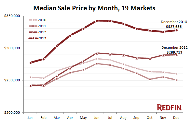
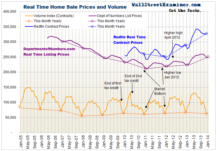
Redfin reports the aggregate median contract price for the current month in the 19 markets where it has offices. It showed that prices actually rose in December by 0.8% month to month, and 13.1% year to year. While somewhat slower than gains earlier in 2013, these increases are still bubble like. The uptick in sale prices in December is unusual. Prior Decembers showed prices flat or falling in December.
Real Time Pending Home Sales Prices – Click to enlarge
Real time listing prices have also proven to accurately show the overall trend of prices as subsequently verified by the lagging closed sales data released several months after the fact.The NAR, Dataquick, and Corelogic release national sales data without smoothing about 2 months after the close of the period in which the contracts were signed. They all confirm the accuracy of current listing price trends in terms of depicting market direction in real time. The widely followed Case Shiller Index compounds the lag by reporting only a moving average of sales over the previous 3 months, resulting in a lag of 5 1/2 months at the time of release.
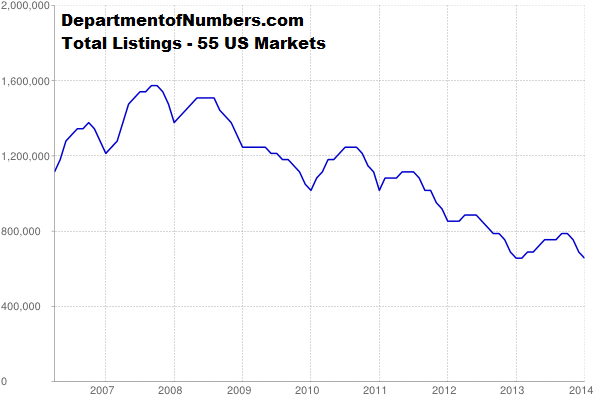
DepartmentofNumbers.com accumulates median listing prices from 55 of the largest US metros and reports an aggregate median listing price for the US as a whole. This data is a good representative sample, including both good and bad markets. The median listing price at the end of January was $250,088, up 1.15% from December and up 11.7% from the year before. The total number of listings as of January 27 was 662,571, barely above the record low reading of 648,938 in January 2012.
Real Time US Homes for Sale Listing Inventory – Click to enlarge
So in spite of near record low sales, tight inventories continue to push prices higher. This is a manifestation of the selective inflation caused by the distortions that result the Fed’s policies of QE and ZIRP. Rising house prices are not included in the CPI however. The conventional definition of inflation excludes asset prices. Conventional economics confuses people about whether there is or is not inflation. There is asset inflation, but CPI inflation is suppressed by the exclusion of housing, and the fact that QE and ZIRP suppress the value of labor. The prices of consumer goods can hardly rise if 90% of consumers are broke and losing purchasing power.
Real Time US Home Prices – Click to enlarge
Thanks to the Fed’s policies of ZIRP and QE which benefit mostly broker dealers, bankers, and speculators, both the financial and housing markets and the economy as a whole are distorted. The recovery, in particular the so called “housing recovery,” is an illusion.
Follow my reports on how the Fed and other central banks pump liquidity into the markets weekly in the Wall Street Examiner Professional Edition. Click this link to try WSE's Professional Edition risk free for 30 days!
©Copyright 2013, The Wall Street Examiner Company. All rights reserved.

