
Parsing The Employment And GDP Releases
The employment release reported a 209,000 net increase in nonfarm payroll (NFP) employment was below consensus, but still represented the sixth straight month of +200K net job creation. The net change in private NFP was 198,000. Here I want to note (1) the household survey based alternate measure of nonfarm payroll employment also continues to rise; (2) revisions in NFP and private NFP have typically been positive in recent months; (3) the 2014Q1 drop in GDP seems a little out of line with labor input.
Regarding employment, trends in the official NFP and the household series adjusted to conform to the NFP concept are positive.
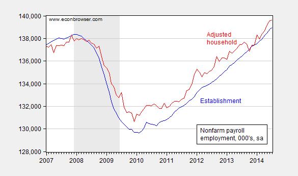
Figure 1: Nonfarm payroll employment (blue), and household survey employment adjusted to the NFP concept (red), both seasonally adjusted, in ’000s. Source: BLS via FREDBLS.
The household adjusted series is a check for those who are skeptical of the BLS firm birth/death model. It’s interesting that the series is above the official series during the expansion, in contrast to the pre-recession period when it typically lagged.
Next, observe that recent revisions have typically been to the upside.
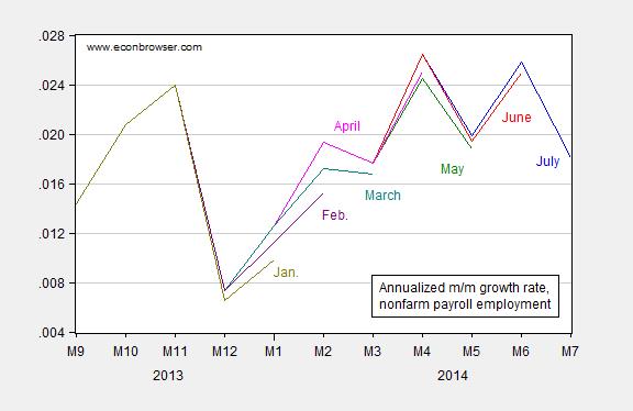
Figure 2: Annualized growth rate in nonfarm payroll employment from July release (blue), June release (red), May release (green), April (pink), March (teal), February (purple), and January (chartreuse), all calculated using log-differences. Source: BLS (various releases) and author’s calculations.
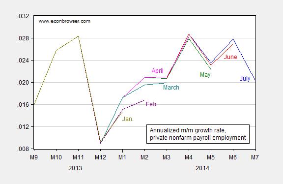
Figure 3: Annualized growth rate in private nonfarm payroll employment from July release (blue), June release (red), May release (green), April (pink), March (teal), February (purple), and January (chartreuse), all calculated using log-differences. Source: BLS (various releases) and author’s calculations.
This pattern suggests that July’s figure will be revised upward as well.
Finally, it’s of interest to see how labor input has covaried with output, particularly over the past couple quarters. In Figure 4, I present the first log difference in GDP, NFP, and aggregate private hours.
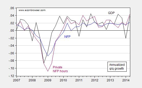
Figure 4: Annualized quarter-on-quarter growth in GDP (black), nonfarm payroll (blue), and aggregate private sector hours (purple), all calculated as log-differences. Source: BEA (2014Q2 advance GDP), BLS (July release), and author’s calculations.
Notice that the first quarter growth rate was revised up from -2.9% to -2.1% (SAAR) in the comprehensive annual revision. Nonetheless, the gap between (the growth rates of) hours and output seems pretty large. This point is shown in a slightly different form in Figure 5.
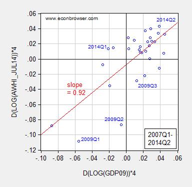
Figure 5: Annualized quarter-on-quarter growth in aggregate private NFP hours against real GDP, all calculated using log-differences.. Hours data is average of monthly observations. Red line is OLS regression line. Source: BEA (2014Q2 advance GDP), BLS (July release), and author’s calculations.
The 2014Q1 observation is far off the regression line — but not as far as in 2009Q1-Q2. However, these two quarters are periods when government consumption and investment rose substantially, in part due to the ARRA (recall aggregate hours are only for the nonfarm private sector). Hence, it may be that Q1 growth rates will be eventually revised noticeably upward.
Side note: Joint Economic Committee Chair Kevin Brady writes:
“Every new job is welcome news, but with millions looking for work we can’t celebrate a modest 209,000 jobs a month. Five years after the recession ended, the Obama recovery remains stuck in second gear.”
For purposes of comparison, five years and six months into President Obama’s presidency, nonfarm payroll employment is 3.8% higher than when he came into office. At a comparable point in President George W. Bush’s presidency, employment was only 2.9% higher than when he entered office.
Disclosure: None.


