
October Labor Report: Effects On Workers & Investors
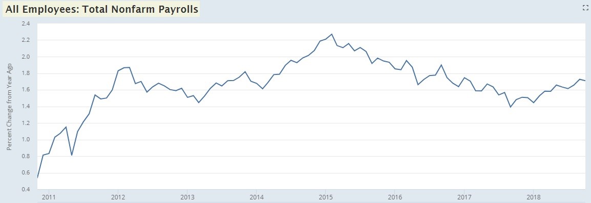
The declining job creation growth from 2015-2017 on a year over year basis caused fear because it implies the labor market cycle is nearing its end. However, those fears have been abated in 2018. The October report showed 250,000 jobs added which beat estimates for 190,000. The September report was revised down from 134,000 to 118,000, but that weakness was catalyzed by the hurricane. The August report was revised up from 270,000 to 286,000, meaning 2 of the past 3 reports have been very good. Sometimes great reports are tainted by negative revisions, but in this case, there was no net change in the past 2 reports combined which is a great sign.
(Click on image to enlarge)
Source: FRED
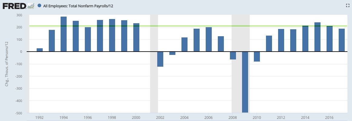
The unemployment rate was steady at 3.7% and the underemployment rate fell from 7.5% to 7.4%. The previous cycle troughed at 7.9% and the 1990s cycle troughed at 6.8%, putting the current level right in between the two. There has been an average of 212,500 jobs created in 2018. If that is steady for the rest of the year, it will be the 3rd best year of job creation since 2000 as you can see from the chart below. This indicates that the labor market still has slack since by growing faster than population growth it means people are coming off the sidelines.
(Click on image to enlarge)
Source: FRED
Terrible For Stocks & Bonds
Even though this labor report is great for workers since there was good job creation and solid wage growth, this was bad for the stock and bond market because it signals labor costs will increase and inflation might increase. Margins will be hurt by wage growth and the Fed might need to hike rates to keep down inflation. As a result of this report, the 10-year yield increased 8 basis points to 3.21% and the S&P 500 fell 0.63%.
Wage Growth Explodes
Let’s look at wage growth specifically now. Average hourly earnings growth was 0.2% month over month and 3.1% year over year. Year over year growth spiked from 2.8% in the previous month, beating estimates for 3%. It’s best to look at weekly wage growth to measure take-home pay as the amount people work shifts. The workweek was steady at 34.5 hours. Average weekly earnings growth was 3.4% which marginally beat the previous cycle peak in October 2010. This growth is far more consequential because more workers are employed now. This is the highest weekly earnings growth since August 2007.
We have been discussing the possibility of stronger real wage growth in previous articles. This seems to be occurring. We only have the inflation reports from September, so we aren’t sure about October yet, but the results look promising. Headline CPI growth fell from 2.7% to 2.3%. Since oil fell in October, it’s possible headline CPI was weak again in October. That would go great with the 3.4% nominal weekly wage growth.
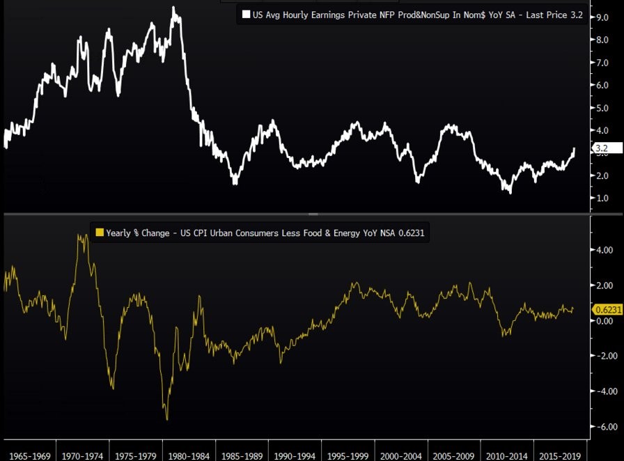
The chart below looks at production non-supervisory wage growth and core CPI.
(Click on image to enlarge)
Source: Bloomberg
This chart shows real wage growth is 0.62%. In the 1970s it was 56 basis points, in the 1980s it was -159 basis points, in the 1990s it was 2 basis points, in the 2000s it was 111 basis points, and in the 2010s it has been 39 basis points. That puts this decade in 3rd place out of 5.
Decent Productivity Growth
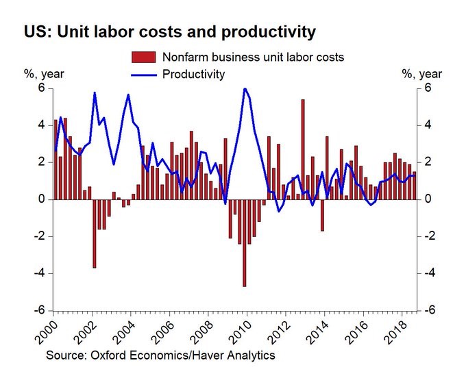
The BLS report isn’t the only way to measure wage inflation. The Q3 productivity and costs report showed unit labor costs were up 1.2% quarter over quarter and productivity growth was 2.2%.
(Click on image to enlarge)
Source: Oxford Economics
Unit labor costs fell 1% in Q2 and productivity growth was 3%. Compensation was up 3.5% in Q3 which increased from 1.9%. Output growth slowed from 5% to 4.1%, but that’s still a strong result. Hours worked growth slowed from 2% to 1.8%. Real compensation growth was 1.4% which was up from negligible and negative growth in the past few quarters. This was a great report as there was strong wage growth and strong output growth despite limited growth in hours worked.
Participation Rate Increases
The labor participation rate increased from 62.7% to 62.9% which beat estimates for 62.8%. This isn’t the best measurement because demographics naturally suppress it. It’s best to look at the prime age participation rate. This rate increased from 81.8% to 82.3% which is the highest rate since April 2010 when it was still declining. In theory, the rate could reach the previous cycle peak of 83.4% in just over 2 months if it keeps increasing at the current rate, but we’ve seen increases followed by declines in the past few years making that unlikely. It will likely increase slower than that.
Disclaimer: Please familiarize yourself with our full disclaimer here.


Back in the 60's, a man could make a living easily, and afford a home. It takes multiple incomes now. Making comparisons over time is like saying a live ball or a dead ball in baseball makes no difference. The game is different now. Purchasing power is different now. Recovery is more in doubt.