
No To: “The Stock Market Which Doubled Under Trump”
There are many people whose brains are “data-free zones”, and this comment is one example of the resulting exposition.
For completeness, here is a plot of the S&P500 (expressed relative to 2017M01).
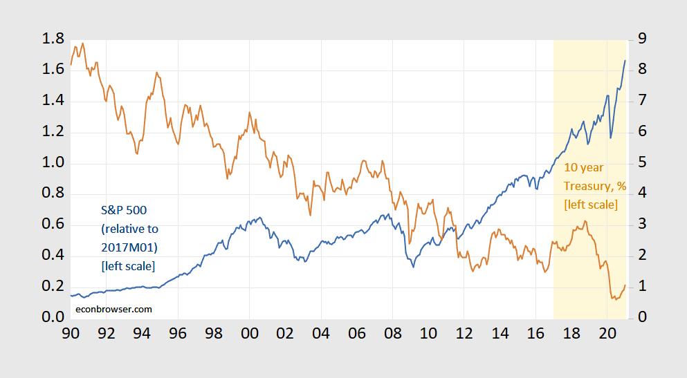
Figure 1: S&P 500 index as ratio to 2017M01 (blue, left scale), and 10 year constant maturity Treasury yield, % (brown, right scale). Orange shading denotes Trump administration. Source: FRED, author’s calculations.
As of January 2021, the index is only 67% higher. At the same time, the 10 year Treasury is 1.3 percentage points lower, so one should’ve expected ceteris paribus stock prices to be lower higher (recalling that the stock price is the present discounted value of dividends).
Folks, we live in an era where almost every macro/finance series — plus more — is available via FRED. Those that aren’t, are available elsewhere (see this list, for gosh sake!). Unless you are deliberately aiming to confuse/mislead people, please look to the data.
PS: Great historical financial data, including CAPE, on Robert Shiller‘s website.
Disclosure: None.


