
Median Household Income By State; A New Look At The Data
The Census Bureau's annual household income report for 2015 was published last month. We've now compiled a few tables for the 50 states and DC based on the Current Population Survey, a joint undertaking of the Census Bureau and Bureau of Labor Statistics, which includes annual data from 1984 to 2014. The details are fascinating.
First, some context. The median US income in 2015 was $56,516, up from $22,415 in 1984 — a 152% rise over the 32-year time frame. However, if we adjust for inflation chained in 2015 dollars, the 1984 median is $48,720, and the increase drops to 16%.
Peak Income Years
The peak annual median income for the US, adjusted for inflation, was in 1999. The latest data point, fifteen years later — after two recessions and two market crashes — is down 2.4%, which is a significant improvement over the 7.2% decline as of the previous year. Here is an alphabetically sorted table showing the data for the 50 states and DC along with the US median data.

The alphabetical listing above makes it easy to find individual states, but for some additional insight, let's sort the data based on the decline from the peak year.

The median household incomes in 9 states plus DC have fared better than the US median as measured by the real percent declines from their respective peak years. A total of 41 states have suffered greater declines, with six states dropping more than 15%. Kentucky is the biggest loser, down 19.5% since its real median income peak in 1998.
Highest to Lowest Incomes
The next table sorts the data by the 2014 median income column. A quick look at this table shows the huge spread between the $75.7K median in New Hampshire and the $40K in Mississippi. Of course, the cost of living, which varies significantly across the country, is a critical factor in comparisons of the raw data, a topic we'll address in a separate commentary.

For an idea of the geographical/regional distribution of median incomes, here is a map that color codes the states based on a quintile breakdown.

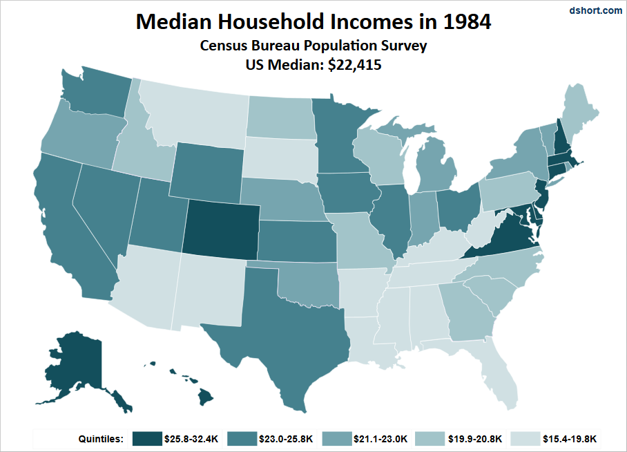
For the sake of comparison, here is the comparable map for the year 1984, the earliest year for which the Current Population Study provides the state breakdown.
21st Century Winners and Losers
We'll conclude this commentary with a comparison of the rankings of the 50 states and DC in 2000 and in 2014. The key column is the one labeled Change. Twenty-two states and DC have risen in the rankings, and 28 have declined.
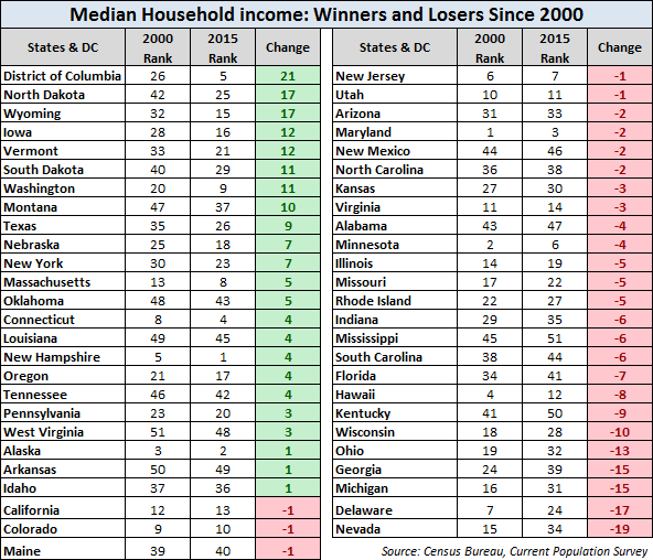
The many economic and political factors underlying the changes in rank are beyond our scope.
In a follow-up commentary, we'll take another look at median incomes by state after adjusting for the cost of living. As you can readily anticipate, the rankings shift dramatically.
Disclosure: None.


