

Image Source: Unsplash
How This Year Stacks Up
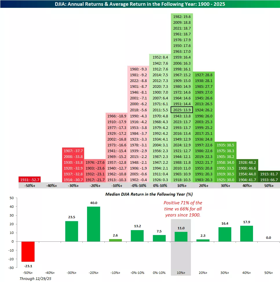
The Dow Jones Industrial Average has the longest history, so we’ll start with that.
The chart below shows the annual returns of the Dow for every year since 1900, grouped by ten percentage point increments.
With a gain of 13.9% this year (through 12/29), 2025 ranks in the upper middle of the pack as there have been 44 years when the index performed better and 65 when it performed worse.
Annual returns in the range of 10% to 20%, though, rank as more common than any other ten percentage point increment.
This year’s gain will be the 29th such occurrence since 1900. As the second chart highlights, years with gains of between 10% and 20% have been followed the next year by a median gain of 11.0% with positive returns 71% of the time.
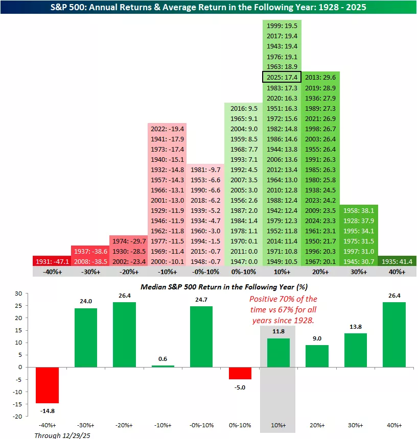
Moving on to the S&P 500, this year’s gain of 17.4% also ranks in the most common category of returns, as there have been 23 other years since 1928 when the index was up between 10% and 20%.
In terms of how this year compares to other years, there have been 46 years when the S&P 500 had a larger gain than this year and 51 when it performed worse.
Overall, in the 23 prior years when the S&P 500 was up between 10% and 20%, the median gain the following year was 11.8%, with positive returns 70% of the time.
It's also interesting to note that it has been more common for the S&P 500 to be up 20% to 30% than it has been for it to be up between 0% and 10%.
More By This Author:
Whose Bubble Is It Anyway?
Magnificent Metals
Quiet Post Christmas Friday


Comments
Log in or sign up to join the conversation.