
Half Of Case Shiller Home Price Cities Now At All-Time Highs
The monthly S&P/Case-Shiller home price indices were released earlier this week, and below we provide a look at the results so you can see how real estate prices are doing in your area of the country. (If you’re outside of the US, we’re sorry!)
In the first chart below, we show how much each of the cities tracked gained (or lost) on a month-over-month and year-over-year basis. Keep in mind that these indices are on a two-month lag, so this month we’re looking at February results.
As shown, every city tracked posted MoM and YoY gains in February, with Seattle up the most over both time frames. Thank you Amazon.com!
Chicago was up the least on a month-over-month basis (+0.05%), while the DC area was up the least on a year-over-year basis (+2.43%).
(Click on image to enlarge)

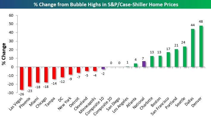
In the chart below, we show how much each city is up or down versus its highest point during the Housing Bubble of the mid-2000s. This month we saw both San Diego and Los Angeles eclipse their prior all-time highs, which means exactly half of the cities tracked are now at new all-time highs, while half are still below their bubble highs.
Denver and Dallas are by far up the most from their mid-2000s highs, while Las Vegas, Phoenix, Miami, and Chicago are the farthest below their prior highs.
(Click on image to enlarge)
Our next chart shows how much home prices have gained off of their low points following the bursting of the Housing Bubble.Most of these lows weren’t made until 2011/2012, which was 2-3 years after the low for the stock market in March 2009. As shown, the three composite indices are now up around 50% off of their lows. San Francisco home prices are up the most at +118%, followed by Las Vegas (+93%), Seattle (+85%), and Detroit (+84%).
On the weak side, Cleveland and New York have seen home prices bounce the least off of their housing crash lows at just +25%. Other cities that have posted relatively weak home price gains over the last few years include the DC area and Chicago.
(Click on image to enlarge)

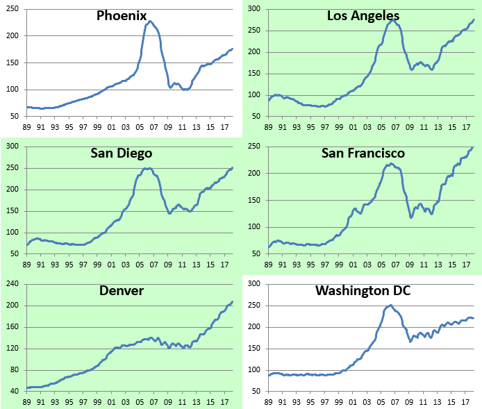
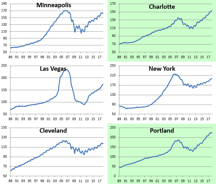
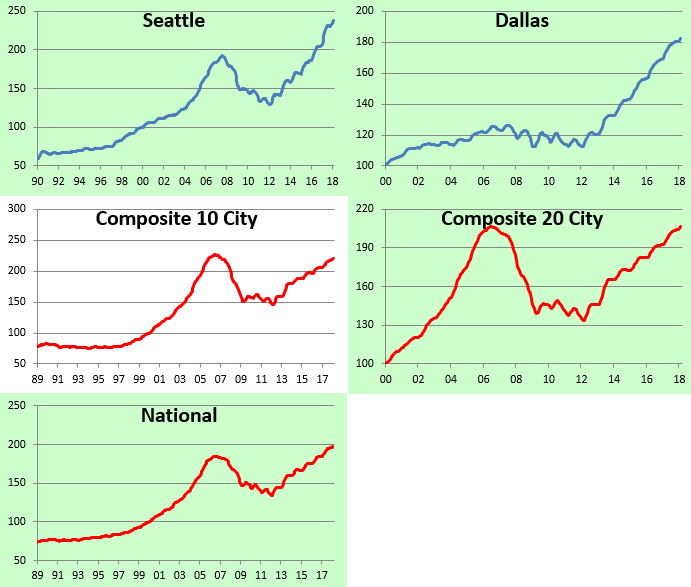
Below we provide raw price charts for the S&P/Case Shiller home price indices going back as far as their data goes.Cities that are highlighted in green have eclipsed their prior Housing Bubble highs, while those not highlighted in green are still below their prior highs.As mentioned earlier, Los Angeles and San Diego are the two cities that just made new highs this month.
(Click on image to enlarge)
(Click on image to enlarge)

(Click on image to enlarge)
(Click on image to enlarge)
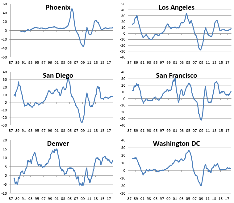
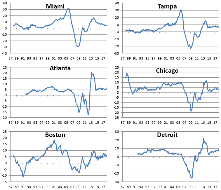
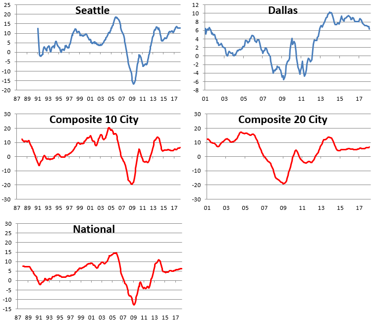
We’ve also made charts that highlight the year-over-year percentage change in the S&P/Case-Shiller home price indices. These are included below.When looking through the charts, you’ll mostly notice a big spike in YoY gains during the Housing Bubble, then a crash to extremely negative levels during the bust, and then a two-stage recovery since then. The last period of rapid YoY home price growth for most cities came to an end in 2013/2014, and since then, we’ve seen slow and steady gains. No city has seen a year-over-year decline in home prices for a number of years now.
(Click on image to enlarge)
(Click on image to enlarge)
(Click on image to enlarge)

(Click on image to enlarge)
Disclosure: Start a two-week free trial to Bespoke Institutional for more in-depth coverage of US ...
more

