
Charts To Consider This Weekend

Image Source: Unsplash
If you’re reading this, consider yourself one of the very lucky creatures that aren't stuck in a single room in your house to conserve energy with your family, discovering which person would absolutely betray you for a space heater (I wrote this last night, so maybe it would turn out to be me).
We bought this house in September, and we’ve quickly discovered just how much heat loss we experience every day. Our windows are now covered in plastic, and it looks like we live in a bounce house. I don’t know what the weather will actually look like yet, but given that we’re out in the country and our electrical wires hang from our telephone poles like wet noodles, I’m going to bank on a low probability of power on Monday and Tuesday.
The good news is that I have a pretty strong patchwork backup electrical system, and so long as I’m able to plug our modem in, we should be good -- which is the exact sentence spoken moments before everything fails.
We’ll see. it’s bound to be just a wonderful time. Thanks to Hurricane Ian for the practice. Now, let’s quit screwing around and look at key charts from the markets.
Chart 1: More Than Bullish
Well, this is something. People couldn’t be much more bullish right now, according to Bank of America. I wonder why?
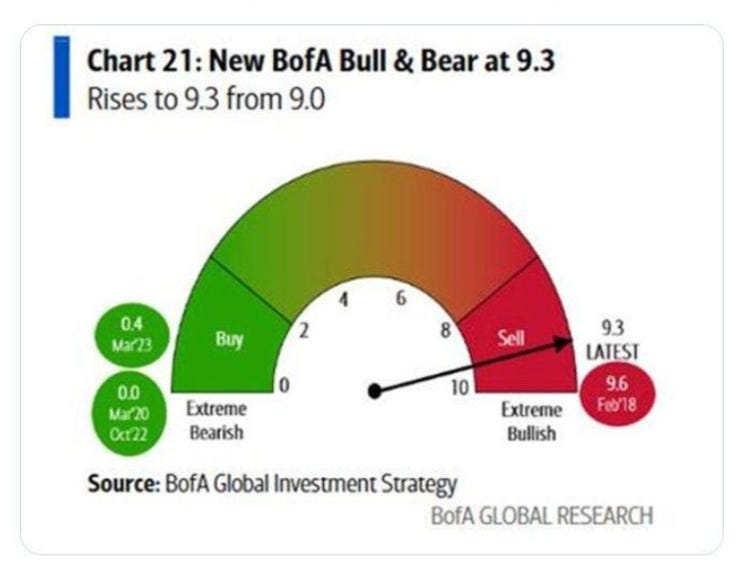
Image Source: Bank of America
Could it be the stimulus from Japan? The U.S. Fed buying half a trillion in assets? The government buying MBS? If someone says it's earnings, I’m going to lose it.
Chart No. 2: You Haven't Seen Anything Yet
Retail option trading continues to explode in volume, up and to the right. The retail trade is a growing share of options activity, and it shows. But guess what? It’s about to explode much higher.
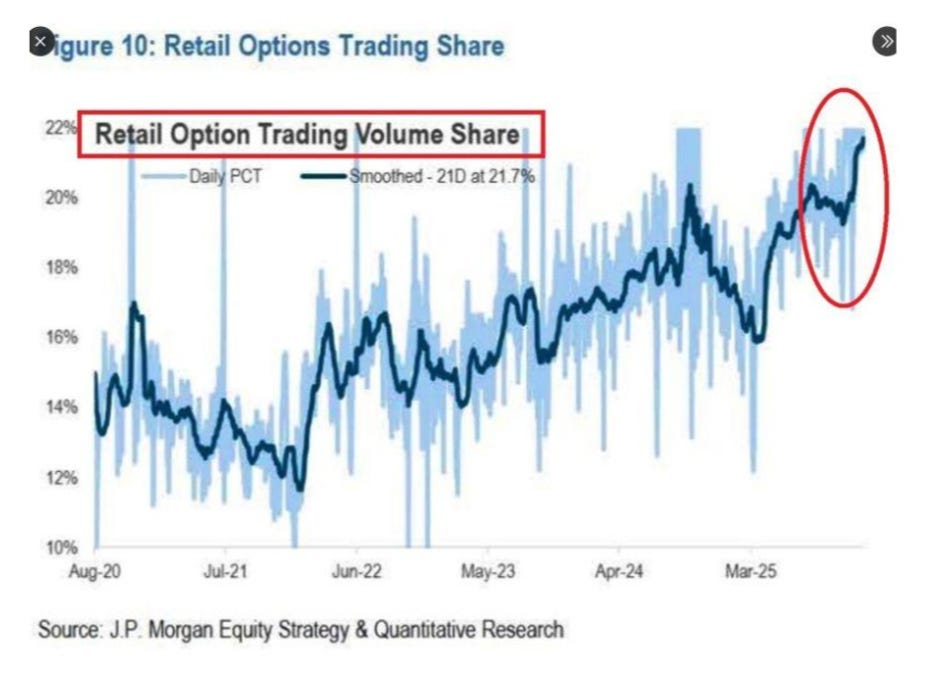
Image Source: JPMorgan
On Monday, we’ll receive our first batch of 0-DTE options across 8 assets. Want to trade options activity for Apple expiration on Monday in February? Now you can. Because we don’t build factories, we build expirations.
Did you think we were going to put that money into a factory? I need to do an Iron Condor on the iShares Bitcoin Trust ETF (IBIT), and then look to do a butterfly on Amazon. Nothing says capital formation like emotional hedging.
Chart No. 3: Great Time for The Short Squeeze
It seems they've printed money yet again. Just a reminder that liquidity drives momentum, and returns are the end result of momentum.
So, when liquidity returns, all of the junk in the market with high short interest just burns higher. Did we really think that something was going to change in this market?
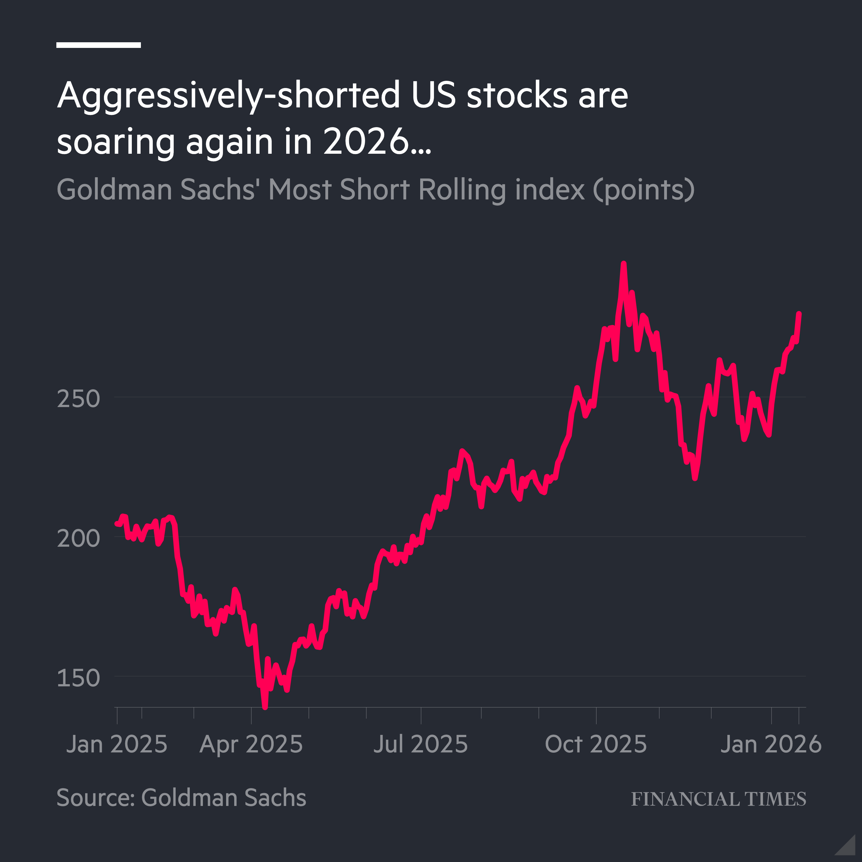
Image Source: Goldman Sachs/Financial Times
The most recent bottoming on these short interest stocks was Nov. 21. What happened on that date? Japan announced $117 billion in stimulus. What happened the day prior? Insiders loaded up at their highest buying-to-selling ratio in real dollars since mid-April.
A potential approach could be to wait for stocks with high short interest to align with a switch to positive momentum (our signal). Then, wait for the eight-day EMA to cross above the 20-day EMA. Buy the stock, set a tight stop, and then hold it until it either stops out, falls back under its eight-day EMA, or goes overbought on the Relative Strength Index (RSI).
Chart 4: All Hail Silver
Silver ran above $100, and this isn’t similar to 1980 or 2011. This is structural.
My favorite part of this chart is that I was buying a significant amount of physical silver starting in April 2024, about a few weeks after we advocated for gold and silver in an era of dollar debasement, more monetary policy, and the hyper-issuance of short-term Treasury bills.
When all that silver arrived at my house from BGASC, my wife just complained, saying “What are you doing? Where are you putting all this stuff? Why are you buying this?”
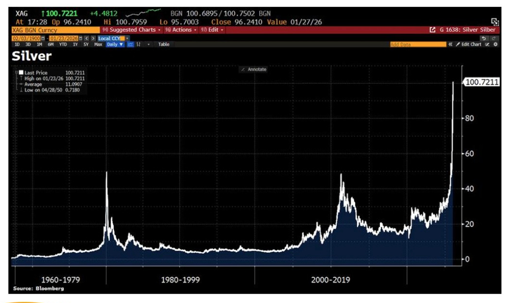
(Click on image to enlarge)
Image Source: Bloomberg/Syz Group
Now, it all sits in a safe deposit box. When I told her that silver had gone up 300% since I started buying it all, she corrected me, saying “When we started buying it?”
People keep telling me that silver is up 50% over the last few months. Or we could say what’s really going on: The dollar is down 33% against silver over the last few months, which no one has mentioned, oddly enough.
Chart No. 5: 1993 Happened?
One of the original series of articles that I wrote in this publication was called “1993.” It explored the six major events in 1993 that explain this chart, as well as the fact that markets are at all-time highs and are completely disconnected from the underlying economy.
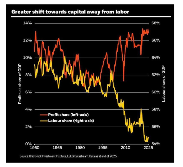
Image Source: BlackRock
I had long argued that the Inflation Targeting debate (and later implementation) was the big one. But the more I think about it, the more I’m sure it was giving Al Gore so much power over the environment and supply-side policies. We stopped building things. We can’t open mines here without lawyers blowing up processes. So, we really started financializing during that time period, and it’s compounded.
And if you’re looking to laugh, read The Man with the Big Red Balloon. That book was supposed to be satire, but now it feels like non-fiction.
Chart No. 6: Anchoring Currencies to Gold
So, some people continue to argue that the U.S. dollar should be linked to gold. If we did anchor it, we would need gold to be around $20,000 per ounce, but there are some estimates that are wilder. VanEck has it at $39,000 to back the global M0, and $184,000 an ounce to back the Global M2.
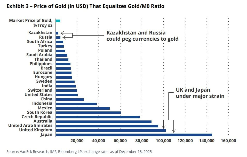
Image Source: VanEck
Japan, however, would need it in the range of $145,000. Aren’t paper currencies magical?
Chart No. 7: Everyone About to Be An Expert
When the newscycle ends around this massive storm, this will be the chart that people will be talking about. Backup battery storage and the incredible demand required to actually backstop our infrastructure and electrical grid.
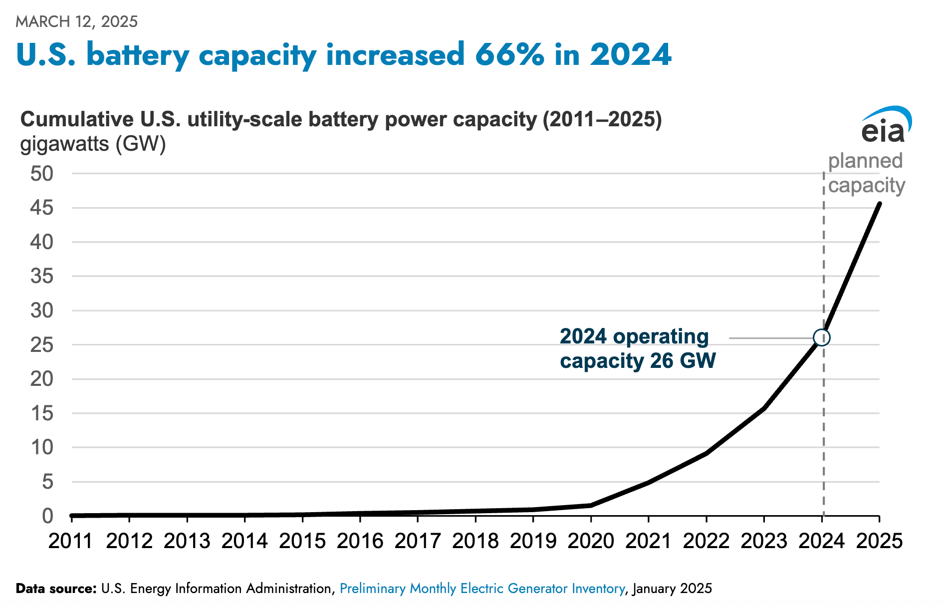
Image Source: EIA
Generac (GNRC) is about to have quite the week.
Watch Congress mandate backup power, then regulate the extension cord. And then try to mandate that people buying homes spend countless amounts on backup power, as we’ve done elsewhere by adding lots of expensive bells and whistles to new cars. That feels inevitable. Put the responsibility on the individual, not on the system they are responsible for.
Chart No. 8: It’s in the Midstream
It’s not really a chart, but it’s a map of our pipelines around the nation.
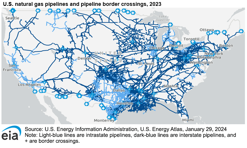
Image Source: EIA
How is solar faring right now as a source of energy in this storm? What about wind? How are our battery systems? Well, here’s what’s holding the country up: Natural gas pipelines.
Just remember, there’s always money in the midstream.
Chart No. 9: And Finally
I’m long.
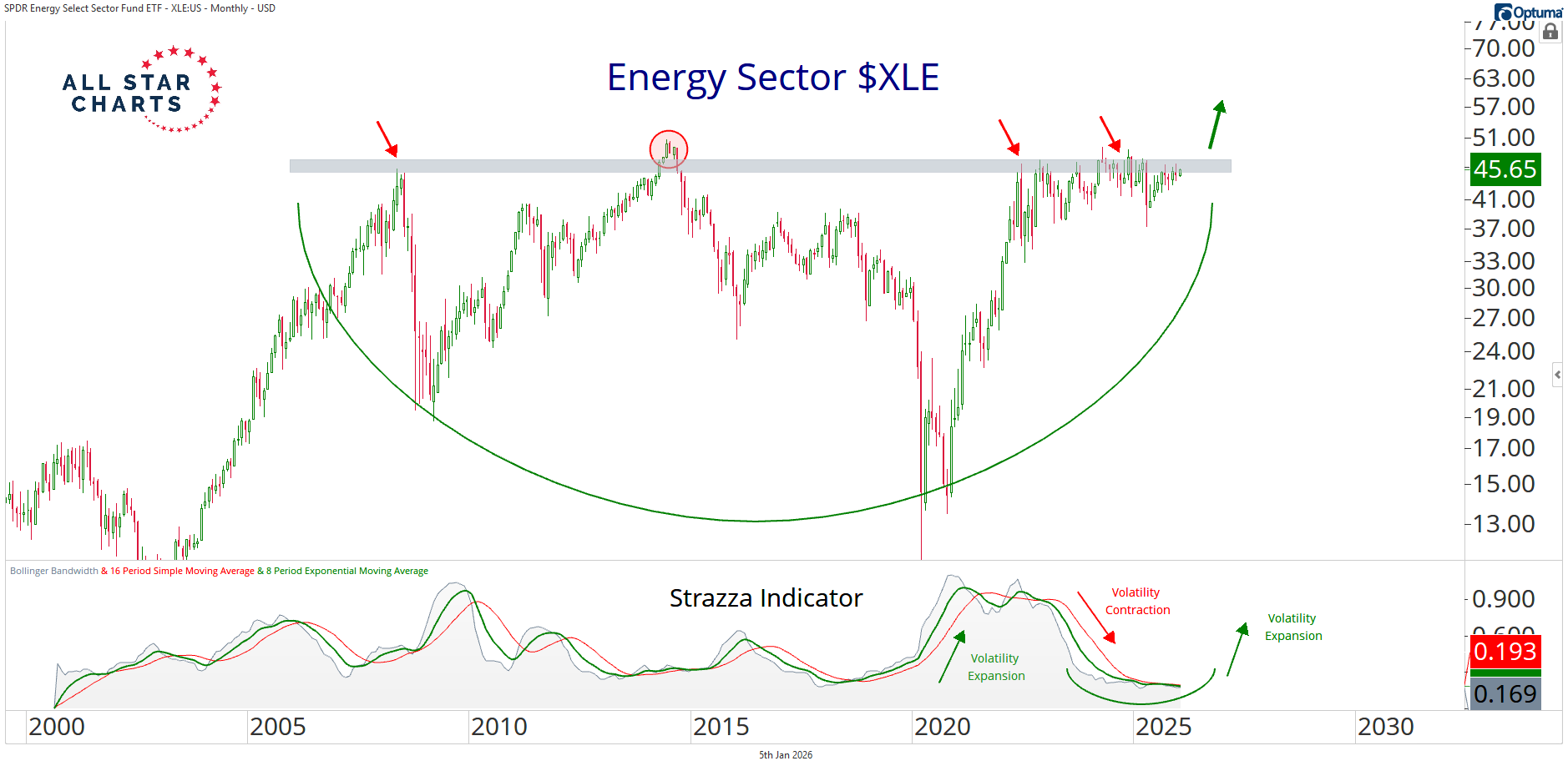
Image Source: All Star Charts
Energy Secretary Christopher Wright said this week that the world needed to double oil output to prevent energy poverty. Given that he actually understands how energy works (unlike many of our previous energy secretaries), I’ll look for an opportunity.
There are still dozens of E&P names trading under their book value that would make for intriguing takeover candidates. But I’ll stick with the oil-and-gas industry for the long haul because I expect it will continue to benefit from strong tailwinds. It feels like this country is starting to actually wake up to the fact that we need hard assets if we want to be able to accomplish anything.
Now then, enjoy the rest of your day and let me know who won the football games.
More By This Author:
This Winter Storm Is A 17-Year Stress TestYen Intervention, Leverage Checks, And Other Things To Think...
A Short Look At Charts


