
Bullish Expanding Falling Wedge
I’ve been mentioning lately that I thought that many areas in the PM complex could be building out a potential bullish expanding falling wedge. This is a bullish pattern that few if any chartists actually look for.

My experience with this pattern is that it often leads to a big move.
The reason this pattern is so bullish is because it is made up of lower highs and lower lows with the last low being extreme, catching all the sell/stops and scaring investors out of their positions. Once that happens there are no sellers left and the move reverses direction leaving those that sold into the decline sitting on the sidelines.
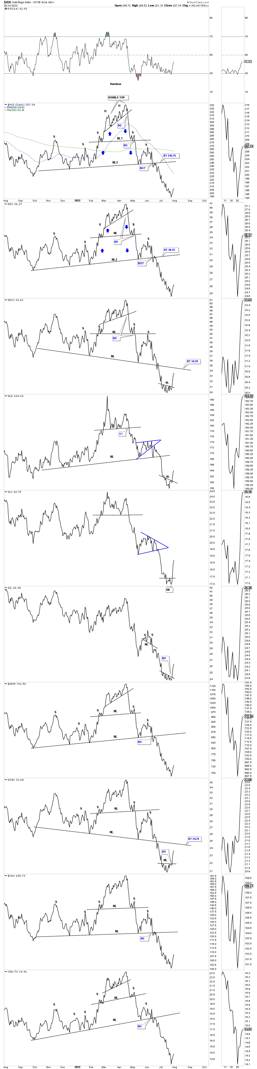
I would like to start with the daily line chart for the PM complex we’ve been following on a daily basis which now shows some small reversal patterns like the H&S and double bottoms. The reason I want to start with this chart is to make you aware of where those small H&S and double bottoms are in the bigger picture.
As you can see the GDXJ, GLD, SIL and the GOEX have a small H&S reversal pattern forming after the steep decline from the double top. The SLV has a small double bottom reversal pattern.
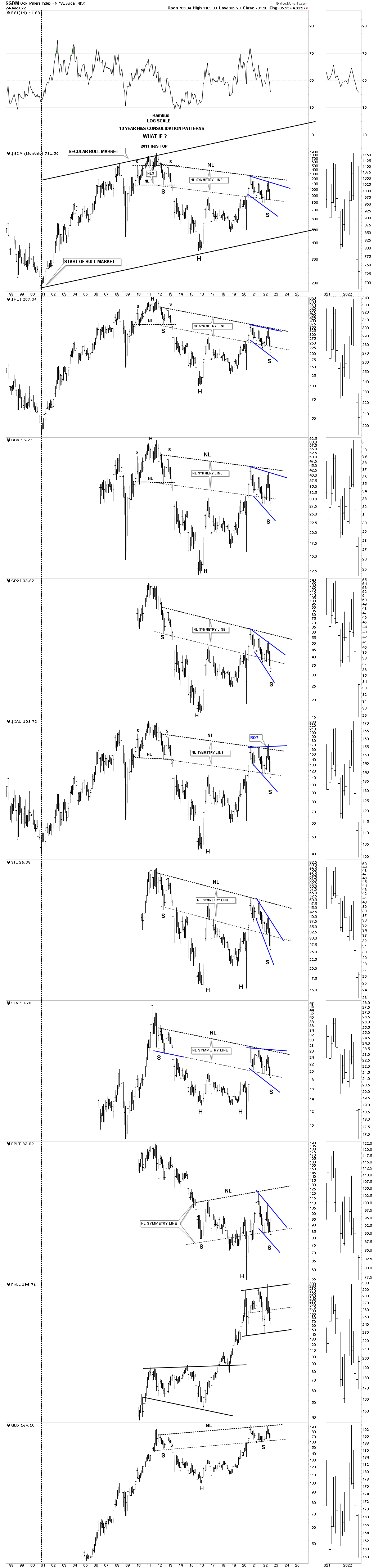
We’ve been following this next long term weekly chart for the HUI which shows the 2016 trading range which is still under construction. There are two rather large consolidation patterns that make up the internal structure of the potential 2016 rising wedge formation, the 2016 bullish falling wedge and the possible 2020 expanding falling wedge.
I’ve been showing you for a month or so where we may look for important support to come into play which is where the bottom rail of the 2016 rising wedge and the bottom rail of the blue expanding falling wedge intersect around the 200 area which so far has been holding support.

Its been several months since I last showed you the monthly combo chart for the PM complex which shows the potential massive H&S consolidation patterns. When the price action started to trade below the right shoulder neckline symmetry line I began to lose hope that the potential massive H&S consolation patterns were failing.
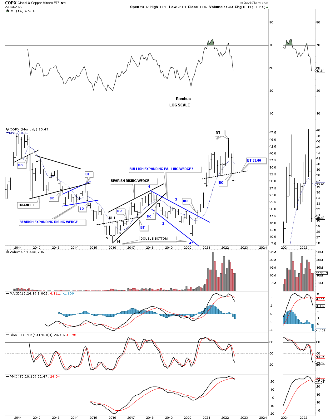
As you can see that just about every PM stock indexes is showing the blue expanding falling wedge. It is very important to keep in mind that this potential bullish pattern won’t be complete until the top rail is broken to the upside. If we see that happen then we’ll know the big H&S consolidation pattern will also give way.
The last point I would like to make about the potential bullish expanding falling wedge is that this is one of the hardest patterns to spot in real time as I described in the 2nd paragraph of this Weekend Report. If one can spot the last reversal point in the expanding falling wedge they will be richly rewarded while the sellers will be greatly disappointed for selling their shares in a panic.
When you look at the first chart, the daily line combo chart above, note where the small H&S and double bottoms show up on this chart below.
I’ve been showing many bullish expanding falling wedges since the very first day we opened up our door back in 2011. In a bull market the bullish expanding falling wedge and the bullish rising wedge are my two favorite chart patterns.
The charts to follow are pretty self explanatory, but you will see with your own two eyes why I like this pattern so much. Normally I will buy the breakout and backtest of a chart pattern unless I see a reversal pattern forming on an important trendline, then I’ll try to buy the bottom which is tougher to do.
When you look at the following charts think how much fun you would have if you had bought the very bottom of the bullish expanding falling wedge and had the courage to ride the move to completion. Just like any chart pattern it can form on any timeframe.
In no special order.


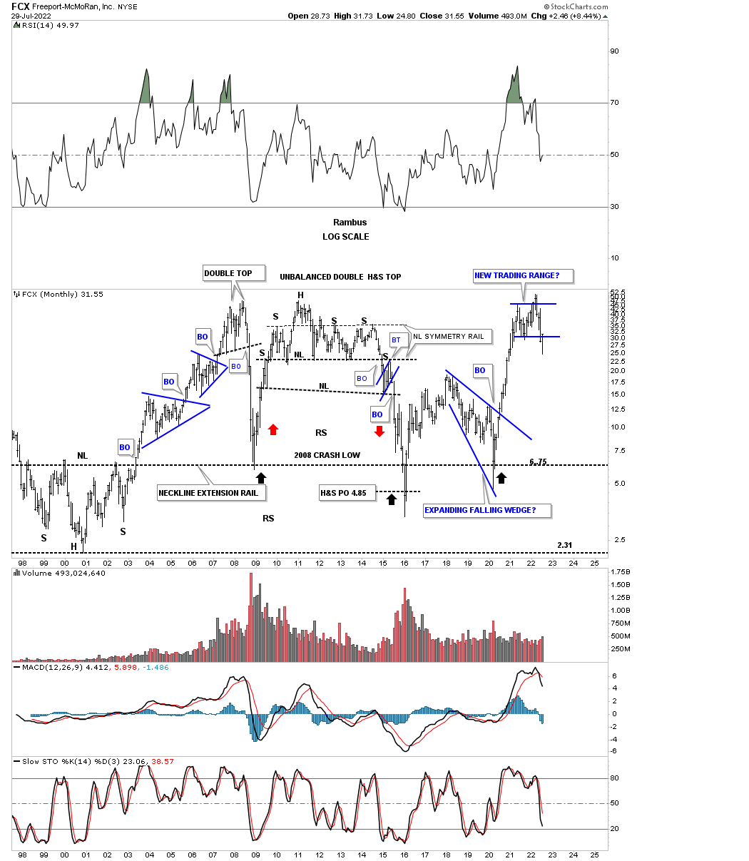
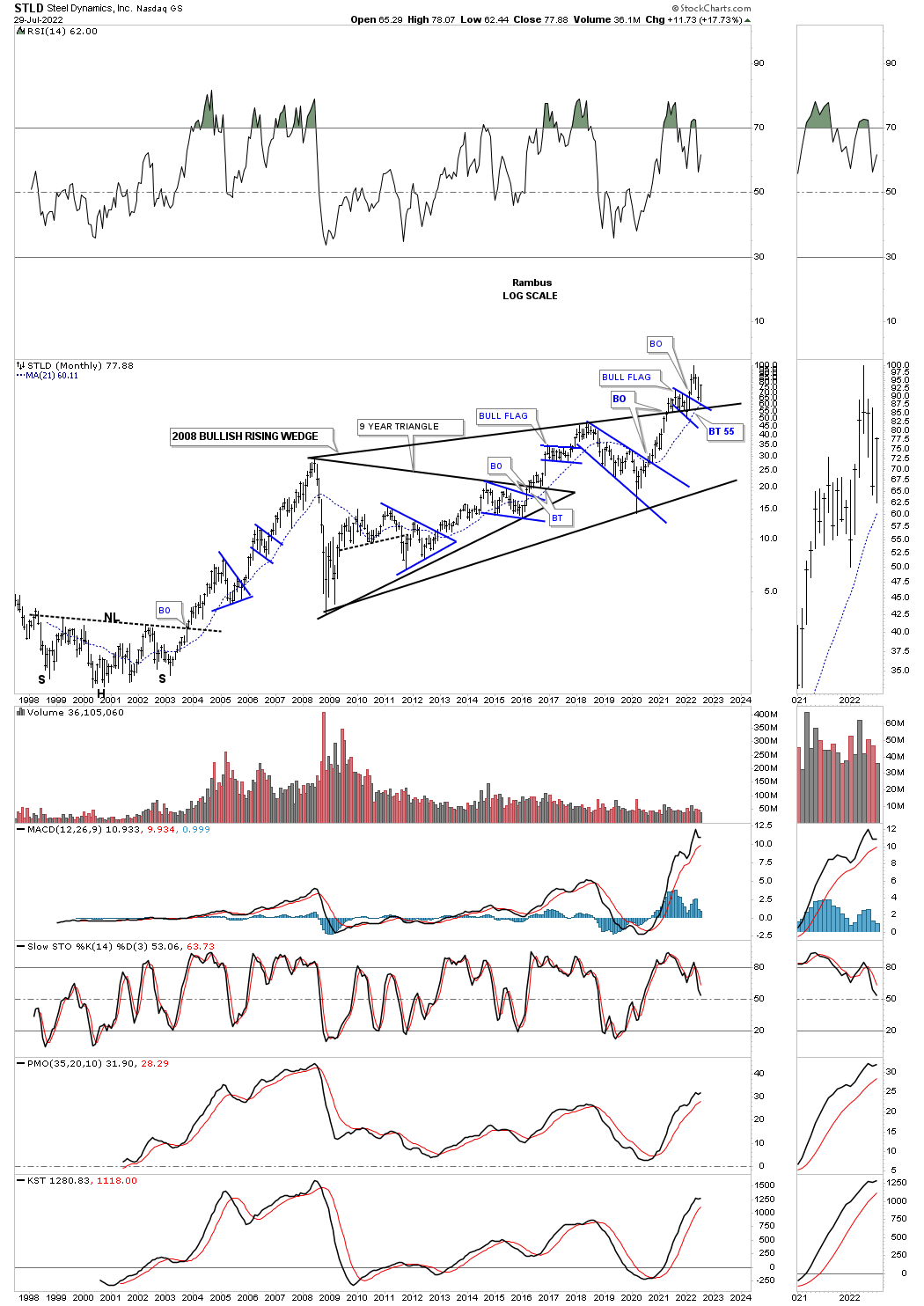
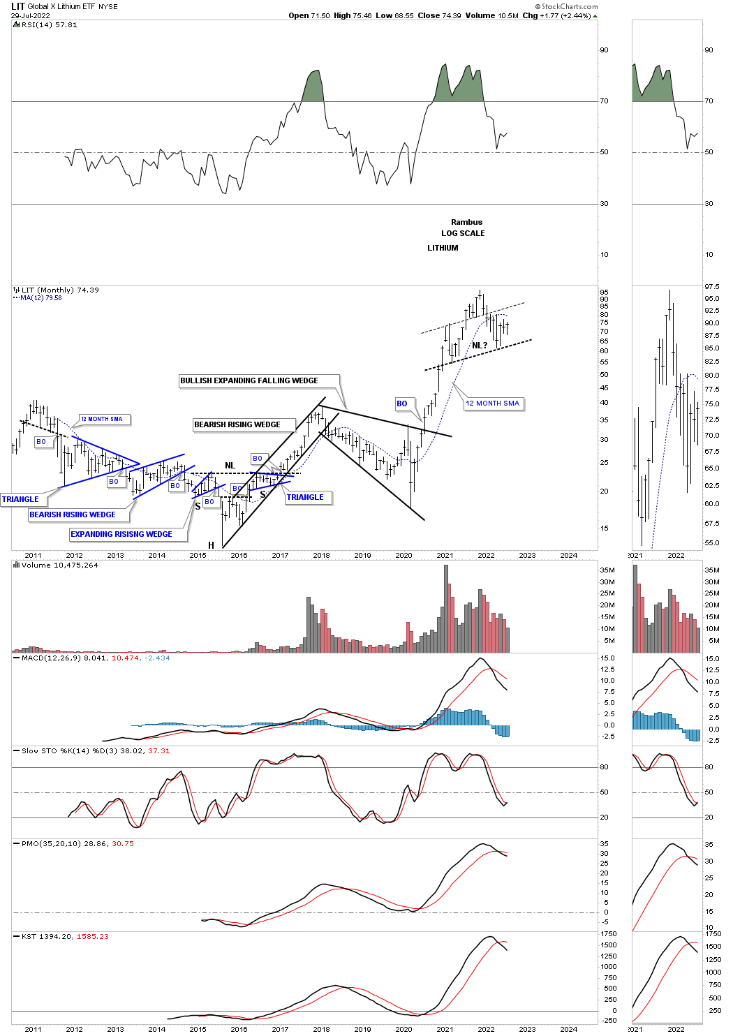
2018 & 2022?
Can the current price action trade back above the top rail to complete the third bullish expanding falling wedge?
13 years:
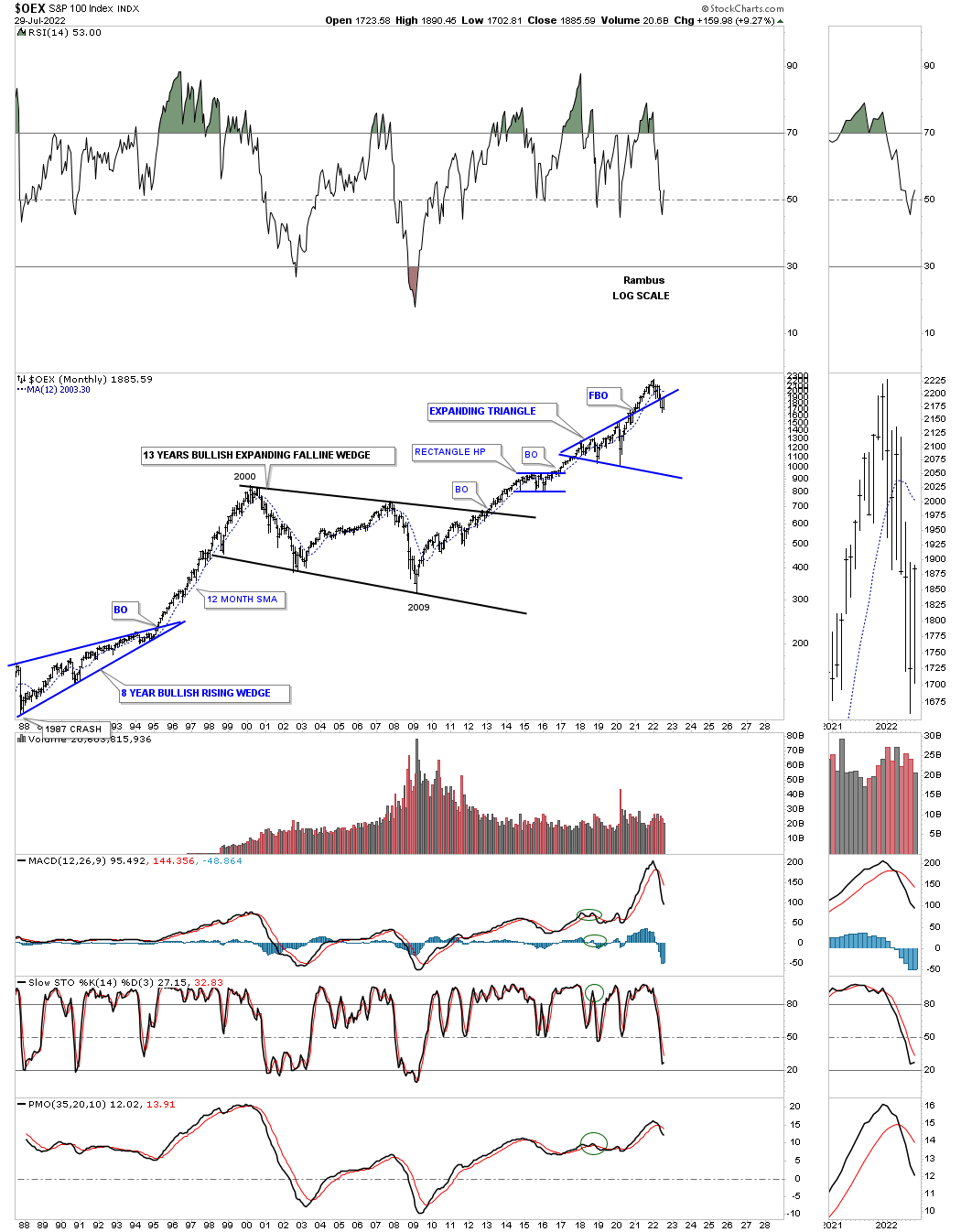
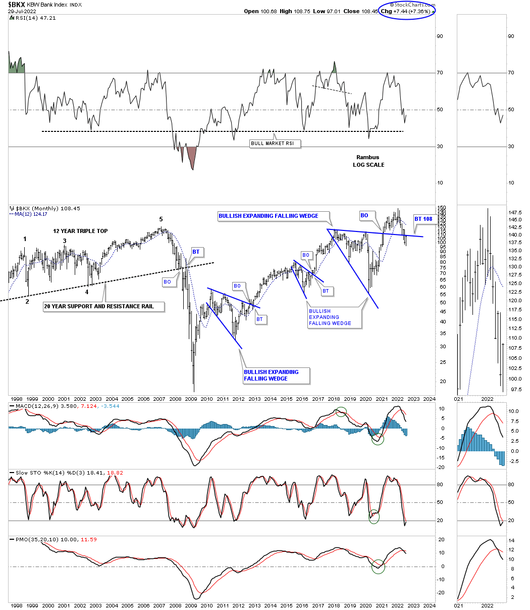
Two bullish expanding falling wedges.
Two bullish expanding falling wedges.

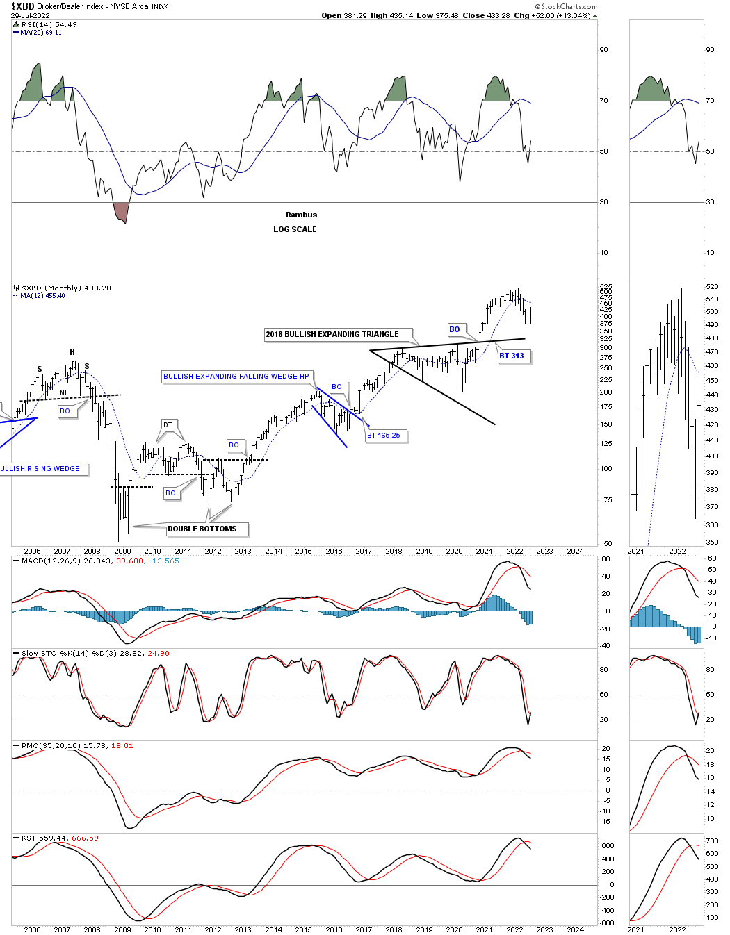
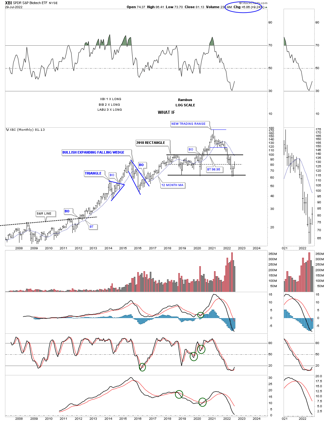
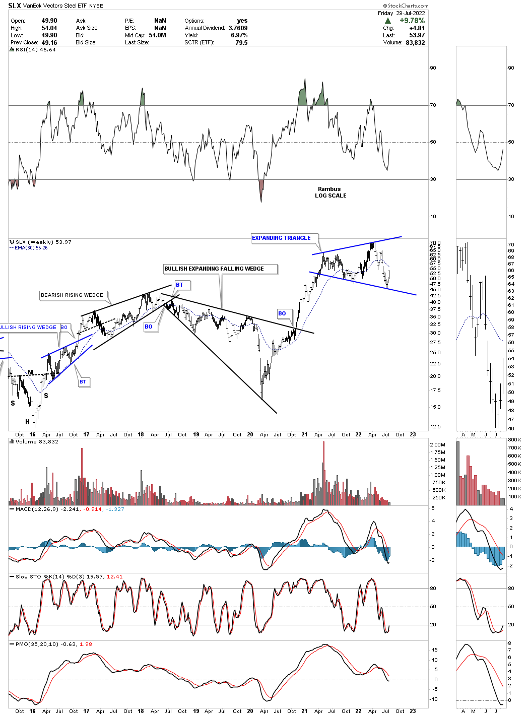
Part of a bigger consolidation pattern.
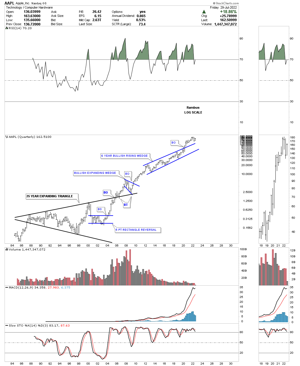
AAPL history chart: You know the pattern is valid when you see the backtest form where it is supposed to.
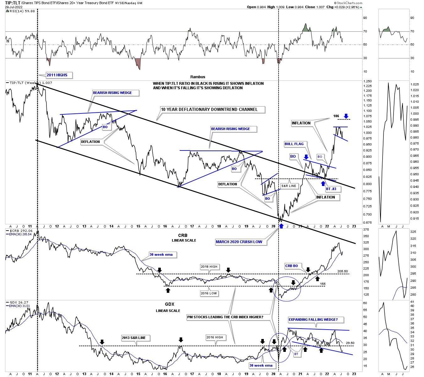
Inflation / deflation chart with the GDX on the bottom.
Gold 2008 crash low.

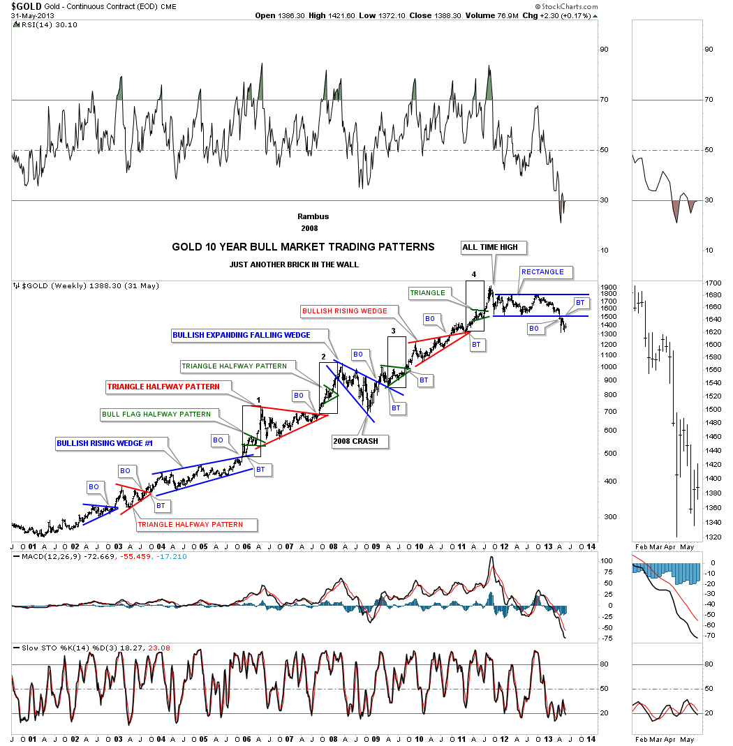
All the chart patterns made during the 2000 to 2011 bull market.
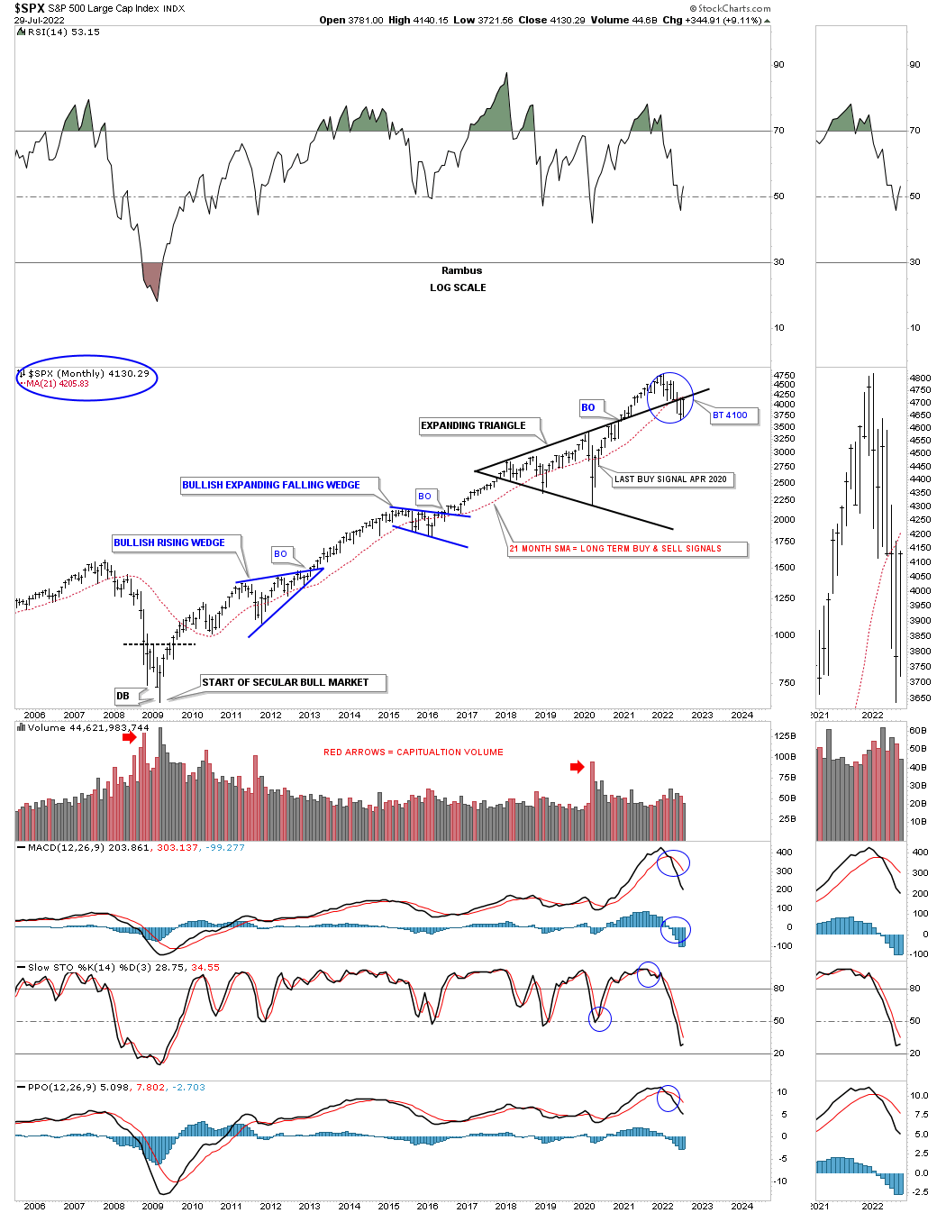
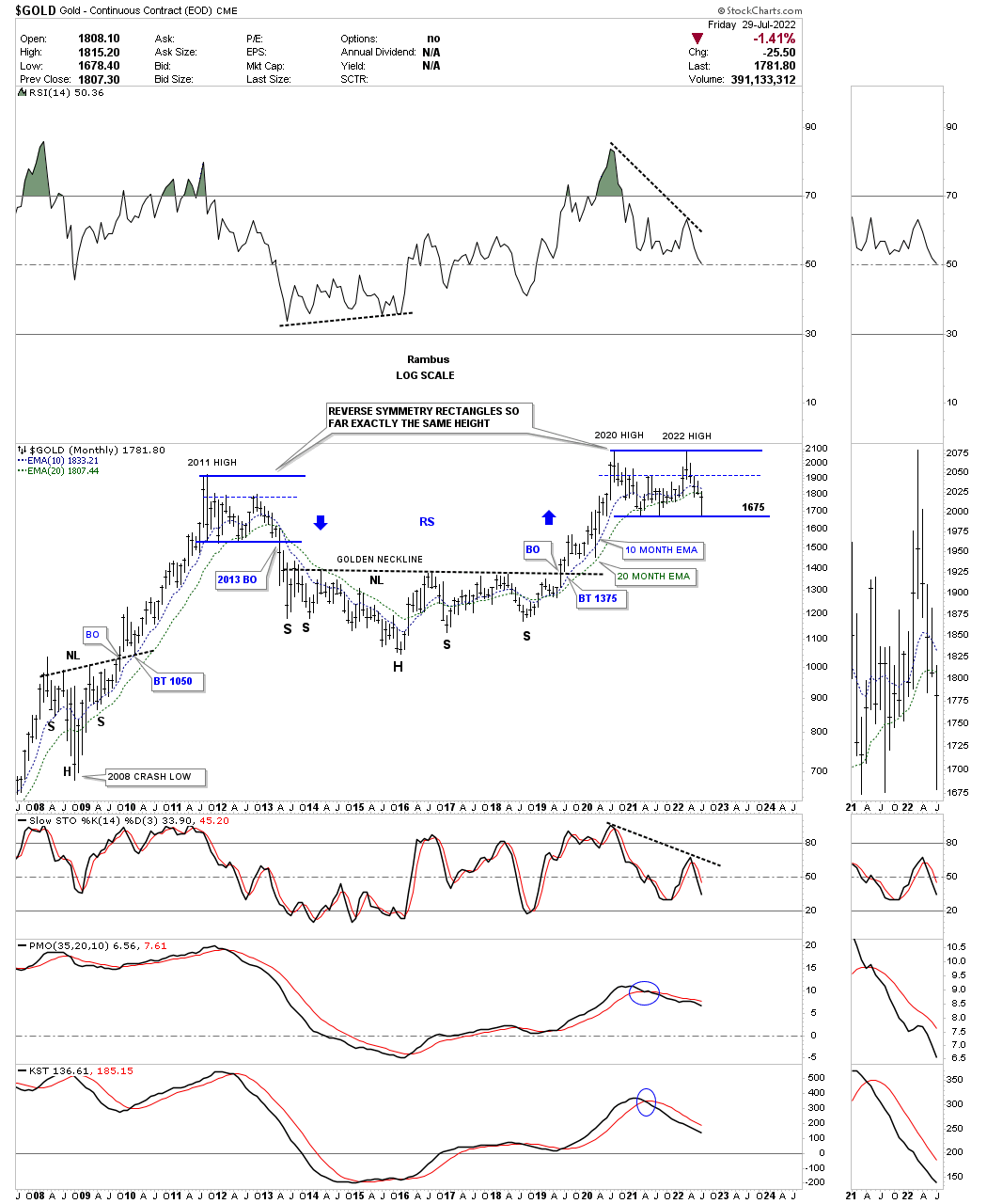
Gold made a valiant effort, but closed the month of July just below the 10 and 20 month ema.
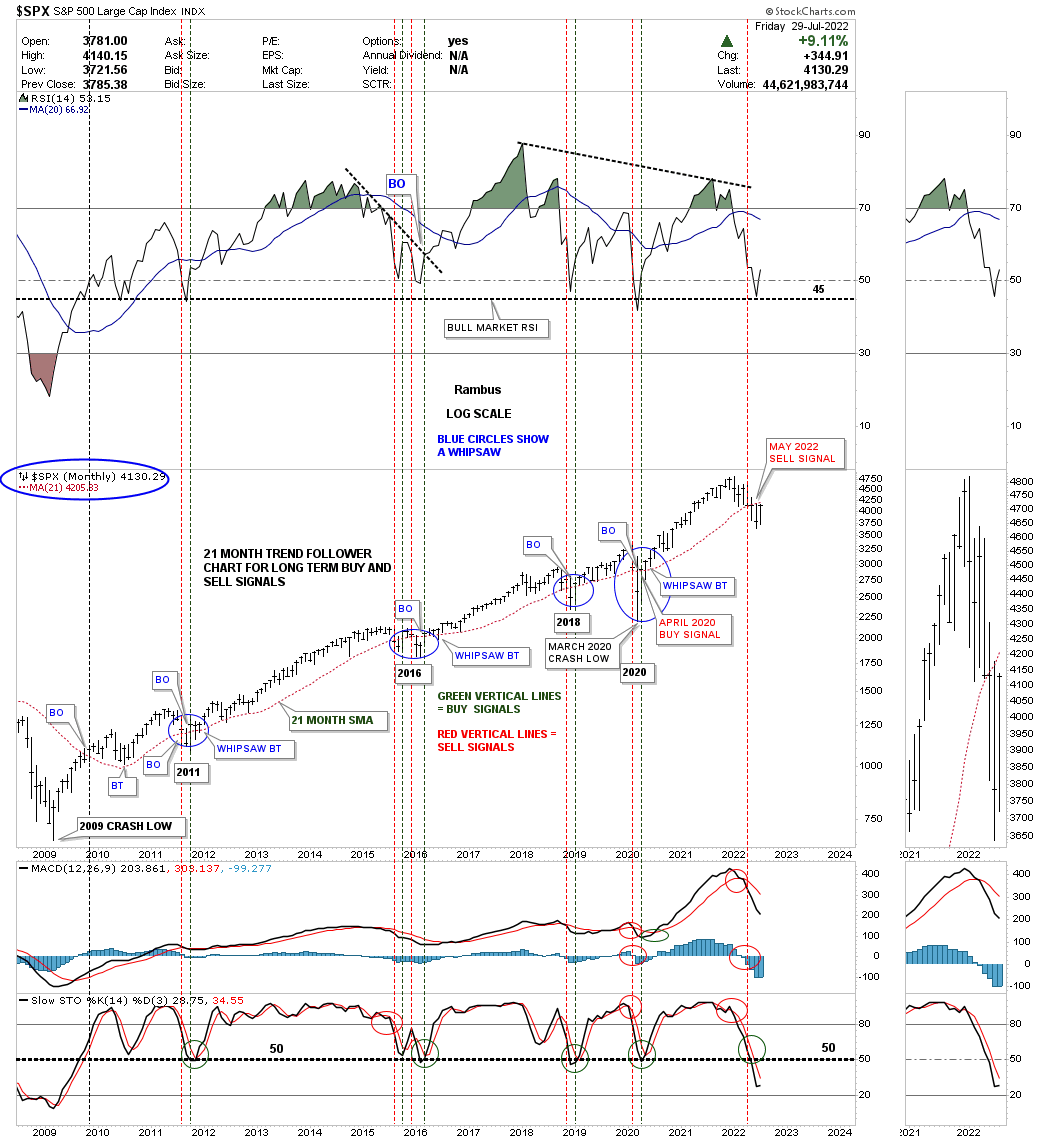
Same with the SPX which closed the month of July just below its 21 month sma which is still on a sell signal.
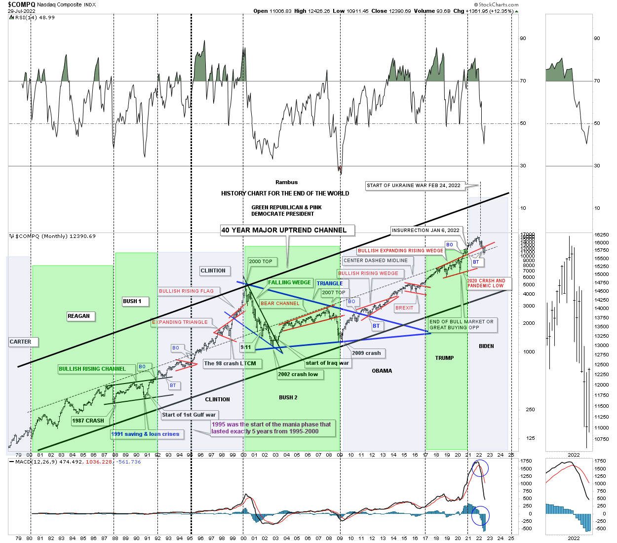
This last chart for tonight is the, HISTORY CHART FOR THE END OF THE WORLD, which shows all the important lows that felt like the end of the world if you were trading when these events happened. The last chart pattern to have formed is the red expanding rising wedge which can have bullish implications if the price action can trade back above the bottom rail. The center dashed midline has held support during this current weakness.
Now you know why I got positioned in the Kamikaze Portfolio as quickly as I did. If I’m wrong the risk is minimal, but if I’m right the reward will be worth taking the risk at the very bottom. This is how you get 5 to10 baggers in the PM complex. All the best…Rambus
More By This Author:
Precious Metals Stocks: To Buy Or Not To Buy That Is The QuestionThe Many Faces Of Gold
Markets Update - Precious Metals Consolidation / Stock Market Bear Action
Disclosure: None. If you'd like more information about the additional free trading education mentioned in ...
more

