Between A Rock & A Hard Place - 08/05/16

Several weeks ago, I commented on the fact that if I were Janet Yellen I would have hiked rates in July by .50 bps. Here was my reasoning at that time:
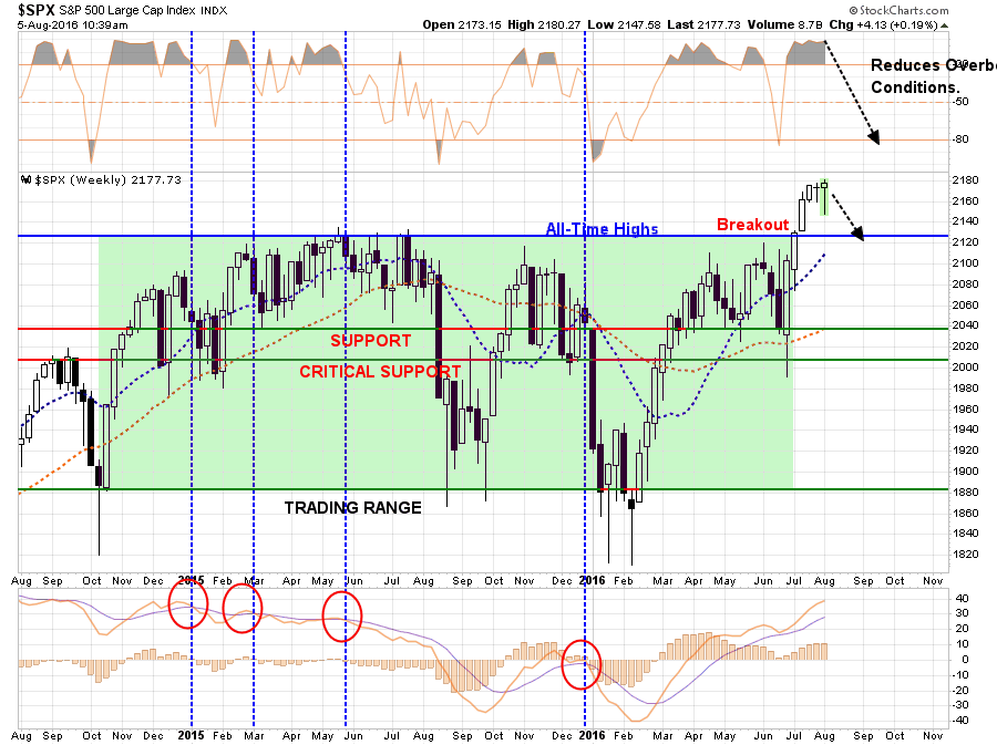
“First, with the markets making new all-time highs, there is a “price” cushionavailable for the markets to absorb a rate hike without breaking important downside support as shown below.”
Chart updated through Friday’s open.
“Secondly, with Central Banks globally flooding the markets with liquidity, as discussed yesterday, a further ‘shock absorber’ is currently engaged in softening the impact of a rate hike.

“Lastly, the economy is likely going to show a bit of ‘strength’ in upcoming reports, with slightly stronger inflationary pressures. This pickup in economic strength will be another inventory restocking cycle following several months of weakness. As has been in the past, it will be transient and that strength will evaporate as quickly as it came.
If I were Janet Yellen, I would hike interest rates by .50 bps immediately in a surprise announcement and use the price and Central Bank liquidity cushions to soften the blow.“
Of course, she didn’t do it. As expected. I bring this up because Friday’s employment report which showed a 255,000 job increase for July, combined with upward revisions to the prior two months, puts Ms. Yellen in a very tough spot to NOT raise rates in September.
But here is what is interesting.
While Ms. Yellen is being pushed into a corner of hiking rates, thereby further tightening monetary policy, the rest of the world is flushing the system liquidity. The latest participant in the QE process was the Bank of England (BOE) this past week which lowered interest rates, announced a bigger than expected QE program and loosened restrictions on bank lending.
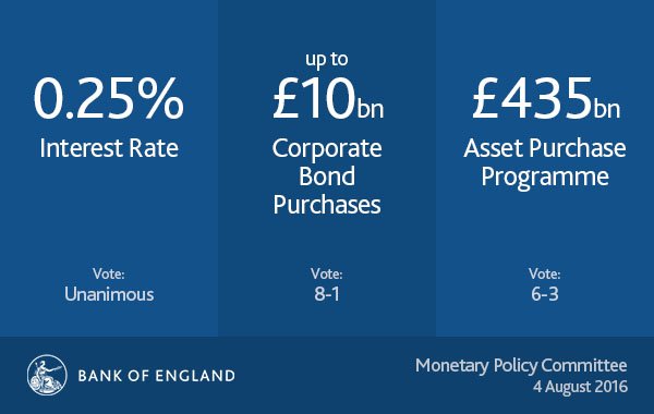
This follows the European Central Bank and Bank of Japan all doing the same thing.With global economic growth shrinking rapidly, BOE reduced economic growth expectations from 2.3% to just 0.8% for 2017, Ms. Yellen is banking on stronger economic growth in the future to support higher rates.
However, the “bond market ain’t buyin’ it.”
As shown in the chart below, interest rates are a function of economic growth, wages, and inflation. Therefore, interest rates are confirming the low inflation/low growth environment in the U.S. and will unlikely be able to withstand a further tightening of monetary policy at this juncture.
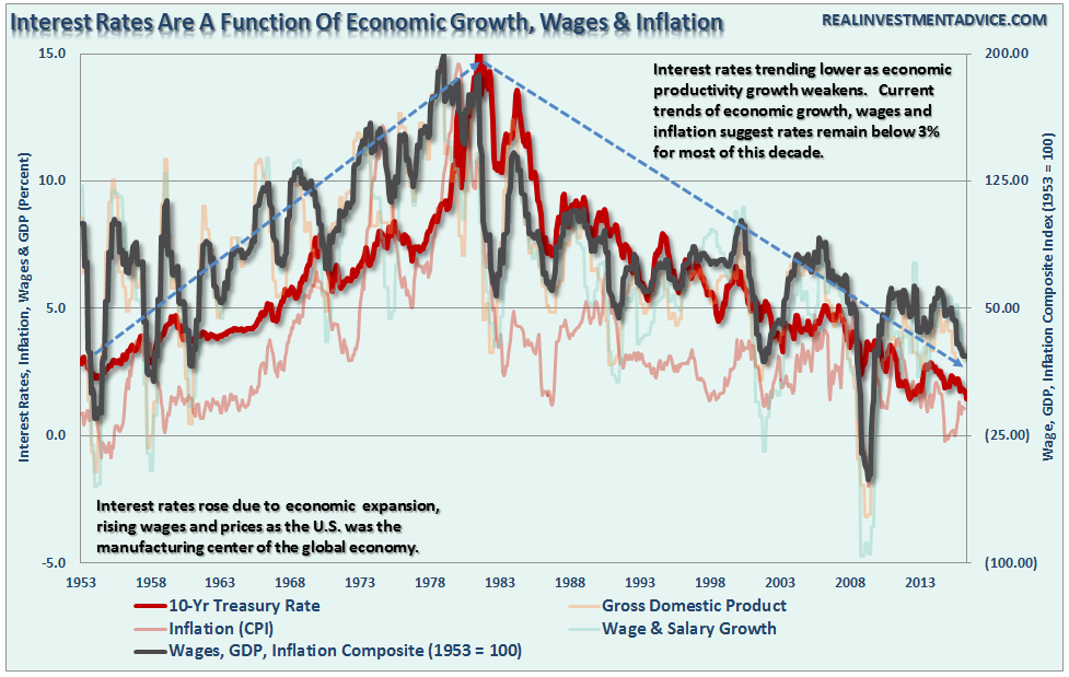
The black line is a composite index of the annual rate of wage growth, GDP, and inflation. With this metric on the decline, interest rates are set to decline further.
Ms. Yellen is likely going to “punt” again on raising rates in September given the proximity to the Presidential election cycle, however, she shouldn’t. The market and seasonal bounces in the economic data are giving her temporary cover to make her move, it is questionable whether she will have the same opportunity after the election.
This is a gamble she could well lose.
Employment Not A Strong As Reported
Back to the employment data for a moment. The large number in July of 255,000 defies the payroll tax collection data. Remember, the BLS takes a phone survey of individuals asking them what their employment status is, or is not. The corporate tax receipt data is an actual measure of the amount of payroll taxes being paid for all employees. (Which do you think is a more accurate measure?)
As Nick Colas of Convergex recently noted:
“Looking at individual tax/withholding receipts (available from the U.S. Treasury) for the month of July, there is a reason for caution on both indicators.July “Withheld” receipts – those tax and withholding payments that come straight from wage earner pay stubs – are down 1.0% year over year.
Also worth noting: YTD non-withheld tax receipts (such as those that come from ‘Gig economy’ workers) are down 6.5%, and July’s comp is 15% lower than a year ago.
Last, corporate tax receipts are down 11% YTD, and if the current pace of these payments holds it will be the first negative comp since 2011. Bottom line: if the tax man isn’t as busy, can the U.S. economy really be expanding?”

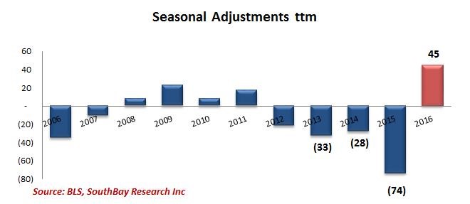
But then there is also the ongoing seasonal adjust “fudgery” going on with the employment data this week as well.
“As Mitsubishi UFJ strategist John Herrmann wrote in a note shortly after the report, the ‘jobs headline overstates’ strength of payrolls. He adds that the unadjusted data show a ‘middling report’ that’s ‘nowhere as strong as the headline’ and adds that private payrolls unadjusted +85k in July vs seasonally adjusted +217k.
In Herrmann’s view, the government applied a ‘very benign seasonal adjustment factor upon private payrolls to transform a soft private payroll gain into a strong gain.’”
Southbay Research also blasted today’s seasonal adjustment factor, this is how the seasonal adjustments look like relative to history.
The +85k unadjusted number also confirms the trends of fixed and non-private residential investment. Businesses hire against the demand for their products and services. This is why, as shown in the chart below, the historical relationship between employment and fixed investment is extremely high….until now.
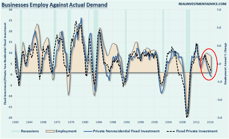
Importantly, there are two takeaways from this data:
- Currently, the markets don’t care about what is really happening in the economy, but whether the data keeps the “punch bowl” available. Liquidity is key to supporting asset prices at current levels.
- However, eventually, the markets WILL care about this data when the economy slows to a point where recessionary forces are no longer deniable.
For now, we are not at the second point as of yet. Therefore, the bullish bias remains intact as long as Central Bankers remain accommodative and keeps interest rates suppressed. Of course, the ongoing liquidity push is distorting market dynamics to a point that will lead to some very bad things in the future.
So enjoy the party for now. Just don’t be the last guy out of the door when the cops show up.
1-in-1200 Year Event
Jesse Felder wrote a great piece on Friday picking up this point of liquidity driven exuberance.
“Today’s euphoria is directed squarely at yields and what some have come to call, “bond alternatives.” Treasury bond yields have fallen to record lows but what is even more stunning is just how far certain, yield-focused segments of the equity market have soared in recent months. Not only have they set new record-highs in terms of valuation, they have done so to a degree that should almost never happen.
Michael Lebowitz shared a chart today showing the utilities sector, one of the most popular yield-focused segments of the equity market, trading at 3 standard deviations, also called “sigma,” above its long-term average. Jeremy Grantham defines a bubble as a 2 sigma event, which should occur every 44 years or so. This 3 sigma event in utilities is statistically the very same degree of overvaluation we witnessed in residential real estate at the height of its recent bubble and should only occur once every 1,200 years, according toGrantham.”
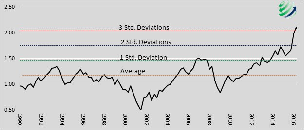
“I asked Michael to share his data with me so I could run the numbers on consumer staples stocks, as well, another very popular focus of those looking for, ‘bond alternatives.’ I found that they currently trade 2 standard deviations above their 10-year average valuation (in terms of enterprise value-to-EBITDA), also meeting Grantham’s definition of a bubble.
In other words, there is in fact a bubble in the markets right now. It’s a bubble focused in STUB (staples, telecom, utilities and bonds). And it’s not likely to end any differently than any other bubble we have witnessed over the past couple of decades.”
But that doesn’t mean it will end today.
Or tomorrow.
Or next month.
Just understand that the emotionally driven bias of the herd can keep stocks detached from underlying realities far longer than logic would deem possible.
But it does end.
It ends badly.
And it ends when you aren’t paying attention.
Still Waiting On A Correction
So, am I buying equities to move portfolios to the current target allocation?
Not yet.
Three weeks ago, when the market broke out of its 18-month consolidation process, I laid out the case to increase equity exposure in portfolios. I am repeating that case here for new readers of this missive.
“This week, I am adjusting the model allocations up to 75%. Review last week’s missive for the individual sector analysis for recommendations leading up to the model change.”
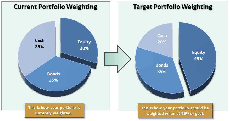
“However, while I am changing the model, this does not mean going out and clicking the ‘buy’ button on everything you can find. We must now wait for the right entry point to increase equity allocations to the new model weights.“
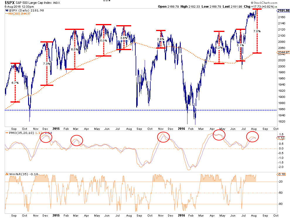
The consolidation over the past two weeks DID pull the deviation back from 3-standard deviations above the 50-dma to just 2-standard deviations. This didn’t solve much of the problem as of yet.
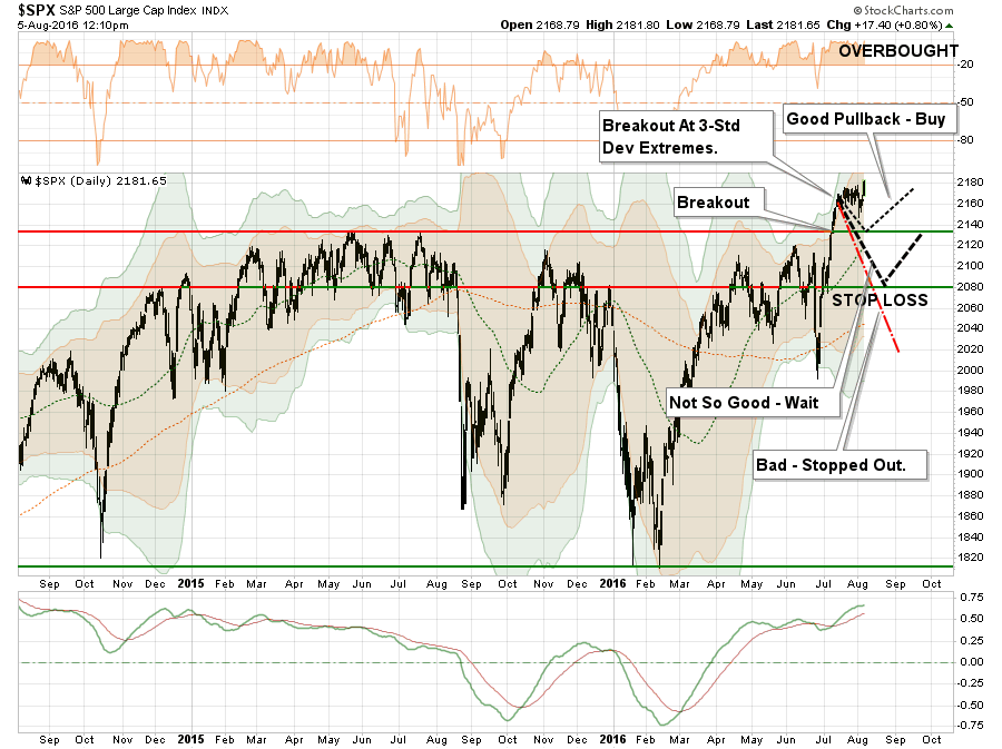
Importantly, the market is now trading at one of its highest levels of deviations from the 200-day moving average that we have seen over the last couple of years. As I have explained in the past, like a rubber band, prices can only be stretched so far from the moving averages until they eventually “snap back.”
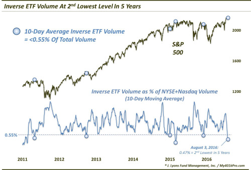
Lastly, my friend Dana Lyons recently made some excellent comments the very low levels of inverse ETF volume which has historically denoted short-term market peaks. To wit:
“On the other end of the spectrum, very low levels of inverse ETF volume can be a sign of complacency, indicative of market tops of varying degrees(though, like most metrics, the ‘top’ signals are less reliable than the bottom signals). A low level of inverse ETF volume may indicate that investors have very little in the way of ‘hedges’ and, therefore, may be especially vulnerable in a decline.
This notion is relevant presently as, on a 10-day basis, relative inverse equity ETF volume has dropped to its 2nd lowest level in more than 5 years.“
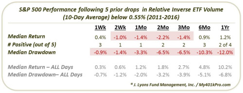
“As the table indicates, the sweet spot for weakness occurs in the range between short and intermediate-term, specifically 2 weeks to 3 months. By 1 month, 4 of the 5 events had experienced a drawdown of at least -3% (January 2015 was the exception). By 2 months, the median drawdown was -6.5%. So while this occurrence may turn out differently, the track record certainly is not pretty.”
All the data points to some sort of corrective action over the next two months (as discussed last week) which will provide a better risk/reward setup for increasing equity exposure. This is, of course, provided that important technical supports are not violated in the process returning the market back to its previous consolidation channel.
Remaining patient is tough. But waiting for the “right pitch” always leads to a better outcome than swinging at everything being thrown.
THE MONDAY MORNING CALL
The Monday Morning Call – Analysis For Active Traders
Earnings Worse Than Expected
Despite hopes by the more mainstream economists that earnings would be improving sooner rather than later, this has yet to be the case. As Eric Parnell recently noted:
“Roughly two-thirds of the companies in the S&P 500 Index have now reported their latest quarterly earnings. And while the headlines are filled with companies that continue to “beat” expectations, the reality is that the downward revisions in corporate earnings are even worse than what this stock market bear expected this quarter. And the readings for the latest week have almost assured that corporate earnings are going to fall short of the reasonable targets set at the beginning of the quarter.”
However, the only reason that companies are currently beating estimates, is because those estimates had been dramatically lowered since the beginning of this year turning earnings season into a “participation event.” In other words, if you lower the bar enough, eventually everyone “gets a trophy.”
The chart below shows the evolution of earnings expectations since March of 2015, to present with the bottom part of the chart showing forward estimate changes from January, 2016.
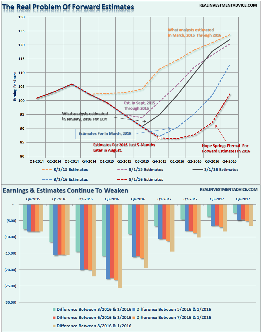
As discussed over the last couple of weeks, the direction of the dollar will be a major determinant as to the realization of those “hockey stick” recovery hopes shown above.
“While earnings are set to decline again this quarter, which will push valuations even further into the proverbial stratosphere, the real risk to watch is the US Dollar. While Central Banks have gone all in, including the BOJ with additional QE measures of $100 billion, to bail out financial markets and banks following the ‘Brexit’ referendum, it could backfire badly if the US dollar rises from foreign inflows. As shown below, a stronger dollar will provide another headwind to already weak earnings and oil prices in the months ahead .“

Unlike the stock market which is pushing extreme overbought levels, the dollar is at an extreme oversold condition and has only started a potential move higher. This is something to pay very close attention to in the months ahead.
With interest rates negative in many areas of the world, the push of capital into the U.S. for a higher return on reserves is very likely which will continue to suppress earnings and economic growth.
As Eric concludes:
“All of this continues to present an increasing dilemma for an already richly valued stock market trading at all-time highs. For with each passing day, stocks are becoming more expensive even if they simply stand still.”
Eventually, valuations will matter.
Potential Short-Term Oil Bounce
At the beginning of July I wrote:
“With oil prices back to extreme overbought conditions, a retracement to $35 or $40/bbl would not be surprising particularly if, and when, the US Dollar strengthens. Remain underweight this sector as valuations for energy stocks have entered into ‘moon shot’ territory.”
That call was quite prescient as shown.
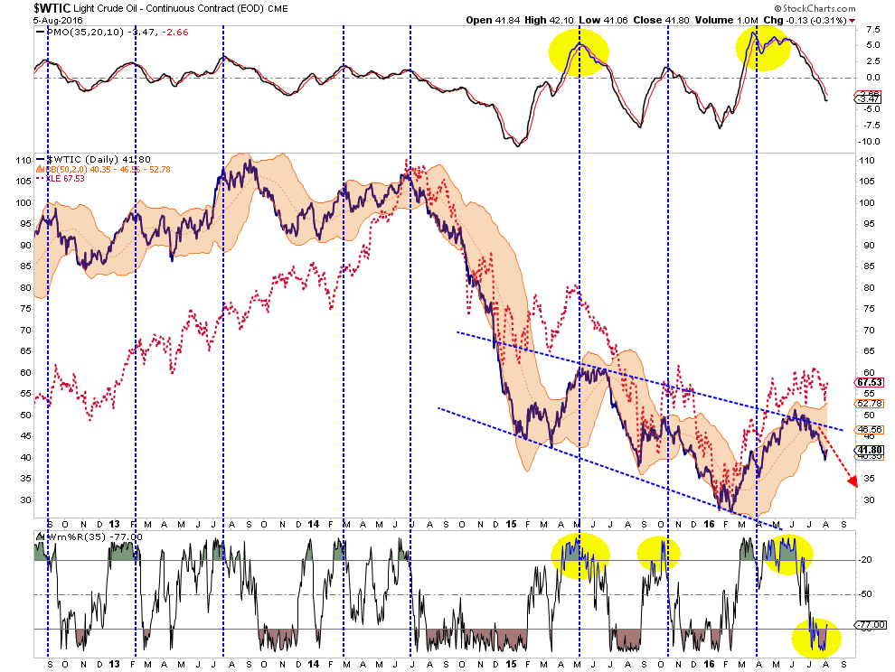
On a very short-term basis, oil has gotten oversold enough for a bounce to $46ish. I would begin reducing exposure to energy at that level as the next retracement lower will likely search for the $30-35 level. I suggest this because, on a weekly basis, oil currently remains trading at levels that have historically noted peaks in price.

Oil, and subsequently energy related stocks, currently remain trading vehicles rather than investments. There is a lot of damage still to come as earnings continue to slump in this sector over the next couple of years as oil prices remain low.
Looking For An Opportunity To Buy Bonds
I discussed previously that interest rates had gotten so oversold (bonds overbought)due to the “Brexit” that a reversal was very possible. As I noted on previously, the rotation from bonds to stocks confirmed the push higher in the markets.
“Much of the sustainability of the rally going forward is dependent upon the ongoing rotations from ‘safety’ back into ‘risk.'”
That occurred as suspected and the “short position” on interest rates using the exchange-traded fund (TBT) at the time has now been closed out. With rates now pushing on the long-term downtrend line, I am now looking for weakness in the bond market to add to existing fixed income holdings for the next decline in rates.
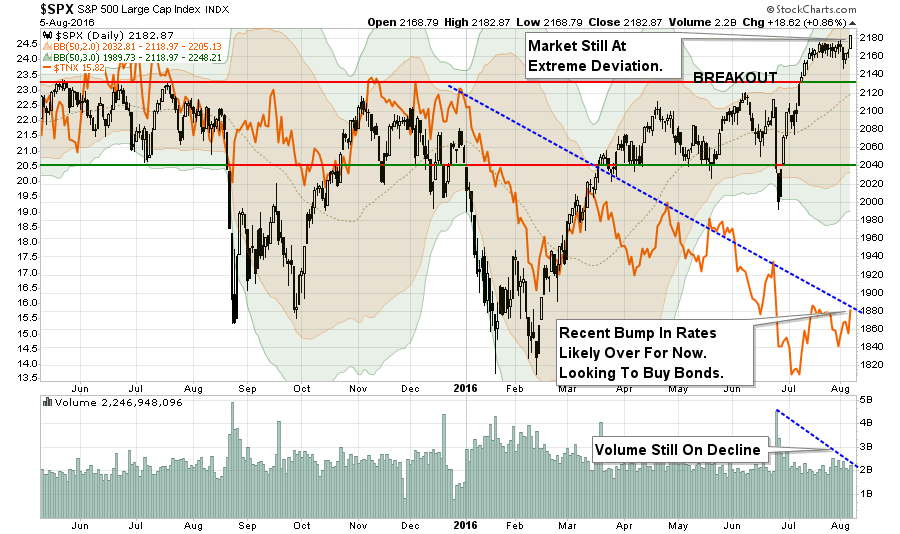
If I am correct, and the markets do experience a short-term correction, or worse, interest rates will likely retest recent lows. One thing is for sure…
“Rates ain’t going significantly higher anytime soon.”
Model Update
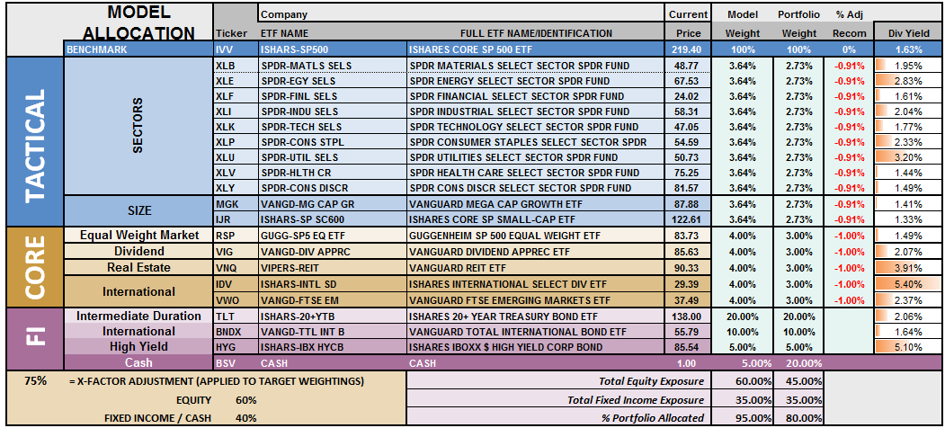
S.A.R.M. Sector Analysis & Weighting
The current risk weighting remains at 50% this week but will increase to 75% given the appropriate correction of the overbought condition. With all buy signals currently in place, and the bullish trend intact, this is not a market to bet heavily against…for now. However, it is also not a market to become extremely complacent in either.
Again, we must be given the right “set up” to increase equity allocations. Begin by“averaging up” in existing holdings to match model allocation and weights. When, and IF, the market confirms the continuation of the “bullish trend,” then begin adding new holdings to the model.
(Note: This is an equally weighted model example and may differ from discussions of overweighting/underweighting specific sectors or holdings.)
Relative performance of each sector of the model as compared to the S&P 500 is shown below. The table compares each position in the model relative to the benchmark over a 1, 4, 12, 24 and 52-week basis.
Historically speaking, sectors that are leading the markets higher continue to do so in the short-term and vice-versa. The relative improvement or weakness of each sector relative to index over time can show where money is flowing into and out of. Normally, these performance changes signal a change that last several weeks.
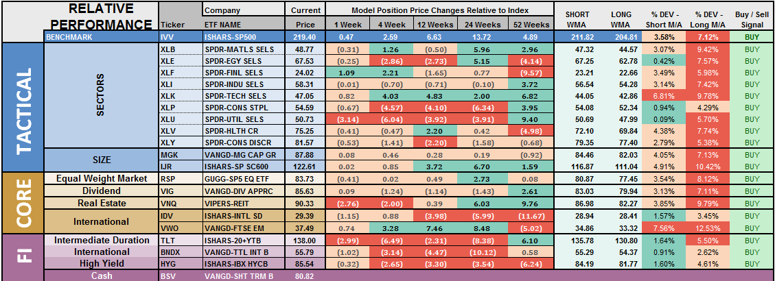
The two charts below graphically show the relationship of each positions performance relative to the S&P 500 Index. If we are trying to “beat the index” over time, we want to overweight sectors/asset classes that are either improving in performance or outperforming the index, and underweight or exclude everything else.
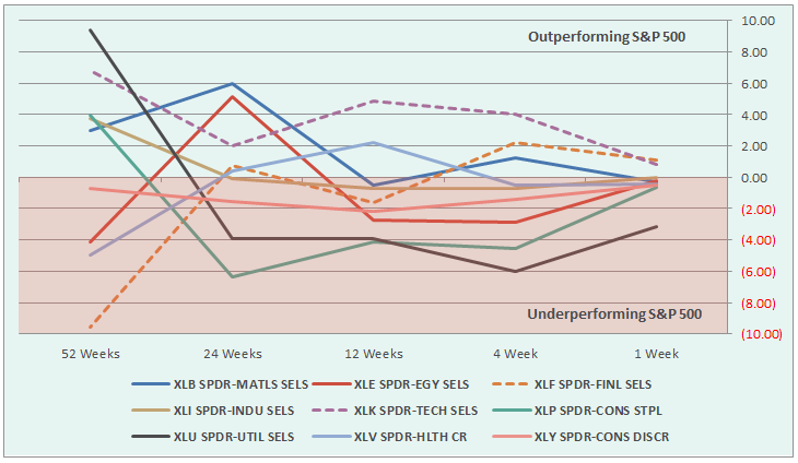
Sectors Currently Outperforming:
- Financials
- Technology
Sectors Currently Performing In Line
- Materials
- Industrials
- Staples
- Healthcare
- Energy
- Discretionary
Sectors Currently Under Performing
- Utilities
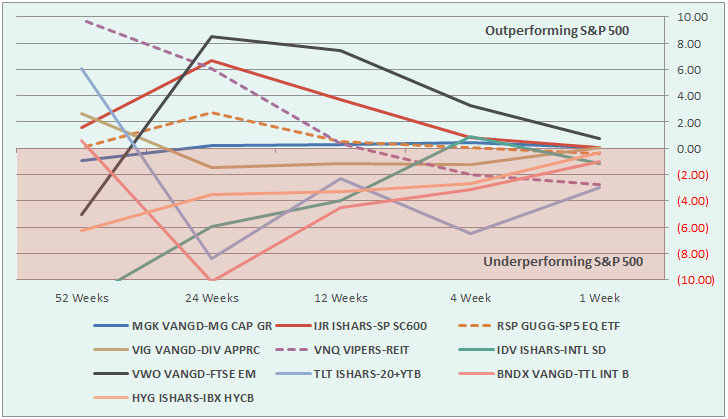
Index/Other Asset Classes Out Performing S&P 500
- Emerging Markets (but notice deterioration in relative performance)
Index/Other Asset Classes Performing In-Line With S&P 500
- Mid-Caps
- Small-Caps
- Equal-Weight S&P 500
- International Bonds
- High-Yield Bonds
- Dividend Stocks
- International Stocks
Index/Other Asset Classes Under Performing S&P 500
- REITs
- Bonds (noticeable improvement in performance – watch for opportunity)
The risk-adjusted equally weighted model has been increased to 75%. However, as stated above, a pullback in the markets is needed before making any changes.
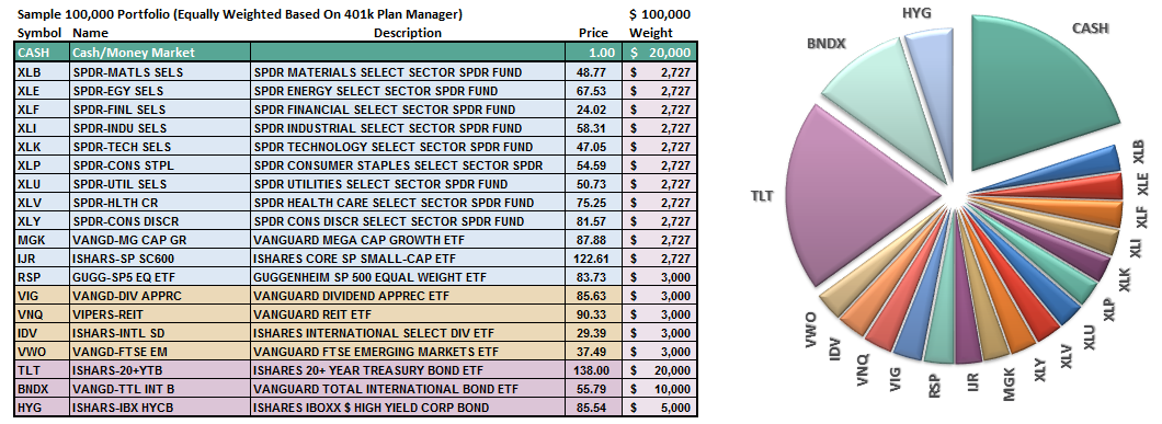
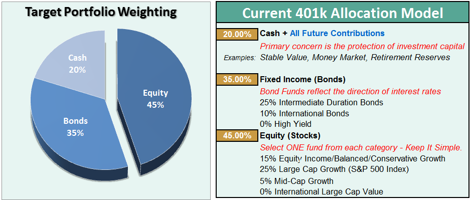
Such an increase will change model allocations to:
- 20% Cash
- 35% Bonds
- 45% in Equities.
As always, this is just a guide, not a recommendation. It is completely OKAY if your current allocation to cash is different based on your personal risk tolerance, time frames, and goals.
For longer-term investors, we still need to see improvement in the fundamental and economic backdrop to support the resumption of a long-term bullish trend. Currently, there is no evidence of that occurring.
THE REAL 401k PLAN MANAGER
The Real 401k Plan Manager – A Conservative Strategy For Long-Term Investors
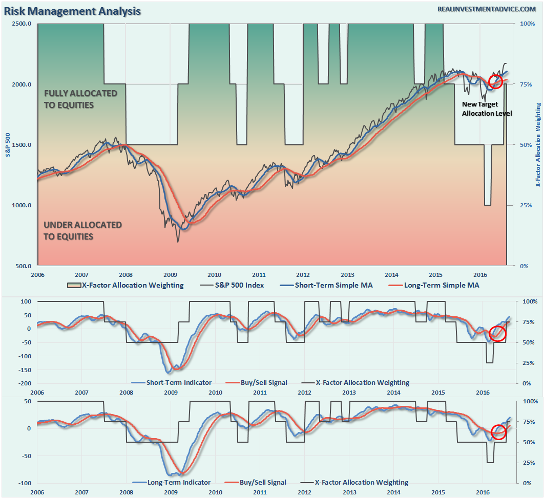
NOTE: I have redesigned the 401k plan manager to accurately reflect the changes in the allocation model over time. I have overlaid the actual model changes on top of the indicators to reflect the timing of the changes relative to the signals.
There are 4-steps to allocation changes based on 25% reduction increments. As noted in the chart above a 100% allocation level is equal to 60% stocks. I never advocate being 100% out of the market as it is far too difficult to reverse course when the market changes from a negative to a positive trend. Emotions keep us from taking the correct action.

Still Excessively Overbought
As I noted last time:
“With the technical underpinnings still bullishly biased at the moment, we are now in the position to increase equity allocations over the next couple of weeks.
However, as is always the case, by the time markets makes a significant technical change, prices are generally at an extreme overbought or oversold condition. This is the case currently with the recent breakout which has created an extreme overbought condition in the short term.”
And…we are still waiting….for the moment. This is where having the patience to wait for the “fat pitch” becomes much more difficult, but more often than not, provides the best results.
As discussed at length in the above missive, we certainly want to prepare ourselves to increase equity exposure in portfolios, however, we must patiently wait for the right conditions to apply those increases. Furthermore, while waiting for the relaxation of prices to make more prudent entries, it also enables investors to bypass potential “head fakes” of market actions.
- Review the allocation model adjustments below
- Identify the next course of actions in your 401k-plan
- Wait to make adjustments until technical conditions improve.
- Change allocations to target levels when conditions are right.
If you need help after reading the alert; don’t hesitate to contact me.
Current 401-k Allocation Model
The 401k plan allocation plan below follows the K.I.S.S. principal. By keeping the allocation extremely simplified it allows for better control of the allocation and a closer tracking to the benchmark objective over time. (If you want to make it more complicated you can, however, statistics show that simply adding more funds does not increase performance to any great degree.)
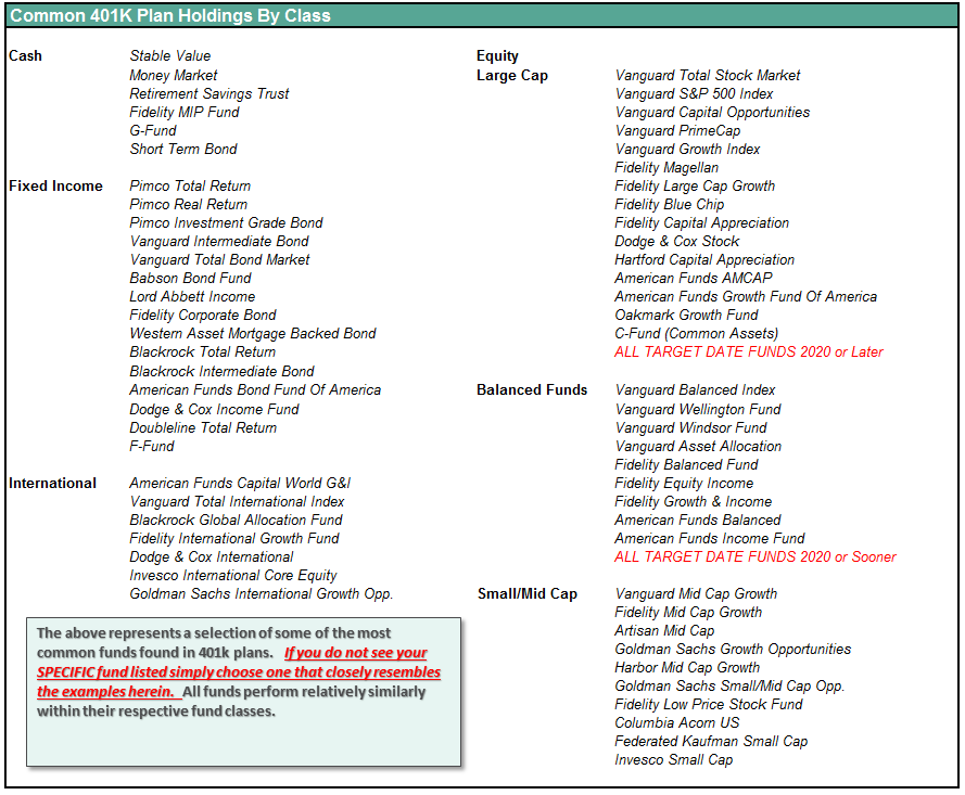
401k Choice Matching List
The list below shows sample 401k plan funds for each major category. In reality, the majority of funds all track their indices fairly closely. Therefore, if you don’t see your exact fund listed, look for a fund that is similar in nature.
Disclosure: The information contained in this article should not be construed as financial or investment advice on any subject matter. Streettalk Advisors, LLC expressly disclaims all liability in ...
more


Very good article, and the practical timing advice for tactical implementation of changing actual vs. allocation by sector is excellent. (This aspect is usually omitted by many authors/advisors.)
Great article, except interest rates do not seem to be a function of growth over time. The relentless decline in yields has occurred in boom times in the 1990's and during the housing boom in the early 2000's. The 10 year bond has a life of its own, being hoarded. Hoarding skews the data, and more and more, usage as clearinghouse collateral and as tier 1 capital pushes yields down all along the curve.
Interest rate levels may be a function of inflation, which means the Fed cannot allow inflation. The Fed cannot permit inflation at all, because the hoarding of bonds as money, as gold, has made it impossible for it to do a Volcker or else the "gold" will lose its value. The very, very elite have determined, IMO, that this just cannot be permitted. Europe is a prime example, even dropping into negative to preserve the value of the sovereign bonds and notes.