
Benchmark Candles On The Daily And Weekly Charts For Tesla
One of my Twitter followers asked a question about benchmarking in relation to Tesla and I thought this would make an interesting post as it gives me the opportunity to consider both the daily and weekly charts for the stock and highlight some interesting lessons from a volume price analysis perspective. The broad context of the question concerned the issue of benchmarking which is a key component of the volume price analysis methodology. So what is benchmarking?
In using volume as a key element in the VPA methodology, the first issue we must recognize is that volume is, of course, subjective, in terms of what we might consider being high, medium, or low volume, or indeed extreme. This is one aspect. The second is price, and the context of the relationship between the two when looking to judge whether the volume and price we are seeing at the leading edge are in agreement or disagreement and to do this we search out our benchmarks to help provide us with the answer. Across the chart, we identify up candles and down candles, preferably with small or no wicks, which then give us an idea of what is ‘the norm’ for the instrument on a particular timeframe. Once we have established ‘the norm’ we can then judge the current price and volume against our benchmark candles which will then confirm if we are witnessing an anomaly. If the answer is yes, then we can expect a reversal to follow. If not, then all is well. This also applies to candles such as hammers and shooting stars.
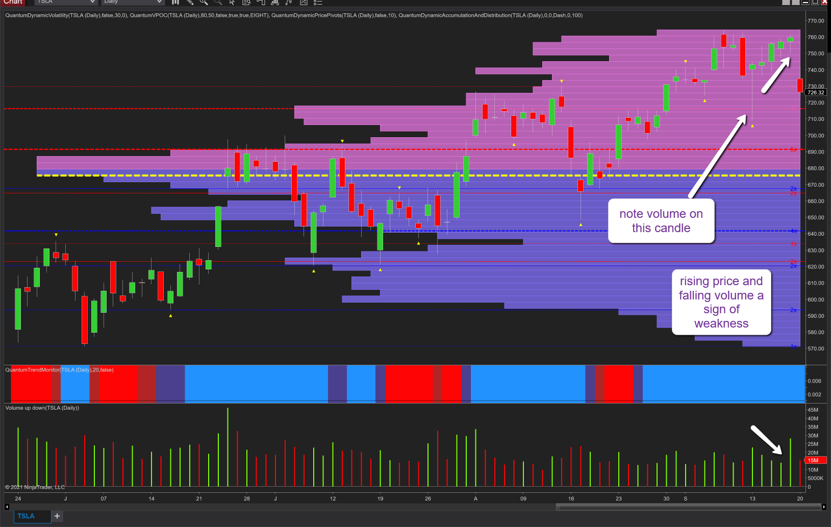
So, if we start with the daily chart for TSLA and last week’s price action. Note Monday’s volatile price action, a sharp move lower and recovery, yet the volume is modest and hardly indicative of sustained buying by the market makers. This is confirmed over the following days with the price rising on falling volume. Look at Wednesday’s price action, a nice wide spread candle, but consider the volume, and compare it to a benchmark candle. It looks lightweight. Finally, to today’s price action with the US indices selling off sharply, it’s no surprise to see the stock has fallen, in fact, gapped down, but the volume looks light. After all, we are seeing dramatic price action, and whilst the session is not yet over (at the time of writing), the volume thus far looks to be average at best and hardly indicative of major selling by the market makers. The volume on the day needs to be substantially higher if this is a genuine move.
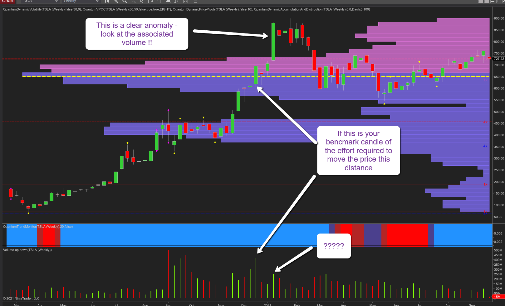
Moving to the weekly chart and one anomaly which jumps off the chart is the widespread up candle of January 2021. Look at the associated volume – it is the same as candles of half this spread, and against any benchmark looks like a trap which was indeed the case. As an aside, notice how the up volume candles of 2021 are generally falling when compared to the volume from September 2020 through to the end of the year, so another reason the stock is struggling to regain last year’s highs.
Finally, I would always suggest looking at more than one timeframe when considering anomalies, and benchmarking as a slower timeframe can give further context to the price action thereby providing a complete picture.
Disclaimer: Futures, stocks, and spot currency trading have large potential rewards, but also large potential risk. You must be aware of the risks and be willing to accept them in order to invest in ...
more

