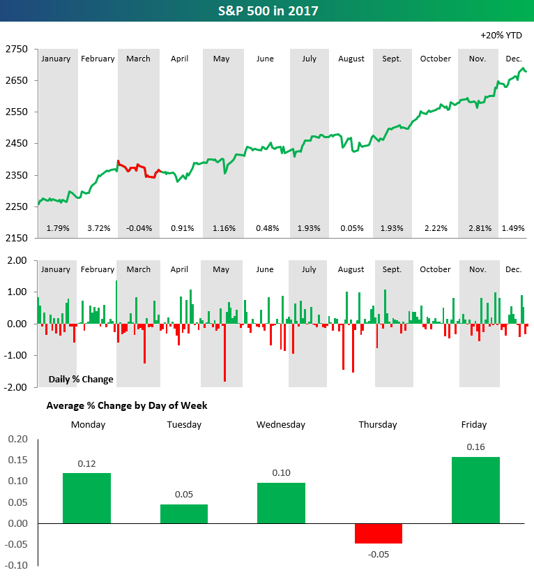
The chart below is from our 2018 annual outlook report. The full report is available now with any membership level using our
more
The chart below is from our 2018 annual outlook report. The full report is available now with any membership level using our Annual Outlook Sign-Up Special.
Disclaimer: All information, data and analysis contained in the Site or the Service are provided “AS IS” and without warranty of any kind, either expressed or implied. All information, data and analysis provided by the Site or the Service is for informational and educational purposes only and is not a recommendation to buy or sell a security or basket of securities, including but not limited to equities, options and other derivative products, fixed income products, and ETFs. Bespoke believes all information, data and analysis contained in the Service to be accurate, but does not guarantee its accuracy. Under no circumstances, including, but not limited to, negligence, shall Bespoke, any of Bespoke´s affiliates, employees, or other third party data providers be liable to you for direct, indirect, consequential, incidental, special, punitive or exemplary damages even if an authorized Bespoke representative has been advised specifically of the possibility of such damages, arising from the use of or inability to use the Site or the Service, such as, but not limited to, losses, loss of revenue, anticipated profits or lost business. Applicable law may not allow the limitation or exclusion of liability or incidental or consequential damages. In no event shall Bespoke´s total liability to you for all damages, losses, and causes and action (whether in contract or tort, including but not limited to negligence) exceed the amount paid by you, if any, for accessing this Site or using the Service. All opinions expressed on this Site are subject to change without notice, and you should always obtain current information and perform appropriate due diligence before making trades or investment decisions. Bespoke, any of Bespoke´s affiliates, employees, or other third party data providers may have long or short positions in the securities discussed in the Service and may purchase or sell such securities without notice. Bespoke uses various methods to evaluate investments which may, at times, produce contradictory recommendations with respect to the same securities. When evaluating the results of prior Bespoke recommendations or Bespoke performance rankings, you should also consider that Bespoke may modify the methods it uses to evaluate investment opportunities from time to time. For this and for many other reasons, the performance of Bespoke´s past recommendations or investments is not a guarantee of future results.
The securities mentioned in this Site or in the Service may not be eligible for sale in some states or countries, nor be suitable for all types of investors; their value and income they produce may fluctuate and/or be adversely affected by exchange rates, interest rates or other factors. Please view Bespoke’s Form ADV here.
less